Introduction
TableView is an extremely popular control, but it’s also probably the most complex and least understood. This article is about how to manage the styling aspects of TableView, but it would help if you understood the basics. This page has several articles that explain how to create and customize TableViews in your layouts. If you are not comfortable with CSS in JavaFX and the Modena stylesheet, this page has articles that can help you.
TableView is composed of a large number of components nested into several layers. Most of these components have their own styling elements, so understanding how to style TableView really means understanding how to style all of these components, and how they interact. The approach in this article is to look at virtually all of the style class selectors of all of the components and to examine how they are used.
This article is broken down into two main sections. The first is a tutorial section that explains some techniques that you can use to exploit the structure of TableView and the style class selectors that are available. The second is a reference section that lists every style class selector in every component element that I could track down. This should give you all the information you need to customize TableView.
There’s not much code in the article, but what code there is, is written in Kotlin.
A Note on Selectors in the Article
In order to keep all of the examples as simple and as generic as possible, any references to style class selectors that might be ambiguous with other classes supported by Modena have been prefixed with .table-view.
In practice, it is probably better to add a custom style class selector to your TableView and then use that as the root of your selectors. For instance, the column-header selector is used with both TreeView and TableView. Let’s say that you want to style the TableColumnHeaders for a TableView in your layout…
Start by assigning a selector to the TableView, let’s say my-table. Then you would use:
.my-table .column-header {}
instead of:
.table-view .column-header {}
However, in this article you will only see the second form used.
Tutorials
One of the biggest challenges with styling TableView, apart from the fact that it’s quite complicated, is that many of the internal components are not exposed to the programming API. This means that you cannot extend them, modify them or change their implementation. All you can do is add styling for them via CSS.
The overall structure of TableView is that it is composed of two main parts: The header row, and the VirtualFlow which contains everything else. Inside the VirtualFlow there are the ScrollBars if required, and a clipping rectangle holding a Group called sheet. Inside sheet are the TableRows which in turn hold the TableCells.
Every component, from TableView, through VirtualFlow down to TableCell has style class selectors. Often they have several selectors, and they may be shared with other components.
TableRow and TableCell Styling
We’ll start by looking at the body of TableView, which are the elements contained inside sheet.
Standard Styling
The structure of the body of a TableView is a set of TableRows, each of which contains a number of TableCells. This means that the TableRow is the enclosing layout component for all of the TableCells. In standard Modena, the TableCells are normally transparent with a thin border on the right, resulting in much of the colour of the TableCells coming from the underlying TableRow:
.table-cell {
    -fx-padding: 0.166667em; /* 2px, plus border adds 1px */
    -fx-background-color: null;
    -fx-border-color: transparent -fx-table-cell-border-color transparent transparent;
    -fx-cell-size: 2.0em; /* 24 */
    -fx-text-fill: -fx-text-background-color;
}
The main selector for TableRow is .table-row-cell and supports the odd and even Pseudo-classes from IndexedCell:
.table-row-cell {
    -fx-background: -fx-control-inner-background;
    -fx-background-color: -fx-table-cell-border-color, -fx-background;
    -fx-background-insets: 0, 0 0 1 0;
    -fx-padding: 0;
    -fx-text-fill: -fx-text-background-color;
}
.table-row-cell:odd {
    -fx-background: -fx-control-inner-background-alt;
}
Where:
-fx-control-inner-background-alt: derive(-fx-control-inner-background,-2%)
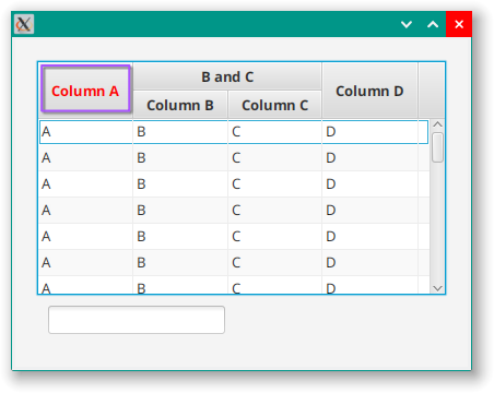
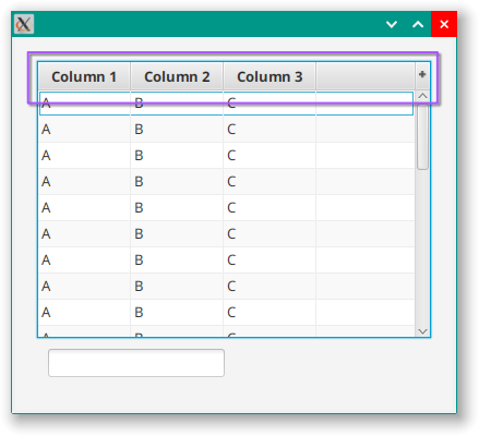
And this is what you see in an otherwise unstyled TableView, the cell text sitting on alternating rows of grey and slightly-darker-grey.
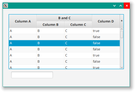
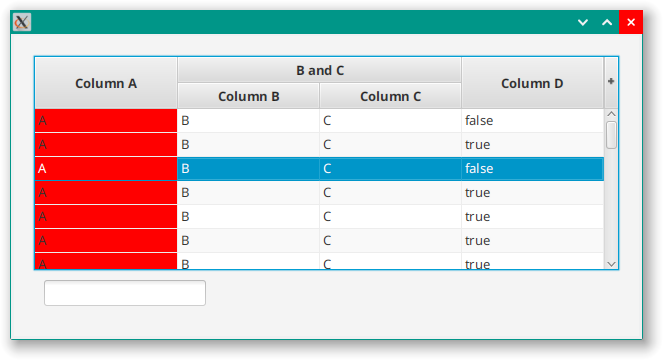
Primarily, in Modena you’ll see styling for TableRows that have the Pseudo-class selected (often combined with filled):
..table-view:focused > .virtual-flow > .clipped-container > .sheet > .table-row-cell:filled:selected {
  -fx-background: -fx-selection-bar;
  -fx-table-cell-border-color: derive(-fx-selection-bar, 20%);
}
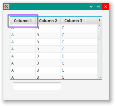
Which is the bluish colour you’re familiar with:
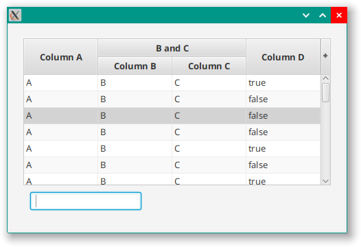
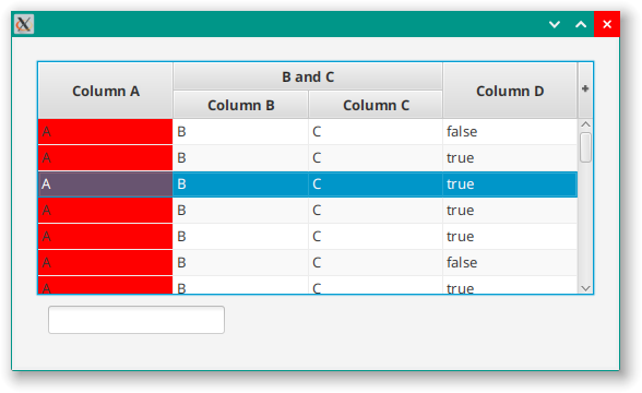
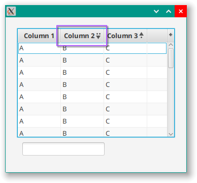
With the focus somewhere else, it looks like this:
Custom Cell Styling
For sure, you can create a CellFactory for any column, and in your custom code you can assign whatever selectors that you want and do all kinds of things. But there are good reasons to style the TableCells in a particular column without doing all that. Primarily, that you don’t have to create a custom CellFactory to do it.
Also, it’s probably a good practice to set up a bunch of re-usable custom TableColumns that deal with particular data types that you commonly encounter. For instance, you might want to create a DateTableColumn that handles date display in a standardized way, or a MoneyTableColumn or IntegerTableColumn.
In these cases, assign a style class selector to the cells in a TableColumn and all of the cells in that column will get that selector. This includes the TabelColumnHeader as well. You can exclude the TableColumnHeader in your style sheet by specifying your selector as a sub-component of .table-row-cell. This would typically be one of these forms:
.table-row-cell .my-selector {}
.table-view .table-row-cell .my-selector {}
.table-view > .virtual-flow > .clipped-container > .sheet > .table-row-cell .my-selector {}
.my-table-selector .table-row-cell .my-selector {}
You can use it like this:
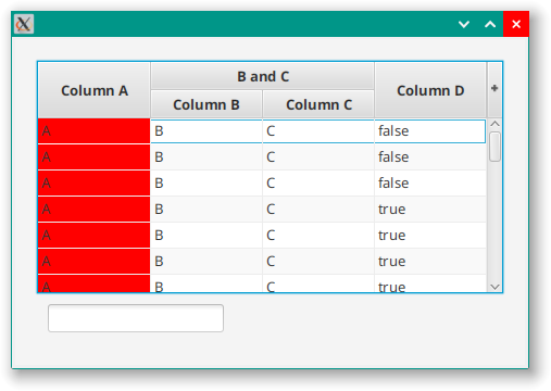
columns += TableColumn<TableData1, String>("Column A").apply {
    setCellValueFactory { it.value.value1 }
    styleClass += "a-column"
}
and
.table-row-cell > .a-column {
  -fx-background-color: red;
  -fx-background-insets: 0 0 1 0px;
}
Which looks like this:
If you don’t specify .table-row-cell as the parent, you’ll get this:
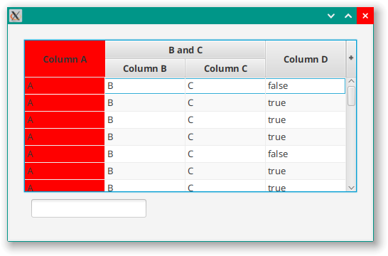
Which is probably not what you want.
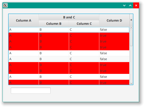
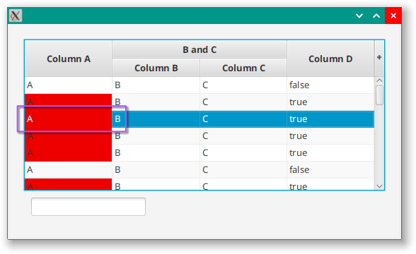
Once you apply this kind of styling to a TableCell, you’ll have to contend with the fact that its non-transparency will mess with the TableRow styling underneath, particularly with selected TableRows:
One way to deal with this is to add a custom styling for a-column as a child of a TableRow with the selected Pseudo-class applied:
.table-row-cell:selected > .a-column {
  -fx-background-color: #ee000070;
}
Here, the background colour has had its opacity reduced:
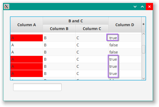
Row Styling Based on Data Values
TableRow inherits from Cell through IndexedCell, which means that it supports customization just like TableCell. However, while you are not meant to mess about with the layout of TableRow, you can add other custom features like Pseudo-classes and behaviours based on data in the TableRow.
Just like TableCell, enough TableRows are created to fill the viewport of the TableView and then they are recycled and reloaded with data as the user scrolls through the TableView. The key method here is Cell.updateItem() which you can customize as required. Let’s look at how to add a PseudoClass to the TableRow and then link it to an element in the TableRow data:
class CustomTableRow : TableRow<TableData1>() {
    companion object PseudoClasses {
        val specialPC = PseudoClass.getPseudoClass("special")
    }

    override fun updateItem(newValue: TableData1?, empty: Boolean) {
        super.updateItem(newValue, empty)
        if (empty || newValue == null) {
            pseudoClassStateChanged(specialPC, false)
        } else {
            pseudoClassStateChanged(specialPC, newValue.value4.value)
        }
    }
}
The only customization that we’ve done here is to create a PseudoClass as a static member of the CustomTableRow and then used CustomTableRow.updateItem() to call pseudoClassStateChanged() according to the new data being loaded.
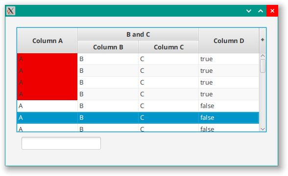
If we apply the following styling:
.table-row-cell:special {
  -fx-background-color: red;
}
We get the following result:
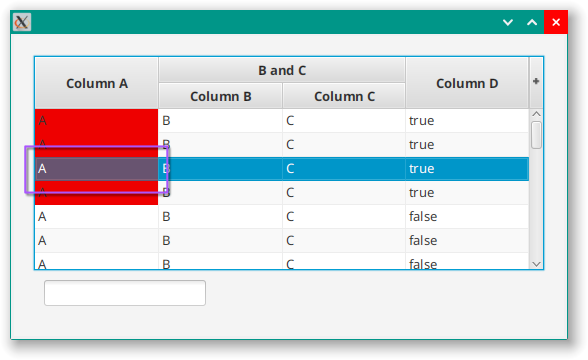
We don’t just have to style the entire row. We can apply styling to a specific cell if we’ve added a style class selector to its TableColumn by doing this:
.table-row-cell:special > .a-column {
   -fx-background-color: red;
   -fx-background-insets: 0 0 1 0px;
 }
Note that this is exactly the same as the example in the previous section except that we’ve applied the special Pseudo-class to .table-row-cell instead of selected:
However, note that we have the same problem as before:
But we can fix it by adding a new selector for TableRow with both Pseudo-classes applied and reducing the opacity again:
.table-row-cell:selected:special > .a-column {
  -fx-background-color: #ee000070;
}
And you can see that the rows without the special Pseudo-class continue to work as normal:
Accessing Specific Column Headers
Instances of TableColumnHeader are not going to be programmatically accessible to you, since they are purely internal to the TableView. The only elements that you can add style class selectors to are the one that you normally access when defining the table. This is mostly TableColumn, TableRow and TableCell.
Fortunately, a TableColumnHeader will automatically be assigned any style class selectors added to their associated TableColumn. So the following code will add the selector, “a-column” to the TabelColumnHeader associated with this column.
columns += TableColumn<TableData, String>("Column A").apply {
    setCellFactory { CustomTableCell() }
    setCellValueFactory { it.value.value1 }
    styleClass += "a-column"
}
If we try to style this column directly using something like this:
.a-column .text {
  -fx-fill: red;
}
We get this:
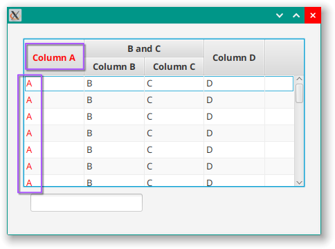
You can see that it’s styled all the Text in the column, and not just the column header. However, if we use the fact that the column header is enclosed in the TableHeaderRow, which has the selector, “.column-header-background”, then we can isolate the column header:
.table-view .column-header-background .a-column .text {
  -fx-fill: red;
}
Which looks like this:
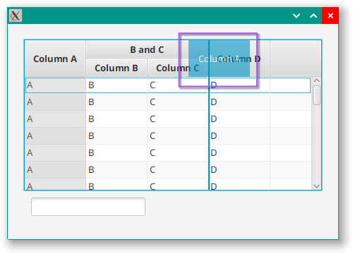
Nested Column Headers
In TableView all TableColumns are potentially parents of nested columns. The entire header row is actually styled as a single nested column, and then using the TableColumn.getColumns().add() method on any TableColumn will generate another nested column inside the main nested column. Rinse and repeat if you want nested nested columns.
The JavaFX terminology is that the parent column gets the term “Nested” even though the it’s the child columns that are nested. The class for the parent column header is NestedTableColumnHeader, and it has a style sheet selector of nested-column-header. Unfortunately, you can’t really get to any of the header row components directly through programming without cheating and you have to do your customization through the TableColumn itself.
This presents a problem if you want to style the header for different nested columns differently, especially since JavaFX CSS doesn’t support sibling selectors. Let’s look at this code:
TableView<TableData>().apply {
   columns += TableColumn<TableData, String>("Column A").apply {
      setCellFactory { CustomTableCell() }
      setCellValueFactory { it.value.value1 }
  }
  columns += TableColumn<TableData, String>("B and C").apply {
      styleClass += "bc-nested-column"
      columns += TableColumn<TableData, String>("Column B").apply {
          setCellFactory { CustomTableCell() }
          setCellValueFactory { it.value.value2 }
          styleClass += "bc-column"
      }
      columns += TableColumn<TableData, String>("Column C").apply {
          setCellFactory { CustomTableCell() }
          setCellValueFactory { it.value.value3 }
          styleClass += "bc-column"
      }
   }
}
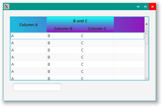
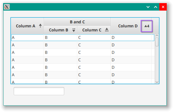
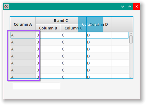
Columns “B” and “C” are inside a nested column with the title “B and C”. The nested column gets the selector bc-nested-column and the two inner columns get the selector bc-column. Since we don’t have sibling combinators to allow us to use .nested-column-header ~ bc-nested-column as a selector, our options for styling are limited. However, we can do this:
.root {
  -wfx-header-background: linear-gradient(to right, #1dbbdd, #9310b9)
}

.table-view .column-header-background {
   -fx-background-color: -wfx-header-background;
}

.table-view .column-header {
  -fx-background-color: transparent;
}

.filler {
  -fx-background-color: transparent;
}

.nested-column-header {
   -fx-background-color: -wfx-header-background;
   -wfx-header-background: transparent;
}

.bc-nested-column {
  -wfx-header-background: linear-gradient(to bottom, #0dffee, #9310b9);
}
Here, we have a custom colour defined as a blue to purple gradient to the right in the .root section. The gradients are ugly, but they make it easy to see the continuity of the background behind other elements. Then we set the global header background to this colour. Then we set all of the column headers to transparent, including the filler column at the far right. Next, we set -fx-background-color for the nested column headers to our custom colour and redefine it to be transparent in this context. Finally, for our nested “B and C” column, we redefine our custom colour to be the same gradient, but going down instead of to the right.
It looks like this:
The biggest issue here is the filler column at the right. This is defined outside the nested column header that covers all of the other parts of the header row. This means that we have to apply the custom colour to the header background, and then make the main nested column header transparent. If we get rid of the filler by setting a constrained ColumnResizePolicy, and then adding a fourth column just to have something at the right, then we can simplify the style sheet:
.root {
  -wfx-header-background: linear-gradient(to right, #1dbbdd, #9310b9)
}

.table-view .column-header {
  -fx-background-color: transparent;
}

.nested-column-header {
   -fx-background-color: -wfx-header-background;
}

.bc-nested-column {
  -wfx-header-background: linear-gradient(to bottom, #0dffee, #9310b9);
}
Which looks like this:
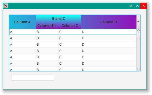
Now we don’t need to worry about the header background or the filler, and we can set the initial gradient on the main nested column header.
Unfortunately, JavaFX only supports name elements for colours, so we cannot use this technique for other attributes, like background radii or insets.
Alternate Approaches
We can use the fact that the main wrapper class for the header row is a NestedTableColumnHeader and specify further children of that selector:
.nested-column-header {
   -fx-background-color: linear-gradient(to right, red, blue);
}

.nested-column-header > .nested-column-header {
   -fx-background-color: linear-gradient(to bottom, lightgreen, pink);
   -fx-background-radius: 10 10 3 3px;
}

.column-header {
  -fx-background-color: transparent;
}
Which looks like this:
As you can see, this would allow you to specify more attributes than just colour - like background radius in this case. However, you still cannot style siblings differently. It is good if you want to style the wrapper columns for all nested columns the same.
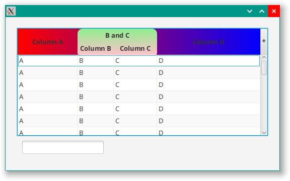
Finally, you can also assign a style class to the TableColumn that corresponds to the NestedTableColumnHeader and use the technique outlined in the “Accessing Specific Column Headers” section above. That technique works just as well for NestedTableColumnHeaders. The following style sheet:
.nested-column-header {
   -fx-background-color: linear-gradient(to right, red, blue);
}

.bc-nested-column {
   -fx-background-color: linear-gradient(to bottom, lightgreen, pink);
   -fx-background-radius: 10 10 3 3px;
}

.column-header {
  -fx-background-color: transparent;
}
Also yields:
Styled Components of TableView
This section contains as complete a listing as I could compose of the styleable elements of TableView. It’s organized top-down, with subsections for components that are contained within other components. This means that the table of contents for this section should let you see at a hierarchy of the various styled components.
For each entry, I’ve given the individual style class selector, the actual class of the element, a description of what it is and some hints about how to use it, and then a complete listing of every entry in Modena that has that selector as the final child element. When it seemed appropriate, I’ve also included images that highlight the component in action.
Additionally, I’ve included Pseudo-classes that are supported by each component that aren’t documented somewhere else.
At the top of the hierarchy is TableView itself, which has a single selector:
| CSS Selector: | table-view |
|---|---|
| Type: | StackPane |
| Description: | This is the TableView itself. It supports a number of Pseudo-classes that are also used as selectors for child elements. |
| Modena: | .table-view.table-view:disabled.table-view:focused |
| Pseudo-classes | constrained-resizeunconstrained-resizecell-selectionrow-selection |
Note that there are two entries for .table-view in Modena. One, in the section called “Box-like Things” sets styling like background colours and insets. The other, in the section called “TableView” defines some colours.
TableHeaderRow
This is the wrapper class for the entire header row.
| CSS Selector: | column-header-background |
|---|---|
| Type: | StackPane |
| Description: | This is the area at the top of the TableView that holds the column headings and the related controls. Don’t let “background” confuse you, this is the entire header row. |
| Modena: | .table-view .column-header-background |
Root NestedTableColumnHeader
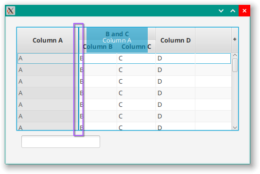
Every TableColumnHeader can act as a NestedTableColumnHeader by adding TableColumns to its associated TableColumn. Technically, every TableColumnHeader is the child of a NestedTableColumnHeader because the TableHeaderRow contains a single, main, NestedTableColumnHeader to which all of the other TableColumnHeaders (or NestedTableColumnHeaders) are added.
It’s impossible to add style class selectors to the top-level NestedTableColumnHeader because it’s not exposed programmatically, and all NestedTableColumnHeaders have the some selector. You can access this specific, top-level, NestedTableColumnHeader via: .table-view .column-header-background > .nested-column-header.
Other NestedTableColumnHeaders can be given custom style class selectors by adding one to the corresponding TableColumn.
| CSS Selector: | nested-column-header |
|---|---|
| Type: | StackPane |
| Description: | This is the master NestedTableColumnHeader that serves as the container for all of the other TableColumnHeaders and NestedTableColumnHeaders that are defined in the TableView. |
| Modena: | None |
You can access the other NestedTableColumnHeaders via: .table-view .column-header-background > .nested-column-header .nested-column-header.
TableColumnHeader
For each NestedTableColumnHeader in the TableView there will be some number of TableColumnHeaders that have the following CSS structure:
| CSS Selector: | column-header |
|---|---|
| Type: | TableColumnHeader (extends Region) |
| Description: | The header for a TableColumn. This inherits any style classes added to its associated TableColumn |
| Modena: | .table-view .column-header |
This also supports the last-visible Pseudo-class.
Additionally, the column header inherits any style classes applied to its associated TableColumn. Initially, this is just table-column:
| CSS Selector: | table-column |
|---|---|
| Type: | TableColumnHeader (extends Region) |
| Description: | This is the standard inherited styleclass from the TableColumn. This is also shared with all of the TableCells in the column. |
| Modena: | None |
This also supports the last-visible Pseudo-class.
Column Label
TableColumnHeader holds a Label to hold the column title:
| CSS Selector: | label |
|---|---|
| Type: | Label |
| Description: | This is just a standard Label |
| Modena: | .table-view .column-header .label |
| CSS Selector: | text |
|---|---|
| Type: | LabeledText |
| Description: | This is the Text element inside the Label in the column header. |
| Modena: | None |
Column Context Menu
| CSS Selector: | context-menu |
|---|---|
| Type: | ContextMenu |
| Description: | If a ContextMenu has been established for the related TableColumn then a right click in the TableColumnHeader will invoke the context menu. This is the default selector for this. However, since the ContextMenu is established in the application code, it is possible to style it directly from the application code. This will also have all of the styling elements of a ContextMenu. |
| Modena: | None |
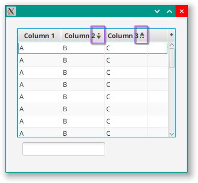
Column Sort Indicators
TableColumns can be sorted by clicking on the column headers. Secondary and tertiary sort columns can be specified. The TableColumns contain a GridPane holding an arrow, sort number dots and pontentially a Label if more than 3 columns are selected for sorting. The elements in the GridPane are moved around programmatically depending on a number of factors and this connot be controlled via CSS.
| CSS Selector: | arrow |
|---|---|
| Type: | Region |
| Description: | In Modena, this is an SVG shape of a triangle pointed down. If the column sort is ascending, then it is rotated 180 degrees. |
| Modena: | table-view .arrow |
| CSS Selector: | sort-order |
|---|---|
| Type: | Label |
| Description: | If there are more than 3 columns with sorting applied, then the fourth and later columns will show a number beside the arrow instead of a series of dots above/below the arrow. Otherwise this element is not visible. |
| Modena: | .table-view .column-header .sort-order |
| CSS Selector: | sort-order-dots-container |
|---|---|
| Type: | HBox |
| Description: | This is just an HBox that holds the sort order dots. |
| Modena: | .table-view .column-header .sort-order-dots-container |
The next two selectors are applied to the actual “dots”:
| CSS Selector: | sort-order-dot |
|---|---|
| Type: | Region |
| Description: | This is just a small Region with a background colour and curved corners that looks like a “dot”. |
| Modena: | .table-view .column-header .sort-order-dot |
| CSS Selector: | ascending or descending |
|---|---|
| Type: | Region |
| Description: | You can style the dots differently for ascending vs decsending sort orders. These selectors are not used in Modena itself. |
| Modena: | None |
Column Drag
In case you didn’t know, you can drag the column headings around to change their order in the TableView. These elements style the drag action:
| CSS Selector: | column-drag-header |
|---|---|
| Type: | StackPane |
| Description: | When a column is being ‘dragged’ to be placed in a different position, this is a region that follows along the column header area to indicate where the column will be dropped. |
| Modena: | .table-view .column-drag-header |
| CSS Selector: | column-overlay |
|---|---|
| Type: | StackPane |
| Description: | This semi-transparent overlay to indicate the column that is currently being moved. |
| Modena: | .table-view .column-overlay |
| CSS Selector: | column-resize-line |
|---|---|
| Type: | Region |
| Description: | This is the line that runs down between the columns to indicate where a column will be placed when it is dropped. Oddly, resizing a column does not make this line appear. |
| Modena: | .table-view .column-resize-line |
Filler Column
| CSS Selector: | filler |
|---|---|
| Type: | Region |
| Description: | If you haven’t set the TableView.columnResizePolicyProperty() to one of the “constrained” policies, then there might be a phantom column at the far rght of your table. This element is the column header for that last, phantom column. |
| Modena: | .table-view .filler |
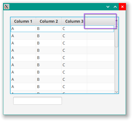
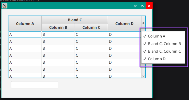
Show/Hide Column Button
| CSS Selector: | show-hide-columns-button |
|---|---|
| Type: | Pane |
| Description: | The space at the top right corner, above the vertical scrollbar is a “Button” (but not a Button) that opens a menu allowing you to show or hide various columns. By default this is not visible, but can be turned on. This is the styling for this “Button”. |
| Modena: | .table-view > .column-header-background > .show-hide-columns-button |
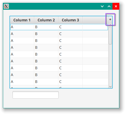
| CSS Selector: | show-hide-column-image |
|---|---|
| Type: | StackPane |
| Description: | This is the “+” that appears in the column show/hide Button. It is a StackPane with an SVG shape applied. |
| Modena: | .table-view .show-hide-column-image |
| CSS Selector: | context-menu |
|---|---|
| Type: | ContextMenu |
| Description: | When you click on the “button” this is the context menu appears showing all of the table columns and allowing you to pick which ones to show or hide. This will also have all of the styling elements of a ContextMenu. |
| Modena: | .table-view > .column-header-background > .show-hide-columns-button .context-menu |
VirtualFlow
TableView is one of the controls that uses VirtualFlow which enables it to have a descrete set of screen Nodes to support a limitless number of elements in a List. This set of Nodes is recycled as they scroll on/off the viewport of the TableView.
| CSS Selector: | virtual-flow |
|---|---|
| Type: | VirtualFlow (extends Region) |
| Description: | VirtualFlow is the container for all of the TableView elements except those in the TableHeaderRow. This includes the rows and columns and the scrollbars. |
| Modena: | No direct uses, but it is specified as the parent of other elements. |
ClippedContainer
| CSS Selector: | clipped-container |
|---|---|
| Type: | VirtualFlow.ClippedContainer (extends Region) |
| Description: | This is simple just a Region with a clipping rectangle specified. It acts as a wrapper around sheet to limit the visibility of the contents of the TableView so that it will fit within the space allocated. |
| Modena: | No direct uses, but it is specified as the parent of other elements. |
ClippedContainer -> Sheet
| CSS Selector: | sheet |
|---|---|
| Type: | Group |
| Description: | This is the element that contains all of the individual TableCells and TableRows. |
| Modena: | No direct uses, but it is specified as the parent of other elements. |
TableRow
TableRow is itself a Cell and it has three selectors. Since you can specify a RowFactory for a TableView it is possible to apply your own selectors to a customized TableRow. However, if you just want to change the styling of the TableRow without creating a RowFactory, you can use these selectors.
| CSS Selector: | cell |
|---|---|
| Type: | TableRow |
| Description: | This selector is applied to all of the Cell subclass elements in the TableView including the individual TableCells, so any styling here will also apply to all of the TableCells. This is inherited from the standard implementation of Cell |
| Modena: | No direct uses, but it is specified as the parent of other elements. |
| CSS Selector: | indexed-cell |
|---|---|
| Type: | TableRow |
| Description: | This selector is applied to all of the Cell subclass elements in the TableView including the individual TableCells, so any styling here will also apply to all of the TableCells. This is inherited from the standard implementation of IndexedCell. |
| Modena: | None |
| CSS Selector: | table-row-cell |
|---|---|
| Type: | TableRow |
| Description: | This is the only selector which is specific to TableRow. Use this for styling that you don’t want applied to individual TableCells. |
| Modena: | .table-row-cell.table-row-cell:odd.table-view:focused > .virtual-flow > .clipped-container > .sheet > .table-row-cell:filled:selected.table-row-cell:filled:selected.table-view:focused:row-selection > .virtual-flow > .clipped-container > .sheet > .table-row-cell:focused |
TableColumn
While you do create TableColumns and add them to the TableView, TableColumn doesn’t appear as an actual element in the skin of TableView. Instead it is used to create TableCells and the TableColumnHeaders, both of which will inherit any style sheet selectors applied to the related TableView. As a default, all TableColumns have the following selector applied:
| CSS Selector: | table-column |
|---|---|
| Type: | Various |
| Description: | The default style sheet selector added to all elements that derive from TableColumn. |
| Modena: | None |
TableCell
Since you can specify a CellFactory for a TableColumn it is possible to add a custom style class selector to your custom TableCells. However, if you wish to style all of the TableCells in a TableView, then you an use one of the selectors listed here.
| CSS Selector: | cell |
|---|---|
| Type: | TableCell |
| Description: | This selector is applied to all of the Cell subclass elements in the TableView including the individual TableRows, so any styling here will also apply to all of the TableRows. This is inherited from the standard implementation of Cell. |
| Modena: | No direct uses, but it is specified as the parent of other elements. |
| CSS Selector: | indexed-cell |
|---|---|
| Type: | TableCell |
| Description: | This selector is applied to all of the IndexedCell subclass elements in the TableView including the individual TableRows, so any styling here will also apply to all of the TableRows. This is inherited from the standard implementation of IndexedCell. |
| Modena: | None |
| CSS Selector: | table-cell |
|---|---|
| Type: | TableCell |
| Description: | This is the sole standard style class selector related only to TableCell and comes from the standard implementation of TableCell. |
| Modena: | .table-cell.table-cell:selected:disabled.table-row-cell:filled > .table-cell:selected.table-view:focused:cell-selection > .virtual-flow > .clipped-container > .sheet > .table-row-cell > .table-cell:focused.table-view > .virtual-flow > .clipped-container > .sheet > .table-row-cell .table-cell:selected.table-view:constrained-resize > .virtual-flow > .clipped-container > .sheet > .table-row-cell > .table-cell:last-visible |
| CSS Selector: | table-column |
|---|---|
| Type: | TableCell |
| Description: | This is the standard inherited styleclass from the TableColumn. This is also shared with the TableColumnHeader for the column. |
| Modena: | None |
| CSS Selector: | text |
|---|---|
| Type: | LabeledText |
| Description: | Since TableCell inherits from Labeled, it also inherits this standard style class selector from Labeled that is associated with the LabeledText element in Labeled. |
| Modena: | .text |
ScrollBars
The scrollbars in TableView are an instance of VirtualScrollBar which extends ScrollBar and is intended to work with VirtualFlow. ScrollBar itself is skinned, also. All of the selectors come from the ScrollBar class itself, and there’s nothing added from the TableView.
The standard ScrollBar has and arrow “Button” at each end of a track that has an indicator called a “thumb” that runs up and down it.
The orientation of a ScrollBar is indicated by a Pseudo-classes applied to the ScrollBar itself and will be either horizontal or vertical.
| CSS Selector: | scroll-bar |
|---|---|
| Type: | VirtualScrollBar |
| Description: | This is the selector for the entire ScrollBar. The horizontal and vertical Pseudo-classes are applied to this selector. |
| Modena: | .table-view > .virtual-flow > .scroll-bar:vertical.table-view > .virtual-flow > .scroll-bar:horizontal |
| CSS Selector: | track-background |
|---|---|
| Type: | StackPane |
| Description: | The track background covers the entire space of the ScrollBar minus any padding set on the ScrollBar itself. All of the other components sit on top of the track background. |
| Modena: | None |
| CSS Selector: | track |
|---|---|
| Type: | StackPane |
| Description: | The track is the space between the end buttons that the thumb runs up and down. |
| Modena: | None |
| CSS Selector: | increment-button |
|---|---|
| Type: | Region |
| Description: | This is one of the two end “Buttons” in the ScrollBar, and is at the bottom of a vertical ScrollBar and the right of a horizontal ScrollBar. Not this this is not an actual Button but just a Region. |
| Modena: | .scroll-bar > .increment-button.scroll-bar:horizontal > .increment-button.scroll-bar:vertical > .increment-button |
| CSS Selector: | increment-arrow |
|---|---|
| Type: | Region |
| Description: | This is the actual “arrow” that is drawn in the increment “Button”. In Modena, it is styled by appling an SVG shape to the Region. |
| Modena: | .scroll-bar > .increment-button > .increment-arrow.scroll-bar > .increment-button:hover > .increment-arrow.scroll-bar > .increment-button:pressed > .increment-arrow.scroll-bar:horizontal > .increment-button > .increment-arrow .scroll-bar:vertical > .increment-button > .increment-arrow |
| CSS Selector: | decrement-button |
|---|---|
| Type: | Region |
| Description: | This is one of the two end “Buttons” in the ScrollBar, and is at the top of a vertical ScrollBar and the left of a horizontal ScrollBar. Not this this is not an actual Button but just a Region. |
| Modena: | .scroll-bar > .decrement-button.scroll-bar:horizontal > .decrement-button.scroll-bar:vertical > .decrement-button |
| CSS Selector: | decrement-arrow |
|---|---|
| Type: | Region |
| Description: | This is the actual “arrow” that is drawn in the decrement “Button”. In Modena, it is styled by appling an SVG shape to the Region. |
| Modena: | .scroll-bar > .decrement-button > .decrement-arrow .scroll-bar > .decrement-button:hover > .decrement-arrow.scroll-bar > .decrement-button:pressed > .decrement-arrow .scroll-bar:horizontal > .decrement-button > .decrement-arrow.scroll-bar:vertical > .decrement-button > .decrement-arrow |
| CSS Selector: | thumb |
|---|---|
| Type: | StackPane |
| Description: | This is the indicator/control that sits in the track and slides along the track as the ScrollBar scrolls. |
| Modena: | .scroll-bar > .thumb .scroll-bar:vertical > .thumb.scroll-bar > .thumb:hover.scroll-bar > .thumb:pressed |
Corner
| CSS Selector: | corner |
|---|---|
| Type: | StackPane |
| Description: | This is the little square that appears at the bottom right corner where the two scrollbars meet, if they are both visible. |
| Modena: | .table-view > .virtual-flow > .corner |
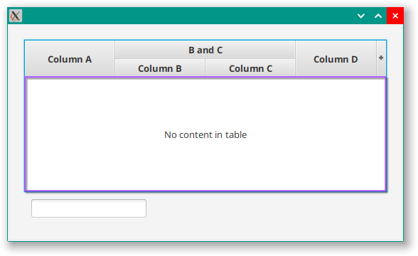
PlaceHolder
There is a Node that will be displayed if the TableView is empty which is called “placeholder”. TableView has a Property called placeholder that you can use to set your own, custom, Node and set your own style class selectors. In the event that you use the default placeholder, which is a StackPane holding a Label, these are the selectors:
| CSS Selector: | placeholder |
|---|---|
| Type: | StackPane |
| Description: | When the TableView is empty, or if it contains no column, then a “placeholder” StackPane containing a Label will be shown instead of the usual rows and columns. |
| Modena: | None |
| CSS Selector: | empty-table |
|---|---|
| Type: | Unknown |
| Description: | This selector appears in Modena, but there is no source code which assigns it to any components. It is possible that it is left over from an earlier version and has no current usages. |
| Modena: | .table-view .empty-table |
| CSS Selector: | label |
|---|---|
| Type: | Label |
| Description: | This is the selector inherited from the standard implementation of Label. |
| Modena: | None |
Conclusion
If you are interested in doing this kind of investigation into other JavaFX controls, these are the techniques that I used:
- Node.lookupAll(“*”)
-
This command will give you a list of all of the elements with style class selectors in the
Nodeto which it is applied. -
However, it will not show items that are not on the SceneGraph, and will not show parent -> child relationships. So further investigation will almost always be required. It is a good start to get a handle on the scope of the elements involved.
- Searching the Source Code
-
At some point you’ll need to look at the source code to discover how the elements are related to each other and whether there are additional style class selectors that you didn’t see with
Node.lookupAll("*")- and there will be some of those. -
A good starting point is to search through the source code for “getStyleClass”, or just “StyleClass” because that is the only way to add style class selectors.
-
Remember that some selectors are created at the “control” level, and more might be added in the skin. Many components of
TableVieware themselves skinned. -
Finally, you need to find the components, and the components of the components. Look for
Nodesubclasses that are declared as fields. Search for “getChildren” and “layoutChildren” in the source code. - Searching Through Modena
-
After all of that, you still might/probably have missed something. Search through Modena for the style class selectors that you have found and pay attention to any parent or child elements listed in the selectors. Also, look for Pseudo-classes that are used and then go back to the source code to find out how they are used.
I remain convinced that all of this sleuthing is something that should be completely unnecessary, and it should all be readily available in the documentation for the JavaFX library. After all, all of this part of the public API and, as such, should be documented.
For instance the TableView Pseudo-class unconstrained-resize is defined in TableView but isn’t used anywhere in Modena and won’t appear in Node.lookupAll("*") since it is a Pseudo-class. The only way to find it is to infer its existence from Modena’s use of constrained-resize and then go looking for it in the source code. Even then it’s not directly used, but comes from the toString() of the UNCONSTRAINED_RESIZE_POLICY Callback. And if you are looking to see if constrained-resize is a special case of one of the other policies (it isn’t) you need to drill down into ConstrainedColumnResizeBase to find its toString() method.
What can you use these Pseudo-class for? In Modena, constrained-resize is used turn the right-hand side border of the last visible column’s TableCells transparent. With an unconstrained policy, you would have a filler column to the right of the last visible column, and you would need to see that border.
Regardless of that, hopefully you will find this tutorial and reference helpful in styling your own TableViews.