Introduction
One of the key paradigms of JavaFX is that styling should be done in an external style sheet - a CSS file. JavaFX supplies a large number of standard styling attributes that apply to the Node classes when they make sense. This includes padding, background parameters, border parameters, min/max/pref sizes and a host of other things.
It could be argued that anything that can be styled via CSS should be styled by CSS. Personally, I tend to use CSS for everything except padding and spacing, which feel to me more like layout than styling, and are very convenient to customize programmatically. Spacing is even a constructor parameter for HBox and VBox.
But what about aspects that aren’t covered by the standard JavaFX attributes?
It turns out that JavaFX exposes to application programmers all of the tools that you need to make your own styleable attributes. In fact, if you look at the source code for those standard attributes, you’ll find that they don’t do anything that you can’t do yourself in your applications.
However, the JavaDocs for the classes that you’ll need to use are somewhat less than clear, and seem to be very complicated. In this article, we’ll take a step by step approach to implementing some custom styleable attributes, understand what’s happening, and then look at how you can deviate from the “best practices” described in the JavaDocs to make it easier to implement custom styling in your layouts.
Finally, we’ll look at how you should go about implementing custom styling in a custom Node subclass that you create for general purpose use.

While code is this article is written in Kotlin, all of the JavaFX concepts are exactly the same. Most of the Kotlin should be intuitively obvious to Java programmers, but if you need help understanding it, refer to this page.
Custom Styling in a Layout
Let’s take a look at a simple example that can be done with standard styling and then look at why you might want to implement custom styleable properties…
Using Traditional Styling
class Styleable0 : Application() {
    override fun start(stage: Stage) {
        stage.scene = Scene(createContent()).apply {
            Styleable0::class.java.getResource("styleable0.css")?.toString()?.let { stylesheets += it }
        }
        stage.show()
    }

    private fun createContent(): Region = BorderPane().apply {
        center = CustomBox()
        padding = Insets(10.0)
    }
}

class CustomBox : HBox(20.0) {

    init {
        styleClass += "custom-widget"
        children += Circle(100.0).apply {
            styleClass += "circle"
        }
        children += Rectangle(200.0, 200.0).apply {
            styleClass += "square"
        }
    }
}

fun main() = Application.launch(Styleable0::class.java)
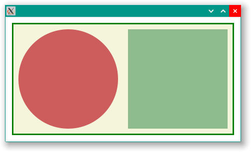
Here’s the style sheet:
.custom-widget {
  -fx-padding: 10px;
  -fx-border-width: 3px;
  -fx-border-color: green;
  -fx-background-color: beige;
}

.custom-widget .circle {
  -fx-fill: indianred;
}

.custom-widget .square {
  -fx-fill: darkseagreen;
}
And it looks like this:
I’ve implemented this as a custom class extending HBox to emphasize a few points:
- You’d do this when you want to reuse this component over and over.
- You’d probably want to limit the client code’s ability to mess with the internal workings of it.
- It doesn’t stop client code from messing with its internal workings.
The first thing is that, as an extension of HBox, it exposes quite a few methods that client code can use to mess around with it. Most importantly, it exposes Pane.getChildren() which means that client code can get references to all of its component parts, and even add or remove them. Additionally, the presence of the CSS selectors for the component parts means that client code can alter any styleable aspect of those components, not just the colour. There’s not even an implied understanding that only the colours should be customized.
How do we fix this?
Locking Down the Structure
The first thing we can do is to change the base class of our custom component from HBox to Region. This is because Region exposes a lot less public methods. Most importantly, Region.getChildren() is protected, unlike Pane.getChildren(), which is public. This means that our custom class’s code can call getChildren() but client code cannot. So now our custom class looks like this:
class CustomBox1 : Region() {

    init {
        children += HBox(20.0).apply {
            styleClass += "custom-widget"
            children += Circle(100.0).apply {
                styleClass += "circle"
            }
            children += Rectangle(200.0, 200.0).apply {
                styleClass += "square"
            }
        }
    }
}
And, of course, it still looks like this:
This is our starting point. We have a layout, and now we need to provide a means for client code and style sheets to control the colours of the shapes without letting it muck about with any other aspect of those components.
We do this through custom StyleableProperties.
We’ll start with just the circle, and when that’s working, then we’ll duplicate it for the square.
The first thing we need is a Property to store the colour. JavaFX gives us a special set of Properties that we can use to link back to a style sheet. We will use StyleableObjectProperty here:
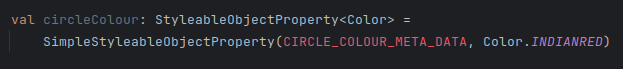
As you can see, the parameter CIRCLE_COLOUR_META_DATA is red, meaning that it hasn’t been defined yet. It’s also in all caps with underscores, hinting that it might be a static constant - which it is.
This is where the JavaDocs just dump a whole pantload of details on you without any explanations and quickly get confusing. So we’ll go through this one piece at a time, and explain what’s happening.
A StyleableProperty needs a way to link back to the CSS file, and this is done with something called CssMetaData, which is what CIRCLE_COLOUR_META_DATA is. Well, actually it will be an anonymous inner class extending CssMetaData.
First off, CssMetaData is a generic class. It has two types, one is the type of the Node that contains the StyleableProperty (actually it’s any class that implements the Styleable interface) and the other is type of the data contained in the StyleableProperty. In our case, this is CustomBox2 and Color.
Let’s look at the standard constructor for CssMetaData. It has two parameters:
- A
Stringwhich is the attribute tag in the CSS file. - A converter that will take the attribute value in the CSS file and convert it into the same data type as is held in the associated
StyleableProperty.
This second item is usually provided by a standard converter which is part of the JavaFX library. You can get an instance of one of these by calling a method in the StyleConverter class. There is one for each of the kind of values that you are likely to need, including standard JavaFX types like Color, Font and Duration. In our case we’ll use:
CssMetaData("-wfx-circle-colour", StyleConverter.getColorConverter())`
This constructor provides the essential connection to the CSS file.
Moving on, CssMetaData has two abstract methods that need to be supplied by any extending class:
- A method that returns whether or not the value of the property can be set from the style sheet.
- A method that returns the associated
StyleableProperty.
Remember that CssMetaData is defined statically, but the StyleableProperty is an instance variable, or field, of the class. This means that we cannot just reference the StyleableProperty directly. But both of these methods take an instance of the class as a parameter, so we can reference the field through that parameter.
The official documentation treats these methods like they are just standard boilerplate that you can just copy and paste without thinking about them. But we’ll think about them here…
You cannot set a Property that has been bound. That would generate a runtime error and would be bad. So the standard answer to whether a StyleableProperty can be set from the CSS file is just to check if it has been bound. You may have other criteria that you care about, and you’ll have to decide if just checking if the StyleableProperty is bound is enough for your situation.
The standard method for returning the StyleableProperty is to hard-code it in the method body. 99% of the time, this is what you are going to want to do. However, there’s no reason you have to stick to this. Let’s say that you have 7 boxes in your layout, one for each day of the week, and you want the box for today to be styled a certain way. You could have a List of StyleableProperties and you could use a DOW calculation to pick one.
For now, at least, we are going to stick with the standard implementation:
val circleColour: StyleableObjectProperty<Color> =
    SimpleStyleableObjectProperty(CIRCLE_COLOUR_META_DATA, Color.INDIANRED)

companion object CssStuff {
    val CIRCLE_COLOUR_META_DATA: CssMetaData<CustomBox2, Color> =
        object : CssMetaData<CustomBox2, Color>("-wfx-circle-colour", StyleConverter.getColorConverter()) {
            override fun isSettable(p0: CustomBox2): Boolean = !p0.circleColour.isBound

            override fun getStyleableProperty(p0: CustomBox2): StyleableProperty<Color> = p0.circleColour
        }
}
In Kotlin, a companion object is a way of encapsulating static elements. They aren’t really “static”, but more like singletons, but otherwise behave just like static elements. You can reference them exactly the same way that you would in Java. I like the companion object structure because it segregates the static elements from the instance members of the class.
In the JavaDocs, the next steps are generally intended for creating classes that you intend to be extended at some point. In such a case, you want the CssMetaData to be heritable and you need to set everything up properly. But in our case, where we are just building a “one-off”, and all that stuff would just be “dotting i’s and crossing t’s” for the sake of formality. So we can forgo it here.
We need a way for the underlying JavaFX code to see our new CssMetaData and incorporate it into its styling information. The Styleable interface has a method called getCssMetaData() that we can override for this purpose. We need to integrate our new CssMetaData into the list that the parent class, in this case Region, already has:
override fun getCssMetaData(): MutableList<CssMetaData<out Styleable, *>> =
         (super.getCssMetaData() + CIRCLE_COLOUR_META_DATA) as MutableList
Finally, we need to use this new Property in the layout:
children += Circle(100.0).apply {
    fillProperty().bind(circleColour)
}
To summarize:
- Create a
StyleablePropertyof the appropriate type, and reference a static CssMetaData class that you will create. - Create a static instance of
CssMetaDatathat matches your newStyleableProperty - Add your new
CssMetaDatainstance to the a list that will be returned fromgetCssMetaData() - Use the new
StyleablePropertyin the layout somehow.
Our complete code looks like this:
class CustomBox2 : Region() {

    private val circleColour: StyleableObjectProperty<Color> =
        SimpleStyleableObjectProperty(CIRCLE_COLOUR_META_DATA, Color.WHITE)
    private val squareColour: StyleableObjectProperty<Color> =
        SimpleStyleableObjectProperty(SQUARE_COLOUR_META_DATA, Color.WHITE)

    companion object CssStuff {
        val CIRCLE_COLOUR_META_DATA: CssMetaData<CustomBox2, Color> =
            object : CssMetaData<CustomBox2, Color>("-wfx-circle-colour", StyleConverter.getColorConverter()) {
                override fun isSettable(p0: CustomBox2): Boolean = !p0.circleColour.isBound

                override fun getStyleableProperty(p0: CustomBox2): StyleableProperty<Color> = p0.circleColour
            }
        val SQUARE_COLOUR_META_DATA: CssMetaData<CustomBox2, Color> =
            object : CssMetaData<CustomBox2, Color>("-wfx-square-colour", StyleConverter.getColorConverter()) {
                override fun isSettable(p0: CustomBox2): Boolean = !p0.squareColour.isBound

                override fun getStyleableProperty(p0: CustomBox2): StyleableProperty<Color> = p0.squareColour
            }
    }

    override fun getCssMetaData() =
        (getClassCssMetaData() + CIRCLE_COLOUR_META_DATA + SQUARE_COLOUR_META_DATA) as MutableList

    init {
        styleClass += "custom-widget"
        children += HBox(20.0).apply {
            styleClass += "inner-box"
            children += Circle(100.0).apply {
                fillProperty().bind(circleColour)
            }
            children += Rectangle(200.0, 200.0).apply {
                fillProperty().bind(squareColour)
            }
        }
    }
}
Using an Anonymous Inner Class
All of the documentation in the JavaDocs are oriented towards creating a resuable, possibly extendable, named custom class. This means that the approach that’s documented goes through all of the ceremony required to ensure that things are done “by the book”.
But, is it possible to just create a StyleableProperty and CssMetaData in the layout code?
The answer, unfortunately, is no. This is because Node.getCssMetaData() (or something that underlies it) needs to be overriden in order to activate any custom CssMetaData that we create. And the only way to do this is to extend whatever Node subclass that we’re working with.
The next problem that we have is that we cannot declare companion objects (or, in Java, static members) for inner classes. This shouldn’t be a huge problem. If our layout element that we’re creating the custom styling for is really a “one-off”, then it shouldn’t make too big a difference if we create the custom CssMetaData in a non-static way.
The next issue that we need to deal with is this:
override fun isSettable(p0: CustomBox2): Boolean = !p0.squareColour.isBound
If our layout element is an anoymous inner class, then we don’t have a way to specify the type of p0. We could try this variation:
override fun isSettable(p0: Styleable): Boolean = !(p0 as CustomBox2).squareColour.isBound
That’s going to let us create a method that’s compatible with the inner workings of JavaFX, but we’re still stuck with the as CustomBox2 because we don’t have a name for our anonymous inner class. So we cannot do this.
But…
This is a one-off, right? So we should be able to just create a StyleableProperty and then just reference it directly. No need to create it as a field of our anonymous inner class get it from there. We could do something like this:
val circleColour: StyleableObjectProperty<Color> =
    SimpleStyleableObjectProperty<Color>(circleColourMetaData,Color.BLUEVIOLET)

val circleColourMetaData: CssMetaData<Styleable, Color> =
    object : CssMetaData<Styleable, Color>("-wfx-circle-colour", StyleConverter.getColorConverter()) {
        override fun isSettable(p0: Styleable): Boolean = !circleColour.isBound
        override fun getStyleableProperty(p0: Styleable): StyleableProperty<Color> = circleColour
    }
Here, we are just referencing circleColour. We don’t care about p0 because it can only ever be one thing, we only ever want to return circleColour.
But…
There’s a problem. In my IDE, it looks like this:
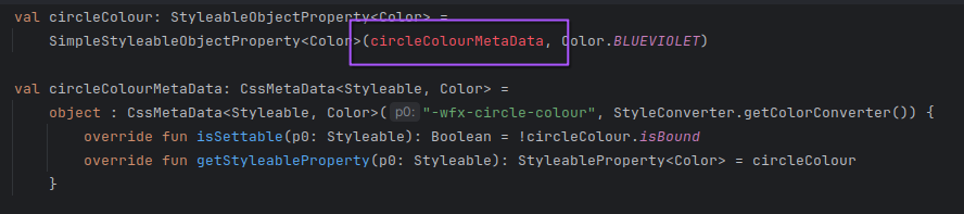
I cannot refer to circleColourMetaData yet because it’s declaration comes later in the code. And I can’t just flip the declarations around, because those two functions need to refer to circleColour. So I’m stuck.
But…
We need a class that extends StyleableObjectProperty but there’s nothing that says that we have to use SimpleStyleableObjectProperty. And it’s only SimpleStyleableObjectProperty's implementation that is demanding that we supply the corresponding CssMetaData in its constructor.
It turns out that, just like SimpleObjectProperty, SimpleStyleableObjectProperty doesn’t actually do much. It satisfies the interface requirements for the “Bean” stuff, and provides the constructors to populate the Bean data…but that’s about all. The one extra thing it does is to provide the getCssMetaData() method, and initialize it via the constructor.
This means that it’s trivial to create a version which doesn’t take the CssMetaData in the constructor, but rather exposes a setCssMetaData() method that can be called later. I’ve called it DeferredStyleableObjectProperty:
class DeferredStyleableObjectProperty<T>(
    private val bean: Any?,
    private val name: String,
    initialValue: T? = null
) : StyleableObjectProperty<T>() {

    private var cssMetaData: CssMetaData<out Styleable?, T>? = null

    constructor() : this(null, "", null)
    constructor(initialValue: T) : this(null, "", initialValue)

    init {
        initialValue?.let { super.setValue(it) }
    }

    override fun getBean(): Any? {
        return this.bean
    }

    override fun getName(): String {
        return this.name
    }

    override fun getCssMetaData(): CssMetaData<out Styleable?, T>? = cssMetaData

    fun setCssMetaData(newVal: CssMetaData<out Styleable?, T>) {
        if (cssMetaData == null) cssMetaData = newVal
    }
}
As you can see, it’s pretty simple. One thing to watch out for is that it would probably be very bad to change the value of cssMetaData after it has been set. I’ve provided some protection against this, and it will ignore any attempts to set cssMetaData if its current value is not null.
Now we can do this:
fun customBox3(): Region {
    val circleColour = DeferredStyleableObjectProperty(Color.BLUEVIOLET)
    val circleColourMetaData: CssMetaData<Styleable, Color> =
        object : CssMetaData<Styleable, Color>("-wfx-circle-colour", StyleConverter.getColorConverter()) {
            override fun isSettable(p0: Styleable): Boolean = !circleColour.isBound
            override fun getStyleableProperty(p0: Styleable): StyleableProperty<Color> = circleColour
        }
    circleColour.setCssMetaData(circleColourMetaData)

    val squareColour = DeferredStyleableObjectProperty(Color.BLUEVIOLET)
    val squareColourMetaData: CssMetaData<Styleable, Color> =
        object : CssMetaData<Styleable, Color>("-wfx-square-colour", StyleConverter.getColorConverter()) {
            override fun isSettable(p0: Styleable): Boolean = !squareColour.isBound
            override fun getStyleableProperty(p0: Styleable): StyleableProperty<Color> = squareColour
        }
    squareColour.setCssMetaData(squareColourMetaData)

    return object : HBox(20.0) {
        override fun getCssMetaData(): MutableList<CssMetaData<out Styleable, *>> =
            (getClassCssMetaData() + circleColourMetaData + squareColourMetaData) as MutableList
    }.apply {
        styleClass += "custom-widget"
        children += Circle(100.0).apply {
            fillProperty().bind(circleColour)
        }
        children += Rectangle(200.0, 200.0).apply {
            fillProperty().bind(squareColour)
        }
    }
}
You can see that we create the StyleableProperties using the new DeferredStyleableObjectProperty class, then declare the CssMetaData using those DeferredStyleableObjectProperties, and then we call DeferredStyleableObjectProperty.setCssMetaData() to complete the initialization.
We still need to extend our class in order to override getCssMetaData(), but then we can just use .apply{} to complete the rest of the layout. However, those StyleableProperties don’t have to be declared in this method, they could be fields in the ViewBuider itself:
class Styleable3 : Application() {
    private val circleColour = DeferredStyleableObjectProperty(Color.BLUEVIOLET)
    private val circleColourMetaData: CssMetaData<Styleable, Color> =
        object : CssMetaData<Styleable, Color>("-wfx-circle-colour", StyleConverter.getColorConverter()) {
            override fun isSettable(p0: Styleable): Boolean = !circleColour.isBound
            override fun getStyleableProperty(p0: Styleable): StyleableProperty<Color> = circleColour

            init {
                circleColour.setCssMetaData(this)
            }
        }

    private val squareColour = DeferredStyleableObjectProperty(Color.BLUEVIOLET)
    private val squareColourMetaData: CssMetaData<Styleable, Color> =
        object : CssMetaData<Styleable, Color>("-wfx-square-colour", StyleConverter.getColorConverter()) {
            override fun isSettable(p0: Styleable): Boolean = !squareColour.isBound
            override fun getStyleableProperty(p0: Styleable): StyleableProperty<Color> = squareColour

            init {
                squareColour.setCssMetaData(this)
            }
        }

    override fun start(stage: Stage) {
        stage.scene = Scene(createContent()).apply {
            Styleable3::class.java.getResource("styleable3.css")?.toString()?.let { stylesheets += it }
        }
        stage.show()
    }

    private fun createContent(): Region = BorderPane().apply {
        center = customBox3()
        padding = Insets(10.0)
    }

    private fun customBox3(): Region = object : HBox(20.0) {
        override fun getCssMetaData(): MutableList<CssMetaData<out Styleable, *>> =
            (getClassCssMetaData() + circleColourMetaData + squareColourMetaData) as MutableList
    }.apply {
        styleClass += "custom-widget"
        children += Circle(100.0).apply {
            fillProperty().bind(circleColour)
        }
        children += Rectangle(200.0, 200.0).apply {
            fillProperty().bind(squareColour)
        }
    }
}

fun main() = Application.launch(Styleable3::class.java)
We don’t have an official ViewBuilder in this simple example, so we’re just using Application itself, but you can see how it would work. I like this coding arrangement. The StyleableProperties and the CssMetaData are more like utility classes in this implementation, and they are out of the layout code and don’t clutter it up. The layout code now looks very much like it did before, and it’s fairly easy to read.
You’ll just have to make sure that you don’t re-use that CssMetaData in another part of the layout.
The CSS looks like this:
.custom-widget {
  -wfx-circle-colour: indianred;
  -wfx-square-colour: teal;
  -fx-border-color: blue;
  -fx-border-width: 3px;
  -fx-padding: 5px;
}
Encapsulated CssMetaData
This gymnastics with the delayed initialization of the CssMetaData in the StyleableProperty goes away if you encapsulate the CssMetaData definition in the StyleableProperty itself. If you make the not unreasonable decision that the Java Bean stuff should be ignored, then you can keep the constructor simple. Like this:
class StandardStyleableObjectProperty<T>(
    attributeName: String,
    styleConverter: StyleConverter<*, T>,
    initialValue: T? = null
) : StyleableObjectProperty<T>() {

    private var cssMetaData: CssMetaData<out Styleable, T> =
        object : CssMetaData<Styleable, T>(attributeName, styleConverter) {
            override fun isSettable(p0: Styleable): Boolean = !this@StandardStyleableObjectProperty.isBound
            override fun getStyleableProperty(p0: Styleable): StyleableProperty<T> =
                this@StandardStyleableObjectProperty
        }

    init {
        initialValue?.let { super.setValue(it) }
    }

    override fun getBean(): Any? = null

    override fun getName(): String = "Styleable Property"

    override fun getCssMetaData(): CssMetaData<out Styleable, T> = cssMetaData
}
I’ve called this StandardStyleableObjectProperty because it uses the default !this@StandardStyleableObjectProperty.isBound to respond to isSettable(). If you want to generalize this class, you’d need to provide a constructor parameter that takes a Function or Supplier to use here. It’s also pretty simple, coming in at around a dozen lines of code.
Once you’ve created this StandardStyleableObjectProperty class, the layout code gets much simpler:
class Styleable4 : Application() {
    private val circleColour =
        StandardStyleableObjectProperty("-wfx-circle-colour", StyleConverter.getColorConverter(), Color.BLUEVIOLET)
    private val squareColour =
        StandardStyleableObjectProperty("-wfx-square-colour", StyleConverter.getColorConverter(), Color.BLUEVIOLET)

    override fun start(stage: Stage) {
        stage.scene = Scene(createContent()).apply {
            Styleable3::class.java.getResource("styleable3.css")?.toString()?.let { stylesheets += it }
        }
        stage.show()
    }

    private fun createContent(): Region = BorderPane().apply {
        center = customBox3()
        padding = Insets(10.0)
    }

    private fun customBox3(): Region = object : HBox(20.0) {
        override fun getCssMetaData(): MutableList<CssMetaData<out Styleable, *>> =
            (getClassCssMetaData() + circleColour.cssMetaData + squareColour.cssMetaData) as MutableList
    }.apply {
        styleClass += "custom-widget"
        children += Circle(100.0).apply {
            fillProperty().bind(circleColour)
        }
        children += Rectangle(200.0, 200.0).apply {
            fillProperty().bind(squareColour)
        }
    }
}

fun main() = Application.launch(Styleable4::class.java)
Now, the custom StyleableProperty hardly takes up any space in your mind when you read the code.
Removing the Anonymous Inner Class
The need to extend HBox in order to implement the modified getCssMetaData() is the biggest problem with the code readability. It would be nicer if there was some sort of setLayoutCssMetaData() method that we could use to inject our custom StyleableProperties into our HBox. Like this:
class StyleableHBox(spacing: Double) : HBox(spacing) {
    val layoutCssMetaData = mutableListOf<CssMetaData<out Styleable, *>>()

    override fun getCssMetaData(): MutableList<CssMetaData<out Styleable, *>> {
        return (super.getCssMetaData() + layoutCssMetaData) as MutableList
    }
}
We can use this new class this way:
class Styleable5 : Application() {
    private val circleColour =
        StandardStyleableObjectProperty("-wfx-circle-colour", StyleConverter.getColorConverter(), Color.BLUEVIOLET)
    private val squareColour =
        StandardStyleableObjectProperty("-wfx-square-colour", StyleConverter.getColorConverter(), Color.BLUEVIOLET)

    override fun start(stage: Stage) {
        stage.scene = Scene(createContent()).apply {
            Styleable3::class.java.getResource("styleable3.css")?.toString()?.let { stylesheets += it }
        }
        stage.show()
    }

    private fun createContent(): Region = BorderPane().apply {
        center = customBox()
        padding = Insets(10.0)
    }

    private fun customBox(): Region = StyleableHBox(20.0).apply {
        layoutCssMetaData += listOf(circleColour.cssMetaData, squareColour.cssMetaData)
        styleClass += "custom-widget"
        children += Circle(100.0).apply {
            fillProperty().bind(circleColour)
        }
        children += Rectangle(200.0, 200.0).apply {
            fillProperty().bind(squareColour)
        }
    }
}

fun main() = Application.launch(Styleable5::class.java)
This achieves all of the objectives. The layout code now looks like bog standard layout code and nothing gets in the way of understanding it at a glance. The custom class StyleableHBox is generic enough that it could be put into a library and used over and over. For me, and the way that I write layouts, I’d probably never need to deal with any of the other HBox constructors, but a rigorous implementation would have to handle them as well.
Should You Actually Do This?
I should note at this point that this approach spurns almost all of the “best practices” advocated in the JavaDocs. Specifically, the JavaDocs say this:
The method Node.getCssMetaData() is called to obtain the List
. This method is called frequently and it is prudent to return a static list rather than creating the list on each call.
When I was preparing the code for these examples I made some simple stupid coding errors that prevented it from working (more on that later). In the course of debugging the problems, I placed some println() statements in various key places, including in my implementation of Node.getCssMetaData(). I found that it wasn’t called more than once or twice at runtime.
While it may be true that, in general, that Node.getCssMetaData() is called a gazillion times collectively from all the Nodes in your layout, or that it might be called frequently in some other use case, this does not appear to be a problem when used in this manner.
There are caveats to using this approach. You would have to be very careful using the same StyleableProperties to supply CssMetaData to two or more layout elements. It would be difficult to say what would happen if two different style class selectors ended up controlling the same StyleableProperty, it would probably be difficult to debug.
You also need to take a good look at whether or not some configurable aspect of a layout element should be styleable from the style sheet, or whether it’s better to simply configure it programmatically. This less likely to be the case with custom layout elements.
All that being said, this approach does work. Actually quite well. If it’s an approach that you want to use extensively, then it would probably be worth creating versions of StlyeleableHBox for VBox, Pane and StackPane as well.
I think that this is a very important technique to master if you want to use a lot of custom styling in your layouts without cluttering up your layout code with single-use classes and boilerplate code.
Almost more importantly, I feel that going through this demonstration gives a really good understanding of how this CssMetaData stuff really does work. This is an insight that you probably won’t get from reading the JavaDocs.
A Proper Custom Class
This previous example was aimed at solving the issue of how you would cope with the need to provide custom styling for a specific layout, in a situation where you weren’t going to be using that styling repeatedly across multiple layouts, or within the same layout. Because of this, huge amounts of the boilerplate and ceremony around creating CssMetaData that are described in the JavaDocs could simply be tossed out, with little impact on performance.
However, if you are going to be reusing your custom styling, either within or between layouts, then you do need to take a more rigorous approach to implementing your custom styling. So let’s take a look at that.
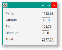
Here’s our initial screen layout:
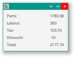
Which was achieved via this code:
class Styleable6 : Application() {
    override fun start(stage: Stage) {
        stage.scene = Scene(createContent()).apply {
            Styleable3::class.java.getResource("styleable6.css")?.toString()?.let { stylesheets += it }
        }
        stage.show()
    }

    private fun createContent(): Region = BorderPane().apply {
        center = customBox()
        padding = Insets(10.0)
    }

    private fun customBox(): Region = VBox(7.0).apply {
        println("Got here")
        children += HBox().apply {
            children += Label("Parts:").apply { minWidth = 150.0 }
            children += Label("1783.98")
        }
        children += HBox().apply {
            children += Label("Labour:").apply { minWidth = 150.0 }
            children += Label("300")
        }
        children += HBox().apply {
            children += Label("Tax:").apply { minWidth = 150.0 }
            children += Label("103.76")
        }
        children += HBox().apply {
            children += Label("Discount:").apply { minWidth = 150.0 }
            children += Label("-10")
        }
        children += HBox().apply {
            children += Label("Total:").apply { minWidth = 150.0 }
            children += Label("2177.74")
        }
    }
}

fun main() = Application.launch(Styleable6::class.java)
Obviously, this would be better achieved via a GridPane, but we want to keep the layout as simple as possible. So a VBox of HBoxes is what we’ll use. The problem that we’re going to concentrate on is the number display, because it’s horrible. We are going to customize these aspects:
- Numeric input
- Justification
- Number of decimal places
- Formatting of negative values
Obviously, we are going to be doing this 5 times in this layout, and this is an issue that arises all the time in many applications, so we’re going to create a custom Label class called DecimalLabel to handle all of this.
Numeric Input and Justification
These don’t actually take any custom StyleableProperties to achieve, at least at first:
class DecimalLabel(value : ObservableDoubleValue): Label() {

    init {
        textProperty().bind(value.map { it.toString() })
        alignment = Pos.CENTER_RIGHT
    }
}
I’m not providing a constructor that takes a Double value because this class, virtually by definition, is intended to display data values. Any data values that I might have to display are going to be stored in Observable wrappers, so that’s what I’m going to accept in my constructor. This is then bound to the textProperty of the Label. Our layout code now changes to this:
class Styleable6 : Application() {

    val partsAmount: DoubleProperty = SimpleDoubleProperty(1783.98)
    val labourAmount: DoubleProperty = SimpleDoubleProperty(300.0)
    val taxAmount: DoubleProperty = SimpleDoubleProperty(103.76)
    val discountAmount: DoubleProperty = SimpleDoubleProperty(-10.0)
    val totalAmount: DoubleProperty = SimpleDoubleProperty(2177.74)
    override fun start(stage: Stage) {
        stage.scene = Scene(createContent()).apply {
            Styleable3::class.java.getResource("styleable6.css")?.toString()?.let { stylesheets += it }
        }
        stage.show()
    }

    private fun createContent(): Region = BorderPane().apply {
        center = customBox()
        padding = Insets(10.0)
    }

    private fun customBox(): Region = VBox(7.0).apply {
        println("Got here")
        children += HBox().apply {
            children += Label("Parts:").apply { minWidth = 150.0 }
            children += DecimalLabel(partsAmount)
        }
        children += HBox().apply {
            children += Label("Labour:").apply { minWidth = 150.0 }
            children += DecimalLabel(labourAmount)
        }
        children += HBox().apply {
            children += Label("Tax:").apply { minWidth = 150.0 }
            children += DecimalLabel(taxAmount)
        }
        children += HBox().apply {
            children += Label("Discount:").apply { minWidth = 150.0 }
            children += DecimalLabel(discountAmount)
        }
        children += HBox().apply {
            children += Label("Total:").apply { minWidth = 150.0 }
            children += DecimalLabel(totalAmount)
        }
    }
}

fun main() = Application.launch(Styleable6::class.java)
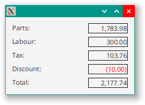
But the result looks pretty much the same, even with the right justification. If we add some styling to our DecimalLabel to give it a border, then we can see why:
.decimal-label {
  -fx-border-width: 1px;
  -fx-border-color: black;
}
Ah! The DecimalLabels might be right justified internally, but they are only as wide as they need to be to hold the text and the HBox aligns its elements Pos.LEFT by default. We can fix this be adding a minimum width:
.decimal-label {
  -fx-border-width: 1px;
  -fx-border-color: black;
  -fx-min-width: 5em;
}

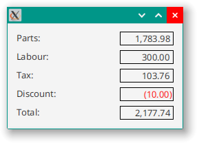
That’s better.
Controlling the Number of Decimal Places
In our example, it’s clear that these are monetary amounts which are usually specified to two decimal places (at least in my part of the world). Since we creating a general purpose custom Label class, we’ll make the number of decimal places a StyleableProperty so that we can specify it via the style sheet. Let’s add the StyleableProperty and the CssMetaData to our DecimalLabel:
class DecimalLabel(value: ObservableDoubleValue) : Label() {

    private val decimalPlaces: StyleableObjectProperty<Number> = SimpleStyleableObjectProperty(DECIMAL_PLACES_META_DATA,2)

    companion object CssStuff {
        val DECIMAL_PLACES_META_DATA =
            object : CssMetaData<DecimalLabel, Number>("-wfx-decimal-places", StyleConverter.getSizeConverter(), 2) {
                override fun isSettable(p0: DecimalLabel): Boolean = !p0.decimalPlaces.isBound

                override fun getStyleableProperty(p0: DecimalLabel): StyleableProperty<Number> = p0.decimalPlaces
            }
    }

    init {
        styleClass += "decimal-label"
        textProperty().bind(value.map { it.toString() })
        alignment = Pos.CENTER_RIGHT
    }
}
We need a way to use this property to control how many decimal places are shown. To do this, we create a Binding that is dependent on decimalPlaces and value. It will use String.format() to do the conversion:
class ConversionBinding(
    private val labelValue: ObservableDoubleValue,
    private val decimalPlaces: ObservableValue<Number>
) :
    StringBinding() {
    init {
        super.bind(labelValue, decimalPlaces)
    }

    override fun computeValue(): String {
        return String.format("%,.${decimalPlaces.value.toInt()}f", labelValue.value)
    }
}
Finally, we need to make the CSS information available to JavaFX. We do this by overriding Label.getCssMetaData().
But…
Label.getCssMetaData() is final! Looking at the JavaDocs for this method in Control we see that:
This method returns a List containing all CssMetaData for both this Control (returned from getControlCssMetaData() and its Skin, assuming the skin property is a SkinBase.
Developers who wish to provide custom CssMetaData are therefore encouraged to override getControlCssMetaData() or SkinBase.getCssMetaData(), depending on where the CssMetaData resides.
Since we aren’t working with the skin of Label, we can override getControlCssMetaData():
override fun getControlCssMetaData() = getClassCssMetaData()
The next step deals more with inheritability. You can see that our instance method, getControlCssMetaData() is just calling the static getClassCssMetaData(). We need to work with this static method to make sure that we pull in all of the CssMetaData from the parent class, Label, and then add our new, custom, CssMetaData to it. Then, if someone extends DecimalLabel, they can follow the same methodology and inherit all the CssMetaData in DecimalLabel as well as Label.
I’ve followed the same convention as the JavaDocs here, putting the cumulative CssMetaData into a static List variable, and then returning that from getClassCssMetaData(). I think this is going to be more readable, especially if we add more custom CssMetaData.
We also want to allow the StyleleableProperty to be accessible from layout code, but we don’t want to expose it as a StyleableProperty to that code, we just want it to be ObjectProperty<Number>. In Java you would create the standard three methods to get/set the value and return the Property, but in Kotlin you create a (Kotlin) property of the enclosed type and then delegate its get() and set() methods to the StyleableProperty. This will repsond to getDecimalPlaces() as well as decimalPlaces = x.
class DecimalLabel(value: ObservableDoubleValue) : Label() {

    private val decimalPlacesSP: StyleableObjectProperty<Number> =
        SimpleStyleableObjectProperty(DECIMAL_PLACES_META_DATA, 2)
    var decimalPlaces : Int
        get() = decimalPlacesSP.value.toInt()
        set(value) = decimalPlacesSP.set(value)
    fun decimalPlacesProperty() : ObjectProperty<Number> = decimalPlacesSP

    companion object CssStuff {
        val negativePseudoClass = PseudoClass.getPseudoClass("negative")
        val DECIMAL_PLACES_META_DATA =
            object : CssMetaData<DecimalLabel, Number>("-wfx-decimal-places", StyleConverter.getSizeConverter(), 2) {
                override fun isSettable(p0: DecimalLabel): Boolean = !p0.decimalPlacesSP.isBound

                override fun getStyleableProperty(p0: DecimalLabel): StyleableProperty<Number> = p0.decimalPlacesSP
            }

        private val cssMetaDataList =
            (Label.getClassCssMetaData() + DECIMAL_PLACES_META_DATA) as MutableList

        fun getClassCssMetaData() = cssMetaDataList
    }

    override fun getControlCssMetaData() = getClassCssMetaData()

    init {
        styleClass += "decimal-label"
        textProperty().bind(ConversionBinding(value, decimalPlacesSP))
        alignment = Pos.CENTER_RIGHT
        value.subscribe { newVal -> pseudoClassStateChanged(negativePseudoClass, newVal.toFloat() < 0) }
    }

    class ConversionBinding(
        private val labelValue: ObservableDoubleValue,
        private val decimalPlaces: ObservableValue<Number>
    ) :
        StringBinding() {
        init {
            super.bind(labelValue, decimalPlaces)
        }

        override fun computeValue(): String {
            return String.format(
                "%,.${decimalPlaces.value.toInt()}f",
                labelValue.value
            )
        }
    }
}
The other thing that I’ve done here is to introduce a PseudoClass for when the value is negative. This will allow us to style the DecimalLabel differently when the value is below zero. To enable this, I’ve added a subcription to the value ObservableValue which calls pseudoClassStateChanged().
If we use this style sheet:
.decimal-label {
  -fx-border-width: 1px;
  -fx-border-color: black;
  -fx-min-width: 5em;
  -wfx-decimal-places: 3;
}

.decimal-label: negative {
  -fx-text-fill: red;
}
Then we get this result:

Styling Negative Values
There are two standard stylings for negative values. One is to prefix the number with “-“ and the other is to surround the number with “()”. In order to enable this as a choice, we’ll create an Enum for this called NegativeFormat with two values SIGN and PAREN.
The rest of this is pretty much rinse and repeat of the process for decimal places. We add a new StyleableProperty<NegativeFormat> and then add the elements to expose it to client code. Then we create the associated CssMetaData and add it to getClassCssMetaData(). It looks like this:
class DecimalLabel(value: ObservableDoubleValue) : Label() {

    private val decimalPlacesSP: StyleableObjectProperty<Number> =
        SimpleStyleableObjectProperty(DECIMAL_PLACES_META_DATA, 2)
    var decimalPlaces: Int
        get() = decimalPlacesSP.value.toInt()
        set(value) = decimalPlacesSP.set(value)

    fun decimalPlacesProperty(): ObjectProperty<Number> = decimalPlacesSP

    private val negativeFormatSP: StyleableObjectProperty<NegativeFormat> =
        SimpleStyleableObjectProperty(NEGATIVE_FORMAT_META_DATA, NegativeFormat.SIGN)
    var negativeFormat: NegativeFormat
        get() = negativeFormatSP.value
        set(value) = negativeFormatSP.set(value)

    fun negativeFormatProperty(): ObjectProperty<NegativeFormat> = negativeFormatSP

    companion object CssStuff {
        val negativePseudoClass: PseudoClass = PseudoClass.getPseudoClass("negative")
        val DECIMAL_PLACES_META_DATA =
            object : CssMetaData<DecimalLabel, Number>("-wfx-decimal-places", StyleConverter.getSizeConverter(), 2) {
                override fun isSettable(p0: DecimalLabel): Boolean = !p0.decimalPlacesSP.isBound

                override fun getStyleableProperty(p0: DecimalLabel): StyleableProperty<Number> = p0.decimalPlacesSP
            }
        val NEGATIVE_FORMAT_META_DATA =
            object : CssMetaData<DecimalLabel, NegativeFormat>(
                "-wfx-negative-format",
                StyleConverter.getEnumConverter(NegativeFormat::class.java),
                NegativeFormat.SIGN
            ) {
                override fun isSettable(p0: DecimalLabel): Boolean = !p0.negativeFormatSP.isBound

                override fun getStyleableProperty(p0: DecimalLabel): StyleableProperty<NegativeFormat> =
                    p0.negativeFormatSP
            }

        private val cssMetaDataList =
            (Label.getClassCssMetaData() + DECIMAL_PLACES_META_DATA + NEGATIVE_FORMAT_META_DATA) as MutableList

        fun getClassCssMetaData() = cssMetaDataList
    }

    override fun getControlCssMetaData() = getClassCssMetaData()

    init {
        styleClass += "decimal-label"
        textProperty().bind(ConversionBinding(value, decimalPlacesSP, negativeFormatSP))
        alignment = Pos.CENTER_RIGHT
        value.subscribe { newVal -> pseudoClassStateChanged(negativePseudoClass, newVal.toFloat() < 0) }
    }

    enum class NegativeFormat { SIGN, PAREN }

    class ConversionBinding(
        private val labelValue: ObservableDoubleValue,
        private val decimalPlaces: ObservableValue<Number>,
        private val negativeFormat: ObservableValue<NegativeFormat>
    ) :
        StringBinding() {
        init {
            super.bind(labelValue, decimalPlaces)
        }

        override fun computeValue(): String {
            return String.format(
                "%${if (negativeFormat.value == NegativeFormat.PAREN) "(" else ""},." +
                        "${decimalPlaces.value.toInt()}f",
                labelValue.value
            )
        }

    }
}
The Binding has been updated to take the new ObservableValue<NegativeFormat> as a parameter, and it uses it to decide to add a “(“ at the beginning of the formatting string.
With the style sheet updated to look like this:
.decimal-label {
  -fx-border-width: 1px;
  -fx-border-color: black;
  -fx-min-width: 12ex;
  -wfx-decimal-places: 2;
  -wfx-negative-format: paren;
}

.decimal-label: negative {
  -fx-text-fill: red;
}
The output looks like this:
There’s one small problem with this. The closing “)” shifts the negative number over one, so that the number columns don’t line up nicely. We need to change the formatting string like this:
override fun computeValue(): String {
    return String.format(
        "%${if (negativeFormat.value == NegativeFormat.PAREN) "(" else ""},." +
                "${decimalPlaces.value.toInt()}f" +
                if ((labelValue.value.toFloat() >= 0) && (negativeFormat.value == NegativeFormat.PAREN)) " " else "",
        labelValue.value
    )
}
Now we put an extra “ “ at the end of the number if it isn’t negative. This will be displayed only if the closing “)” isn’t shown. Now it looks like this:
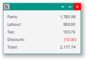
And the columns line up nicely. With the borders removed, it looks like this:
And fulfills the requirements. There are more StyleableProperties that you could add. I’ve formatted the output with “,” between the thousands, but you could implement that as a Boolean styleable value to turn them on or off. You could create a StyleableStringProperty to allow the actual format string to be defined via CSS.
You could decide that you don’t like the implementation of negative as a PseudoClass and that you’d rather just control the colour via another StyleableProperty. Something like colourWhenNegative. That would work just fine, too.
Conclusion
One thing that I’ve noticed when doing the coding for this article is that it is very, very easy to make a small mistake that stops everything from working. It’s especially frustating because the bits that do the work are buried deep inside JavaFX, and you don’t get to see them working. This means that there’s no feedback, nothing that says, “This part broke”. It just doesn’t work, and the lines that you put into your style sheet aren’t reflected in the GUI when it’s running.
Things that I found helpful:
- Call
getCssMetaData()and print the output to the console. Make sure that your custom elements are listed. - Add a
Subscriptionto yourStyleablePropertiesso that you can see when they change. - Make sure that your custom attributes are applied to the correct selectors in your style sheet.
- Double-check the spelling of the attribute names in both the
CssMetaDataand the style sheet. - Put unconvertable values in the attributes in the style sheet. This will tell you if JavaFX is trying to apply it.
Overall, I think that the idea of creating custom classes with custom styling attributes is probably the correct approach for most situations. This is especially true if you take the time to create those classes so that they can be used over and over again. The idea of having a Label subclass for handling values with special display critea, like decimals, integers and dates is generally useful, in my opinion. JavaFX doesn’t supply those, but it does give you all the tools you need to implement them the way that you want to.
Layout-centric custom styling is an idea that has been completely ignored in the JavaFX library. It’s also harder to decide if something should be configured via CSS or just implemented via code - especially since you’re already there writing code in the first place. However, if you are just changing the presentation of a layout…code that hasn’t been modified is code that doesn’t need to be tested (as much). This isn’t to say that you can’t mess up a screen by changing the style sheet, but at least you know that he logic behind the “Save” Button doesn’t need to be retested, because no code in that class has been changed.