Introduction
If you rigorously follow DRY (Don’t Repeat Yourself), and you should, then you’ll eventually have to think about “Big Picture DRY”. This all about avoiding repeating yourself in different projects, and different parts of projects. Not just within a single class or module of an application.
If you are one of those programmers that likes to use TableView - and there are lots of you out there - then one of the ways you might be repeating yourself without thinking about it is your TableColumns. Or, and this is even more likely, you’re avoiding properly configuring some kinds of TableColumns because it’s just too much tedious work to do every time.
In this article, we are going to look at how to create custom TableColumns to handle and display various kinds of data the way that you want to deal with them and that you can re-use over and over. We are also going to look at how custom TableViewCells work hand-in-glove with custom TableColumns and how you can create them to work together seemlessly.

While code is this article is written in Kotlin, all of the JavaFX concepts are exactly the same. Most of the Kotlin should be intuitively obvious to Java programmers, but if you need help understanding it, refer to this page.
Different Data Types Should be Presented Differently
TableColumns are easy to set up when the data in the column is just a simple String. But what about numbers? What about dates and money?
Once you get into these questions, then you’re suddenly looking at custom TableCells to handle the presentation. The difference between adding a TableColumn with nothing more than a CellValueFactory and doing it right can seem huge. But it doesn’t have to be, and if you approach it properly then you can put your work into a personal library that you can use over and over.
Let’s start by looking at a TableView configured with the bare minimum:
class Example1 : Application() {
    override fun start(stage: Stage) {
        stage.scene = Scene(createContent(), 400.0, 350.0).apply {
            Example1::class.java.getResource("example.css")?.toString()?.let { stylesheets += it }
        }
        stage.show()
    }

    private fun createContent(): Region = BorderPane().apply {
        center = TableView<TableData1>().apply {
            columns += TableColumn<TableData1, String>("Column A").apply {
                setCellValueFactory { it.value.value1 }
                styleClass += "a-column"
            }
            columns += TableColumn<TableData1, Double>("Temperature").apply {
                setCellValueFactory { it.value.value4.asObject() }
            }
            columns += TableColumn<TableData1, String>("Column C").apply {
                setCellValueFactory { it.value.value2 }
                styleClass += "c-column"
            }
            for (x in 1..30) items += TableData1(
                "A",
                "B",
                "C",
                Random.nextDouble(45.0)
            )
        }
        padding = Insets(10.0)
    }
}
Which looks like this:
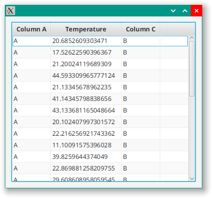
I think we can all agree that this is very, very ugly. We can clean it up a bit by rounding it off to one decimal place by using ObservableValue.map{}:
columns += TableColumn<TableData1, Double>("Temperature").apply {
    setCellValueFactory { it.value.value4.asObject().map { number -> Math.round(number * 10.0) / 10.0 } }
}
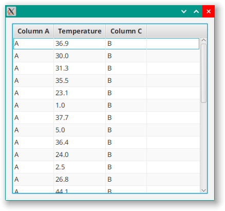
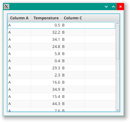
Which is a little bit less ugly, but still not very good. The worst thing is that the numbers are all left justified, so let’s fix that by adding a style class selector temperature-column to the TableColumn and then fixing the alignment in the style sheet:
.table-row-cell .temperature-column  {
  -fx-alignment: center-right;
}
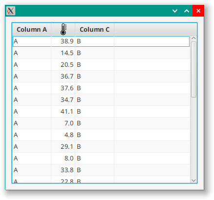
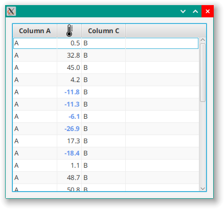
One last problem is that the column is way too wide for the data because the heading, “Temperature” is a long word. “Temp” would work but it’s also commonly used for “temporary” (at least to programmers) and doesn’t seem right. Let’s just use a graphic instead:
columns += TableColumn<TableData1, String>("").apply {
    styleClass += "temperature-column"
    setCellValueFactory {
        it.value.value4.asObject().map { number -> Math.round(number * 10.0) / 10.0 }
            .map { number -> "%6.1f".format(number) }
    }
    Example1::class.java.getResource("thermometer24.png")?.toString()?.let { graphic = ImageView(it) }
}
Which looks like this:
At this point, I’m not pretending that this is a great UI design. This article is about programming techniques, so we’re looking for interesting things to do here.
Creating a Custom Column
For me, this small amount of code would be enough to trigger DRY the next time I created a “Temperature” column. We can do it by creating a builder function or by creating a custom class extending TableColumn. If we were going to stop here, then a builder would be the best option. But we’re not going to stop here, so we’ll create a custom class, which will look like this to start:
class TemperatureColumn<T>(extractor: (data: T) -> DoubleProperty) : TableColumn<T, Double>() {
    init {
        styleClass += "temperature-column"
        setCellValueFactory {
            extractor.invoke(it.value).asObject().map { number -> Math.round(number * 10.0) / 10.0 }
        }
        TemperatureColumn::class.java.getResource("thermometer24.png")?.toString()?.let { graphic = ImageView(it) }
    }
}
All of the apply{} code from before has been moved into init{} in our custom class. We don’t need a column heading parameter in the constructor, because we are just going to use our graphic. But we are now taking a constructor parameter that specifies how to extract our column data from the table data.
In the TableView setup code we invoke our TemperatureColumn like this:
columns += TemperatureColumn<TableData1> { it.value4 }
Once we’ve done this, our attitude to how we approach this new TableColumn changes in two ways:
- It’s now worth doing things that we wouldn’t have put in the effort for with a “one-off” implementation.
- It’s now worth doing things really, really technically correct and configurable.
We’ll see this in the first enhancement that we make…
Styling a New Colour for Temperatures Below Freezing
Let’s look at how to change the colour of the text to indicate temperatures at or below freezing. This is best done through a Pseudo-class so that we can set the colour via the style sheet.
Let’s start with the style sheet:
.table-row-cell .temperature-column:freezing  {
  -fx-text-fill: cornflowerblue;
  -fx-font-weight: bold;
}
To do this, we’ll need to create the PseudoClass which will mean creating a custom TableCell:
class TemperatureTableCell<T> : TableCell<T, Double>() {
    companion object PseudoClasses {
        val freezingPseudoClass: PseudoClass = PseudoClass.getPseudoClass("freezing")
    }

    init {
        itemProperty().subscribe { newValue ->
            pseudoClassStateChanged(freezingPseudoClass, (newValue?.let { (it <= 0.0) } ?: false))
        }
        textProperty().bind(itemProperty().asString())
    }
}
Which looks like this:
Clearly, it is possible to just code in the colour change for freezing temperatures as part of the TemperatureTableCell, and that approach might be more expeditious. But when you are building a custom TableColumn for re-use, you want to get it as close to “right” as you can. And that means that you treat the colour as styling and you implement it so that it can be styled through the style sheets.
You may have guessed, given the formula, that this column is intended to display °C. What if you need °F?
Styling the Units
The first thing we need to do is to move the rounding feature out of the TemperatureColumn itself, and into the TemperatureTableCell because we don’t want to be doing any conversions on previously rounded numbers. Then we can introduce an Enum called TemperatureUnit and an ObjectBinding<Double> to convert between Celsius input and Fahrenheit, Celsius and Kelvin output.
class TemperatureColumn<T>(extractor: (data: T) -> DoubleProperty) : TableColumn<T, Double>() {

    val outputUnits: ObjectProperty<TemperatureUnit> = SimpleObjectProperty(TemperatureUnit.C)

    infix fun outputAs(newOutput: TemperatureUnit) = this.apply { outputUnits.value = newOutput }

    companion object PseudoClasses {
        val freezingPseudoClass: PseudoClass = PseudoClass.getPseudoClass("freezing")
    }

    init {
        styleClass += "temperature-column"
        setCellValueFactory {
            extractor.invoke(it.value).asObject()
        }
        TemperatureColumn::class.java.getResource("thermometer24.png")?.toString()?.let { graphic = ImageView(it) }
        setCellFactory { TemperatureTableCell() }
    }

    enum class TemperatureUnit { C, F, K }

    inner class TemperatureTableCell<T> : TableCell<T, Double>() {
        init {
            itemProperty().subscribe { newValue ->
                pseudoClassStateChanged(freezingPseudoClass, (newValue?.let { (it <= 0.0) } ?: false))
            }
            textProperty().bind(
                ConversionBinding(itemProperty(), outputUnits)
                    .map { rawValue -> rawValue?.let { Math.round(rawValue * 10.0) / 10.0 }?.toString() })
        }
    }

    class ConversionBinding(
        val celciusValue: ObjectProperty<Double>,
        val outputUnits: ObjectProperty<TemperatureUnit>
    ) : ObjectBinding<Double?>() {
        init {
            super.bind(celciusValue, outputUnits)
        }

        override fun computeValue(): Double? = when (outputUnits.value) {
            TemperatureUnit.K -> celciusValue.value?.let { it + 270.0 }
            TemperatureUnit.F -> celciusValue.value?.let { (it * 9 / 5) + 32 }
            else -> celciusValue.value
        }
    }

}
First off, everything has been moved inside the TemperatureColumn class, and TemperatureTableCell has been labled an “inner” class so that it can access fields from the outer TemperatureColumn class. There is a ConversionBinding that is dependent on Cell's item and TableColumn's outputUnits Properties and which handles the conversion from Celsius to all three output formats. The text Property of TemperatureTableCell is now bound to the item Property through this custom Binding and then further processed to limit it to one decimal place.
The outputAs() method of TemperatureColumn has been written as an infix decorator to make it easier to configure from the layout code.
In the layout, I’ve added a second TemperatureColumn so that we can have one in Celcius and one in Farenheit:
columns += TemperatureColumn<TableData1> { it.value4 } outputAs TemperatureColumn.TemperatureUnit.F
columns += TemperatureColumn<TableData1> { it.value4 }
And it looks like this:
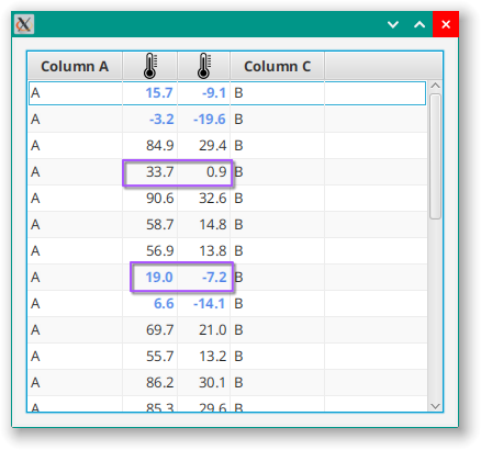
You can see here that the freezing Pseudo-class is still calculated properly as it is done on the Celsius value. The conversions happens as textProperty() is updated, so the internal value of item always remains in Celsius.
Styling the Units Via CSS
Ideally, all the aspects of how the output is displayed should be configurable via Style Sheets. Let’s look at how to set up the StyleableProperties in our TableColumn so that we can configure the output units via CSS:
class TemperatureColumn<T>(extractor: (data: T) -> DoubleProperty) : TableColumn<T, Double>() {

    private val outputUnits: StyleableObjectProperty<TemperatureUnit> =
        SimpleStyleableObjectProperty(OUTPUT_UNITS_META_DATA, TemperatureUnit.C)

    infix fun outputAs(newOutput: TemperatureUnit) = this.apply { outputUnits.value = newOutput }

    companion object StylingStuff {
        val freezingPseudoClass: PseudoClass = PseudoClass.getPseudoClass("freezing")
        val OUTPUT_UNITS_META_DATA: CssMetaData<TemperatureTableCell<*>, TemperatureUnit> = object :
            CssMetaData<TemperatureTableCell<*>, TemperatureUnit>(
                "-wfx-temperature-unit",
                StyleConverter.getEnumConverter(TemperatureUnit::class.java)
            ) {
            override fun isSettable(styleable: TemperatureTableCell<*>) =
                !(styleable.outputUnits.isBound)

            override fun getStyleableProperty(styleable: TemperatureTableCell<*>) = styleable.outputUnits
        }

        private val cssMetaDataList =
            (TableColumn.getClassCssMetaData() + OUTPUT_UNITS_META_DATA) as MutableList

        fun getClassCssMetaData() = cssMetaDataList
    }

    init {
        styleClass += "temperature-column"
        setCellValueFactory {
            extractor.invoke(it.value).asObject()
        }
        TemperatureColumn::class.java.getResource("thermometer24.png")?.toString()?.let { graphic = ImageView(it) }
        setCellFactory { TemperatureTableCell(outputUnits) }
    }

}

class TemperatureTableCell<T>(val outputUnits: StyleableObjectProperty<TemperatureUnit>) :
    TableCell<T, Double>() {

    override fun getControlCssMetaData() =
        (super.getControlCssMetaData() + TemperatureColumn.getClassCssMetaData()) as MutableList

    init {
        itemProperty().subscribe { newValue ->
            pseudoClassStateChanged(freezingPseudoClass, (newValue?.let { (it <= 0.0) } ?: false))
        }
        textProperty().bind(
            ConversionBinding(itemProperty(), outputUnits)
                .map { rawValue -> rawValue?.let { Math.round(rawValue * 10.0) / 10.0 }?.toString() })
    }
}
Now, this is a little bit complicated if you are new to creating custom StyleableProperties. If you want to learn all about this you can read my article about it here.
We’ve turned outputUnits into a StyleableObjectProperty which will enable us to connect it to a style sheet. This is done via something called CssMetaData, which really should be defined statically. The CssMetaData is in the companion object - which is pretty much the Kotlin version of static - and is called OUTPUT_UNITS_META_DATA. This is how you create an instance of a static anonymous inner class in Kotlin, and the constructor defines the style class selector and the data converter that will be used. Then we override a couple of methods to tell it how to find the data in the TableCell and how to determine if it is settable by the style sheet.
Since it’s static, the CssMetaData doesn’t need to be defined in the class that uses it. In this case, we are going to be using the same Property for each TableCell in the TableColumn, so we can define it in the custom TableColumn and then include it in the CssMetaDataList for the TemperatureTableCell.
One more twist on this is that getCssMetaData() is final in TableCell, but we have getControlCssMetaData() that we can use instead.
And now we can do this in the style sheet:
.temperature-column {
  -wfx-temperature-unit: "k";
}
Adding More Styleable Properties
What if, instead of “freezing”, you wanted to define “cold” as a styleable element? Even freezing is contextual, because the use case assumes the freezing point of water, but “cold” isn’t a generally understood value. This means we’ll have to have some way to define “cold” in the style sheet, as well as provide all of the same elements that we did for freezing.
We’ve already performed most of the types of setup that we will need for the previous styling, so adding “cold” is just applying what we’ve already seen:
class Example2 : Application() {
    override fun start(stage: Stage) {
        stage.scene = Scene(createContent(), 400.0, 350.0).apply {
            Example2::class.java.getResource("Example0.css")?.toString()?.let { stylesheets += it }
        }
        Menu()
        stage.show()
    }

    private fun createContent(): Region = BorderPane().apply {
        center = TableView<TableData1>().apply {
            columns += TableColumn<TableData1, String>("Column A").apply {
                setCellValueFactory { it.value.value1 }
                styleClass += "a-column"
            }
            columns += TemperatureColumn2<TableData1> { it.value4 } outputAs TemperatureUnit.F
            columns += TemperatureColumn2<TableData1> { it.value4 }
            columns += TableColumn<TableData1, String>("Column C").apply {
                setCellValueFactory { it.value.value3 }
                styleClass += "c-column"
            }
            repeat(30) {
                items += TableData1(
                    "A",
                    "B",
                    "C",
                    Random.nextDouble(-30.0, 55.0)
                )
            }

        }
        padding = Insets(10.0)

    }
}

class TemperatureColumn2<T>(extractor: (data: T) -> DoubleProperty) : TableColumn<T, Double>() {

    private val outputUnits: StyleableObjectProperty<TemperatureUnit> =
        SimpleStyleableObjectProperty(OUTPUT_UNITS_META_DATA, TemperatureUnit.C)
    private val numDecimals: StyleableObjectProperty<Number> =
        SimpleStyleableObjectProperty<Number>(NUM_DECIMALS_META_DATA, 1)
    private val coldPoint: StyleableObjectProperty<Number> =
        SimpleStyleableObjectProperty<Number>(COLD_POINT_META_DATA, 1000)

    infix fun outputAs(newOutput: TemperatureUnit) = this.apply { outputUnits.value = newOutput }

    companion object StylingStuff {
        val freezingPseudoClass: PseudoClass = PseudoClass.getPseudoClass("freezing")
        val coldPseudoClass: PseudoClass = PseudoClass.getPseudoClass("cold")
        val OUTPUT_UNITS_META_DATA: CssMetaData<TemperatureTableCell2<*>, TemperatureUnit> = object :
            CssMetaData<TemperatureTableCell2<*>, TemperatureUnit>(
                "-wfx-temperature-unit",
                StyleConverter.getEnumConverter(TemperatureUnit::class.java)
            ) {
            override fun isSettable(styleable: TemperatureTableCell2<*>) = !(styleable.outputUnits.isBound)

            override fun getStyleableProperty(styleable: TemperatureTableCell2<*>) = styleable.outputUnits
        }
        val NUM_DECIMALS_META_DATA: CssMetaData<TemperatureTableCell2<*>, Number> = object :
            CssMetaData<TemperatureTableCell2<*>, Number>(
                "-wfx-num-decimal",
                StyleConverter.getSizeConverter()
            ) {
            override fun isSettable(styleable: TemperatureTableCell2<*>) =
                !(styleable.numDecimals.isBound)

            override fun getStyleableProperty(styleable: TemperatureTableCell2<*>) = styleable.numDecimals
        }
        val COLD_POINT_META_DATA: CssMetaData<TemperatureTableCell2<*>, Number> = object :
            CssMetaData<TemperatureTableCell2<*>, Number>(
                "-wfx-cold-point",
                StyleConverter.getSizeConverter()
            ) {
            override fun isSettable(styleable: TemperatureTableCell2<*>) =
                !(styleable.coldPoint.isBound)

            override fun getStyleableProperty(styleable: TemperatureTableCell2<*>) = styleable.coldPoint
        }

        private val cssMetaDataList =
            (TableColumn.getClassCssMetaData() +
                    OUTPUT_UNITS_META_DATA +
                    NUM_DECIMALS_META_DATA +
                    COLD_POINT_META_DATA) as MutableList

        fun getClassCssMetaData() = cssMetaDataList
    }

    init {
        styleClass += "temperature-column"
        setCellValueFactory {
            extractor.invoke(it.value).asObject()
        }
        TemperatureColumn2::class.java.getResource("thermometer24.png")?.toString()?.let { graphic = ImageView(it) }
        setCellFactory { TemperatureTableCell2(outputUnits, numDecimals, coldPoint) }
    }

}

class TemperatureTableCell2<T>(
    val outputUnits: StyleableObjectProperty<TemperatureUnit>,
    val numDecimals: StyleableObjectProperty<Number>,
    val coldPoint: StyleableObjectProperty<Number>,
) :
    TableCell<T, Double>() {

    override fun getControlCssMetaData() =
        (super.getControlCssMetaData() + TemperatureColumn2.getClassCssMetaData()) as MutableList

    init {
        itemProperty().subscribe { newValue ->
            pseudoClassStateChanged(TemperatureColumn2.freezingPseudoClass, (newValue?.let { (it <= 0.0) } ?: false))
            pseudoClassStateChanged(
                TemperatureColumn2.coldPseudoClass,
                (newValue?.let { (it <= coldPoint.value.toDouble()) } ?: false))
        }
        textProperty().bind(
            ConversionBinding(itemProperty(), outputUnits)
                .map { rawValue -> rawValue?.let { (rawValue * 10.0).roundToInt() / 10.0 }?.toString() })
    }
}


fun main() = Application.launch(Example2::class.java)
With the following added to the CSS file:
.table-row-cell .temperature-column:cold  {
  -fx-text-fill: hotpink;
  -fx-font-weight: bold;
}

.table-row-cell .temperature-column:freezing  {
  -fx-text-fill: cornflowerblue;
  -fx-font-weight: bold;
}
Note that the freezing element goes after the cold element, because the freezing threshold (in this case) is below cold and will need to override cold.
There is more that we could do, but I’m sure that you get the idea at this point.
More Utilitarian TableColumn Types
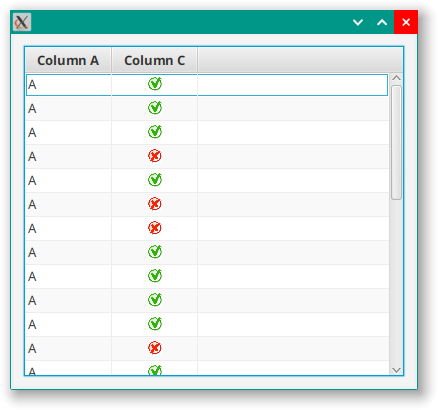
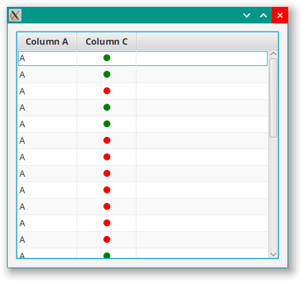
In my own projects I rarely use TableColumn directly. I have custom columns for Double, Integer and even String. One of the primitive types that really doesn’t work for me out-of-the-box is Boolean. The default is a CheckBox, and it just doesn’t look right. I much prefer to use an image of some sort.
Something like this:
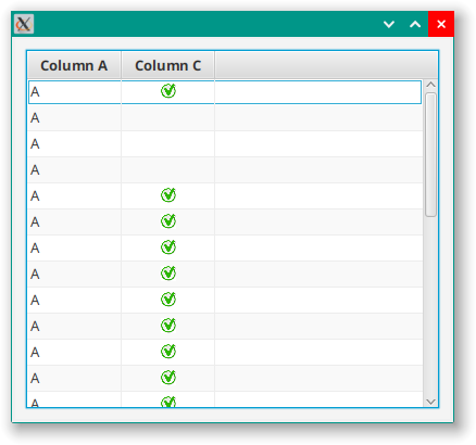
This can look a little busy, so it can be useful to only show the true images:
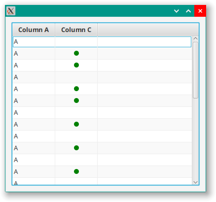
It can be cleaner to just use red and green dots:
This can be especially effective if you only show the dots for true values:
Let’s look at the code for this:
class Example3 : Application() {
    override fun start(stage: Stage) {
        stage.scene = Scene(createContent(), 400.0, 350.0).apply {
            Example3::class.java.getResource("Example0.css")?.toString()?.let { stylesheets += it }
        }
        stage.show()
    }

    private fun createContent(): Region = BorderPane().apply {
        center = TableView<TableData3>().apply {
            columns += TableColumn<TableData3, String>("Column A").apply {
                setCellValueFactory { it.value.value1 }
                styleClass += "a-column"
            }
            columns += BooleanColumn<TableData3>("Column C") { it.value4 }.apply {
                styleClass += "c-column"
            } withFalseValues false withCircles true withCircleSize 18.0
            repeat(30) {
                items += TableData3(
                    "A",
                    "B",
                    "C",
                    Random.nextBoolean()
                )
            }

        }
        padding = Insets(10.0)

    }
}

class BooleanColumn<T>(title: String, extractor: (data: T) -> BooleanProperty) : TableColumn<T, Boolean>(title) {

    private val showFalse: StyleableBooleanProperty = SimpleStyleableBooleanProperty(SHOW_FALSE_META_DATA, true)
    private val useCircles: StyleableBooleanProperty = SimpleStyleableBooleanProperty(USE_CIRCLES_META_DATA, false)
    private val circleSize: StyleableDoubleProperty = SimpleStyleableDoubleProperty(CIRCLE_SIZE_META_DATA, 7.0)

    infix fun withCircles(withCircles: Boolean) = apply {
        useCircles.value = withCircles
    }

    infix fun withCircleSize(circleRadius: Double) = apply {
        circleSize.value = circleRadius
    }

    infix fun withFalseValues(falseValues: Boolean) = apply {
        showFalse.value = falseValues
    }

    companion object StylingStuff {
        val SHOW_FALSE_META_DATA: CssMetaData<BooleanTableCell<*>, Boolean> = object :
            CssMetaData<BooleanTableCell<*>, Boolean>(
                "-wfx-show-false",
                StyleConverter.getBooleanConverter()
            ) {
            override fun isSettable(styleable: BooleanTableCell<*>) = !(styleable.showFalse.isBound)

            override fun getStyleableProperty(styleable: BooleanTableCell<*>) = styleable.showFalse
        }
        val USE_CIRCLES_META_DATA: CssMetaData<BooleanTableCell<*>, Boolean> = object :
            CssMetaData<BooleanTableCell<*>, Boolean>(
                "-wfx-use-circles",
                StyleConverter.getBooleanConverter()
            ) {
            override fun isSettable(styleable: BooleanTableCell<*>) = !(styleable.useCircles.isBound)

            override fun getStyleableProperty(styleable: BooleanTableCell<*>) = styleable.useCircles
        }
        val CIRCLE_SIZE_META_DATA: CssMetaData<BooleanTableCell<*>, Number> = object :
            CssMetaData<BooleanTableCell<*>, Number>(
                "-wfx-circle-size",
                StyleConverter.getSizeConverter()
            ) {
            override fun isSettable(styleable: BooleanTableCell<*>) = !(styleable.circleSize.isBound)

            override fun getStyleableProperty(styleable: BooleanTableCell<*>) = styleable.circleSize
        }

        private val cssMetaDataList =
            (TableColumn.getClassCssMetaData() + SHOW_FALSE_META_DATA + USE_CIRCLES_META_DATA + CIRCLE_SIZE_META_DATA) as MutableList

        fun getClassCssMetaData() = cssMetaDataList
    }

    init {
        styleClass += "boolean-column"
        setCellValueFactory {
            extractor.invoke(it.value).asObject()
        }
        setCellFactory { BooleanTableCell(showFalse, useCircles, circleSize) }
    }
}

class BooleanTableCell<T>(
    val showFalse: StyleableBooleanProperty,
    val useCircles: StyleableBooleanProperty,
    val circleSize: StyleableDoubleProperty
) : TableCell<T, Boolean>() {

    override fun getControlCssMetaData() =
        (super.getControlCssMetaData() + BooleanColumn.getClassCssMetaData()) as MutableList

    init {
        val booleanItem = booleanProperty(itemProperty())
        styleClass += "boolean-table-cell"
        graphic = StackPane(
            ImageView(BooleanColumn::class.java.getResource("checkmark.png")?.toString()).apply {
                fitWidth = 14.0
                fitHeight = 14.0
                visibleProperty().bind(booleanItem.and(useCircles.not()))
                this.styleClass += "true-image"
            },
            ImageView(BooleanColumn::class.java.getResource("crossmark.png")?.toString()).apply {
                fitWidth = 14.0
                fitHeight = 14.0
                visibleProperty().bind(booleanItem.not().and(showFalse).and(useCircles.not()))
                this.styleClass += "false-image"
            },
            Circle().apply {
                visibleProperty().bind(booleanItem.and(useCircles))
                radiusProperty().bind(circleSize)
                fill = Color.MEDIUMSEAGREEN
                styleClass += "true-circle"
            },
            Circle().apply {
                visibleProperty().bind(booleanItem.not().and(useCircles).and(showFalse))
                radiusProperty().bind(circleSize)
                fill = Color.FIREBRICK
                styleClass += "false-circle"
            }
        )
    }
}

class TableData3(initVal1: String, initVal2: String, initVal3: String, initVal4: Boolean) {
    val value1: StringProperty = SimpleStringProperty(initVal1)
    val value2: StringProperty = SimpleStringProperty(initVal2)
    val value3: StringProperty = SimpleStringProperty(initVal3)
    val value4: BooleanProperty = SimpleBooleanProperty(initVal4)
}

fun main() = Application.launch(Example3::class.java)
and the CSS file:
.boolean-column {
  -wfx-show-false: false;
  -wfx-use-circles: true;
  -wfx-circle-size: 5.0;
}

.boolean-column .true-image {
  -fx-fit-width: 14px;
  -fx-fit-height: 14px;
  -fx-image: url(checkmark.png);
}

.boolean-column .false-image {
  -fx-fit-width: 14px;
  -fx-fit-height: 14px;
  -fx-image: url(crossmark.png);
}

.boolean-column .true-circle {
  -fx-fill: green;
}

.boolean-column .false-circle {
  -fx-fill: red;
}
We have 3 StyleableProperties here. One to control the image/circle display, one to control the size of the circles (if used), and one to determine if anything will be displayed when the value is false. These StyleableProperties are all passed to the BooleanTableCell as constructor parameters.
The BooleanTableCell has a graphic that is just a StackPane with 2 ImageViews and 2 Circles in it. The visibility of each of those elements is bound to dependencies on showFalse, useCircles and the item value, such that only one of them (or maybe none of them) will ever be visible. Note that the item Property is of type ObjectProperty<Boolean>, so you don’t have the Fluent API for BooleanProperty. To get around this, the variable booleanItem is instantiated using BooleanProperty.booleanProperty() which is automatically bound to item but is of type BooleanProperty. Then the Fluent API can be used in the visibility bindings.
There are default values for the ImageView images and the Circle colours. However, no provision has been made to allow them to be modified from the layout. This means that the BooleanTableCell will work without any Style Sheet configuration at all, but you cannot change the colours without using a style sheet.
Accessing the BooleanTableCell Programmatically
OK. You can’t do this. Even if you could find a way to do so, you’d be breaking the underlying paradigm for TableView and it would be a bad idea.
The whole idea behind TableView is that the TableCells at runtime are kept at “arms length” from your code. You don’t know how many there are, you don’t have references to them, you don’t know which ones are currently in use and you don’t access them directly. What you can do is define them, and tell the system how to create one.
This means that you cannot programmatically call a method on them to configure it after it has been instantiated, and they can only be instantiated through the Callback specified in the TableColumn. What you can interact directly with, however, is the TableColumn. That’s why the StyleableProperties are defined in the BooleanColumn and then passed to the BooleanTableCell in its constructor. That’s also why the three infix decorator methods are defined in the BooleanColumn.
This means you can do this:
columns += BooleanColumn<TableData3>("Column C") { it.value4 }.apply {
    styleClass += "c-column"
} withFalseValues false withCircles true withCircleSize 18.0
Accessing the ImageViews and Circles
Because the ImageViews and the Circles are defined in the BooleanTableCell, you cannot access them programatically from your layout code at all.
This is why all four of these elements have unique styleclass selectors. This allows you to style just about everything about them from the style sheet.
Once again, if you do want to programatically configure them, you’ll have to do it through the BooleanColumn and then pass the values to the BooleanTableCell in it’s constructor.
JavaDocs
My experience has been that most people find that understanding layout code is the most difficult aspect of enhancing and doing maintenance of a JavaFX application. Because of this, anything that you can do to reduce and simplify your layout code is going to be a big win.
If you can define a TableView with 10 columns with 10-15 lines of code, and if 10 of those lines are just simple constructor calls for custom TableColumns you can go a long way towards simplifying to layout code. This is especially true if you use good, descriptive names for your custom TableColumns.
Look at our BooleanColumn, it can be instantiated like this:
columns += BooleanColumn("Some Heading"){item -> item.someBooleanProperty()}
But, if the maintenance programmer has to click through into BooleanColumn to see how it works and how to configure some aspect of its display, then it gets harder, not easier, for them.
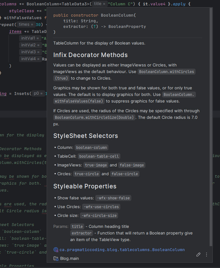
It’s really important to make that information readily available without forcing maintenance programmers to read the source code. JavaDocs can be crucial here. Let’s take a look at some JavaDocs (KDocs actually, because it’s Kotlin) for BooleanColumn
/**
 * TableColumn for the display of Boolean values.
 *
 * ## Infix Decorator Methods
 * Values can be displayed as either ImageViewss or Circles, with ImageViews as the default behaviour.  Use
 * `BooleanColumn.withCircles(true)` to change to Circles.
 *
 * Graphics may be shown for both true and false values, or for only true values.  The default is to
 * display graphics for both.  Use `BooleanColumn.withFalseValues(false)` to suppress graphics for
 * false values.
 *
 * If Circles are used, the radius of the Circles may be specified with through `BooleanColurm.withCircleSize(Double)`.
 * The default Circle radius is 7.0px.
 *
 * ## StyleSheet Selectors
 * - Column: `boolean-column`
 * - TableCell: `boolean-table-cell`
 * - ImageViews: `true-image` and `false-image`
 * - Circles: `true-circle` and `false-circle`
 *
 * ## Styleable Properties
 * - Show false values: `-wfx-show-false`
 * - Use Circles: `-wfx-use-circles`
 * - Circle size: `-wfx-circle-size`
 *
 * @param title Column heading title
 * @param extractor Function that will return a Boolean property give an item of the TableView type.
 */
We have the standard stuff that explains the constructor parameters, of course. But equally important is all the information that they’d need to do configuration in the layout, or to tailor the StyleSheet.
It looks like this in my IDE:
There’s probably more that I should add in, but you get the idea.
Conclusion
This is another one of the cases where JavaFX gives you all the raw tools that you need to build things exactly the way that you want without cluttering up the library with classes that do things the way that they want. Even more, TableColumns and TableCells are extremely generic and almost impossible to use out-of-the-box without doing some kind of customization. So why not do that customization “right”, do it completely, and then just re-use it over and over again?
A key concept here is recognizing that TableCells that go with a certain kind of data go with TableColumns of the same kind of data. The two are a matched pair. Once you think of it this way, it’s fairly clear how to design a TableColumn such that it supports a matched TableCell. And then, in your layout code, you simply don’t have to think about the TableCells at all because they just work.
The difference in your layout code between using a pre-built, custom, TableColumn and doing the configuration on the fly is huge. I don’t think you can overestimate how much baggage that in-layout configuration brings with it. Using a custom TableColumn eliminates all of that baggage and can make your TableView configuration absolutely trivial.