Introduction
If you use JavaFX, then you are almost certainly using the Modena stylesheet - or a custom stylesheet designed to work with the standard JavaFX Node subclasses in much the same way that Modena does.
Unfortunately, Modena is big. Like… 3,440 lines big. And it can seem very complicated because it uses a lot of advanced and subtle techniques that aren’t obvious if you’re not a CSS guru.
This article is about understanding Modena, and how it interacts with the standard JavaFX Nodes. The intention is that once you’ve read this article, you should be able to look at the styling of just about any of those Nodes on the screen, and then find the right places in Modena that make it look way and understand how it does it.
You aren’t going to see any specific methods for handling any specific Node classes here. This article is all about giving you the tools to be able to figure that for yourself, which is far more valuable.
The Components of JavaFX Styling
In JavaFX there are four basic elements that are used to create styling for a Node subclass.
- StyleableProperties
These are the base units of styling in JavaFX. EveryStyleablePropertyhas a connection back to a stylesheet attribute and provides the mechanism to turn that stylesheet attribute setting into something visual in the GUI. - CSS Selectors
Stylesheets are broken down into sections that are identified via a name called a “Selector”. JavaFXNodescontain a list of CSS selectors that will be applied, in order, to provide values for the variousStyleablePropertiesdefined for theNode. WhenNodesubclasses inherit from their parentNodesthey can either start a brand new list of selectors, or add new values to the inherited list. - Pseudoclasses
PseudoClassesare used to provide selectors that are applied to aNodeon a temporary basis. EachPseudoClassis aBooleanvalue that is associated with a CSS selector. When thePseudoClassvalue istrue, then the selector is applied to theNodeand then removed when it changes tofalse. - StyleSheets
Stylesheets contain all of the specifications of how theStyleablePropertieswill be applied to variousNodesin the GUI. Multiple stylesheets can be added at theStage,Sceneor rootNodelevel of a window and they will be applied in the order in which they are listed.
In this article we are going to concentrate on the last item in this list, the stylesheet. Specifically, we are going to look at the Modena stylesheet, which is the default stylesheet that has shipped with JavaFX for quite a few years.
Modena is Integrated with the JavaFX Library
While it is easy enough to say, “We’re going to look at the Modena stylesheet”, in truth you cannot study it in isolation. Take a look at this snippet:
.web-view .form-select-button {
    -fx-background-radius: 2, 2, 1, 0;
    -fx-background-insets: 2 2 1 2, 2, 3, 4;
}
To understand what this does you need to understand what the selector “.web-view .form-select-button” means. This is defined somewhere in the JavaFX source code, probably in the skin for the WebView control. In the same way, the meanings of “-fx-background-radius” and “-fx-background-insets” are defined as StyleableProperties somewhere in the class hierarchy leading to WebView, probably in Region.
It should be clear at this point that Modena and the JavaFX classes are closely integrated, and you cannot understand Modena without understanding how the various Node classes work and are interelated. One of the biggest challenges is when a Control is actually composed of a number of different Controls - and this happens a lot in JavaFX. Just look at the example above, we can infer that WebView is composed of a number of different elements, one of which is a Button that is related to some function identified as “form select”.
Applying your own custom styling to a Node is generally going to involve adding a CSS selector in your own stylesheet for that Node, and then defining values for the various attributes that apply to that Node class, or its superclasses.
Getting a Copy of Modena
I would strongly suggest that you download a copy of Modena and save it somewhere on your system where you can get at it easily for future reference. It used to be easiest to just extract it from whatever JFX jar you had downloaded to use in your projects. Nowadays, using Maven or Gradle the associated plugin will download OpenJFX is the background and you don’t have to go through the process of grabbing the jar for yourself. You can still pull Modena out of your IDE, however, if you know where to look.
Once you’ve compiled a JavaFX project at least once with Gradle or Maven, you should have a section in your project called “External Libraries”. Somewhere in that section you’ll have a bunch of OpenJFX items. You’re looking for the one that is called “org.openjfx:javafx-controls:{O/S}:{version}”. For me this is “org.openjfx:javafx-controls:linux:23”.
Inside that library, you are looking for the following path: com.sun.javafx.scene.control.skin.modena.modena.css. And that’s the file. You can just open it in your IDE, or you can copy it somewhere that makes it easier for you.
You can get a copy directly from the GitHub project for OpenJFX is the link for the JFX 23 version.
The Reference Guide
The last thing that you’ll need is the CSS Reference Guide for JavaFX. This is available as a web page. For JFX 23, it can be found here:
https://openjfx.io/javadoc/23/javafx.graphics/javafx/scene/doc-files/cssref.html
You should bookmark this, you’ll need it a lot.
The Colours
A large part of understanding Modena boils down to understanding how it deals with colours. Modena does a lot of hocus-pocus with colours and huge amounts of the definitions are about defining and applying various colours.
Base Colours
In reality, Modena has very few colours defined as simple colours. Virtually all of the colours are derived from a handful of base colours, and you can completely change the colour scheme of your application just by redefining some of those colours. Let’s take a look at them, these are all defined in the .root section:
-fx-base: #;

/* A very light grey used for the background of windows.  See also
 * -fx-text-background-color, which should be used as the -fx-text-fill
 * value for text painted on top of backgrounds colored with -fx-background.
 */
-fx-background: derive(-fx-base,26.4%);

/* Used for the inside of text boxes, password boxes, lists, trees, and
 * tables.  See also -fx-text-inner-color, which should be used as the
 * -fx-text-fill value for text painted on top of backgrounds colored
 * with -fx-control-inner-background.
 */
-fx-control-inner-background: derive(-fx-base,80%);


-fx-dark-text-color: black;
-fx-mid-text-color: #333;
-fx-light-text-color: white;

-fx-accent: #0096C9;

-fx-default-button: #ABD8ED;

-fx-focus-color: #039ED3;
-fx-faint-focus-color: #039ED322;

/* The color that is used in styling controls. The default value is based
 * on -fx-base, but is changed by pseudoclasses to change the base color.
 * For example, the "hover" pseudoclass will typically set -fx-color to
 * -fx-hover-base (see below) and the "armed" pseudoclass will typically
 * set -fx-color to -fx-pressed-base.
 */
-fx-color: -fx-base;
-fx-background-color: -fx-background;
I’ve left the comments in because they are useful. Here are the main colours:
This is, as you can see, the familiar blue and gray theme that you see in most JavaFX applications.
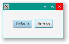
You can change it by adding the following stylesheet to your application:
.root {
  -fx-default-button: #EE8434;
  -fx-focus-color: #C95D63;
  -fx-faint-focus-color: #C95D6322;
}
And it will look like this:
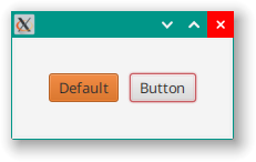
There’s a lot of other colour definitions in the .root section, but they virtually all involve values derived from the handful listed above. For instance:
/* A little lighter than -fx-base and used as the -fx-color for the
 * "hovered" pseudoclass state.
 */
-fx-hover-base: ladder(
    -fx-base,
    derive(-fx-base,20%) 20%,
    derive(-fx-base,30%) 35%,
    derive(-fx-base,40%) 50%
 );
or:
/* A little darker than -fx-color and used to draw boxes around objects such
 * as progress bars, scroll bars, scroll panes, trees, tables, and lists.
 */
-fx-box-border: ladder(
    -fx-color,
    black 20%,
    derive(-fx-color,-15%) 30%
);

/* Darker than -fx-background and used to draw boxes around text boxes and
 * password boxes.
 */
-fx-text-box-border: ladder(
    -fx-background,
    black 10%,
    derive(-fx-background, -15%) 30%
);
You get the idea.
You will also see a lot of uses of derive, gradient and ladder in Modena. You will need to become comfortable with these concepts in order to understand how Modena works.
Redefining Colours
One “trick” that you’ll see quite often in Modena is contextual redefinition of one of the named colours. This most often happens in Pseudo-class selectors like this:
.button:hover {
    -fx-color: -fx-hover-base;
}
What this means is that for a Button, when it has the hover Pseudo-class applied, the value of -fx-color will be changed to be whatever color -fx-hover-base has been defined as. As you’ll see in the next section Button has 4 background colours. Let’s look at one of them:
-fx-body-color: linear-gradient(to bottom,
        ladder(
            -fx-color,
            derive(-fx-color,8%) 75%,
            derive(-fx-color,10%) 80%
        ),
        derive(-fx-color,-8%));
You can see how changing -fx-color will change the definition of -fx-body-color, and this will change the look of the Button when the mouse is hovering over it.
Sometimes a Node will retain most of its inherited styling, but just change the definition of a colour:
.list-cell,
.tree-cell {
    -fx-background: -fx-control-inner-background;
    -fx-background-color: -fx-background;
    -fx-text-fill: -fx-text-background-color;
}
Remember that this colour change will also hold for any sub-components of the Node. In this case, since ListCell is a subclass of Labeled, there will be a graphic and a text element.
Sometimes you see this redefinition used inside a sub-component of another Node:
.combo-box > .list-cell {
    -fx-background: transparent;
    -fx-background-color: transparent;
    -fx-text-fill: -fx-text-base-color;
    -fx-padding: 0.333333em 0.666667em 0.333333em 0.666667em; /* 4 8 4 8 */
}
Here we see the -fx-background redefined from its previous redefinition when it is the the ListCell in the main part of a ComboBox.
Default Styling
If you look at the styling for list-cell in the section above, you’ll see that there isn’t much there. Where does the rest of the styling come from?
The hierarchy to get to ListCell is thisNode -> Parent -> Region -> Control -> Labeled -> Cell -> IndexedCell -> ListCell. Not all of these classes have CSS selectors specified, Node, Parent, Region, Control and Labeled do not. While there are selectors for ListCell, as we’ve seen, there are no selectors in Modena for IndexedCell or Cell, although there are selectors for sub-components and Pseudo-classes of Cell.
So where does the default styling come from?
The answer is to look at Region where you’ll find this:
private static class StyleableProperties {
    private static final CssMetaData<Region, Insets> PADDING;
    private static final CssMetaData<Region, Insets> OPAQUE_INSETS;
    private static final CssMetaData<Region, Background> BACKGROUND;
    private static final CssMetaData<Region, Border> BORDER;
    private static final CssMetaData<Region, Shape> SHAPE;
    private static final CssMetaData<Region, Boolean> SCALE_SHAPE;
    private static final CssMetaData<Region, Boolean> POSITION_SHAPE;
    private static final CssMetaData<Region, Boolean> CACHE_SHAPE;
    private static final CssMetaData<Region, Boolean> SNAP_TO_PIXEL;
    private static final CssMetaData<Region, Number> MIN_HEIGHT;
    private static final CssMetaData<Region, Number> PREF_HEIGHT;
    private static final CssMetaData<Region, Number> MAX_HEIGHT;
    private static final CssMetaData<Region, Number> MIN_WIDTH;
    private static final CssMetaData<Region, Number> PREF_WIDTH;
    private static final CssMetaData<Region, Number> MAX_WIDTH;
    private static final List<CssMetaData<? extends Styleable, ?>> STYLEABLES;

    private StyleableProperties() {
    }

    static {
        PADDING = new CssMetaData<Region, Insets>("-fx-padding", InsetsConverter.getInstance(), Insets.EMPTY) {
            public boolean isSettable(Region var1) {
                return var1.padding == null || !var1.padding.isBound();
            }

            public StyleableProperty<Insets> getStyleableProperty(Region var1) {
                return (StyleableProperty)var1.paddingProperty();
            }
        };
        .
        .
        .
        MAX_WIDTH = new CssMetaData<Region, Number>("-fx-max-width", SizeConverter.getInstance(), -1.0) {
            public boolean isSettable(Region var1) {
                return var1.maxWidth == null || !var1.maxWidth.isBound();
            }

            public StyleableProperty<Number> getStyleableProperty(Region var1) {
                return (StyleableProperty)var1.maxWidthProperty();
            }
        };
    }
}
This is where the default values are established, in the code, and they will be passed to sub-classes through inheritance. There are even more defined in Node, and presumably any class in the hierachy can inject its own styleable properties into the structure. You don’t have to look into the code to find the values, though, the CSS Reference Guide for Region has all this information.
Enclosed Components
It is important to understand that the standard JavaFX Nodes that are composed of other Nodes, especially the ones with skins, don’t have any special qualities when it comes to the stylesheets. Any Region that you use in a layout to hold child Nodes, even nested layout classes, will interact with the stylesheet in exactly the same way.
CSS has two ways to specify compound selectors (which refer to Nodes which are children of other Nodes). The first is .:
.slider .thumb {
    -fx-background-color:
        linear-gradient(to bottom, derive(-fx-text-box-border, -20%), derive(-fx-text-box-border, -30%)),
        -fx-inner-border,
        -fx-body-color;
    -fx-background-insets: 0, 1, 2;
    -fx-background-radius: 1.0em; /* makes sure this remains circular */
    -fx-padding: 0.583333em;  /* 7 */
    -fx-effect: dropshadow(two-pass-box , rgba(0, 0, 0, 0.1), 5, 0.0 , 0, 2);
}
and the second is > .:
.tool-bar > .container > .separator {
    -fx-orientation: vertical;
}
The first form refers to any occurance of the second selector in any of the children, or the children of children, of the first selector. The second form refers only to occurances of the second selector in direct children of the first selector. You’ll find many more usages of the second form in Modena than you will of the first form.
Here’s an example of how this works:
class ModenaExample1 : Application() {
    override fun start(stage: Stage) {
        stage.scene = Scene(createContent(), 300.0, 240.0).apply {
            ModenaExample1::class.java.getResource("example1.css")?.toString()?.let { stylesheets += it }
        }
        stage.show()
    }

    private fun createContent(): Region = VBox(10.0).apply {
        styleClass += "nest-outer"
        children += Button("Outside")
        children += VBox(10.0).apply {
            styleClass += "nest-middle"
            children += Button("Middle")
            children += VBox(10.0).apply {
                styleClass += "nest-inner"
                children += Button("Inside")
            }
        }
    }
}

fun main() = Application.launch(ModenaExample1::class.java)
This is just a set of nested VBoxes, each having a single Button in them. Here’s the stylesheet:
.nest-outer {
  -fx-background : blanchedalmond;
  -fx-padding: 20px;
  -fx-border-color: green;
  -fx-border-width: 3px;
  -fx-body-color: coral;
}

.nest-middle {
  -fx-border-color: blue;
  -fx-border-width: 3px;
  -fx-padding: 20px;
}

.nest-inner {
  -fx-border-color: red;
  -fx-border-width: 3px;
  -fx-padding: 20px;
}

.nest-middle .button {
  -fx-body-color: thistle;
}

.nest-middle > .button {
  -fx-body-color: aqua;
}
Each of the VBoxes has a different coloured border, so that you can see where they are, and the outermost VBox with the selector, nest-outer, redefines -fx-body-color which is the innermost colour in the background for Button. It looks like this:
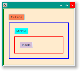
First, you can see that the redefinition of -fx-background holds for all of the elements inside of the nest-outer VBox because all three VBoxes have that same colour.
The last two selectors in the stylesheet redefine -fx-body-color for Buttons inside of the nest-middle VBox. The first one redefines it for every Button inside nest-middle and the second, the > . selector, redefines it for Buttons directly contained inside nest-middle. The order of the selectors inside the stylesheet is important, and if we reverse these two last selectors we get this:
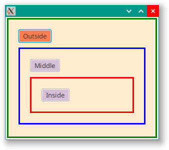
This is becasue the more general selector would supercede the more specific > . selector because it came second.
Modena Doesn’t Use Borders!
Let’s look at the styling for (amongst other things) Button:
.button {
    -fx-background-color: -fx-shadow-highlight-color, -fx-outer-border, -fx-inner-border, -fx-body-color;
    -fx-background-insets: 0 0 -1 0, 0, 1, 2;
    -fx-background-radius: 3px, 3px, 2px, 1px;
    -fx-padding: 0.333333em 0.666667em 0.333333em 0.666667em; /* 4 8 4 8 */
    -fx-text-fill: -fx-text-base-color;
    -fx-alignment: CENTER;
    -fx-content-display: LEFT;
}
Here we have 4 different backgrounds defined. The are applied in order, each successive background going on top of the previous backgrounds. However, the backgrounds on the bottom are all a little bit bigger than the ones that follow, at least in some dimension. This is defined by the insets.
Let’s look at how this works…
The background on the bottom is -fx-shadow-highlight-color and its insets are 0 except for the bottom, which is -1. This means that this background will exactly match the size of the Button on the top, left and right, but extend 1px down below the bottom of the Button.
The next background is -fx-outer-border and it has insets of 0 (or 0,0,0,0), which means that it will exactly match the size of the Button. This will cover up all of the first background, excepty for that strip of 1px at the bottom where it sticks out below the Button. This is hard to see with the normal palette on a white background, but if we change -fx-shadow-highlight-color to red in our custom colour stylesheet, it’s quite clear:
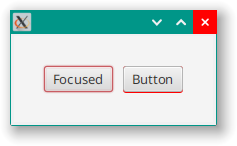
The third background is -fx-inner-border and it has insets of 1. This will leave a 1px wide strip all around the edge of the Button where the second background is visible.
Finally, the last background is -fx-body-color and it has insets of 2. This will be the colour that you see for most of Button and it will leave a 1px wide ring of the third background visible just inside the dimensions of the Button.
Essentially, we have a “border” made up of three different colours - at least on the bottom - and then a background of -fx-body-color. It makes the Button look three dimensional.
This is the technique that you will see used over, and over in Modena. It’s actually very rare to see a real border used in Modena. The attribute -fx-border-width is set only 7 times in the entire file, and -fx-border-color is set to something non-transparent only 15 times.
So borders are used in Modena, it’s just that most of them are composed of stacked backgrounds, and then a tiny handful are actual borders as defined in the JavaFX library.
The Standard PseudoClasses
In order to understand Modena, you’ll need to know about the various Pseudo-classes that are used. These are defined in the JavaFX source code for the various nodes, but you will seem them referenced in Modena, and many are available but not used in Modena itself. You can, however, use them in your own style sheets to customize based on Modena.
All Node subclasses support the following Pseudo-classes:
- disabled
- focused
- focus-visible
- focus-within
- hover
- pressed
- show-mnemomonic
Various other Node subclasses support some of these common Pseudo-classes:
- armed
- cancel
- default
- selected
- determinate
- indeterminate
- empty
- filled
- editable
- showing
- vertical
- horizontal
And then there are a number of Pseudo-classes with a very specific scope. All of these are documented in the JavaFX CSS Reference Guide.
Here’s an example of how Modena commonly implements Pseudo-classes:
.toggle-button:selected {
        -fx-background-color:
            -fx-shadow-highlight-color,
            linear-gradient(to bottom, derive(-fx-outer-border, -20%), -fx-outer-border),
            linear-gradient(to bottom,
                    derive(-fx-color, -22%) 0%,
                    derive(-fx-color, -13%) 20%,
                    derive(-fx-color, -11%) 50%);
    -fx-background-insets: 0 0 -1 0, 0, 1;
}
This is the selected Pseudo-class for a ToggleButton. You can see that it’s mostly a colour change, which isn’t surprising. This definition sets the background colour and insets.
You can see that there are three different background colours stacked on top of each other to create a three dimensional “border” in a manner similar to what we saw with Button. And that’s all this Pseudo-class does, changes the background and border so that it looks “selected”.
You will also see Pseudo-classes stacked quite often:
.toggle-button:selected:focused {
    -fx-background-color:
        -fx-focus-color,
        linear-gradient(to bottom,
            derive(-fx-color, -22%) 0%,
            derive(-fx-color, -13%) 20%,
            derive(-fx-color, -11%) 50%),
        -fx-faint-focus-color,
        linear-gradient(to bottom,
            derive(-fx-color, -22%) 0%,
            derive(-fx-color, -13%) 20%,
            derive(-fx-color, -11%) 50%);
    -fx-background-insets: -0.2, 1, -1.4, 2.6;
    -fx-background-radius: 3, 2, 4, 0;
}
This is the selector for a ToggleButton that is both “selected” and “focused”.
Shared Definitions
When multiple selectors have the same settings, Modena will combine them into a single entry using “,” to separate the selectors. For instance, the selector that defines Button is
.button,
.toggle-button,
.radio-button > .radio,
.check-box > .box,
.menu-button,
.choice-box,
.color-picker.split-button > .color-picker-label,
.combo-box-base,
.combo-box-base:editable > .arrow-button {
  .
  .
  .
}
This means that if you want to change the styling of Button you’re going to have to decide if you really just mean Button or everything that is “button-like”. Otherwise, your application could take on an inconsistent look.
Compound Nodes
There are a large number of Node classes that are actually composed of multiple internal Nodes. Each of these internal components can have their own CSS selectors and be styled individually.
Many times you can spot these in Modena. Here’s CheckBox:
.check-box {
    -fx-label-padding: 0.0em 0.0em 0.0em 0.416667em; /* 0 0 0 5 */
    -fx-text-fill: -fx-text-background-color;
}
.check-box > .box {
    -fx-background-radius: 3, 2, 1;
    -fx-padding: 0.166667em 0.166667em 0.25em 0.25em; /* 2 2 3 3 */
}
.check-box > .box > .mark {
    -fx-background-color: null;
    -fx-padding: 0.416667em 0.416667em 0.5em 0.5em; /* 5 5 6 6 */
    -fx-shape: "M-0.25,6.083c0.843-0.758,4.583,4.833,5.75,4.833S14.5-1.5,15.917-0.917c1.292,0.532-8.75,17.083-10.5,17.083C3,16.167-1.083,6.833-0.25,6.083z";
}
But how do we know that this is all of the internal components that might be styled? Just as there’s no requirement that all of the Pseudo-classes for each Node are styled in Modena, it’s possible that internal components are defined that are just left at their default styling.
To find out definitively, we will need to check the source code for the Node. Let’s do that for CheckBox…
If we put a call to CheckBox() in an application, then we can click through and see the decompiled code for CheckBox. From there we can do a search for “getStyleClass”, which has to be called to add a CSS selector to the class.
private void initialize() {
    this.getStyleClass().setAll(new String[]{"check-box"});
    this.setAccessibleRole(AccessibleRole.CHECK_BOX);
    this.setAlignment(Pos.CENTER_LEFT);
    this.setMnemonicParsing(true);
    this.pseudoClassStateChanged(PSEUDO_CLASS_DETERMINATE, true);
}
The first thing we can see is that all of the StyleClasses that might have been inherited from any superclasses are cleaned out via the setAll() method. And the CheckBox overall is assigned the selector of check-box. There are no other calls to getStyleClass() in the class. This means that any other CSS selectors have to be assigned in the skin.
We need to find where the skin is created. Searching in the code for “skin” gives this:
protected Skin<?> createDefaultSkin() {
     return new CheckBoxSkin(this);
 }
If we click-through into this we’ll come to the constructor for CheckBoxSkin which gives is this:
public CheckBoxSkin(CheckBox var1) {
    super(var1);
    this.behavior = new ButtonBehavior(var1);
    this.box.getStyleClass().setAll(new String[]{"box"});
    this.innerbox = new StackPane();
    this.innerbox.getStyleClass().setAll(new String[]{"mark"});
    this.innerbox.setNodeOrientation(NodeOrientation.LEFT_TO_RIGHT);
    this.box.getChildren().add(this.innerbox);
    this.updateChildren();
}
And a search for “getStyleClass” only yields two hits, which are both in this constructor method. So the only selectors are the ones that we saw used in Modena at the top of this section. This means that we can completely style CheckBox with these three selectors.
We can also now find out two very valuable pieces of information - the types of box and mark. This is important because this will tell us what styling attributes are available to us to customize.
Right above that constructor are these two lines:
private final StackPane box = new StackPane();
private StackPane innerbox;
Now we know that both of these are StackPanes. We could have guessed that they were some kind of Region from the CSS in Modena, but now we know exactly what they are.
Exploring Via Node.lookupAll()
If looking through the source code seems daunting, there is another method you can try. Node has a method called lookupAll() which will accept wildcard characters. This means that you can call Node.lookupAll("*") to find all of the styleclass selectors that are present in a compound Control. It works like this:
class ModenaExample0 : Application() {
    override fun start(stage: Stage) {
        stage.scene = Scene(createContent())
        stage.show()
    }

    private fun createContent(): Region = BorderPane().apply {
        val checkBox = CheckBox().apply {
            styleClass += "fred"
        }
        center = HBox(10.0).apply {
            children += Button("Button").apply {
                isDefaultButton = false
                onAction = EventHandler {
                    checkBox.lookupAll("*").forEach {
                        println("Id: ${it.id}\tStyleClass: ${it.styleClass}\t\tType: ${it::class.java.simpleName}")
                    }
                }
            }
            children += checkBox
        }
        padding = Insets(30.0)
    }
}

fun main() = Application.launch(ModenaExample0::class.java)
You need to run Node.lookupAll() after the SceneGraph has been displayed. That’s why it has been implemented inside the onAction EventHandler for a Button. When you click on the Button, this is what you get:
Id: null   StyleClass: check-box fred    Type: CheckBox
Id: null   StyleClass: text              Type: LabeledText
Id: null   StyleClass: box               Type: StackPane
Id: null   StyleClass: mark              Type: StackPane
We see check-box, box and mark, as well as fred that I explicitly added to the CheckBox to see how it would show in the listing. We get to see all of the selectors added to each Node, which is good.
But what’s this text??? We can see that it’s a LabeledText, but where did it come from?
If we go back to the skin of ComboBox, we see that it extends LabeledSkinBase. If we look at LabeledSkinBase and search for usages of LabeledText we find it right away at the top of the class:
public abstract class LabeledSkinBase<C extends Labeled> extends SkinBase<C> {
    LabeledText text;
    .
    .
    .
}
But you won’t find any place where it is assigned a styleclass selector. However, if you look at the source code for LabeledText you will find it assigns itself the selector text, and this just stays when it’s part of CheckBoxSkin.
If you want to know everything that you might style in a JavaFX Control, especially one with a skin, then it looks like the best place to start is with a test program like this that uses Node.lookupAll("*") to find all of the components that stylesheet selectors. However, this won’t show you how the various components are related to each other, and how they are used. For that, you’ll have to look at the source code.
All that being said, for CheckBox the elements are pretty clear. The text element is obviously the text beside the checkbox, and the mark is the checkmark that goes inside the checkbox. Other skinned Controls could be much more complicated.
Customizing Modena Selectors
I see lots and lots of example programs, especially when people are asking questions on StackOverflow, where they’ll employ a custom style sheet that uses one of the standard Node selectors. Like button or check-box. This is fine in a small sample program, but isn’t necessarily the best approach with a bigger application with multiple screens.
There’s two potential issues with this.
The first is that you are changing the styling of every Node of that type, everywhere. Is this really what you want to do? OK, the Modena styling isn’t exactly exciting, but it is consistent and it does look professional. Change the styling of one element without thinking about how it will integrate everywhere with everything else might look a bit odd.
The second is that many of the stylings work together. If you go back and look at the styling for button, you can see that it is shared with 9 other selectors, some of which are enclosed in other Nodes. Do you want to just change Button? Or should you change all of selectors that share that same styling? I rarely see people do that. Additionally, you should also look for places that depend on the original styling, like Pseudo-classes and enclosed Nodes.
Essentially, you are coupling your styling change all over your application. That’s a good thing when you want to restyle the whole application to give it an entirely different feel, but it can be a problem if you’ve made a change for a specific use case and it impacts seemingly unrelated parts of your GUI.
The alternative is to create a new selector and then perform styleClass += "{new selector}" on the Node. Now you are just styling a particular instance of that Node type, and you won’t have any global issues. If you are adding this new styleclass selector to a whole bunch of instances of the Node then create a builder method to instantiate the Node with the selector added.
Conclusion
My biggest complaint about the JavaFX documentation is that there is no “Styling Guide” that details all of the styleclass selectors and nested components of the standard JavaFX Nodes. It would make life so much easier to be able to simply look up the documentation for a skin class and see what they’ve put there for you to customize. Instead, you’ll have to pour over the source code, search through Modena and figure out how make it work.
However, once you’re comfortable with the techniques used in Modena it is fairly easy to understand how the styling that you see on screen (for most Nodes) is achieved through the stylesheet. Hopefully, this article has given you the tools to understand these techniques.