Introduction
Most programmers start out with JavaFX by manually applying styling to their Nodes using the Node.setStyle() method. It works, but it’s really cumbersome and complicated to read - especially when a Node has extensive styling applied. We’re going to look at Cascading Style Sheets and how they have been implemented in JavaFX.
If you think about it, you’ll realize that, in general, there three elements to the UI of an application:
- The Layout
- This is how the various
Nodeswill be positioned on the screen. How they are aligned, whichNodescontain otherNodes, padding and margins. Things like that. - Configuration
- This defines how the
Nodeswill behave. It includes things like actions onButtonclicks, responses to having focus, whether or not aNodeis visible and how this is controlled. It also defines how variousNodeson the screen are related to each other functionally. Also, this includes how the properties of theNodesare bound to the Model. - Styling
- This is virtually all of the other elements of a
Node’s appearance that aren’t layout. Font sizes, colours, borders and backgrounds, opacity, all that kind of stuff.
You’ll want to keep these three things separated as much as possible. Having everything jumbled together makes it much, much more difficult to understand how a layout is designed, and makes it difficult to identify where you need to look to understand configuration and styling.
This article is about styling, and how you can keep it isolated from the rest of your application by using Cascading Style Sheets. You’ll see that it’s actually quite easy to do and much more convenient than using Node.setStyle().
Why Use stylesheets?
Stylesheets have a number of advantages:
- They put all of your styling in one place.
- They “cascade”.
- It’s much easier to read and understand your styles.
- It’s possible to combine styles together making it easier to do more complicated things.
- They allow Pseudo Classes.
- They keep the styling out of your code.
- They allow “theming” to be easily implemented.
- It’s consistent with the way that the standard JavaFX
Nodeclasses are implemented.
Getting Started
There’s three steps you need to follow to style your Nodes with a stylesheet:
- Create a stylesheet.
- Load the stylesheet into your
Scene. - Apply the styles to your
Nodes.
Creating a StyleSheet
A stylesheet is just a file, usually with a “.css” extension. You need to put it into the resources section of your project so that you can find it with a Class.class.getResource() call. We’ll look at the actual structure a little later on.
Implementing a Stylesheet
The main method for implementing a new stylesheet is the method getStyleSheets(), which returns an ObservableList<String>, where the Strings are URL’s to file locations of the stylesheets. This means that there can be many stylesheets implemented on a single entity. In this case, the stylesheets will be applied in order, with later stylesheets overriding earlier ones if they both define the same element. This is important.
Since this returns a List, once you’ve gotten it, you can add your own stylesheets to it. You can also remove stylesheets if you want to. It’s just a List, but since it’s Observable any changes will instantly be reflected in your UI.
Where To Implement the Stylesheet
The method getStyleSheets() is defined for two classes: Scene and Parent. Parent is a direct descendent of Node, and the ancestor of virtually every other JavaFX Node that you’re likely to use except ImageView and Canvas. So this means that you can implement a stylesheet for virtually any Node that you might use. The only restriction is that it seems you can only add a stylesheet to a Node that is the “root” of a Scene.
This last restriction doesn’t seem to be documented anywhere, and the source code inside JavaFX that deals with this is super complicated. But it appears that the stylesheet is actually pushed up and applied to the Scene, and it does this when the Node is placed into the Scene. And it only looks at the Node directly placed into the Scene in a constructor or with Scene.setRoot().
This means that you can apply a stylesheet at either the Scene, or the layout class which is the “root” element of the Scene. Then every Node in the Scene will get that stylesheet added.
Personally, I prefer to apply the stylesheet at the “root” element of the Scene. This is because the styling seems to me to be part of the content, and it should be included in its definition. Also, if you use the same content in a different Scene, then you don’t have to re-specify the stylesheet, since it’s included in the content.
Of course, you might have a case where you define the content independent of the styling, and wish to have the styling change dependent on the context in which it is being used. If that context is defined when the Scene is created, then it might be better to set the stylesheet at the Scene, not the “root” of the Scene.
For what it’s worth, almost every example that I’ve seen on the web applies the stylesheet to the Scene directly. My guess is that this is mostly just copypasta and the majority of people don’t even realize that it can be applied to the “root” element instead.
Applying a Style
Stylesheets are divided up into two parts: A “root” section, and everything else.
The “root” section is for defining global variables, which you can then use in the rest of the stylesheet. Also, since the stylesheets cascade, if you redefine a variable which was defined in an earlier stylesheet, that new definition will be used in its place - even those uses in other stylesheets.
It’s perfectly reasonable to have a stylesheet that has nothing but a “root” section, which would have the impact of changing global settings defined and used in other stylesheets. Colours are one of the key global variables which are often used, so you can completely change the colour composition of a screen just by changing a handful of colour definitions.
The “.root” section can also allegedly be used to load fonts, but this seems to be a bit problematic (buggy?). We’re not going to look at fonts in this article, though.
The rest of the stylesheet is made up of styles to be used in specific cases. These specific cases are identified by something called “selectors”. There are three kinds of selectors in a JavaFX stylesheet, the “.” selector, the “#” selector, and the object type selector. Let’s look at them:
The Style Class Selector
Node has a method called getStyleClass(). This method returns an ObservableList<String> where the Strings will map to stylesheet selectors prefixed with a “.”. You can call this method and then add or remove elements to/from it and it will change the styles which a applied to the Node. Just as with stylesheets, all the Style Classes are processed in order, and any elements which are re-defined in a later Style Class will override definitions defined in earlier classes.
The ID Selector
Node also has a method called setId(), which takes a String. This ID is expected to be unique, but it’s not enforced. You can then create a selector in your stylesheet with that same ID, prefixed with a “#”.
Notionally, this might be of some use if you have a single Node in a Scene that requires unique styling. But it’s not any easier than just creating a class selector that does the same thing and appending it to the list returned from getStyleClass().
I have a feeling that the ID selector was introduced to facilitate styling from within an FXML file in some way. As such, it’s not really much use if you’re not using FXML. I’ve never used it myself.
The Type Selector
The Node class, from which virtually all JavaFX screen widgets descend, has a method called getTypeSelector(). Presumably, every Node subclass will return a different value for this method. You can use this return value as a selector in your stylesheet. From what I can see, it returns the name of the class, so Label will return “Label”, and so on.
I’ve never seen this used anywhere, and I’ve never felt the need to use it myself. The default JavaFX stylesheets (Modena and its predecessor, Caspian) don’t use it. It’s probably best to ignore it.
Overriding Styles
Most tutorials on the Web list three ways to change the style of a Node: The first two I’ve listed above (they never talk about getTypeSelector()), and re-using one of the predefined selectors, like “.label”.
Let’s be clear though, this isn’t actually a fourth way of implementing a style. This is just a Style Class selector, but one where you don’t need to add the class to getStyleClass() because it’s already there for that class of Node. If you look at source code for any of the Nodes in JavaFX, you’ll find a call to getStyleClass() in every one. Sometimes there will be multiple calls if the Node has multiple parts - usually defined through a “skin”.
What you are doing when you override a standard selector is that you are changing the styling of every Node that uses that selector. So if you create a selector called, “.label” in your stylesheet and you change the font size to “256px”, then every Label in your Scene is going to get really, really big. We’ll come back to this later.
Style Sheet Parameters
How do you know what to put in a Style Class definition?
Happily, we have a reference for that here.
What you see from that reference is that there is a list of parameters to which you can assign values. Different types of Nodes will have different parameters which will work on them. For instance, there’s no point changing the font weight of a Circle, because it doesn’t have any text to which that could possibly apply. These are all detailed in the reference.
Also, you’ll see what the valid values are for these parameters, and the different ways that you can specify values.
In the introduction to the reference it uses this example, and from it you can see how an entry is laid out:
.my-rect {
    -fx-fill: yellow;
    -fx-stroke: green;
    -fx-stroke-width: 5;
    -fx-stroke-dash-array: 12 2 4 2;
    -fx-stroke-dash-offset: 6;
    -fx-stroke-line-cap: butt;
}
This is intended to be applied to a Rectangle Node, which is a descendent of Shape. First we have the selector, which is “.my-rect”, then the parameters are defined in a block delimited with “{}”. In this example, the Rectangle is filled with solid yellow, and the rest of the parameters define a green, dashed outline. You’ll notice that just about all of the parameters start with “-fx-“.
You should also notice that this is far easier to read than some String passed to Node.setStyle(), and that’s a major advantage to using stylesheets.
An Example
Let’s put all of this together see how it works. We’ll create a simple Scene, add a custom stylesheet to the “root” and then use some class selectors to change some styling:
public class StyleSheetDemo1 extends Application {

    public static void main(String[] args) {
        launch();
    }

    @Override
    public void start(Stage stage) throws IOException {
        Scene scene = new Scene(createContent(), 460, 300);
        stage.setScene(scene);
        stage.show();
    }

    private Region createContent() {
        StackPane stackPane = new StackPane(createMainVBox());
        stackPane.setPadding(new Insets(20));
        stackPane.getStylesheets().add(StyleSheetDemo1.class.getResource("stylesheet1.css").toString());
        return stackPane;
    }

    private Region createMainVBox() {
        Label headingLabel = new Label("This is the heading");
        headingLabel.getStyleClass().add("label-heading");
        Label promptLabel = new Label("Name:");
        promptLabel.getStyleClass().add("label-prompt");
        Label dataLabel = new Label("Hermin Vermin");
        dataLabel.getStyleClass().add("label-data");
        HBox nameBox = new HBox(6, promptLabel, dataLabel);
        nameBox.setAlignment(Pos.CENTER_LEFT);
        nameBox.getStyleClass().add("border-box");
        nameBox.getStyleClass().add("name-box");
        nameBox.setPadding(new Insets(60));
        VBox vBox = new VBox(20, headingLabel, nameBox);
        vBox.getStyleClass().add("border-box");
        return vBox;
    }
}
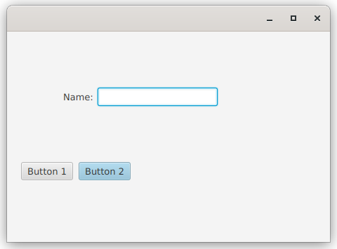
Here’s what it looks like:
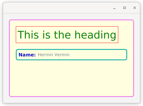
I admit that this is a pretty ugly colour scheme, but it makes it clear how it’s working.
Here’s the stylesheet:
.root {
  -heading-colour: green;
  -prompt-colour: mediumblue;
  -data-colour: slategrey;
  -theme-colour: violet;
  -name-colour: lightseagreen;
  -background-colour: lightyellow;
}

.label-heading {
  -fx-font-size: 35px;
  -fx-text-fill: -heading-colour;
  -fx-border-color: red;
  -fx-border-width: 1px;
  -fx-padding: 5;
}

.label-prompt {
    -fx-font-size: 16px;
    -fx-text-fill: -prompt-colour;
    -fx-font-weight: bold;
}

.label-data {
    -fx-font-size: 14px;
    -fx-text-fill: -data-colour;
}

.border-box {
   -fx-border-color: -theme-colour;
   -fx-border-width: 3px;
   -fx-border-radius: 6px;
   -fx-background-insets: 2px;
   -fx-background-color: -background-colour;
   -fx-background-radius: 6px;
   -fx-padding: 20px;
}

.name-box {
   -fx-border-color: -name-colour;
   -fx-padding: 6px;
}
This is a pretty simple example, but there’s actually a lot going on in it:
-
You have complete stylesheet here, so you can see how the format goes together. It has a “.root” section and then a number of Style Class selectors defined.
-
The wrapper
StackPaneis there so that we can have some padding around the actual content, which makes the border clearer. -
The stylesheet is applied at the wrapper
StackPanelevel, so you can see how it is available to all of theNodescontained within it. -
All of the colours are defined in the .root section of the stylesheet. We’ll see how this makes it easier to change the theme in a little bit.
-
NameBoxhas both the “border-box” and “name-box” selectors applied to it. “name-box” overrides both the padding and the border colour from “border-box”. -
The names of the selectors make sense. The selectors intended to be used for
Labelsall start with “label-“ and then have a suffix indicating the use of theLabel. The “border-box” selector is generic and can be used for any container classNode, while “name-box” is very specific to a particularNodein the layout. -
You can see that stylesheet trumps programmatic settings.
NameBoxattempts to set its padding to 60px programmatically, but clearly this doesn’t happen (you can see from the screen shot), as the stylesheet specifies 6px.
Changing the Theme
Now let’s add a “night mode” to this screen. We’ll use the following stylesheet, called “darkmode.css”. You’ll notice that it is composed entirely of a “.root” section:
.root {
  -heading-colour: darkcyan;
  -prompt-colour: dodgerblue;
  -data-colour: darksalmon;
  -theme-colour: darkviolet;
  -name-colour: #702510;
  -background-colour: #080838;
}
The only change to the code is that we’ll now add the new stylesheet to the StackPane. This stylesheet is added after the “stylesheet1.css” stylesheet, so anything defined in it will override values in “stylesheet1.css”.:
private Region createContent() {
    StackPane stackPane = new StackPane(createMainVBox());
    stackPane.setPadding(new Insets(20));
    stackPane.getStylesheets().add(StyleSheetDemo2.class.getResource("stylesheet1.css").toString());
    stackPane.getStylesheets().add(StyleSheetDemo2.class.getResource("darkmode.css").toString());
    return stackPane;
}
And now it looks like this:
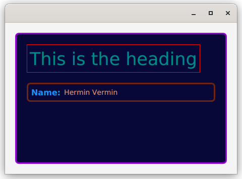
Which is still pretty hideous, but you can see how the colours have all changed because the new “.root” section has redefined the variables.
Understanding and Using the Default StyleSheet: Modena
You need to understand that standard JavaFX Node classes all contain code that links them to a standard, built-in, stylesheet. Earlier versions of JavaFX used a stylesheet called “Caspian”, which was replaced years ago with the current one called “Modena”.
Modena is included in the JavaFX library jar. It’s located at: com/sun/javafx/scene/control/skin/modena. I’ve included a copy of it here. It’s entirely possible that Modena will be updated and changed between releases of JavaFX, so you should probably look at the version that’s included with the JavaFX jar that you’re using. But the version included here is probably close enough to get you started.
The linkage between standard JavaFX Nodes and their styling is created by setting Style Classes on the Nodes and their components. For the most part, these Style Classes are just the names of the Node classes themselves, but in lower case. So Button has the Style Class, “button” added to it, which means that there will be a selector “.button” in the Modena stylesheet.
Some of the Node classes have multiple parts. For instance ScrollPane is way complicated. It has multiple backgrounds and vertical and horizontal ScrollBars. ScrollBars themselves have multiple parts too. They have the tracks that they run on and the things that move along them are called “thumbs”. All of these sub-elements have their own Style Classes which are nested under the main Style Class. We’ll look at this in another tutorial.
In addition, many of the Style Classes support a variety of Pseudo Classes. Pseudo Classes are a way of modifying the styling based on a boolean toggle, essentially on/off. For instance, Button supports the “disabled” Pseudo Class, the “default” Pseudo Class and quite a few others.
I think it’s pretty safe to assume that the people who put together Modena know their way around a stylesheet. Unless you know better you can probably treat the things you see in Modena as “best practices” for stylesheets, and adopt them for your own use. In any event, time spent studying and understanding Modena is highly unlikely to be time wasted.
Button in Modena
To understand how all this works a little better, we’ll look at Button and how it’s defined in Modena:
.button,
.toggle-button,
.radio-button > .radio,
.check-box > .box,
.menu-button,
.choice-box,
.color-picker.split-button > .color-picker-label,
.combo-box-base,
.combo-box-base:editable > .arrow-button {
    -fx-background-color: -fx-shadow-highlight-color, -fx-outer-border, -fx-inner-border, -fx-body-color;
    -fx-background-insets: 0 0 -1 0, 0, 1, 2;
    -fx-background-radius: 3px, 3px, 2px, 1px;
    -fx-padding: 0.333333em 0.666667em 0.333333em 0.666667em; /* 4 8 4 8 */
    -fx-text-fill: -fx-text-base-color;
    -fx-alignment: CENTER;
    -fx-content-display: LEFT;
}
Yuk! It turns out there’s a lot of Button-like things that share the same basic styling. ToggleButtons, MenuButtons, things like that. So, as you can see, you can specify multiple stylesheet selectors to share the same styling. For the rest of this article, I’ll strip out the selectors we’re not interested in to keep things simple.
While we’re here, though. Take a look at “.radio-button > .radio”. What does this mean? This means that RadioButton has a sub-component which is given the Style Class “radio”. It only exists within context of the “radio-button” Style Class. In Modena, that “radio” subclass is styled exactly the same as a Button.
The first thing you should notice about the styling is that Button doesn’t have any borders, but it has 4 different backgrounds. Each of those backgrounds has different insets which means that the ones on top only partially cover up the ones below. Essentially, these create a multi-coloured border.
Almost all of the Style Class definition for Button deals with the border and the backgrounds. This makes sense as a Button is really just a Region with styling to make it look like… a button.
Button doesn’t have any sub-components, but it does have Pseudo Classes, let’s take a look at one of those:
.button:disabled {
    -fx-opacity: 0.4;
}
That’s pretty simple. When a Button is disabled, it’s opacity is set to 40%.
Now let’s look at “focused”
.button:focused {
    -fx-background-color: -fx-focus-color, -fx-inner-border, -fx-body-color, -fx-faint-focus-color, -fx-body-color;
    -fx-background-insets: -0.2, 1, 2, -1.4, 2.6;
    -fx-background-radius: 3, 2, 1, 4, 1;
}
This changes all of the background colours that make up the “border”. The top background colour stays the same, and an extra background is added in.
Let’s look at “armed”. That’s when you click on a Button but haven’t released it yet. It looks like it’s pressed in a little bit:
.button:armed {
    -fx-color: -fx-pressed-base;
}
Now, what does this do? It redefines “-fx-color” within the “.button” selector, when the “armed” Pseudo Class is active.
Sure, but what does this do?
To understand this, we are going to need to understand where those colours come from. So let’s find them:
-fx-base: #ececec;
-fx-color: -fx-base;

-fx-inner-border: linear-gradient(to bottom,
            ladder(
                -fx-color,
                derive(-fx-color,30%) 0%,
                derive(-fx-color,20%) 40%,
                derive(-fx-color,25%) 60%,
                derive(-fx-color,55%) 80%,
                derive(-fx-color,55%) 90%,
                derive(-fx-color,75%) 100%
            ),
            ladder(
                -fx-color,
                derive(-fx-color,20%) 0%,
                derive(-fx-color,10%) 20%,
                derive(-fx-color,5%) 40%,
                derive(-fx-color,-2%) 60%,
                derive(-fx-color,-5%) 100%
            ));


-fx-body-color: linear-gradient(to bottom,
        ladder(
            -fx-color,
            derive(-fx-color,8%) 75%,
            derive(-fx-color,10%) 80%
          ),
        derive(-fx-color,-8%));

-fx-outer-border: derive(-fx-color,-23%);

-fx-pressed-base: derive(-fx-base,-6%);
Now you can see that “-fx-color” is used to derive “-fx-inner-border”, “-fx-outer-border” and “-fx-body-color”. All of which are used in the backgrounds for Button. You don’t need to understand the gradient and ladder stuff at this point, just know that when “-fx-color” changes, so will these other colours.
You can also see that “-fx-pressed-base” is the same colour as “-fx-color”, but 6% darker.
This means that “arming” a Button makes all of the backgrounds except the highlight on the left side go a little bit darker, making it feel like it’s been pressed down.
This is a pretty neat technique, in my opinion. When something is defined outside of “.root”, that definition holds only for the selector in which it is defined. So, in this case, “-fx-color”, which is used to derive a whole bunch of different colours throughout the stylesheet, is redefined just for the selector for the “armed” Pseudo Class for “.button”.
Modifying the Standard Styling
First off, this doesn’t mean that we’re going to make modifications to Modena. You don’t have to. Just add your own stylesheet to the layout, and any definitions in that stylesheet will override the ones that are also in Modena.
None of this need to be complicated. Here’s a few things you can do:
Changing the Colour Scheme
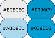
Let’s look at the actual colours that are defined in Modena. There are only about 5 that are used widely, and one of those is just a transparent version of one of the others:
-fx-base: #ececec;
-fx-accent: #0096C9;
-fx-default-button: #ABD8ED;
-fx-focus-color: #039ED3;
-fx-faint-focus-color: #039ED322;
This is what they look like:
Virtually all of the other colours that are used in the stylesheet are derived from these 5 colours. There are a bunch of specialty colours that are used for things like chart lines, but we don’t need to worry about those now.
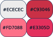
In order to change them, we just need to create a new stylesheet, and put our new definitions into the “.root” section:
.root {
  -fx-accent: #c93046;
  -fx-default-button: #fd7088;
  -fx-focus-color: #e3305d;
  -fx-faint-focus-color: #e3305d22;
}
This is what they look like:
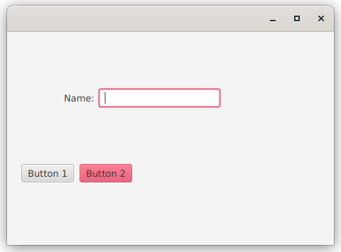
Now let’s put this to use. I’ve used Buttons because they show the colours well, and a TextField because you can see how it gets the “glow” colour around it when it has focus:
public class StyleSheetDemo3 extends Application {

    public static void main(String[] args) {
        launch();
    }

    @Override
    public void start(Stage stage) throws IOException {
        Scene scene = new Scene(createContent(), 460, 300);
        stage.setScene(scene);
        stage.show();
    }

    private Region createContent() {
        StackPane stackPane = new StackPane(createMainVBox());
        stackPane.setPadding(new Insets(20));
        stackPane.getStylesheets().add(StyleSheetDemo3.class.getResource("customcolours.css").toString());
        return stackPane;
    }

    private Region createMainVBox() {
        Label promptLabel = new Label("Name:");
        promptLabel.getStyleClass().add("label-prompt");
        TextField textField = new TextField();
        HBox nameBox = new HBox(6, promptLabel, textField);
        nameBox.setAlignment(Pos.CENTER_LEFT);
        nameBox.setPadding(new Insets(60));
        Button button1 = new Button("Button 1");
        Button button2 = new Button("Button 2");
        button2.setDefaultButton(true);
        HBox buttonBox = new HBox(8, button1, button2);
        VBox vBox = new VBox(20, nameBox, buttonBox);
        vBox.getStyleClass().add("border-box");
        return vBox;
    }
};
This is what it looks like without the custom stylesheet added:
And this is what it looks like with the custom stylesheet:
Global Changes Vs Custom Style Classes
Earlier, I mentioned that a lot of web articles seem to treat overriding a Modena selector as a completely separate approach from creating a new Style Class. But it’s not really, because the base JavaFX Node classes just have a call to getStyleClass().add("{Modena Selector}") in them.
A lot of examples on the web seem to just override the Modena selectors to change particular Nodes in their Scenes. This works okay if you only have one example of that Node class in your scene - like a Scene that has a single TableView in it. Generally speaking, however, this is probably not the best approach to customizing the styling.
It a good idea to write your programs to do exactly what you intend to do. So if you want to change a single instance of a Node class in your scene, then change just a single instance of that Node class - create a Style Class for it and add it to your Node. Globally changing the styling for every instance of that Node class and relying on the fact that you are only using that Node class a single time is sloppy programming.
How to properly use this technique…
Personally, I think the default Modena styling for a disabled Button is horrible. It uses 40% opacity which makes the Button almost disappear. Something like 60% or 70% gets the point across, and looks much better, in my opinion. So I can see putting this in a custom stylesheet:
.button:disabled {
   -fx-opacity: 0.65;
}
And that’s just fine because the intent is to change every Button that appears in the layout.
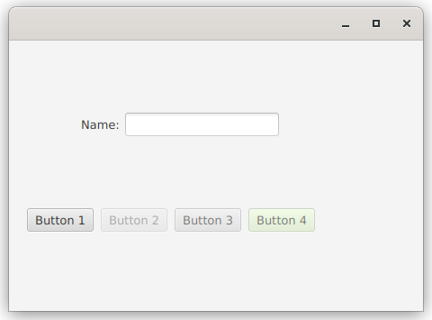
Let’s look at an example where these techniques are mixed together, so that you can see how they work. Still with Buttons:
public class StyleSheetDemo4 extends Application {

    public static void main(String[] args) {
        launch();
    }

    @Override
    public void start(Stage stage) throws IOException {
        Scene scene = new Scene(createContent(), 460, 300);
        stage.setScene(scene);
        stage.show();
    }

    private Region createContent() {
        StackPane stackPane = new StackPane(createMainVBox());
        stackPane.setPadding(new Insets(20));
        stackPane.getStylesheets().add(StyleSheetDemo4.class.getResource("customcolours.css").toString());
        return stackPane;
    }

    private Region createMainVBox() {
        Label promptLabel = new Label("Name:");
        promptLabel.getStyleClass().add("label-prompt");
        TextField textField = new TextField();
        HBox nameBox = new HBox(6, promptLabel, textField);
        nameBox.setAlignment(Pos.CENTER_LEFT);
        nameBox.setPadding(new Insets(60));
        Button button1 = new Button("Button 1");
        Button button2 = new Button("Button 2");
        Button button3 = new Button("Button 3");
        Button button4 = new Button("Button 4");
        button2.getStyleClass().add("modena-button");
        button4.getStyleClass().add("custom-button");
        button2.setDisable(true);
        button3.setDisable(true);
        button4.setDisable(true);
        HBox buttonBox = new HBox(8, button1, button2, button3, button4);
        VBox vBox = new VBox(20, nameBox, buttonBox);
        vBox.getStyleClass().add("border-box");
        return vBox;
    }
};
Here’s the stylesheet:
.button:disabled {
   -fx-opacity: 0.65;
}

.custom-button:disabled {
  -fx-base: ecfed8;
}

.modena-button:disabled {
  -fx-opacity: 0.4;
}
And here’s what it looks like:
Let’s look at what happening with this code and stylesheet:
Button 1 is a normal, enabled Button. It’s there for comparison. Button 3 is a disabled Button with only the standard “.button” Style Class applied. However, since the “.button:disabled” selector has been overridden in the custom stylesheet, it has the opacity of 65%.
Button 2 is a disabled Button with the “modena-button” Style Class added. The selector, “.modena-button:disabled” overrides the overridden default opacity to put it back to 40%, just like it is in Modena. Hence the name “modena-button”. This way you can see how the default Modena styling looks like, side by side with the new styling.
Button 4 is a disabled Button with the “custom-button” Style Class added. The selector “.custom-button:disabled” overrides the value of “-fx-base” to an ugly yellow colour. This changes the colour, but leaves the opacity at 65%.
Even in an example this simple, there are some interesting things to note:
-
If you add a Style Class to a
Nodethat uses Pseudo Classes you automatically get to use those Pseudo Class selectors with that Style Class. -
You can define the Pseudo Class selectors for a Style Class without having to define the base selector for that Style Class. In this case, we define the “disabled” Pseudo Class styles for both “custom-button” and “modena-button” without defining base styles for either Style Class.
-
You can stack styles and override any values that were previously defined in any earlier Style Class.
Conclusion
That’s it. There should be enough information here to get you started using CSS in your JavaFX projects.
If you want more information about how to use Pseudo Classes (it’s way easier than the official JavaDocs would have you think), you can check out this article here: