Introduction
This article/project was inspired by this StackOverflow Question. The OP wanted help creating a “radial menu” for his application. If you’re not familiar with a radial menu, they’re commonly seen in video games (mostly because they work really well with joystick controllers) and they look like this:

This is the example linked to from the original question.
I’m not too sure how useful a radial menu is in a regular, business, application, but I thought it would make for an interesting project and as another example of how to create a custom control by extending Region.
Development Notes
This project didn’t turn out the way I had expected it to. Originally, I had planned to create the menu items as some sort of Pane turned into doughnut wedges via the setShape() function. However, they didn’t behave nicely, and that had to be abandoned.
My next attempt was to build the wedges as Shapes created from Paths, all built at the top of the menu and then rotated around the centre of the menu to their correct places. It would have been a win for the layout, as my intention was to create the Labels at the same time, and I wouldn’t need to worry about rotations when doing the layout.
While that worked better than using Panes, it had some problems. The biggest was that the aspect ratio of the monitor meant that the rated wedges didn’t connect back to make a circle. They connected nicely, but the complete shape was stretched in one dimension. Also, when scaled up during a “mouse” hover, they grew in funny directions, and not straight out from the centre - which was a problem.
Finally, I had no choice but to create each menu “wedge” in its correct place around the menu, and deal with the rotations of the Labels as part of their layout. The result is that the overall design really feels like a disconnected bunch of elements that happen to occupy the same space on the screen. That being said, it works well.
Before we look at any code, let’s take a look at what the final product should look like:
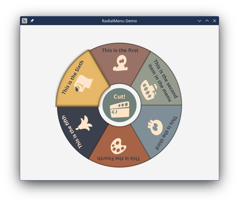
If you look closely, you can see that the menu item labelled, “This is the Sixth”, which has the mouse over it, is a bit bigger and brighter than the others. It’s also more opaque, but it’s hard to tell with the white background. It also has a fuzzy outline from the Bloom effect that’s been added. All of this is easier to see when you’re actually using the menu.
You can also see that the text is upside-down for the three items at the bottom of the menu. I decided to leave this way, as I felt that the added complexity of changing this outweighed the benefits. I was also tempted to find a way to have the text curve to follow along the outer radius - for the same reason.
Finally, some of the geometry gets a bit goofy if the menu only has two or three items, and graphics tend to drift towards the centre. Here again, the complexity needed to correct this outweighed the benefits - who needs a radial menu with two items?
Trigonometry and Path Shapes
This project is highly graphical, and drawing the shapes in the correct place is a big part of the coding.
Trigonometry
There’s no getting around it, for this project you’ll need to understand a little trigonometry. So, let’s jump right into that and get it out of the way:
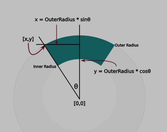
The whole menu looks like a doughnut, and throughout this article we’ll call the pieces of the doughnut that make up the menu items, “wedges”.
The math libraries, for the most part, deal with angles in radians, not degrees. Don’t freak out, a radian is just an amount and just as easy to deal with as degrees. In the same way that there are 360 degrees in a circle, there are 2π radians in a circle. That’s kind of a weird number, but it’s somewhere around 6, meaning that 1 radian is about 60 degrees - just so you can picture that in your head.
Obviously, the size of a wedge is dependent on the number of wedges that make up the menu. Looking at the diagram above, the total angular width of a wedge is 2θ (that’s the angle in the diagram). Since all of our trigonometry is based on that “theta” angle, that’s what we’re going to call it - “theta”.
The angle width of each wedge is 2π divided by the number of menu items (let’s call that numMenuItems), so 2π/numItems. Since θ is 1/2 of that, we can make it π/numMenuItems. We also want the first menu item to point straight up, and since straight up is 0 radians, we need to straddle 0 with our two θ angles. Looking at the diagram, the angles are -θ, and +θ. Going clockwise, the left side of the next wedge would be 1θ, and the right side would be 3θ. And so on.
Mathematically, if we (as programmers do) start counting at 0, then the left side of each wedge is ((2 * itemNumber) - 1) * θ and the right side is ((2 * itemNumber) + 1) * θ. So item number 0 gives -θ and +θ, and item number 2 gives θ and 3θ, and then 3θ and 5θ and so on.
Each corner has an X and Y coordinate based on which multiple of theta that it uses, and which radius it is located on. For X, it’s:
X = radius * sin(θ)
For Y, it’s:
Y = radius * cos(θ)
With θ determined by the formula from above.
Finally, using the standard JavaFX coordinate system, this would put the origin [0,0] in the top left corner of the window. This will result in 3/4 of our menu above or to the left of the window. So we’ll need to translate the whole thing down and to the right. How much? Just a bit more than outer radius. We can just add this offset to every X and Y that we calculate.
Dependencies
This is very important. The geometry of our menu is actually dependent on a very small number of things:
-
Theta(θ) is dependent on the number of menu items. Nothing else, and we can derive it just from knowing how many menu items we have. -
The origin X and Y are entirely dependent on the outer radius.
-
Every corner is dependent on either the inner or outer radius, the origin location, θ and which
itemNumberit is.
We can store all of these dependencies as properties of our class:
private val menuItems = FXCollections.observableArrayList(menuItem1, menuItem2)
private val numItems = Bindings.createIntegerBinding({ menuItems.size }, menuItems)
private val theta: DoubleBinding = Bindings.createDoubleBinding({ PI / numItems.value }, numItems)
private val innerRadiusProperty: StyleableDoubleProperty =
    SimpleStyleableDoubleProperty(INNER_RADIUS_META_DATA, 60.0)
private val outerRadiusProperty: StyleableDoubleProperty =
    SimpleStyleableDoubleProperty(OUTER_RADIUS_META_DATA, 200.0)
private val originX = Bindings.createDoubleBinding({ outerRadiusProperty.value * 1.04 }, outerRadiusProperty)
private val originY = Bindings.createDoubleBinding({ outerRadiusProperty.value * 1.04 }, outerRadiusProperty)
The numItems Property is derived from the size ObservableList holding the menu items. Theta is a binding to that through a formula and the inner and outer radii are StyleableDoubleProperties. OriginX and originY are Bindings based on the outer radius.
Drawing Shapes
JavaFX has a Shape subclass called Path. Path is a closed shape that is constructed by stringing together a set of connected PathElements. Think of Path like drawing the shape with a pencil. You put the pencil down on the paper, then you move it along the paper to the next corner, and then the next and so on.
There’s a number of different PathElements in JavaFX, but we’re going to just use three of them: MoveTo, LineTo and ArcTo. We’ll use MoveTo to get the “pencil” in the right place to start drawing, then we’ll use ArcTo to draw the curves that run along the inner and outer circumfrences of the wedge, and LineTo to draw the straight sides. Actually, we won’t draw the left side because we’ll end at the fourth corner and JavaFX will automatically draw the line to our starting point and close the shape for us.
Our path is going to look like this:
  MoveTo the outer left corner
  ArcTo the outer right corner
  LineTo the inner right corner
  ArcTo the inner left corner
  Auto-close
But here’s the thing: Each of those PathElements is a JavaFX object of it own. This means that each one has Properties! ArcTo, for instance has properties for RadiusX and RadiusY (it allows of ellipse curves), and the destination X and Y. This means that each of these properties can be bound to the two or three Properties of our class that it depends on. Then if the number of menu items changes, or the inner or outer radius are changed, the shapes will automatically adapt and always be correct.
Let’s take a look at that:
private fun createShape(itemNumber: Int) = Path().apply {
    styleClass += "wedge"
    elements += MoveTo().apply {
        xProperty().bind(xBinding(theta.multiply((itemNumber * 2) - 1), outerRadiusProperty))
        yProperty().bind(yBinding(theta.multiply((itemNumber * 2) - 1), outerRadiusProperty))
    }
    elements += ArcTo().apply {
        radiusXProperty().bind(outerRadiusProperty)
        radiusYProperty().bind(outerRadiusProperty)
        isSweepFlag = true
        isLargeArcFlag = false
        xProperty().bind(xBinding(theta.multiply((itemNumber * 2) + 1), outerRadiusProperty))
        yProperty().bind(yBinding(theta.multiply((itemNumber * 2) + 1), outerRadiusProperty))
    }
    elements += LineTo().apply {
        xProperty().bind(xBinding(theta.multiply((itemNumber * 2) + 1), innerRadiusProperty))
        yProperty().bind(yBinding(theta.multiply((itemNumber * 2) + 1), innerRadiusProperty))
    }
    elements += ArcTo().apply {
        radiusXProperty().bind(innerRadiusProperty)
        radiusYProperty().bind(innerRadiusProperty)
        isSweepFlag = false
        xProperty().bind(xBinding(theta.multiply((itemNumber * 2) - 1), innerRadiusProperty))
        yProperty().bind(yBinding(theta.multiply((itemNumber * 2) - 1), innerRadiusProperty))
    }
}
The isSweepFlag and isLargeArcFlag determine which direction the curve of the arc goes, and whether the arc takes the shortest route between the two points or not. The JavaDocs are actually pretty good at describing this.
Menu Items
The Presentation Model for each menu item is the class RadialMenuModel:
class RadialMenuModel(
    initialText: String,
    initialGraphic: Node,
    val action: () -> Unit,
    isDisable: Boolean = false,
    val effect: Effect = Bloom(0.2)
) {
    val disable: BooleanProperty = SimpleBooleanProperty(isDisable)
    val text: StringProperty = SimpleStringProperty(initialText)
    val graphic: ObjectProperty<Node> = SimpleObjectProperty(initialGraphic)
}
We have a field for the text and graphic components of the Label that will appear in the menu wedge, a functional element equivalent to a Java Runnable for the menu action and then an Effect that will be used when the menu item is hovered over. This effect field has a default which is Bloom(0.2).
A new menu wedge can be created by instantiating a RadialMenuModel and then adding via the RadialMenu.addMenuItem() function.
The Labels
The contents of the menu wedges is just a Label. Here, it’s necessary to instantiate the Label and then translate it to the correct position and the use a Rotation transformation to keep it oriented downwards to the centre of the menu.
The tricky part here is that the placement of the items in JavaFX is done via the [0,0] location in the Node, which is the top-left corner. Because of the layout of the Label in this case, that’s the top left corner of the Text enclosed in it (or pretty close).
So, where does this top left corner go?
Well, it depends on the amount of Text, which will determine how wide the Label is. Essentially, we need to get coordinates of the centre angle of the wedge just a bit in from the outer radius, and then shift it counterclockwise by 1/2 the width of the Label. Everything is done in terms of bindings, too. It’s finicky, but the solution in the code seems to work well enough:
private fun createLabel(radialMenuModel: RadialMenuModel, itemNumber: Int) =
    labelOf(radialMenuModel.text, "contents", radialMenuModel.graphic).apply {
        isMouseTransparent = true
        maxWidthProperty().bind(xBinding(theta, outerRadiusProperty).subtract(originX).multiply(1.5))
        translateXProperty().bind(
            xBinding(
                theta.multiply(itemNumber * 2.0).subtract(widthProperty().divide(2).divide(outerRadiusProperty)),
                outerRadiusProperty.multiply(0.98)
            )
        )
        translateYProperty().bind(
            yBinding(
                theta.multiply(itemNumber * 2.0).subtract(widthProperty().divide(2).divide(outerRadiusProperty)),
                outerRadiusProperty.multiply((0.98))
            )
        )
        transforms += Rotate(((theta.value * itemNumber) / PI) * 360.0, 0.0, 0.0).apply {
            angleProperty().bind(
                Bindings.createDoubleBinding(
                    { (this@RadialMenu.theta.value * itemNumber * 360) / PI },
                    this@RadialMenu.theta
                )
            )
        }
    }
Disabling Menu Items
This was a happy surprise. I checked and found that the disable property is inherited from Node - way, way up the hierachy. This also means that both Group and Shape have a disable property. This was counter-intuitive to me. Disable makes sense for controls like Button or TextField, but not so much for Nodes like Shape. So I tried it.
I added a BooleanProperty called disable to RadialMenuItem and the bound the disable property of the Group that holds the wedge and the Label. I set up the sixth item to have its diable set to true. Bingo! It just worked. The wedge no longer responded to hover or mouse clicks. It also inherited some default styling from the Modena style sheet, which basically made it more transparent.
Styling
The idea for this project was to create a control which, for the programmer, has the same kind of interface as any other control. This means making its styling configurable via CSS, just like any other JavaFX Node. For the most part, this done by giving the menu and the menu items specific styleclass selectors. Which then allows standard JavaFX styling elements to be used.
There are two elements, the inner and outer radii, that need to be available via CSS, so these two parameters are implemented via StyleableDoubleProperty, which then needs to be configured to connect to the CSS. Let’s take a look at these. First, the Properties themselves:
private val innerRadiusProperty: StyleableDoubleProperty =
    SimpleStyleableDoubleProperty(INNER_RADIUS_META_DATA, 60.0)
private val outerRadiusProperty: StyleableDoubleProperty =
    SimpleStyleableDoubleProperty(OUTER_RADIUS_META_DATA, 200.0)
These are both straight-forward. They’re just regular Properties with tag for the CSS metadata that they link to.
And now the configuration stuff where that CSS metadata is defined:
companion object CssStuff {
    val OUTER_RADIUS_META_DATA: CssMetaData<RadialMenu, Number> =
        object : CssMetaData<RadialMenu, Number>("-rm-outer-radius", StyleConverter.getSizeConverter()) {
            override fun isSettable(styleable: RadialMenu) = !styleable.outerRadiusProperty.isBound
            override fun getStyleableProperty(styleable: RadialMenu) = styleable.outerRadiusProperty
        }
    val INNER_RADIUS_META_DATA: CssMetaData<RadialMenu, Number> =
        object : CssMetaData<RadialMenu, Number>("-rm-inner-radius", StyleConverter.getSizeConverter()) {
            override fun isSettable(styleable: RadialMenu) = !styleable.innerRadiusProperty.isBound
            override fun getStyleableProperty(styleable: RadialMenu) = styleable.innerRadiusProperty
        }
    private val cssMetaDataList =
        (Region.getClassCssMetaData() + OUTER_RADIUS_META_DATA + INNER_RADIUS_META_DATA) as MutableList
     fun getClassCssMetaData() = cssMetaDataList
    }
override fun getCssMetaData() = getClassCssMetaData()
This type of code is explained in detail in another article, you can read about it here.
In a nutshell, we’re instantiating two anonymous inner classes that extend CssMetaData and linking them to our two StyleableDoubleProperties. Then we add these two objects to the cssMetaDataList that comes from our parent class, which is Region. Finally, we provide the functions so that the JavaFX layout engine can find this metadata and connect it to the actual CSS files for the Scene.
This code is all pretty much boilerplate, but you should note that the two styleclass selectors that it creates are -rm-outer-radius and -rm-inner-radius. Those are the selectors that we’ll need to use in our stylesheet.
Styleclass Selectors and Colours
The entire Radial Menu is given the selector radial-menu.
Each menu item is given two selectors: radial-menu-item and radial-menu-item-{itemNumber}. So we have radial-menu-item-0 and radial-menu-item-1 and so on. The label in each item is given the selector: contents.
The central circle is given the selector centre. The Label in the centre is given the selector centre-contents. The central Circle and the Label aren’t contained in a group, so the Label selector isn’t nested inside the centre selector.
I checked the JavaFX source code for some routines like Color.saturate() to see how they work. Bascially, these routines convert the colours to HSB (Hue, Saturation, Brightness) and then manipulate the saturation and brightness elements of the colour. That gave me some insight into how to define the colours so that it was easy to come up with two versions of each colour - one for the “normal” status, and one for the “hover” status.
I came up with a pallet of complementary pastel colours and got their HSB definitions. I decided on a two stage approach to colour definition. First I would define them as “named” colours; one for normal and then a saturated version. Like this:
-brown-sugar: hsb(11, 42%, 54%);
-s-brown-sugar: hsb(11, 52%, 45%);
You can see that, in this case, the saturated version has the saturation parameter raised, and the brightness dropped, so it should be darker but more vibrant. Darker base colours need the brightness raised for the saturated version.
I think that the HSB definitions made it super easy to fine tune the colours once I saw them running in the application. I even adjusted the hue on a couple of them when I thought that they were too similar. It would have been way, way more troublesome having to adjust the RGB value in a hex definition of the colours.
And then I would assign them to “colour roles” with names that linked them to the RadialMenu. Like this:
-rm-colour-0: -brown-sugar;
-rm-saturate-0: -s-brown-sugar;
I used the “-rm” prefix to avoid collisions with the Modena namespace. This gave me two colours for each menu item.
To implement the colours, I used a standard “trick” from Modena:
.radial-menu-item .wedge {
  -fx-fill: -rm-fill-colour;
}

.radial-menu-item .wedge:hover {
  -rm-fill-colour: -rm-saturate-colour;
}

.radial-menu-item-0 {
  -rm-fill-colour: -rm-colour-0;
  -rm-saturate-colour: -rm-saturate-0;
}
(Note that this snippet just has the colour stuff, other styling info has been stripped out.)
The “trick” here is to define a standard colour, -rm-fill-colour, using it in the base radial-menu-item selector, then redefine it for the hover status. In this case, it’s a standard colour called -rm-saturate-colour. Default values for these colours are defined in the .root section. Finally, the standard definitions for these colours are overridden in the context of the specific menu items.
Using this technique, we don’t have to define two states, “normal” and “hover” for each menu item, which keeps the stylesheet a bit simpler.
The colour scheme can be completely changed without touching anything other than the definitions created in the .root section.
The Stylesheet
Here’ the whole stylesheet, so you can see how it hangs together:
.root {
  -brown-sugar: hsb(11, 42%, 54%);
  -s-brown-sugar: hsb(11, 52%, 45%);
  -sage: hsb(83, 12%, 55%);
  -s-sage: hsb(83, 23%, 35%);
  -air-force-blue: hsb(199, 20%, 53%);
  -s-air-force-blue: hsb(199, 35%, 45%);
  -burnt-sienna: hsb(19, 75%, 60%);
  -s-burnt-sienna: hsb(19, 85%, 45%);
  -space-cadet: hsb(227, 42%, 19%);
  -s-space-cadet: hsb(227, 65%, 40%);
  -lion: hsb(38, 47%, 57%);
  -s-lion: hsb(38, 65%, 45%);
  -feldgrau: hsb(159, 30%, 31%);
  -s-feldgrau: hsb(159, 40%, 31%);
  -rm-colour-0: -brown-sugar;
  -rm-saturate-0: -s-brown-sugar;
  -rm-colour-1: -sage;
  -rm-saturate-1: -s-sage;
  -rm-colour-2: -air-force-blue;
  -rm-saturate-2: -s-air-force-blue;
  -rm-colour-3: -burnt-sienna;
  -rm-saturate-3: -s-burnt-sienna;
  -rm-colour-4: -space-cadet;
  -rm-saturate-4: -s-space-cadet;
  -rm-colour-5: -lion;
  -rm-saturate-5: -s-lion;
  -rm-colour-c: -feldgrau;
  -rm-saturate-c: -s-feldgrau;
  -rm-fill-colour: -feldgrau;
  -rm-saturate-colour: -s-feldgrau;
}

.radial-menu {
  -rm-outer-radius: 200.0;
  -rm-inner-radius: 70.0;
}

.radial-menu .centre {
  -fx-fill: -rm-colour-c;
  -fx-opacity: 0.7;
}

.radial-menu .centre:hover {
  -fx-fill: -rm-saturate-c;
  -fx-opacity: 0.99;
  -fx-scale-x: 1.1;
  -fx-scale-y: 1.1;
}

.radial-menu-item {
  -fx-opacity: 0.85;
}

.radial-menu-item .contents {
  -fx-text-fill: ladder(-rm-fill-colour, BISQUE 34%, -space-cadet 35%);
  -fx-font-weight: bold;
  -fx-font-size: 16px;
  -fx-wrap-text: true;
  -fx-text-alignment: center;
  -fx-content-display: bottom;
}

.radial-menu-item .wedge {
  -fx-fill: -rm-fill-colour;
  -fx-stroke: derive(-rm-fill-colour, -40%);
  -fx-stroke-width: 3px;
}

.radial-menu-item .wedge:hover {
  -rm-fill-colour: -rm-saturate-colour;
  -fx-scale-x: 1.05;
  -fx-scale-y: 1.05;
  -fx-opacity: 1.0;
}

.radial-menu-item-0 {
  -rm-fill-colour: -rm-colour-0;
  -rm-saturate-colour: -rm-saturate-0;
}

.radial-menu-item-1 {
  -rm-fill-colour: -rm-colour-1;
  -rm-saturate-colour: -rm-saturate-1;
}

.radial-menu-item-2 {
  -rm-fill-colour: -rm-colour-2;
  -rm-saturate-colour: -rm-saturate-2;
}

.radial-menu-item-3 {
  -rm-fill-colour: -rm-colour-3;
  -rm-saturate-colour: -rm-saturate-3;
}

.radial-menu-item-4 {
  -rm-fill-colour: -rm-colour-4;
  -rm-saturate-colour: -rm-saturate-4;
}

.radial-menu-item-5 {
  -rm-fill-colour: -rm-colour-5;
  -rm-saturate-colour: -rm-saturate-5;
}

.radial-menu-item-6 {
  -rm-fill-colour: -rm-colour-6;
  -rm-saturate-colour: -rm-saturate-6;
}

.wrapper-region {
   -fx-background-colour: linear-gradient(to bottom, deepskyblue, khaki);
}
Putting it All Together
The centre section is pretty staight-forward, as there are no translations involving angles. Also, the centre isn’t put into a Group as there’s no need to handle toFront() for it.
Here’s the code for the RadialMenu all in one place:
class RadialMenu(
    menuItem1: RadialMenuModel,
    menuItem2: RadialMenuModel,
    centreMenuItem: RadialMenuModel,
    vararg additionalMenuItems: RadialMenuModel
) : Pane() {

    private val menuItems = FXCollections.observableArrayList(menuItem1, menuItem2)
    private val numItems = Bindings.createIntegerBinding({ menuItems.size }, menuItems)
    private val theta: DoubleBinding = Bindings.createDoubleBinding({ PI / numItems.value }, numItems)
    private val innerRadiusProperty: StyleableDoubleProperty =
        SimpleStyleableDoubleProperty(INNER_RADIUS_META_DATA, 60.0)
    private val outerRadiusProperty: StyleableDoubleProperty =
        SimpleStyleableDoubleProperty(OUTER_RADIUS_META_DATA, 200.0)
    private val originX = Bindings.createDoubleBinding({ outerRadiusProperty.value * 1.04 }, outerRadiusProperty)
    private val originY = Bindings.createDoubleBinding({ outerRadiusProperty.value * 1.04 }, outerRadiusProperty)

    companion object CssStuff {
        val OUTER_RADIUS_META_DATA: CssMetaData<RadialMenu, Number> =
            object : CssMetaData<RadialMenu, Number>("-rm-outer-radius", StyleConverter.getSizeConverter()) {
                override fun isSettable(styleable: RadialMenu) = !styleable.outerRadiusProperty.isBound
                override fun getStyleableProperty(styleable: RadialMenu) = styleable.outerRadiusProperty
            }
        val INNER_RADIUS_META_DATA: CssMetaData<RadialMenu, Number> =
            object : CssMetaData<RadialMenu, Number>("-rm-inner-radius", StyleConverter.getSizeConverter()) {
                override fun isSettable(styleable: RadialMenu) = !styleable.innerRadiusProperty.isBound
                override fun getStyleableProperty(styleable: RadialMenu) = styleable.innerRadiusProperty
            }
        private val cssMetaDataList =
            (Region.getClassCssMetaData() + OUTER_RADIUS_META_DATA + INNER_RADIUS_META_DATA) as MutableList

        fun getClassCssMetaData() = cssMetaDataList
    }

    override fun getCssMetaData() = getClassCssMetaData()

    fun outerRadiusProperty() = outerRadiusProperty
    fun innerRadiusProperty() = innerRadiusProperty
    var outerRadius: Double
        get() = outerRadiusProperty.get()
        set(value) = outerRadiusProperty.set(value)
    var innerRadius: Double
        get() = innerRadiusProperty.get()
        set(value) = innerRadiusProperty.set(value)

    init {
        styleClass += "radial-menu"
        children += createMenuItem(0, menuItem1)
        children += createMenuItem(1, menuItem2)
        children += createCentre(centreMenuItem)
        children += createCentreLabel(centreMenuItem)
        addMenuItem(*additionalMenuItems)
        minHeight = 2.08 * outerRadiusProperty.value
        minWidth = 2.08 * outerRadiusProperty.value
    }

    fun addMenuItem(vararg radialMenuModels: RadialMenuModel) {
        radialMenuModels.forEach { radialMenuItem ->
            menuItems += radialMenuItem
            children += createMenuItem(numItems.value - 1, radialMenuItem)
        }
    }

    private fun createCentre(radialMenuModel: RadialMenuModel) = Circle().apply {
        styleClass += "centre"
        centerXProperty().bind(originX)
        centerYProperty().bind(originX)
        radiusProperty().bind(innerRadiusProperty.subtract(15.0))
        onMouseClicked = EventHandler { radialMenuModel.action.invoke() }
        onMouseEntered = EventHandler { effect = radialMenuModel.effect }
        onMouseExited = EventHandler { effect = null }
    }

    private fun createCentreLabel(radialMenuModel: RadialMenuModel) =
        labelOf(radialMenuModel.text, "centre-contents", radialMenuModel.graphic).apply {
            this.translateXProperty().bind(originX.subtract(this.widthProperty().divide(2)))
            this.translateYProperty().bind(originY.subtract(this.heightProperty().divide(2)))
            isMouseTransparent = true
        }

    private fun createMenuItem(itemNumber: Int, radialMenuModel: RadialMenuModel) = Group().apply {
        val wedge = createShape(itemNumber)
        disableProperty().bind(radialMenuModel.disable)
        styleClass += "radial-menu-item"
        styleClass += "radial-menu-item-$itemNumber"
        maxWidth = outerRadiusProperty.value * 2.0
        children += wedge
        children += createLabel(radialMenuModel, itemNumber)
        wedge.onMouseEntered = EventHandler {
            toFront()
            wedge.effect = radialMenuModel.effect
        }
        wedge.onMouseExited = EventHandler { wedge.effect = null }
        wedge.onMouseClicked = EventHandler<MouseEvent> { radialMenuModel.action.invoke() }
    }

    private fun createLabel(radialMenuModel: RadialMenuModel, itemNumber: Int) =
        labelOf(radialMenuModel.text, "contents", radialMenuModel.graphic).apply {
            isMouseTransparent = true
            maxWidthProperty().bind(xBinding(theta, outerRadiusProperty).subtract(originX).multiply(1.5))
            translateXProperty().bind(
                xBinding(
                    theta.multiply(itemNumber * 2.0).subtract(widthProperty().divide(2).divide(outerRadiusProperty)),
                    outerRadiusProperty.multiply(0.98)
                )
            )
            translateYProperty().bind(
                yBinding(
                    theta.multiply(itemNumber * 2.0).subtract(widthProperty().divide(2).divide(outerRadiusProperty)),
                    outerRadiusProperty.multiply((0.98))
                )
            )
            transforms += Rotate(((theta.value * itemNumber) / PI) * 360.0, 0.0, 0.0).apply {
                angleProperty().bind(
                    Bindings.createDoubleBinding(
                        { (this@RadialMenu.theta.value * itemNumber * 360) / PI },
                        this@RadialMenu.theta
                    )
                )
            }
        }

    private fun getX(origin: Double, angle: Double, radius: Double) = origin + (radius * sin(angle))
    private fun getY(origin: Double, angle: Double, radius: Double) = origin - (radius * cos(angle))

    private fun xBinding(angle: ObservableDoubleValue, radius: ObservableDoubleValue) =
        Bindings.createDoubleBinding({ getX(originX.value, angle.get(), radius.get()) }, angle, radius, originX)

    private fun yBinding(angle: ObservableDoubleValue, radius: ObservableDoubleValue) =
        Bindings.createDoubleBinding({ getY(originY.value, angle.get(), radius.get()) }, angle, radius, originY)

    private fun createShape(itemNumber: Int) = Path().apply {
        styleClass += "wedge"
        elements += MoveTo().apply {
            xProperty().bind(xBinding(theta.multiply((itemNumber * 2) - 1), outerRadiusProperty))
            yProperty().bind(yBinding(theta.multiply((itemNumber * 2) - 1), outerRadiusProperty))
        }
        elements += ArcTo().apply {
            radiusXProperty().bind(outerRadiusProperty)
            radiusYProperty().bind(outerRadiusProperty)
            isSweepFlag = true
            isLargeArcFlag = false
            xProperty().bind(xBinding(theta.multiply((itemNumber * 2) + 1), outerRadiusProperty))
            yProperty().bind(yBinding(theta.multiply((itemNumber * 2) + 1), outerRadiusProperty))
        }
        elements += LineTo().apply {
            xProperty().bind(xBinding(theta.multiply((itemNumber * 2) + 1), innerRadiusProperty))
            yProperty().bind(yBinding(theta.multiply((itemNumber * 2) + 1), innerRadiusProperty))
        }
        elements += ArcTo().apply {
            radiusXProperty().bind(innerRadiusProperty)
            radiusYProperty().bind(innerRadiusProperty)
            isSweepFlag = false
            xProperty().bind(xBinding(theta.multiply((itemNumber * 2) - 1), innerRadiusProperty))
            yProperty().bind(yBinding(theta.multiply((itemNumber * 2) - 1), innerRadiusProperty))
        }
        toBack()
    }
}
The Application
Here’s the code for my sample application that draws the RadialMenu:
class RadialMenuApplication : Application() {
    override fun start(stage: Stage) {
        val scene = Scene(createContent { Platform.exit() }, 640.0, 500.0).apply {
            addStyleSheet("/css/RadialMenu.css")
            addWidgetStyles()
        }
        stage.title = "RadialMenu Demo"
        stage.scene = scene
        stage.show()
    }

    private fun createContent(exitAction: () -> Unit) = BorderPane().apply {
        val menu = RadialMenu(
            RadialMenuModel(
                "This is the first",
                FontIcon("captainicon-049:52:BISQUE"),
                { println("First item selected") }),
            RadialMenuModel(
                "This is the second item in the menu",
                FontIcon("captainicon-176:52:BISQUE"),
                { println("Second item selected") }),
            RadialMenuModel("Cut!", FontIcon("captainicon-238:52:BISQUE"), { exitAction.invoke() })
        )
        menu.addMenuItem(
            RadialMenuModel(
                "This is the third",
                FontIcon("captainicon-066:52:BISQUE"),
                { println("Third item selected") }),
            RadialMenuModel(
                "This is the Fourth",
                FontIcon("captainicon-039:52:BISQUE"),
                { println("Fourth item selected") }),
            RadialMenuModel(
                "This is the fifth",
                FontIcon("captainicon-154:52:BISQUE"),
                { println("Fifth item selected") }),
            RadialMenuModel(
                "This is the Sixth",
                FontIcon("captainicon-271:52:BISQUE"),
                { println("Sixth item selected") }, true
            )
        )
        center = menu
        padding = Insets(50.0)
        styleClass += "wrapper-region"
    }
}

fun main() {
    Application.launch(RadialMenuApplication::class.java)
}
I used the Ikonli package which gives excellent integration with FontAwesome for JavaFX. This gives FontIcon, which is an extension of Text that shows icons. There’s lots of good icons spread across several dozen icon packs made by various people. I used the Captionicon pack for this project.
Conclusion
I felt like this was a fun project, even if it isn’t really all that useful for a typical CRUD type business application. It’s a lot more about graphical drawing and layout than it is about functionality, but it has some interesting concepts that are worth learning about.
As an example of how to build a custom control by extending Region, I think it also has some merit. In fact, the extreme focus on the graphics shows that even this kind of approach can lend itself to creating a general purpose control that you can fit into any kind of application.
How to Implement the RadialMenu
This is different from most other kinds of controls because it’s intended to be superimposed over top of the other elements in the window, take over the screen and then disappear when an item is selected.
So, how do you do that?
My approach would be to put the main content pane of the application and the RadialMenu into a StackPane, with the RadialMenu added last and not visible. Whatever action in the main application would make the toggle the isVisible flag of the RadialMenu to true, and any action from the menu would toggle it back to false. You’d probably want to set the PickOnBounds property of the RadialMenu to true so that items under the RadialMenu in the main application screen are disabled.