Introduction
This is Part II in a series about creating custom controls that starts with this article. In the first instalment, we looked at how to look at DRY as the gateway technique towards viewing everything in your layout as a custom control and then examined the basic techniques to create custom controls.
The final result of Part I was a custom control made by extending the standard Region class of JavaFX. This is useful because the method Region.getChildren() is protected, which means that we won’t be exposing the implementation of our control to the client code.
In this article, we’re going to look at how to complete the setup of our custom control to turn it into a true utility class that is virtually indistinguishable from the standard JavaFX Node classes, and can be used and styled in exactly the same ways.
Our Example
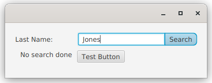
For this tutorial we’re going to continue (from the previous article) to work with a control that looks like this:
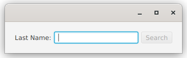
It’s an HBox with a Label, a TextField and a Button in it. When the TextField has focus, then the Button becomes the default button, so you can just type in the TextField and hit
The Original Version - Extended From Region
In the first part of this series, we created a class that extends from Region, which means that the client code can’t mess with its implementation:
class CustomRegion(private val labelText: String,
                   private val buttonText: String,
                   private val boundProperty: StringProperty) : Region() {

   private var buttonAction: ButtonRunner = {}
   private val actionRunning: BooleanProperty = SimpleBooleanProperty(false)
   private val hBox: HBox

   init {
      hBox = createLayout()
      children.add(hBox)
   }

   private fun createLayout() = HBox().apply {
      val textField = TextField().apply { textProperty().bindBidirectional(boundProperty) }
      children += Label(labelText)
      children += textField
      children += Button(buttonText).apply {
         onAction = EventHandler<ActionEvent> {
            actionRunning.value = true
            buttonAction { actionRunning.value = false }
         }
         defaultButtonProperty().bind(textField.focusedProperty().and(textField.textProperty().isNotEmpty))
         disableProperty().bind((textField.textProperty().isEmpty).or(actionRunning))
      }
      alignment = Pos.CENTER_LEFT
   }

   fun setButtonAction(newAction: ButtonRunner) = this.apply {
      buttonAction = newAction
   }

   fun withSpacing(newSpacing: Double) = this.apply { hBox.spacing = newSpacing }
}
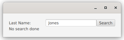
And it was called from this:
class RegionStyle : Application() {

   private val name: StringProperty = SimpleStringProperty("")
   private val results: StringProperty = SimpleStringProperty("No search done")

   override fun start(stage: Stage) {
      stage.scene = Scene(createContent())
      stage.show()
   }

   private fun createContent(): Region = BorderPane().apply {
      center = CustomRegion("Last Name:", "Search", name).setButtonAction { postRunAction ->
         doSearch()
         PauseTransition(Duration(3000.0)).apply {
            onFinished = EventHandler { postRunAction.run() }
            play()
         }
      }.withSpacing(50.0)
      bottom = Label().apply { textProperty().bind(results) }
      padding = Insets(20.0)
   }

   private fun doSearch() {
      results.value = "Nothing found for: ${name.value}"
   }
}

fun main() = Application.launch(RegionStyle::class.java)
Adding More Client Options
This original version is okay, but the implementation is specific in its layout, and doesn’t really allow client code to adjust it for a wide range of applications. The first thing we’ll do is create some delegate properties to the component Node properties:
class InputActionWidget1(private val boundProperty: StringProperty,
                         labelText: String = "Prompt:",
                         buttonText: String = "Start") : Region() {

   private var buttonAction: ButtonRunner = {}
   private val actionRunning: BooleanProperty = SimpleBooleanProperty(false)
   private val hBox: HBox
   private val label = Label(labelText)
   private val textField = TextField()
   private val button = Button(buttonText)
   var labelText: String
      get() = label.text
      set(value) = run { label.text = value }
   val labelTextProperty: StringProperty
      get() = label.textProperty()
   var buttonText: String
      get() = button.text
      set(value) = run { button.text = value }
   val buttonTextProperty: StringProperty
      get() = button.textProperty()
   var textFieldText: String
      get() = textField.text
      set(value) = run { textField.text = value }
   val textFieldTextProperty: StringProperty
      get() = textField.textProperty()

   init {
      hBox = createLayout()
      children.add(hBox)
   }

   private fun createLayout() = HBox().apply {
      children += listOf(label, textField, button)
      textFieldTextProperty.bindBidirectional(boundProperty)
      configureButton()
      alignment = Pos.CENTER_LEFT
   }

   private fun configureButton() {
      button.apply {
         onAction = EventHandler<ActionEvent> {
            actionRunning.value = true
            buttonAction { actionRunning.value = false }
         }
         defaultButtonProperty().bind(textField.focusedProperty().and(textField.textProperty().isNotEmpty))
         disableProperty().bind((textField.textProperty().isEmpty).or(actionRunning))
      }
   }

   fun setButtonAction(newAction: ButtonRunner) = this.apply {
      buttonAction = newAction
   }

   fun withSpacing(newSpacing: Double) = this.apply { hBox.spacing = newSpacing }
}
Here’s what we’ve done:
- Changed the Name
- The original name, “CustomRegion” didn’t really say anything about what this control does. The new name “InputActionWidget” describes what it does a bit better. It takes some input, then performs an action on it.
- Delegate Fields for Node Text Properties
- The
Button,LabelandTextFieldall have a “Text” property. We’ve created delegate fields for all of these properties so that we can access them from the client code. Kotlin makes this approach really easy, but you can do the same thing with Java methods that just delegate to theNodeproperties. These all have unique names, liketextFieldText, in our custom control. - Default Constructor Values
- This is another Kotlin bonus, but you can do the same thing in Java by supplying additional constructors that take different parameters. In order to make this work cleanly, the only mandatory parameter,
boundPropertyhas been moved to the front. - Cleaned Up createLayout()
- Now that we have all of the
Nodesinstantiated as fields, it makes sense to clean up the layout code and move theButtonconfiguration into its own method.
This version is a bit more versatile than the original one.
Cleaning up the Layout
The layout of our custom class is a bit lame. Let’s try making the Button and the TextField look more like a single element.
The first thing we can do is to remove the space between them. This is done easiest by putting them in their own HBox and setting the spacing in that HBox to zero. We change this line:
children += listOf(label, textField, button)
to this:
children += listOf(label, HBox(0.0, textField, button))
The result looks like this:
Adding Styling
That doesn’t look too bad, but the Button and the TextField look more like they’re squished up together than attached to each other as a single thing. It’s the rounded corners that cause the problem. Let’s fix that.
To do this, we need to understand nested style classes in the CSS file. The first thing that we’re going to do is to add a style class for our custom region, we’ll call it “input-action-widget”. We’ll add a line to init{}:
init {
   styleClass += "input-action-widget"
   hBox = createLayout()
   children.add(hBox)
}
The styling for Buttons in Modena doesn’t have borders, but it has a set of backgrounds stacked on top of each other with different insets. The effect looks like a border with shadows and highlights, but it’s not actually a border.
In our StyleSheet, we’ll add this:
.input-action-widget .button {
      -fx-background-radius: 0 7 7 0px, 0 7 7 0px, 0 6 6 0px, 0 5 5 0px;
}
This changes the styling for any Buttons in our custom class to be rounded on the right side, and square on the left. I’ve added a Button to the layout outside the custom class so you can see the difference:
You can see that the nested styling is working. We need to do the same for the TextField, making the right side have sharp corners.
Now we need to have the Button have the same kind of focus highlighting that the TextField does but when the TextField has focus. We’re looking for this:
This is a little bit trickier to achieve. To do this, we need to create a new PseudoClass for the Button to be true when the TextField has focus. If you’re confused about PseudoClases, then you can look at this article which explains the concept. Next, we put a ChangeListener on the FocusProperty of the TextField and trigger a state change in the PseudoClass through it. Finally, we create a CSS entry for it.
Here’s the code that does this:
companion object PseudoClasses {
    val TEXTFIELD_FOCUSED: PseudoClass = PseudoClass.getPseudoClass("textfield-focused");
}

init {
    styleClass += "input-action-widget"
    hBox = createLayout()
    children.add(hBox)
    textField.focusedProperty().addListener { observable, oldValue, newValue ->
       button.pseudoClassStateChanged(TEXTFIELD_FOCUSED, newValue);
    }
}
A companion object is the Kotlin way to do something like static elements. It’s actual a nested singleton, but that’s not really important. Kotlin let’s you refer to its members without specifying the companion object. In the init{} block we connect the PseudoClass to textField.focusedProperty() with a ChangeListener. Now our PseudoClass will stay synchronized with the FocusedProperty of the TextField.
Here’s the StyleSheet entry for the PseudoClass
.input-action-widget .button:textfield-focused {
   -fx-background-color: -fx-focus-color, -fx-outer-border, -fx-inner-border, -fx-body-color;
   -fx-background-insets: -0.5, 0.7,1.3, 2;
}
This was figured out by looking at the Modena stylesheet and putting together the outside blue ring of TextField onto the inner colours of Button.
In the end, it now looks and acts very much like a single control.
The Code So Far
Here’s the entire code for InputActionWidget2 so far:
class InputActionWidget2(private val boundProperty: StringProperty,
                         labelText: String = "Prompt:",
                         buttonText: String = "Start") : Region() {

   private var buttonAction: ButtonRunner = {}
   private val actionRunning: BooleanProperty = SimpleBooleanProperty(false)
   private val label = Label(labelText)
   private val textField = TextField()
   private val button = Button(buttonText)
   var labelText: String
      get() = label.text
      set(value) = run { label.text = value }
   val labelTextProperty: StringProperty
      get() = label.textProperty()
   var buttonText: String
      get() = button.text
      set(value) = run { button.text = value }
   val buttonTextProperty: StringProperty
      get() = button.textProperty()
   var textFieldText: String
      get() = textField.text
      set(value) = run { textField.text = value }
   val textFieldTextProperty: StringProperty
      get() = textField.textProperty()

   companion object PseudoClasses {
      val TEXTFIELD_FOCUSED: PseudoClass = PseudoClass.getPseudoClass("textfield-focused");
   }

   init {
      styleClass += "input-action-widget"
      children.add(createLayout())
   }

   private fun createLayout() = HBox(4.0).apply {
      children += listOf(label, HBox(0.0, textField, button))
      textFieldTextProperty.bindBidirectional(boundProperty)
      configureButton()
      textField.focusedProperty().addListener { _, _, newValue ->
         button.pseudoClassStateChanged(TEXTFIELD_FOCUSED, newValue);
      }
      alignment = Pos.CENTER_LEFT
   }

   private fun configureButton() {
      button.apply {
         onAction = EventHandler<ActionEvent> {
            actionRunning.value = true
            buttonAction { actionRunning.value = false }
         }
         isFocusTraversable = false
         defaultButtonProperty().bind(textField.focusedProperty().and(textField.textProperty().isNotEmpty))
         disableProperty().bind((textField.textProperty().isEmpty).or(actionRunning))
      }
   }

   fun setButtonAction(newAction: ButtonRunner) = this.apply {
      buttonAction = newAction
   }

}
The only other change here is that the setSpacing() function didn’t seem needed any more, so it’s been removed.
And here’s the complete set of StyleSheet entries for it:
.input-action-widget  .button {
   -fx-background-radius: 0 7 7 0px, 0 7 7 0px, 0 6 6 0px, 0 5 5 0px;
}

.input-action-widget  .button:textfield-focused {
   -fx-background-color: -fx-focus-color, -fx-outer-border, -fx-inner-border, -fx-body-color;
   -fx-background-insets: -0.5, 0.7,1.3, 2;
}

.input-action-widget .text-input {
   -fx-background-radius: 3 0 0 3, 2 0 0 2;
}
Custom Styling Elements
Regular JavaFX Nodes allow you to do a lot of styling through either code or CSS. For instance that spacing in the HBox can be controlled through HBox.setSpacing() or by using the -fx-spacing tag in the style sheet. I tend to think of spacing as a coding thing more than a style element because there’s a version of the constructor for both HBox and VBox that let’s you specify the spacing. Otherwise, I usually lean towards the style sheet implementations for most styling.
Let’s keep looking at that space item, and deal with it as a custom styling element.
We don’t want to expose the outer HBox of our layout (nor the inner one around the TextField and Button), because we don’t want client messing with that. So, let’s keep it hidden.
But how do we allow a stylesheet entry for the spacing?
Styleable Properties
Have you ever wondered how that -fx-spacing line in the style sheet ends up changing the spacing in an HBox? Or how any style sheet attribute controls a Node property?
Clearly there’s some stuff going on deep inside the layout manager in JavaFX that we don’t want to look at, but all of the pieces that allow the authors of JavaFX to configure HBox to respond to -fx-spacing in the style sheet are available to us to create our own style sheet properties.
Once the layout manager has found a style sheet selector that applies to a Node is has to follow a process close to this list to apply a style sheet property from that selector to that Node on the screen:
- Determine if the style sheet property is associated with the
Node. - Determine if the style sheet is allowed to update the
Node. - Identify the
StyleablePropertyassociated with the style sheet property. - Convert the value in the style sheet to something compatible with the
StyleableProperty. - Update the
StyleablePropertywith the converted value from the style sheet.
This is done through two elements:
- StyleableProperty
- This is an interface that has one key method that we care about,
applyStyle(). There’s a suit ofSimpleStyleable{Type}Propertyclasses that implement this interface, which also extend or implement all of the appropriate Observable classes and interfaces. - CssMetaData
- This is the class that provides the connection between the style sheet and the StyleableProperty. It has all of the data and the methods to do virtually all of those steps listed above.
If you look at the JavaDocs for StyleableProperty, StyleablePropertyFactory and CssMetaData your head is probably going to explode. It’s not that the concepts are hard to understand, but the explanations in the JavaDocs seem designed to make it nearly impossible to figure it out.
Adding a “TagGap” Property
We’re going to look at how this works by implementing a fairly simple scenario, creating a custom stylesheet property to hold the size of the gap between the Label and the TextField in our custom widget. In reality, this is the spacing between the Label and the HBox holding the TextField and the Button. Also, in reality, these are the only two Nodes in the outer HBox so we can control this by changing the Spacing property of the outer HBox.
The StyleableProperty
The Spacing property is a Double, so we need a compatible StyleableProperty as a field in InputActionWidget:
val tagGap: StyleableDoubleProperty = SimpleStyleableDoubleProperty(GAP_META_DATA, this, "tagGap")
Here, GAP_META_DATA is the CssMetaData that will be associated with this property, we haven’t defined it yet, but it’s next.
The next two constructor parameters are “Bean” stuff. I’m not sure how they are used, or if they are used. In this case, this is the InputActionWidget, and “tagGap” is it’s “Name”.
That’s it. Now we have a StyleableProperty!
The CssMetaData
This is where it get a little bit more complicated. Now, this is one place where Kotlin really, really makes everything super easy, because it has great tools for doing List stuff…
companion object CssStuff {
   val TEXTFIELD_FOCUSED: PseudoClass = PseudoClass.getPseudoClass("textfield-focused");
   val GAP_META_DATA: CssMetaData<InputActionWidget3, Number> =
      object : CssMetaData<InputActionWidget3, Number>("-wfx-gap", StyleConverter.getSizeConverter()) {
         override fun isSettable(styleable: InputActionWidget3) = !styleable.tagGap.isBound
         override fun getStyleableProperty(styleable: InputActionWidget3) = styleable.tagGap
      }
   private val cssMetaDataList = (Region.getClassCssMetaData() + GAP_META_DATA) as MutableList
   fun getClassCssMetaData() = cssMetaDataList
}

override fun getCssMetaData() = getClassCssMetaData()
First, we have more than just Pseudo Class stuff in our companion object, so the name has been changed to something more appropriate.
We create GAP_META_DATA as a (essentially static) constant of an anonymous inner class extending CssMetaData. That’s a mouthful but it’s actually really simple.
The = object : AbstractClass(){} structure is how an anonymous inner class is made in Kotlin. It essentially says, “… is an object which is an extension of the CssMetaData class”. We call the abstract class constructor, then extend it with the stuff in the {}. In this case, we’re going to provide implementations for the two abstract methods: isSettable() and getStyleableProperty().
The constructor sets the name of the property in the style sheet, it’s going to be “-wfx-gap” (“wfx” for WidgetsFX and to avoid collisions with the “-fx” namespace). The second constructor parameter specifies the converter to use to translate the value from the String in the style sheet to a data value in the StyleableProperty. In this case, we’re using the standard converter for sizes, which should deal with all the possible ways that it could be expressed in the style sheet - like “px” or “em”.
Next, we have the implementations of the two abstract methods. Our tagGap property is exposed to the client code, so it could be bound to something, which would cause an error if the layout manager attempts to set it.
The last implementation is the “getter” for the property in the CSS metadata. It just returns our property.
The last piece is publishing our metadata to the Layout Manager. This is where Kotlin really shines because of the List handling stuff:
Step 1 is to effectively inherit the metadata from the class that we extended, which is Region. This is a List of some sort. Then we add our metadata with the “+” operator, generating a new List and we cast it to MutableList because that maintains compatibility with the Java based functions (Kotlin defaults to immutable Lists).
Step 2 is to override the InputActionWidget.ClassMetaData() function to return our new List. Providing this static function means that if we extend InputActionWidget, the subclass will also inherit our gap metadata.
Step 3 is to override the member function, getCssMetaData() to delegate to the static method we just created. This is the method that is actually going to be called by the Layout Manager.
And that’s it.
In Java
This is sufficiently different in Kotlin that it’s worth looking at the version from the JavaDocs, which is, of course, in Java:
private static final CssMetaData GAP_META_DATA =
     new CssMetaData<MyWidget,Number>("-my-gap", StyleConverter.getSizeConverter(), 0d) {

        @Override
        public boolean isSettable(MyWidget node) {
            return node.gapProperty == null || !node.gapProperty.isBound();
        }

        @Override
        public StyleableProperty<Number> getStyleableProperty(MyWidget node) {
            return (StyleableProperty<Number>)node.gapProperty;
        }
 };

 private static final List<CssMetaData<? extends Node, ?>> cssMetaDataList;
 static {
     List<CssMetaData<? extends Node, ?>> temp =
         new ArrayList<CssMetaData<? extends Node, ?>>(Region.getClassCssMetaData());
     temp.add(GAP_META_DATA);
     cssMetaDataList = Collections.unmodifiableList(temp);
 }

 public static List<CssMetaData<? extends Node, ?>> getClassCssMetaData() {
     return cssMetaDataList;
 }

 @Override
 public List<CssMetaData<? extends Node, ?>> getCssMetaData() {
     return getClassCssMetaData();
 }
One of the reasons that the Java looks more complicated is that all of the generic types of the Lists and methods need to be explicitly declared, while in Kotlin they can be inferred. You can see how the List handling is a lot simpler in Kotlin, too.
The StyleSheet
Here’s the selector for the InputActionWidget with the gap specified:
.input-action-widget {
  -wfx-gap: 8.0;
}
And that’s all it takes. It’s not really that complicated, especially when you understand how the mechanism works, and how the steps involved set up the data.
Adding a Dynamic Layout
One of the reasons that we didn’t want to expose the outer HBox in our layout was because it adds a dependency to the implementation of our layout. What if we wanted to give the client code the ability to style the widget with the Label either beside or above the combined TextField/Button?
The way this component is designed, we can achieve this by simply swapping out the outer HBox with a VBox. You can’t really just swap it though, you have to create new container, configure it and populate it with the other components. Then put the new container in as the only child of the outer Region.
Conveniently, JavaFX has an Enum type called Orientation which has the two values, “HORIZONTAL” and “VERTICAL”, and we can use this for out StyleableProperty. Let’s take a look at the code we need to implement that:
val orientation: StyleableObjectProperty<Orientation> =
   SimpleStyleableObjectProperty(ORIENTATION_META_DATA, this, "orientation", Orientation.HORIZONTAL)

companion object CssStuff {
   val TEXTFIELD_FOCUSED: PseudoClass = PseudoClass.getPseudoClass("textfield-focused");
   val GAP_META_DATA: CssMetaData<InputActionWidget4, Number> =
      object : CssMetaData<InputActionWidget4, Number>("-wfx-gap", StyleConverter.getSizeConverter(), 6.0) {
         override fun isSettable(styleable: InputActionWidget4) = !styleable.tagGap.isBound
         override fun getStyleableProperty(styleable: InputActionWidget4) = styleable.tagGap
      }
   val ORIENTATION_META_DATA: CssMetaData<InputActionWidget4, Orientation> = object :
      CssMetaData<InputActionWidget4, Orientation>("-wfx-orientation", EnumConverter(Orientation::class.java)) {
      override fun isSettable(styleable: InputActionWidget4) = !styleable.orientation.isBound
      override fun getStyleableProperty(styleable: InputActionWidget4) = styleable.orientation
   }
   private val cssMetaDataList =
      (Region.getClassCssMetaData() + GAP_META_DATA + ORIENTATION_META_DATA) as MutableList

   fun getClassCssMetaData() = cssMetaDataList
}
That’s all it takes. We just add the StyleableProperty as a field, then add the metadata in the companion object and add it to the List along with the gap metadata. Notice that we’re using EnumConverter, which is easy enough to find if you poke around in the JavaDocs.
The next thing is to incorporate the new property into the layout build:
private fun createLayout() {
   children.clear()
   children += if (orientation.value == Orientation.HORIZONTAL) createHBox() else createVBox()
}

private fun createHBox() = HBox(4.0).apply {
   children += listOf(label, HBox(0.0, textField, button))
   spacingProperty().bind(tagGap)
   alignment = Pos.CENTER_LEFT
   minWidth = 200.0
}

private fun createVBox() = VBox(4.0).apply {
   children += listOf(label, HBox(0.0, textField, button))
   spacingProperty().bind(tagGap)
   alignment = Pos.CENTER_LEFT
}
The configuration of the individual components was separated out from the layout code to keep it cleaner.
Since the layout build is an “action”, and orientation is an observable value, we need to trigger the action from a change in the observable value. This means adding a Listener to orientation:
init {
   styleClass += "input-action-widget"
   configureComponents()
   createLayout()
   orientation.addListener(InvalidationListener { createLayout() })
}
We can get away with an InvalidationListener because createLayout calls the getter for the value of orientation.
This is controlled via the style sheet entry for the widget:
.input-action-widget {
  -wfx-gap: 8.0;
  -wfx-orientation: vertical;
}
And it looks like this when it’s set to vertical:
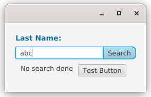
The Label felt like it needed a little bit of styling to make it look more like an integrated part of the widget. So it was made bigger, bold and coloured in the same tone as the focus colour for the style sheet using this entry:
.input-action-widget .label {
  -fx-text-fill: derive(-fx-focus-color, -30%);
  -fx-font-size: 14px;
  -fx-font-weight: bold
}
Exposing the Styleable Properties to Client Code
If we want our custom class to work the same way as any other JavaFX Node, then we should give the client code the ability to manipulate the StyleableProperty directly. And this means we should present it in the Bean format that all of the other Node properties use. We just need the following change (here both the StyleableProperties have been updated):
fun tagGapProperty() = tagGapImpl
val tagGapImpl: StyleableDoubleProperty = SimpleStyleableDoubleProperty(GAP_META_DATA, this, "tagGap")
var tagGap: Double
   get() = tagGapImpl.value
   set(value) = tagGapImpl.set(value)

fun orientationPropery() = orientationImpl
val orientationImpl: StyleableObjectProperty<Orientation> =
   SimpleStyleableObjectProperty(ORIENTATION_META_DATA, this, "orientation", Orientation.HORIZONTAL)
var orientation: Orientation
   get() = orientationImpl.get()
   set(value) = orientationImpl.set(value)
All we’ve done here is change the name of the actual properties to tagGapImpl and orientationImpl and make them private, then set up the usual JavaFX Bean structure for the client code. Now setOrientation(), getOrientation() and orientationProperty() all work as they should from Java code. The same for tagGap.
Final Code
That’s it! Here’s a look at the complete code for our custom InputActionWidget:
class InputActionWidget4(private val boundProperty: StringProperty,
                         labelText: String = "Prompt:",
                         buttonText: String = "Start") : Region() {

   private var buttonAction: ButtonRunner = {}
   private val actionRunning: BooleanProperty = SimpleBooleanProperty(false)
   private val label = Label(labelText)
   private val textField = TextField()
   private val button = Button(buttonText)

   fun labelTextProperty() = label.textProperty()
   var labelText: String
      get() = label.text
      set(value) {
         label.text = value
      }

   fun buttonTextProperty() = button.textProperty()
   var buttonText: String
      get() = button.text
      set(value) {
         button.text = value
      }

   fun textFieldTextProperty() = textField.textProperty()
   var textFieldText: String
      get() = textField.text
      set(value) {
         textField.text = value
      }

   fun textFormatterProperty() = textField.textFormatterProperty()
   var textFormatter: TextFormatter<*>?
      get() = textField.textFormatter
      set(value) {
         textField.textFormatter = value
      }

   fun tagGapProperty() = tagGapImpl
   private val tagGapImpl: StyleableDoubleProperty = SimpleStyleableDoubleProperty(GAP_META_DATA, this, "tagGap")
   var tagGap: Double
      get() = tagGapImpl.value
      set(value) = tagGapImpl.set(value)

   fun orientationPropery() = orientationImpl
   private val orientationImpl: StyleableObjectProperty<Orientation> =
      SimpleStyleableObjectProperty(ORIENTATION_META_DATA, this, "orientation", Orientation.HORIZONTAL)
   var orientation: Orientation
      get() = orientationImpl.get()
      set(value) = orientationImpl.set(value)

   companion object CssStuff {
      val TEXTFIELD_FOCUSED: PseudoClass = PseudoClass.getPseudoClass("textfield-focused");
      val GAP_META_DATA: CssMetaData<InputActionWidget4, Number> =
         object : CssMetaData<InputActionWidget4, Number>("-wfx-gap", StyleConverter.getSizeConverter(), 6.0) {
            override fun isSettable(styleable: InputActionWidget4) = !styleable.tagGapImpl.isBound
            override fun getStyleableProperty(styleable: InputActionWidget4) = styleable.tagGapImpl
         }
      val ORIENTATION_META_DATA: CssMetaData<InputActionWidget4, Orientation> = object :
         CssMetaData<InputActionWidget4, Orientation>("-wfx-orientation", EnumConverter(Orientation::class.java)) {
         override fun isSettable(styleable: InputActionWidget4) = !styleable.orientationImpl.isBound
         override fun getStyleableProperty(styleable: InputActionWidget4) = styleable.orientationImpl
      }
      private val cssMetaDataList =
         (Region.getClassCssMetaData() + GAP_META_DATA + ORIENTATION_META_DATA) as MutableList

      fun getClassCssMetaData() = cssMetaDataList
   }

   override fun getCssMetaData() = getClassCssMetaData()

   init {
      styleClass += "input-action-widget"
      configureComponents()
      createLayout()
      orientationImpl.addListener(InvalidationListener { createLayout() })
   }

   private fun configureComponents() {
      textFieldTextProperty().bindBidirectional(boundProperty)
      configureButton()
      textField.focusedProperty().addListener { _, _, newValue ->
         button.pseudoClassStateChanged(TEXTFIELD_FOCUSED, newValue);
      }
   }

   private fun createLayout() {
      children.clear()
      children += if (orientationImpl.value == Orientation.HORIZONTAL) createHBox() else createVBox()
   }

   private fun createHBox() = HBox(4.0).apply {
      children += listOf(label, HBox(0.0, textField, button))
      spacingProperty().bind(tagGapImpl)
      alignment = Pos.CENTER_LEFT
      minWidth = 200.0
   }

   private fun createVBox() = VBox(4.0).apply {
      children += listOf(label, HBox(0.0, textField, button))
      spacingProperty().bind(tagGapImpl)
      alignment = Pos.CENTER_LEFT
   }

   private fun configureButton() {
      button.apply {
         onAction = EventHandler<ActionEvent> {
            actionRunning.value = true
            buttonAction { actionRunning.value = false }
         }
         isFocusTraversable = false
         defaultButtonProperty().bind(textField.focusedProperty().and(textField.textProperty().isNotEmpty))
         disableProperty().bind((textField.textProperty().isEmpty).or(actionRunning))
      }
   }

   fun setButtonAction(newAction: ButtonRunner) = this.apply {
      buttonAction = newAction
   }
}
The only extra thing in this is that we now have some code to provide access to the TextFormatter property of the TextField.
Here’s the complete set of style sheet entries for this class:
.input-action-widget {
  -wfx-gap: 8.0;
  -wfx-orientation: horizontal;
}

.input-action-widget  .button {
   -fx-background-radius: 0 7 7 0px, 0 7 7 0px, 0 6 6 0px, 0 5 5 0px;
}

.input-action-widget  .button:textfield-focused {
   -fx-background-color: -fx-focus-color, -fx-outer-border, -fx-inner-border, -fx-body-color;
   -fx-background-insets: -0.5, 0.7,1.3, 2;
}

.input-action-widget .text-input {
   -fx-background-radius: 3 0 0 3, 2 0 0 2;
}

.input-action-widget .label {
  -fx-text-fill: derive(-fx-focus-color, -30%);
  -fx-font-size: 14px;
  -fx-font-weight: bold
}
Conclusion
By my count, this is about 120 lines of code to implement a complete custom control that can be utilized in almost exactly the same as any other standard JavaFX Node. The only thing that’s missing is some JavaDocs and you could publish it in a library.
The important thing to learn from all of this is that there’s really nothing magic or mysterious about creating your own custom Node classes. When you look at it, it’s just a simple layout wrapped up in a class to control access to its properties and styling. It’s easy to do, and if you have patterns that you use repeatedly in your layouts should really be thinking about implementing them as custom controls.
I think the only thing involved in this that’s a bit challenging to understand are the StyleableProperties and the CssMetaData structure. But even here, it’s mostly difficult because the standard documentation is appalling.