Introduction
In previous articles, we’ve looked at how to create custom components by using builders and factory methods, and then by extending Region to create a custom component class. If you’re writing JavaFX applications, then extending Region is all that you ever need to do to create a custom component, because it’s a pretty complete solution.
The idea of “skins” was mentioned briefly, but not pursued because you don’t really need it when you’re creating your own custom components for your own use.
But…What’s the point of skins then?
The idea behind a skinnable Control is that you can change its visual representation without messing with the workings of the Control itself. Virtually all of the standard JavaFX Controls are built as skinnable components.
Now, you may not ever want to create a brand new skinnable Control, but you very well might want to reskin one of the existing Controls. That’s what we’re going to look at here.
In this article we’re going to look at ToggleButton and change it so that it doesn’t look like a Button any more, but something entirely different.
Disclaimer
There aren’t any “official” tutorials or documentation about how to go about creating a skin. The closest I’ve seen is a placeholder on the OpenJDK Wiki for Upcoming Topics, but that could be years old by now and still not coming. The best way that I know how to figure it out is to look at the source code for JavaFX and other libraries that have created skins.
Building a skin is a bit different from creating a layout in a Region for a custom component. Some of the methods that you need to use are designed to be invoked - often indirectly - from the Layout Manager. In this respect, some of your coding can be considered to be “under the hood” from a JavaFX perspective.
Undoubtedly, there are rules about how things should be done what’s allowed in some of these methods but you won’t find these spelled out anywhere and, once again, you have to figure them out for yourself.
This is the first time I’ve tried to do something like this, and I’ll be the first to admit that I don’t know everything about JavaFX skins and custom controls.
However, the code in this tutorial works, and the result is a ToggleButton that acts like a ToggleButton (but doesn’t look like one), and that doesn’t break when you try to do normal ToggleButton stuff with it. Perhaps that’s enough.
What is a Skin?
The Skin/Skinnable concept in JavaFX is an implementation of the Model-View-Controller framework specialized for JavaFX Controls.
The Skin itself takes the role of the View. Skin is an interface, that has only 3 methods: dispose(), getNode() and getSkinnable(). Of these, the most interesting is getSkinnable() which returns a reference to the Control that the Skin is attached to.
Skinnable is the complimentary interface implemented by Controls that also has only 3 methods: getSkin(), setSkin() and skinProperty().
None of this appears to shed a light on how Skins work, however. And that’s about as far as you’ll get with the JavaDocs.
Let’s look at how Skins work…
Every Skinnable class has two parts, the Skin and the Control itself, which is the Skinnable. Keeping with the comparison to MVC, the Skinnable comprises the Model and the Controller in a single unit. The OpenJDK Wiki says the Control is the Model, and the Skin is the Controller + View, but I disagree with that (for what it’s worth).
The Model for these controls is composed of the Properties that you’re used to dealing with in JavaFX. These are things like the TextProperty, MinWidthProperty, OnEventProperty and VisibleProperty. The Skinnable/Controller contains all of the methods for accessing these Properties from outside the Control, like getText(), setMinWidth(), and visibleProperty().
Most, if not all, of these Properties are shared with the Skin/View, so that they can be used in the component’s layout.
You instantiate one of these objects through the Skinnable part - the Control itself. Something like new Button("Click Me"). All of the standard JavaFX Controls have a default Skin defined, and the Control will instantiate that by itself. Somehow (and we don’t really care how), the Skin gets passed to the Layout Manager which manages it in the GUI.
Reskinning a Control
Since Skinnable has a method, setSkin(), we can create our own Skins and attach them to the standard JavaFX Controls. This is actually the intention with the design - at least in theory - so that you’re not locked into the screen implementations that came “out of the box”. In reality it can get a bit tricky, the standard Skins often use a private JavaFX API that we don’t have access to - so extending an existing Skin will often be problematic.
It’s also possible to specify the skin via a stylesheet. In that case, you use the -fx-skin attribute.
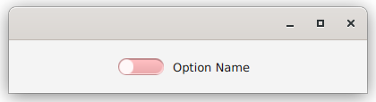
In this article we’re going to look at reskinning ToggleButton to turn it into something quite different, a toggle (or “flip”) switch. What we are going for is something that looks like one of these:
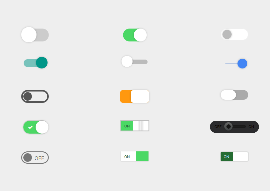
You can see that this is quite a different look from the standard ToggleButton, which looks
like a regular Button but has two looks, one for “Selected” and one for “Not Selected”. Our version will also have two looks:
The Standard ToggleButton Skin
Let’s take a look at the standard Skin for ToggleButton, so we can see how it works…
public class ToggleButtonSkin extends LabeledSkinBase<ToggleButton> {

    private final BehaviorBase<ToggleButton> behavior;
    public ToggleButtonSkin(ToggleButton control) {
        super(control);
        behavior = new ToggleButtonBehavior<>(control);
    }

    @Override public void dispose() {
        super.dispose();

        if (behavior != null) {
            behavior.dispose();
        }
    }
}
That’s pretty underwhelming!
There’s really nothing here. Some behaviour stuff, whatever that is, but nothing visual. If you look at BehaviorBase you’ll find that it relates to traversal and hot key stuff - important things, but still nothing visual.
Now, if you look at LabeledSkinBase you’ll see that there’s a lot of stuff there. A lot. It’s quite complicated. But it has nothing specific to ToggleButton or even Button to it at all.
It turns out that what makes a Button look like a Button has nothing to do with the Skin at all. It’s all in the styling. From the visual perspective, a Button is just a Label that’s been styled to look like a Button, and a ToggleButton is just a Button with an added Pseudo Class for selected.
The New Skin
But we want our ToggleButton to look like something completely different, and there isn’t any way to do that with just some CSS hocus pocus. We need a new layout with different elements that will show our toggle as a switch.
It turns out that the skin that gets us furthest towards this is CheckBoxSkin. Just like ToggleButtonSkin, it extends LabeledSkinBase, but it also has an extra element - the checkbox. So what we’re going to do is to add the toggle switch in the same manner that CheckBoxSkin adds the checkbox, but still base off ToggleButtonSkin.
Why not extend from CheckBoxSkin?
CheckBox has three states: “selected”, “unselected” and “indeterminate”. CheckBoxSkin works with CheckBox and if we use CheckBoxSkin then we’ll need to implement our Control as a CheckBox not a ToggleButton. Which means that we’ll need to deal with “indeterminate”. To keep this as a ToggleButton we’ll need to use a ToggleButton skin.
The approach we’re going to take here is to instantiate a ToggleButton, and the use its setSkin() method to replace the standard skin with our own skin, which we’ll call ToggleFlipSkin. In this way we’re not going to change the behaviour of ToggleButton one bit. It will still behave exactly like a standard ToggleButton, except that its visual component will be customized.
Custom Styleable Property
Before we get into the actual visual switch aspect, we need to deal with one factor that we’ll need in order to build that switch. And that means adding a StyleableProperty…
There’s only one StyeableProperty that we’re going to add, one which will control the size of the toggle switch itself by specifying the radius of the flippers inside it. This radius will drive the rest of the sizing for the toggle switch.
Since we’re not extending ToggleButton, we need to do all of this from inside the skin, but it’s essentially the same as adding any other StyleableProperty to Node. We need to add the StyleableProperty and then add the CssMetaData to support it.
The quirk here is that the skin does not implement Styleable, so we need to build the CssMetaData with reference to the ToggleButton control itself, which does implement Styleable. This results in some awkward self-references and casting back to the skin where the new CssMetaData is defined.
Let’s look at just this part:
fun flipperSizeProperty() = flipperSizeImpl
val flipperSizeImpl: StyleableDoubleProperty =
    SimpleStyleableDoubleProperty(ToggleFlip.BUTTON_SIZE_META_DATA, this, "flipperSize", 12.0)
var flipperSize: Double
    get() = flipperSizeImpl.value
    set(value) = flipperSizeImpl.set(value)

companion object CssStuff {
    val BUTTON_SIZE_META_DATA: CssMetaData<ToggleButton, Number> =
        object : CssMetaData<ToggleButton, Number>("-wfx-flipper-size", StyleConverter.getSizeConverter()) {
            override fun isSettable(styleable: ToggleButton) =
                !((styleable.skin as ToggleFlipSkin).flipperSizeImpl.isBound)

            override fun getStyleableProperty(styleable: ToggleButton) =
                (styleable.skin as ToggleFlipSkin).flipperSizeImpl
        }
    private val cssMetaDataList =
        (ToggleButton.getClassCssMetaData() + BUTTON_SIZE_META_DATA) as MutableList

    fun getClassCssMetaData() = cssMetaDataList
}

override fun getCssMetaData(): MutableList<CssMetaData<out Styleable, *>> {
    return getClassCssMetaData()
}
If you’ve read the article about customizing custom components that extend Region, you’ll see that this is very similar code.
The two implemented functions in new CssMetaData object - isSettable() and getStyleableProperty() - both take a Styleable as a parameter. In this case, it’s going to be our control, which is a ToggleButton. But of course we need to refer to the StyleableProperty which is defined in our skin, which means we have to call ToggleButton.getSkin(). Then we have to cast it our skin class which is ToggleFlipSkin - and this is safe because we couldn’t get here unless we were here in the first place.
Finally, we need to get the rest of the CssMetaData elements from ToggleButton not the skin, and that’s how cssMetaDataList is created.
BTW: If you want to avoid this round-about casting stuff by extending ToggleButton and adding the StyleableProperty and the CssMetaData directly to it, you’ll still get a little stuck. That’s because getCssMetaData() is final in ToggleButton (and most other controls). There’s actually a note that if you want to override it you should override getCssMetaData() in the skin.
The Toggle Switch Graphic
Now we are going to look at how to create the extra piece of visual component, the switch graphic itself…
This is one of the rare occasions when AnchorPane is the right solution! Our toggle switch is an AnchorPane with two StackPanes inside it, each anchored to either the lef or right side of the AnchorPane. The StackPanes are made into circles by calling setShape(Circle(10.0)). These StackPanes are the “flippers” of the switch. The Visible property of each flipper is bound to the Selected property of the ToggleButton such that only one is visible at a time.
That’s all there is to it really. The minimum and maximum height and width properties of the flippers are bound to the FlipperSize StyleableProperty. The only tricky bit here is that the anchor distances need to scale up and down as the size of the flippers is bigger or smaller.
Let’s take a look at the code for this:
private fun createFlipperBox(): Region = AnchorPane().apply {
    val flipperOff = flipper("flipper", false)
    val flipperOn = flipper("flipper", true)
    setFlipperInsets(flipperOff, flipperOn)
    flipperSizeProperty().addListener { _ -> setFlipperInsets(flipperOff, flipperOn) }
    minWidthProperty().bind(flipperSizeProperty().multiply(6.0))
    children += listOf(flipperOff, flipperOn)
    styleClass += "flipper-box"
}

private fun flipper(theStyle: String, showWhen: Boolean) = StackPane().apply {
    minWidthProperty().bind(flipperSizeImpl.multiply(2.0))
    minHeightProperty().bind(flipperSizeImpl.multiply(2.0))
    maxHeightProperty().bind(flipperSizeImpl.multiply(2.0))
    maxWidthProperty().bind(flipperSizeImpl.multiply(2.0))
    shape = Circle(10.0)
    styleClass += theStyle
    visibleProperty().bind(
        Bindings.createBooleanBinding(
            { control.isSelected == showWhen },
            control.selectedProperty()
        )
    )
}

private fun setFlipperInsets(buttonOff: StackPane, buttonOn: StackPane) {
    val inset = flipperSize / 6.0
    AnchorPane.setLeftAnchor(buttonOff, inset)
    AnchorPane.setTopAnchor(buttonOff, inset)
    AnchorPane.setBottomAnchor(buttonOff, inset)
    AnchorPane.setRightAnchor(buttonOn, inset)
    AnchorPane.setTopAnchor(buttonOn, inset)
    AnchorPane.setBottomAnchor(buttonOn, inset)
}
This is all very straight-forward, and there’s nothing very complicated about this layout. The minimum width of the flipper box is set to 6 times the radius of the flippers, which gives a nicely proportioned toggle switch design.
The Toggle Switch Styling
The biggest question about a toggle switch is, “Which way is on?”. In this design, it’s the one on the right, but that’s not going to be obvious to a user. We’ll need a visual clue.
There’s a lot of different ways to do this. To keep things simple for this example, we’re just going to use colours. You could, however, put images or text inside the StackPanes, you could add Text in the areas outside the StackPanes and you could add custom StyleableProperties to support these approaches. Just using colours may not be the best approach because some users might have difficulties differentiating them.
For colours, though, it’s all in the style sheets:
.toggle-flip {
  -wfx-flipper-size: 8px;
}

.toggle-flip .flipper-box {
  -fx-base: #ffb8bb;
  -fx-background-color: -fx-shadow-highlight-color, derive(-fx-outer-border, -2%), -fx-inner-border-bottomup, -fx-body-color;
  -fx-background-insets: 1 0 0 0, 0, 3 0 1 1.5, 2;
  -fx-background-radius: 12px, 12px, 112px, 10px;
  -fx-text-fill: -fx-text-base-color;
}

.toggle-flip:selected .flipper-box {
  -fx-base: #6acda0;
}

.toggle-flip .flipper {
  -fx-background-color: derive(-fx-base, +90%);
}
Most of the complexity here is to create a 3D feel to the switch body via shading and highlighting. That’s why there’s 4 different background colours with different insets.
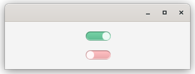
The colour change is done by manipulating -fx-base. This colour is set at the root of the Modena stylesheet as a global value. By redefining it in .toggle-flip .flipper-box it’s just changed for the AnchorPane and all of its children. It starts off as pastel pink, and then in .toggle-flip:selected .flipper-box it gets changed to pastel green.
The result looks like this for selected:
And this for unselected:
One last point:
If you change the flipper radius to a much larger number, then the background radii from the style sheet start to make the AnchorPane corners decidely square. There’s no way to couple the -wfx-flipper-size to the -fx-background-radius attribute in the style sheet. It doesn’t seem unreasonable, however, to expect a programmer to adjust the background radii if they are changing the flipper size.
However, the flipper size property is exposed publicly. If this size is manipulated programatically, there’s really no way to adjust the background radii in tandem. Doing this would involve calling up the AnchorPane background and expecting it to be a List of BackgroundFill and then manipulating the radius of each. But doing that assumes, then, that the style sheet specifies that the backgrounds are constructed this way. Which, of course, doesn’t need to be true.
The Layout of the Skin
So far, we haven’t really introduced any brand new concepts, just layouts and styling. Working with the skin layout itself is a little bit trickier. This is where we’re going to see how our new layout component interacts with the rest of the skin.
Remember that ToggleButtonSkin extends LabeledSkinBase and that Labeled subclasses have two basic layout components; a Text and a Graphic and either one (or both) of them can be Null. We need to integrate a third layout component with those other two components in a way that makes sense. The skin itself is a Region, and the standard skin approach is to manually place the children in the Region and control the other parameters to make it work.
The updateChildren() Method
One thing about skins is that there are a whole bunch of special techniques and rules that aren’t documented or explained anywhere. The only way to learn is to look at existing examples and try to understand what they are doing and why they are doing it that way.
The first of these is the method to add our new layout element, the “FlipBox”, to the Region. For this we need to use this:
private val flipperBox: Region? = createFlipperBox()

override fun updateChildren() {
    super.updateChildren()
    if (flipperBox != null) {
        children.add(flipperBox)
    }
}
It appears that this is the only place where you should be adding new Nodes to the layout.
Here flipperBox is a field in the skin. It is possible - actually, certain - that this will be called from the super-type before flipperBox has been initialized. Because of this, you have to check to make sure that flipperBox is not Null before you attempt to add it to the children of the Region.
Honestly, I don’t know how it does this and Intellij complains that flipperBox can never be Null. But I have the stack dumps to show that it happens.
There’s a call to updateChildren() in the init{} block of our skin, this ensures that the flipperBox gets added to the layout once it has been initialized.
The layoutChildren() Method
The next important method to understand is layoutChildren(). This method is called whenever the Layout Manager needs to recalculate the layout of the skin Region. It is called automatically, and can be triggered by any number of things that you really don’t have any control over.
One thing that will trigger it is if you change the size or position of a Node inside the layout. Another that will trigger it is if you add more children (or children of children) to the layout. You will get an infinite loop if you add children inside the layoutChildren() method. So, don’t do that.
Let’s look at our layoutChildren():
override fun layoutChildren(x: Double, y: Double, w: Double, h: Double) {
    val boxWidth = snapSizeX(flipperSize * 6.33)
    val boxHeight = snapSizeY(flipperSize * 2.33)
    val computeWidth = control.prefWidth(-1.0).coerceAtLeast(control.minWidth(-1.0))
    val labelWidth = (computeWidth - boxWidth).coerceAtMost(w - snapSizeX(boxWidth))
    val labelHeight = control.prefHeight(labelWidth).coerceAtMost(h)
    val maxHeight = boxHeight.coerceAtLeast(labelHeight)
    val xOffset = Utils.computeXOffset(w, labelWidth + boxWidth, control.alignment.hpos) + x
    val yOffset = Utils.computeYOffset(h, maxHeight, control.alignment.vpos) + y
    layoutLabelInArea(xOffset + boxWidth, yOffset, labelWidth, maxHeight, control.alignment)
    flipperBox.resize(boxWidth, boxHeight)
    positionInArea(
        flipperBox,
        xOffset,
        yOffset,
        boxWidth,
        maxHeight,
        0.0,
        control.alignment.hpos,
        control.alignment.vpos
    )
}
The first part of this method is figuring out how much space things should take up. Note that the coerceAtLeast() and coerceAtMost() functions are Kotlin native implementations of Math.max() and Math.min().
It’s important to note that all of these calculated numbers are just for the use of positioning the children in the layout. By the time this method is called, something higher up the chain has figured out where the whole thing goes in the screen layout and how big it will be - that’s what the x,y,w and h parameters are.
The last three calls do the positioning work…
The method layoutLabelInArea() is the method that handles the traditional Label elements of the layout: the Text and the Graphic. If you like, you can think of our overall layout as an AnchorPane in a Region with a Label. This is the call that organizes the layout of the Label part.
The next call, to flipperBox.resize() is a method of Region and the JavaDocs say that your application should not call this directly.
So what’s up?
Once you’re inside layoutChildren(), as well as some other places in the skin, those “Application code should not…” rules just don’t apply. This is code that is only invoked from inside the Layout Manager, and this is the place those methods are intended to be called from. In this case, resize() actually sets the size of the AnchorPane, and if you leave this call out, then you get a FlipperBox with zero size - and you can’t see it.
Finally, we have positionInArea(). This is the method that figures out where to put the FlipperBox in the Region. This is a method that delegates to another positionInArea() method adding in a parameter for zero insets, and that delegates to method of Region that adds some more default parameters which in turn delegates to another method.
For the most part, this code was lifted directly from CheckBoxSkin and then the boxWidth and boxHeight calculations were changed to apply the flipperSize property.
Setting the Control Size
Changing layoutChildren() almost finished the job, but the text was getting chopped off. This could be fixed by manually setting the minWidth() of the ToggleButton in the layout code, but that shouldn’t be necessary. Once again, checking the code for CheckBoxSkin had the answer.
The following methods were added to the skin:
override fun computeMinWidth(
    height: Double,
    topInset: Double,
    rightInset: Double,
    bottomInset: Double,
    leftInset: Double
) = super.computeMinWidth(
    height,
    topInset,
    rightInset,
    bottomInset,
    leftInset
) + snapSizeX(flipperBox.minWidth(-1.0))


override fun computeMinHeight(
    width: Double,
    topInset: Double,
    rightInset: Double,
    bottomInset: Double,
    leftInset: Double
) = super.computeMinHeight(width - flipperBox.minWidth(-1.0), topInset, rightInset, bottomInset, leftInset)
    .coerceAtLeast(topInset + flipperBox.minHeight(-1.0) + bottomInset)

override fun computePrefWidth(
    height: Double,
    topInset: Double,
    rightInset: Double,
    bottomInset: Double,
    leftInset: Double
) = super.computePrefWidth(
    height,
    topInset,
    rightInset,
    bottomInset,
    leftInset
) + snapSizeX(flipperSize * 6.33) + snapSizeX(20.0)


override fun computePrefHeight(
    width: Double,
    topInset: Double,
    rightInset: Double,
    bottomInset: Double,
    leftInset: Double
) = super.computePrefHeight(width - flipperBox.prefWidth(-1.0), topInset, rightInset, bottomInset, leftInset)
    .coerceAtLeast(topInset + flipperBox.prefHeight(-1.0) + bottomInset)
These methods let the normal LabeledSkinBase skin calculate the dimension of the Label part of the layout, and then add in an allowance for the FlipperBox.
The main concern here was computePrefWidth(). It now adds enough space for the FlipperBox and a spacer of 20 pixels.
Some further investigation revealed that these methods are expected to be overriden by skins in order to handle sizing properly.
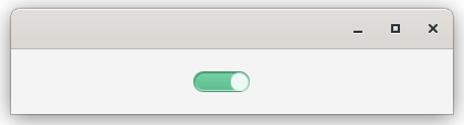
The result looks like this:
All the Code in One Place
At this point, you’ve seen nearly all the code for the skin, just chopped up into little parts. Let’s take a look at it all together:
import com.sun.javafx.scene.control.skin.Utils
import javafx.beans.binding.Bindings
import javafx.css.*
import javafx.scene.control.Skin
import javafx.scene.control.ToggleButton
import javafx.scene.control.skin.ToggleButtonSkin
import javafx.scene.layout.AnchorPane
import javafx.scene.layout.Region
import javafx.scene.layout.StackPane
import javafx.scene.shape.Circle

class ToggleFlipSkin(val control: ToggleButton) : ToggleButtonSkin(control) {
    fun flipperSizeProperty() = flipperSizeImpl
    val flipperSizeImpl: StyleableDoubleProperty =
        SimpleStyleableDoubleProperty(ToggleFlip.BUTTON_SIZE_META_DATA, this, "flipperSize", 12.0)
    var flipperSize: Double
        get() = flipperSizeImpl.value
        set(value) = flipperSizeImpl.set(value)

    private val flipperBox: Region = createFlipperBox()

    companion object CssStuff {
        val BUTTON_SIZE_META_DATA: CssMetaData<ToggleButton, Number> =
            object : CssMetaData<ToggleButton, Number>("-wfx-flipper-size", StyleConverter.getSizeConverter()) {
                override fun isSettable(styleable: ToggleButton) =
                    !((styleable.skin as ToggleFlipSkin).flipperSizeImpl.isBound)

                override fun getStyleableProperty(styleable: ToggleButton) =
                    (styleable.skin as ToggleFlipSkin).flipperSizeImpl
            }

        private val cssMetaDataList =
            (ToggleButton.getClassCssMetaData() + BUTTON_SIZE_META_DATA) as MutableList

        fun getClassCssMetaData() = cssMetaDataList
    }

    override fun getCssMetaData(): MutableList<CssMetaData<out Styleable, *>> {
        return getClassCssMetaData()
    }

    init {
        control.styleClass.setAll("toggle-flip")
        updateChildren()
    }

    override fun updateChildren() {
        super.updateChildren()
        if (flipperBox != null) {
            children.add(flipperBox)
        }
    }

    private fun createFlipperBox(): Region = AnchorPane().apply {
        val flipperOff = flipper("flipper", false)
        val flipperOn = flipper("flipper", true)
        setFlipperInsets(flipperOff, flipperOn)
        flipperSizeProperty().addListener { _ -> setFlipperInsets(flipperOff, flipperOn) }
        minWidthProperty().bind(flipperSizeProperty().multiply(6.0))
        children += listOf(flipperOff, flipperOn)
        styleClass += "flipper-box"
    }

    private fun flipper(theStyle: String, showWhen: Boolean) = StackPane().apply {
        minWidthProperty().bind(flipperSizeImpl.multiply(2.0))
        minHeightProperty().bind(flipperSizeImpl.multiply(2.0))
        maxHeightProperty().bind(flipperSizeImpl.multiply(2.0))
        maxWidthProperty().bind(flipperSizeImpl.multiply(2.0))
        shape = Circle(10.0)
        styleClass += theStyle
        visibleProperty().bind(
            Bindings.createBooleanBinding(
                { control.isSelected == showWhen },
                control.selectedProperty()
            )
        )
    }

    private fun setFlipperInsets(buttonOff: StackPane, buttonOn: StackPane) {
        val inset = flipperSize / 6.0
        AnchorPane.setLeftAnchor(buttonOff, inset)
        AnchorPane.setTopAnchor(buttonOff, inset)
        AnchorPane.setBottomAnchor(buttonOff, inset)
        AnchorPane.setRightAnchor(buttonOn, inset)
        AnchorPane.setTopAnchor(buttonOn, inset)
        AnchorPane.setBottomAnchor(buttonOn, inset)
    }

    override fun computeMinWidth(
        height: Double,
        topInset: Double,
        rightInset: Double,
        bottomInset: Double,
        leftInset: Double
    ) = super.computeMinWidth(
        height,
        topInset,
        rightInset,
        bottomInset,
        leftInset
    ) + snapSizeX(flipperBox.minWidth(-1.0))


    override fun computeMinHeight(
        width: Double,
        topInset: Double,
        rightInset: Double,
        bottomInset: Double,
        leftInset: Double
    ) = super.computeMinHeight(width - flipperBox.minWidth(-1.0), topInset, rightInset, bottomInset, leftInset)
        .coerceAtLeast(topInset + flipperBox.minHeight(-1.0) + bottomInset)

    override fun computePrefWidth(
        height: Double,
        topInset: Double,
        rightInset: Double,
        bottomInset: Double,
        leftInset: Double
    ) = super.computePrefWidth(
        height,
        topInset,
        rightInset,
        bottomInset,
        leftInset
    ) + snapSizeX(flipperSize * 6.33) + snapSizeX(20.0)


    override fun computePrefHeight(
        width: Double,
        topInset: Double,
        rightInset: Double,
        bottomInset: Double,
        leftInset: Double
    ) = super.computePrefHeight(width - flipperBox.prefWidth(-1.0), topInset, rightInset, bottomInset, leftInset)
        .coerceAtLeast(topInset + flipperBox.prefHeight(-1.0) + bottomInset)


    override fun layoutChildren(x: Double, y: Double, w: Double, h: Double) {
        val boxWidth = snapSizeX(flipperSize * 6.33)
        val boxHeight = snapSizeY(flipperSize * 2.33)
        val computeWidth = control.prefWidth(-1.0).coerceAtLeast(control.minWidth(-1.0))
        val labelWidth = (computeWidth - boxWidth).coerceAtMost(w - snapSizeX(boxWidth))
        val labelHeight = control.prefHeight(labelWidth).coerceAtMost(h)
        val maxHeight = boxHeight.coerceAtLeast(labelHeight)
        val xOffset = Utils.computeXOffset(w, labelWidth + boxWidth, control.alignment.hpos) + x
        val yOffset = Utils.computeYOffset(h, maxHeight, control.alignment.vpos) + y
        layoutLabelInArea(xOffset + boxWidth, yOffset, labelWidth, maxHeight, control.alignment)
        flipperBox.resize(boxWidth, boxHeight)
        positionInArea(
            flipperBox,
            xOffset,
            yOffset,
            boxWidth,
            maxHeight,
            0.0,
            control.alignment.hpos,
            control.alignment.vpos
        )
    }
}
Running It
The entire point of this approach was to be able to use a standard ToggleButton and then just replace the skin to implement a new look and feel. And that’s all you need to do to use this new skin:
class ToggleFlipDemo : Application() {
private val nameProperty: StringProperty = SimpleStringProperty("Not Started")
private var counter: Int = 0
override fun start(primaryStage: Stage) {
primaryStage.scene = Scene(createContent()).addWidgetStyles().apply {
object {}::class.java.getResource("/css/toggleflip.css")?.toString()?.let { stylesheets += it }
}
primaryStage.show()
}
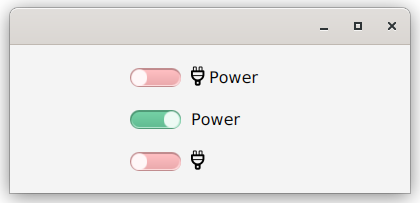
private fun createContent(): Region = BorderPane().apply {
val customControl1 = ToggleButton("Power").apply {
graphic = FontIcon("typ-plug").apply {
iconSize = 23
}
skin = ToggleFlipSkin(this)
}
val customControl2 = ToggleButton("Power").apply {
skin = ToggleFlipSkin(this)
}
val customControl3 = ToggleButton("").apply {
skin = ToggleFlipSkin(this)
graphic = FontIcon("typ-plug").apply {
iconSize = 23
}
}
center = VBox(20.0, customControl1, customControl2, customControl3).apply {
alignment = Pos.CENTER_LEFT
padding = Insets(0.0, 0.0, 0.0, 100.0)
}
minWidth = 400.0
} padWith 20.0
}
fun main() = Application.launch(ToggleFlipDemo::class.java)
Final Notes
One thing about this design is that the toggle switch graphic always appears to the left of the Label. That’s because that’s how CheckBox works, and we started from there. It’s also easier to deal with if you have a column of these switches because the graphics will all line up nicely - something that could be an issue if the Label text for each is a different length with the graphic on the right. Not that that couldn’t be dealt with, by making the layout behaviour pin the graphic at the far right of the layout, and specifying a preferred width for each one. But that would make the design more complicated.
Also, you could introduce a StyleableProperty for the positioning of the label and graphic. You could also design it such that the switch graphic could be vertical instead of horizontal.
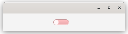
This design preserves the ability to use either or both of the Label text and graphic, like this:
Conclusion
There’s no point in pretending that reskinning a Control is simple and something suitable for beginners to JavaFX. The programming itself isn’t complex, but you do need a solid understanding of the basic principles of layouts, Nodes and Controls. You’ll need to be comfortable poking around in the source code for JavaFX, and understand how the pieces connect to each other.
If you do try this yourself, it’s almost guaranteed that you’ll knock up against undocumented constraints and quirks of the Skin class. There are times when it will be frustrating, and you’ll have no choice other than to test out various approaches to find what works.
It’s also instructive to look at the source code for ControlsFX and AtlantaFX, as they both contain completely custom skins that don’t rely on extending existing skins in JavaFX.