Introduction
For some reason, tables (so in JavaFX, TableView) are one of the first elements that programmers want to include in their screens. Yet at the same time, they are one of the more complicated screen elements and the concepts behind them are a bit more advanced than most beginners are ready to handle.
In all honesty, you won’t find anything in this article that isn’t covered in just about every “TableView 101” article out there. What I’ve tried to do, however, is to explain why things are done the way that they are done, and how to think about TableView as a data presentation tool.
What is a TableView?
A TableView is a screen element for displaying tabular data. You can find lots of examples on StackOverflow and elsewhere on the web where programmers ask questions like, “How do I print my TableView?”, “How do I create a PDF from my TableView?”, “How do I populate my TableView from this SQL command”, or “How do I import my TableView from JSON?”. And really, none of these questions have anything to do with TableView. TableView is a screen element, and all of these questions are data-centric and don’t really have anything to do with TableView at all.
You should understand this first: TableView is all about letting you display your data in rows and columns on the screen. Nothing else (well, you can edit it too - but that’s a subject for another article).
TableView is an excellent choice when you have dense data that fits naturally into a row and column presentation like a spreadsheet. If users need to move columns around, or sort and filter based on column values, then that’s also a good reason to use a TableView.
My experience is that screen real-estate is always at a premium. If you have a column in your TableView that only has data in about 10% of its rows, then that is a huge waste of screen space. If your data is sparsely populated, or has a great deal of variation in its content and structure, then you should probably think about using a ListView instead.
Understanding the Structure of TableView
Before we look at some examples, you should understand the basic structure of TableView.
TableView is a Generic Class
This means that any instantiation of TableView should include a type. So you can have a TableView<PersonModel> or TableView<Customer> or TableView<InventoryItem>. Things like that.
Ideally, the type should be a class which is constructed like a typical JavaFX presentation data model - meaning that it has fields which are Observables and with appropriate getters and setters for the fields. Beyond that, your TableView type can be any class you like, but it needs to provide different data elements for each column.
TableView Data
Every TableView has a property called items. Items is a wrapper around an ObservableList<TableType>. So it’s a list of whatever class you’ve defined as your generic type for your TableView. Since it’s an ObservableList, any changes to its contents are going to be instantly reflected on the screen in your TableView.
Columns
The first internal elements of TableView are the columns. Columns are all instances of TableColumn, which is also a generic class. TableColumn has two type parameters: the first is the generic type of the TableView itself, and the second is the type of the data in the TableColumn.
TableColumn defines three important things: the layout of the column including things like width and heading, how to extract the data from the TableView generic type class, and how to create cells. We’ll look at all of these later.
Cells
At the intersection of rows and columns are the cells. Cells are all instances of the class TableCell. Customizing TableCell is one of the key ways to alter the display of data in your TableView. TableCell is a subclass of Labeled; which means that it has two visual elements, the Text and the Graphic. Just as with Labels, you can customize the Graphic to be whatever you want.
The default TableCell will simply take whatever data you give it, run it through toString() and put it in the Text element. Essentially this is just like using Label.setText().
Rows
Much less useful on a day-to-day basis are rows, which are instances of the class TableRow. For the most part, you’ll deal with rows in order to handle special click actions and styling. Notionally, a TableRow is associated with a single instance of the TableView's generic type, but there’s seldom any need to access the data this way. Just like any other scroll-able screen element, TableView has the concept of a “viewport”. This is the area of the TableView which is currently visible on the screen. TableViews can scroll horizontally and vertically, but vertical scrolling is the most important part to understand.
The key concept that you absolutely have to understand is this:

TableView only instantiates enough cells to populate the viewport plus a little bit extra. These cells are then recycled as you scroll up or down through the TableView.
What this means is that if you have a TableView with 1,000,000 items in its list, but a viewport that can only show 10 rows at a time, then you’ll probably have around 12-15 rows of cells instantiated. As a row scrolls off the top or the bottom of the viewport, its cells are released, and then populated with new data as new rovs scroll onto the screen.
The other implication of this is that virtually all the cells that are used are instantiated when the TableView itself is instantiated or when the viewport is expanded. Data loading into the cells is performed constantly, and potentially frequently. This has two important impacts on how you design your cells:
- The cell constructor needs to run in the absence of any table data.
- The data load function needs to be as efficient as possible.
From a practical standpoint, this means that any layout code in your TableCells should happen in the constructor, and the data load function should only put data into the layout.
Perhaps the best way to understand this is to put some console output statements into the constructor and the data load method of a custom TableCell. Maybe put a unique identifier into each TableCell which you include in the output. Then you can see how TableCells are instantiated and recycled.
A Simple Example
With the background info out of the way, let’s build a simple example that doesn’t rely on understanding any of that.
I feel that it’s a good practice to separate out the inner workings of your TableViews from the rest of your layout. Years ago, I would have created a custom class extending TableView, but now I prefer to use the builder pattern. So that’s what we’ll do here.
This example is just a table of orders of some type. It’s typical of the kind of thing you’d see in a business application, and it has lots of potential for customization and fancy presentation. But we’ll start of with the basics.
The Model
Let’s take a look at the data first. We’ll create some kind of inventory item:
public class OrderModel_1 {

    private final StringProperty sku = new SimpleStringProperty("");
    private final ObjectProperty<Integer> uid = new SimpleObjectProperty<>(0);
    private final ObjectProperty<Integer> quantity = new SimpleObjectProperty<>(0);
    private final ObjectProperty<LocalDate> date = new SimpleObjectProperty<>(LocalDate.now());
    private final BooleanProperty shipped = new SimpleBooleanProperty(false);

    public OrderModel_1(int uid, String sku, int quantity, LocalDate date, Boolean shipped) {
        this.uid.set(uid);
        this.sku.set(sku);
        this.quantity.set(quantity);
        this.date.set(date);
        this.shipped.set(shipped);
    }

    public StringProperty skuProperty() {
        return sku;
    }

    public ObjectProperty<Integer> uidProperty() {
        return uid;
    }

    public ObjectProperty<Integer> quantityProperty() {
        return quantity;
    }

    public ObjectProperty<LocalDate> dateProperty() {
        return date;
    }

    public BooleanProperty shippedProperty() {
        return shipped;
    }

    public static List<OrderModel_1> generateList() {
        List<OrderModel_1> results = new ArrayList<>();
        int uid = 0;
        results.add(new OrderModel_1(uid++, "PART 1", 20, LocalDate.of(2022, 1, 20), false));
        results.add(new OrderModel_1(uid++, "PART 17", 20, LocalDate.of(2021, 7, 15), true));
        results.add(new OrderModel_1(uid++, "PART 20", 20, LocalDate.of(2020, 5, 5), false));
        results.add(new OrderModel_1(uid++, "PART 101", 20, LocalDate.of(2021, 4, 17), false));
        results.add(new OrderModel_1(uid++, "PART 171", 20, LocalDate.of(2022, 12, 27), true));
        results.add(new OrderModel_1(uid++, "PART 35", 20, LocalDate.of(2021, 11, 4), false));
        results.add(new OrderModel_1(uid++, "PART 18", 20, LocalDate.of(2020, 6, 10), true));
        results.add(new OrderModel_1(uid++, "PART 59", 20, LocalDate.of(2021, 9, 19), true));
        results.add(new OrderModel_1(uid++, "PART 28837", 20, LocalDate.of(2022, 10, 23), false));
        results.add(new OrderModel_1(uid++, "PART A73B", 20, LocalDate.of(2021, 4, 15), true));
        results.add(new OrderModel_1(uid++, "PART 4J1", 20, LocalDate.of(2020, 2, 14), false));
        results.add(new OrderModel_1(uid++, "PART FFC32", 20, LocalDate.of(2021, 7, 13), true));
        results.add(new OrderModel_1(uid++, "PART 1832-882B", 20, LocalDate.of(2022, 3, 1), false));
        results.add(new OrderModel_1(uid++, "SUBPART 25", 20, LocalDate.of(2022, 1, 6), false));
        results.add(new OrderModel_1(uid++, "ASSEMBLY 7K22", 20, LocalDate.of(2022, 11, 12), true));
        results.add(new OrderModel_1(uid++, "PART 9983", 20, LocalDate.of(2021, 9, 24), true));
        results.add(new OrderModel_1(uid++, "PART GH887", 20, LocalDate.of(2020, 4, 30), false));
        results.add(new OrderModel_1(uid++, "PART 1003", 20, LocalDate.of(2021, 3, 17), false));
        results.add(new OrderModel_1(uid++, "PART 31", 20, LocalDate.of(2021, 10, 5), true));
        results.add(new OrderModel_1(uid++, "PART 98XB", 20, LocalDate.of(2022, 3, 22), false));
        return results;
    }
}
This is a pretty basic JavaFX data model. I’ve not included any of the delegated setters and getters, since we won’t be using them.
To keep things clean, we’ve got a static method that supplies some dummy data included here. It’s just a list of OrderModel with random values put in them. I think this took longer to write than all the rest of the code.
The TableView
Now, let’s take a look at the Builder for the TableView:
public class TableViewBuilder1 implements Builder<Region> {

    private final ObservableList<OrderModel_1> model;

    public TableViewBuilder1(ObservableList<OrderModel_1> model) {
        this.model = model;
    }

    @Override
    public Region build() {
        TableView<OrderModel_1> results = new TableView<>();

        TableColumn<OrderModel_1, Integer> uidCol = new TableColumn<>("UID");
        uidCol.setCellValueFactory(cdf -> cdf.getValue().uidProperty());
        results.getColumns().add(uidCol);

        TableColumn<OrderModel_1, String> skuCol = new TableColumn<>("SKU");
        skuCol.setCellValueFactory(cdf -> cdf.getValue().skuProperty());
        results.getColumns().add(skuCol);

        TableColumn<OrderModel_1, Integer> quantityCol = new TableColumn<>("Quantity");
        quantityCol.setCellValueFactory(cdf -> cdf.getValue().quantityProperty());
        results.getColumns().add(quantityCol);

        TableColumn<OrderModel_1, LocalDate> dateCol = new TableColumn<>("Date");
        dateCol.setCellValueFactory(cdf -> cdf.getValue().dateProperty());
        results.getColumns().add(dateCol);

        TableColumn<OrderModel_1, Boolean> shippedCol = new TableColumn<>("Shipped?");
        shippedCol.setCellValueFactory(cdf -> cdf.getValue().shippedProperty());
        results.getColumns().add(shippedCol);

        results.setItems(model);
        results.setColumnResizePolicy(TableView.CONSTRAINED_RESIZE_POLICY);
        return results;
    }
}
This is pretty straight-forward. First we instantiate the TableView itself, then we instantiate and configure each of five columns and add them to the TableView. Finally, we connect the TableView to the Model and set the ColumnResizePolicy.
Configuring the Columns
TableColumns are generic, and each one needs to specify the type of data in the TableView, and then the type of data in the column. In this case the generic type of our TableView is OrderModel_1, and we have columns with String, Integer, Boolean and LocalDate. The constructor parameter for each TableColumn specifies the column heading.
We also need to tell each TableColumn how to extract the data from the Model for this column. You do this with TableColumn.setCellValueFactory(). This needs a little explanation…
If you look at the JavaDocs for TableColumn, you’ll find this:
public final void setCellValueFactory(Callback<TableColumn.CellDataFeatures<S,T>,ObservableValue<T>> value)
Yikes! What’s that?
It’s a Callback which is identical to a Function in its definition. What makes a Callback a Callback is how it’s used. A Callback is intended to provide a “hook” back to some data or functionality from some particular context that we don’t really know about. In this case, the TableView internal code is going to need to extract an ObservableValue from our table model, and we need to tell it how to do that. We don’t know, and don’t want to know, the particulars of how or when it’s going to do this - the only piece of context we need is to know that it will have an instance of CellDataFeatures at hand when it does it.
This means that we need to provide a Function that, given a CellDataFeatures will return some kind of ObservableValue, and that ObservableValue will be the data for the TableCell.
So now we need to know a little about CellDataFeatures. It’s an internal class of TableColumn, and it’s, “a wrapper class to provide all necessary information for a particular Cell” - whatever that means. Most importantly, it contains a reference to the data in the TableRow that the TableCell is in. There’s a method TableColumn.CellDataFeatures.getValue() that returns the row data.
At this point, that’s all you need to know about CellDataFeatures.
Let’s look at our SKU column:
TableColumn<OrderModel_1, String> skuCol = new TableColumn<>("SKU");
skuCol.setCellValueFactory(cdf -> cdf.getValue().skuProperty());
SKU is a String, so that’s the column data type, and OrderModel_1 is the class that has our row data. Our non-generic version of setCellValueFactory will look like this:
public final void setCellValueFactory(Callback<TableColumn.CellDataFeatures<OrderModel_1,String>,ObservableValue<String>> value)
We have our Callback (Function) defined by the lambda expression: cdf.getValue().skuProperty(). We know that getValue() is going to return an OrderModel_1 object, and that skuProperty() is going to return us a StringProperty, which satisfies the need for an ObservableValue<String>.
Configuring the TableView
There’s only two things we need to do with the TableView as a whole:
- Connect it to the Data
- We use the method
TableView.setItems()to do this. Remember that items is actually aObjectProperty<ObservableList<OrderModel_1>>. So by callingsetItems() we are installing a newObservableListon theTableView. - Disable the Last Empty Column
- This is a fussy, annoying thing, but it just takes one line to fix. If you don’t include
setColumnResizePolicy(TableView.CONSTRAINED_RESIZE_POLICY)then you’ll get an empty column on the right side of yourTableView.
The Application
And now, finally, the rest of the application:
public class TableViewDemo1 extends Application {

    private final ObservableList<OrderModel_1> tableItems = FXCollections.observableArrayList();

    public static void main(String[] args) {
        launch();
    }

    @Override
    public void start(Stage primaryStage) throws Exception {
        primaryStage.setScene(new Scene(createContent()));
        primaryStage.show();
        fetchData();
    }

    private Region createContent() {
        VBox results = new VBox(new TableViewBuilder1(tableItems).build());
        results.setPadding(new Insets(20));
        results.setMinWidth(500);
        return results;
    }

    private void fetchData() {
        Task<List<OrderModel_1>> loadTask = new Task<>() {
            @Override
            protected List<OrderModel_1> call() throws InterruptedException {
                Thread.sleep(2000);
                return OrderModel_1.generateList();
            }
        };
        loadTask.setOnSucceeded(evt -> tableItems.setAll(loadTask.getValue()));
        Thread loadThread = new Thread(loadTask);
        loadThread.start();
    }
}
A lot of this is the usual Application.start() boilerplate. The content of the screen is just a VBox with the TableView in it. The VBox is included so that we can put some padding around the TableView, so it won’t butt up against the edges of the window.
We also have a simulated data load routine. This has a Thread.sleep() in it because databases always have some amount of latency, and this way we can see how the GUI behaves in a realistic environment. You can also see that we’re using Task for this to run our simulated database access in a background thread and loading the results into the TableView on the FXAT.
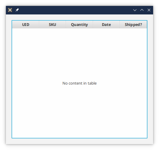
When it starts, it looks like this for a few seconds:
Then it changes to this:
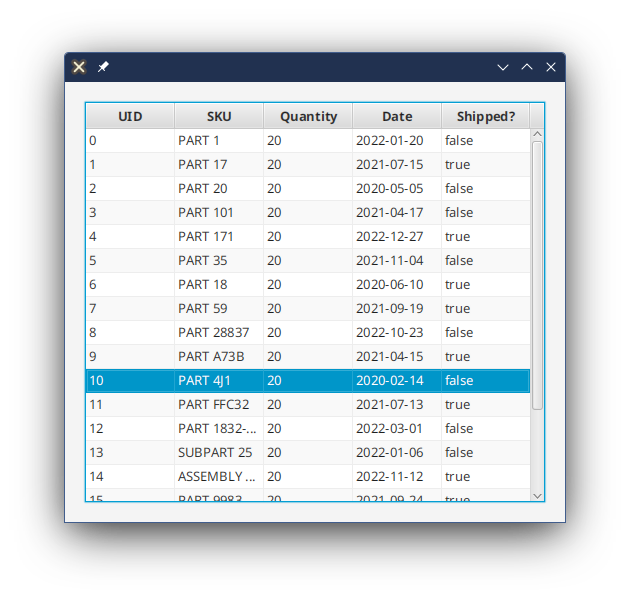
The first screen snap shows us the “placeholder” for the TableView. This is the graphic that is shown when the TableView has no data in it. You can customize this, but that’s a topic for a later article.
Customizing a Cell
The only topic left to cover in TableView basics is how to customize a TableCell. This is done by configuring the TableColumn to use a custom CellFactory. Once again, this is done via a Callback, which we’ve already noted is really just a Function.
The declaration of the method is this:
public final void setCellFactory(Callback<TableColumn<S,T>,TableCell<S,T>> value)
The input is just our TableColumn, and the return value is a TableCell with the generic types set to match our TableColumn generic types. Now we need to look at how to customize a TableCell…
In our example we have a Boolean column called shippedCol. The data displayed in this column is either true or false, which is pretty ugly. We’ll look at some better ways to do this.
The main thing to remember is that TableCells are created once and re-used many times. This means that we need to define the layout of the TableCell in its constructor, and then provide a mechanism to load data into it as required.
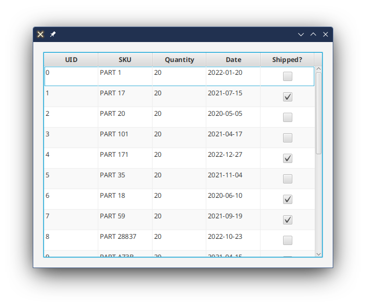
Using a CheckBox
This is, in my opinion, the least satisfying way to show Boolean data, but it does have the advantage of being a simple load of the cell data into a Node. This technique will translate nicely into any type of data that you would display in any appropriate JavaFX Node, so it’s worth taking a look at:
public class BooleanTableCell1<S> extends TableCell<S, Boolean> {

    CheckBox checkBox = new CheckBox();
    StackPane container;

    public BooleanTableCell1() {
        container = new StackPane(checkBox);
        container.setPadding(new Insets(8));
        setText(null);
        setGraphic(null);
    }

    @Override
    protected void updateItem(Boolean item, boolean empty) {
        super.updateItem(item, empty);
        if (!empty) {
            if (item != null) {
                checkBox.setSelected(item);
            } else {
                checkBox.setSelected(false);
            }
            setGraphic(container);
        } else {
            setGraphic(null);
        }
    }
}
First, you should note that it’s more common to just declare a custom TableCell as an anonymous inner class, but it’s shown here as a stand-alone class for clarity. Second, it’s been left as a partially generic class to make the point that it can be used with any TableView type - you could design this as a utility class to use across your application to have the presentation of different data types consistent in all TableViews.
Finally, I’m aware that there is a CheckBoxTableCell in the JavaFX library that does pretty much the same thing.
To use this custom TableCell, there’s been one line of code added to the TableViewBuilder1 class:
shippedCol.setCellFactory(tableColumn -> new BooleanTableCell1<>());
The Callback here is defined with a lambda, and it does nothing more than call the constructor of our BooleanTableCell1 class. The generic type can be inferred inside the lambda with the <> operator.
The result looks like this:
The Custom TableCell Code
Let’s have a look at actual code in our custom BooleanTableCell1
The Custom TableCell Gotcha!
The most important line in all of this class is:
super.updateItem(item, empty);
Eventually, you will forget to include this line. The result will be hours of lost time and frustration, messing with all the different parts of your TableCell layout, testing, testing, testing and retesting. But still weird things happen. Finally, you’ll have the, “Ay! Carumba!” moment and you’ll realize the super.updateItem() call is missing. We all go through this. You will too.
The Constructor
Just like any Labeled subclass, TableCell has a Text and a Graphic property, either or both of which you can use. In this case, we’re creating a layout that will go into the Graphic property. We won’t be using the Text property at all.
In the constructor we create a layout, which is just a StackPane with a CheckBox in it. We probably don’t need the StackPane, but it’s been included to make the point that Graphic can be any kind of layout that you want. Then we set the Graphic and the Text properties to null, just to make sure that the TableCell is initially empty.
The updateItem() Method
Every time that the TableView decides that it needs to reload or re-use the TableCell, it will call the updateItem() method. This is the method that you need to customize in order to load the data into your custom layout.
First, a TableCell can either be in a row with an item, or it may be in an empty row. This is why one of the parameters is the Boolean empty. If this flag is true, then the normal action is to just clear out the Graphic property (or the Text property if you are using it), of the TableCell, and you’re all done. That’s what we do here.
If empty is false, then we’re not displaying in empty row. However, since the value for this cell is unpacked from an ObservableObject wrapper, it’s possible that the value might be Null, so we need to account for this. Here we are just displaying an unselected CheckBox.
If you have a non-Null value in a non-empty cell, then the value is simply loaded into the appropriate property in the layout Node. In this case, we’re calling CheckBox.setSelected().
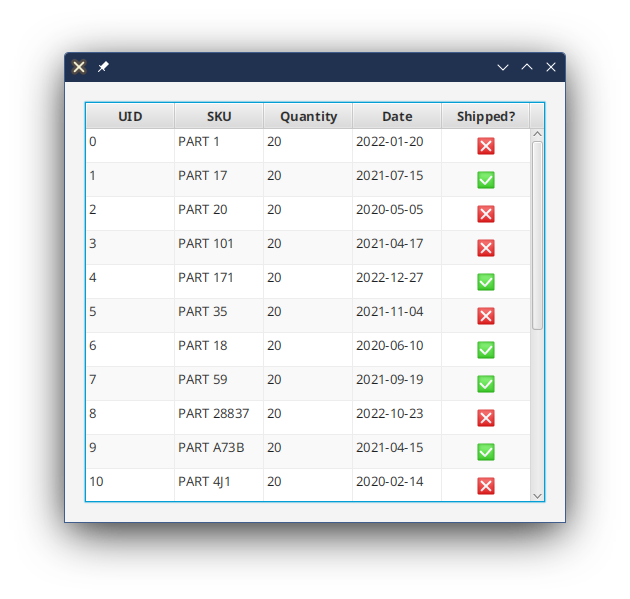
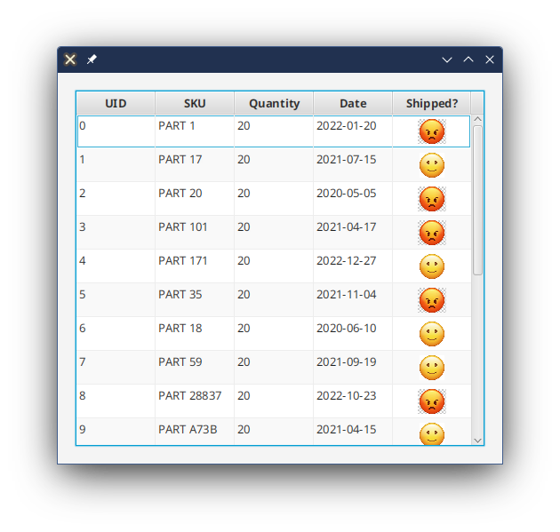
Using an Image
An image can be a bit more satisfying. Here we’re using images of checkboxes filled in with checkmarks and crossmarks in green and red. Visually it looks a bit better than using the CheckBox control.
public class BooleanTableCell2 {

    public BooleanTableCell2() {
       checkMark = createImageView(this.getClass().getResource("check-mark.png").toExternalForm());
       crossMark = createImageView(this.getClass().getResource("cross-mark.png").toExternalForm());
       container = new StackPane(checkMark, crossMark);
       container.setPadding(new Insets(2));
       setText(null);
       setGraphic(null);
   }

   private ImageView createImageView(String path) {
       ImageView imageView = new ImageView(path);
       imageView.setPreserveRatio(true);
       imageView.setFitHeight(24);
       imageView.setVisible(false);
       return imageView;
   }

   @Override
   protected void updateItem(Boolean item, boolean empty) {
       super.updateItem(item, empty);
       if (!empty) {
           if (item != null) {
               checkMark.setVisible(item);
               crossMark.setVisible(!item);
           } else {
               checkMark.setVisible(false);
               crossMark.setVisible(false);
           }
           setGraphic(container);
       } else {
           setGraphic(null);
       }
   }
}
Here we use the same StackPane, but this time we put two ImageViews in it. One is a checkmark and the other is a crossmark. The updateItem() method now manipulates the visibility of these to ImageViews so that only the appropriate on is shown in any given row. If the row is empty, or the ObservableValue contains Null then we just hide both of the images.
The most important take-away from this is that the layout of the Graphic is not changed in updateItem(). Any code that create in updateItem() which instantiates Nodes, or adds or removes Nodes to the layout is doomed to have performance issues. Yes, go ahead and change properties of the Nodes in the layout, but never, never change the layout itself.
You don’t have to stick to checkbox style images, either. Here’s one using emojis:
Using a Shape
Finally, we’re going to look at using a simple shape, in this case a Circle, for the boolean value:
public class BooleanTableCell3<S> extends TableCell<S,Boolean> {

    private final Shape circle;

    public BooleanTableCell3() {
       circle = new Circle(5);
       circle.setFill(Color.GREEN);
       circle.setStroke(Color.GREEN);
       setText(null);
       setGraphic(null);
   }

   @Override
   protected void updateItem(Boolean item, boolean empty) {
       super.updateItem(item, empty);
       setGraphic(null);
       if (!empty && (item != null) && item) {
           setGraphic(circle);
       }
   }
}
In this case, we’re only going to have the one shape, and we’re going to only display it when the value of the boolean is present and true. In any other case, we’ll simply leave the cell empty. It looks like this:
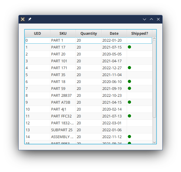
This can be an extremely effective approach, especially when you have multiple boolean columns and you want the user to be able to quickly see which rows have positive values. Any kind of graphic for the false value clutters up the TableView and makes it harder to see the positives. Of course, this is subjective and the kind of decision that needs to be made as part of the UX design.
If you want to have red Circles for the false values, then make the Circle always visible for non-empty, non-Null cells, and manipulate the Fill and Stroke colours of the Circle.
Conclusion
At this point, you have all the information you need to create a basic TableView, populate it with data, and do some basic customization of the TableCells.
We looked at the TableCell and how it’s layout is very much the same as Label, and we looked at how data is loaded into it. While we looked at different types of Nodes to put in the Graphic, the most important aspect of these examples was to see the different ways that TableCell.updateItem() interacted with the layout to change the way the Graphic looked, or whether to show it at all.
There’s a lot more that can be done with TableView that involves customizing the TableRows, creating complicated TableCells and dealing with row selections. There’s the idea of having TableCells update automatically when data inside the Properties inside the data model change. Not to mention TableView styling, which can be a learning odyssey all of its own.
We’ll look these topics in future articles.