Introduction
The ComobBox! Everybody’s go-to control for multiple choice input. It’s one of those elements that’s dead simple to get started with, but has a lot of power that many people don’t use.
In this article we are going to cover the absolute basics, and then take a look at some slightly more involved situations that seem to come up all the time. We’ll also see how easy it is to massage the presentation of the selectable items in your ComboBox to make it more user-friendly.
Simple Implementation
The easiest way to use a ComboBox is to just stuff some values in a list, bind the ValueProperty and stick it in a layout:
class ComboBoxExample : Application() {

    private val comboBoxValue: StringProperty = SimpleStringProperty("")

    override fun start(stage: Stage) {
        val scene = Scene(createContent()).apply {
            addWidgetStyles()
        }
        stage.scene = scene
        stage.show()
    }

    private fun createContent(): Region = VBox(20.0).apply {
        children += Label().apply {
            textProperty().bind(comboBoxValue.map { "The selected value is: $it" }.orElse("No value has been selected"))
        }
        children += ComboBox<String>().apply {
            items += listOf("Fred", "George", "Mary", "Jane")
            comboBoxValue.bind(valueProperty())
        }
        padding = Insets(40.0)
    }


}

fun main() = Application.launch(ComboBoxExample::class.java)
Note the use of ObservableValue.map() and ObservableValue.orElse() to translate the raw value from the ComboBox to the text for the Label. This is new since JavaFX 19, and it greatly simplifies a lot of bindings.
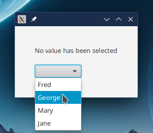
It starts out with a Null value, so the ComboBox just looks like an empty Button with an arrow. Click anywhere on it and it opens up with a list of choices for the user to click on:
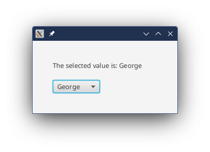
Picking one then populates the Button, and closes the pop-up list:
Standard Configuration Options
- Editable
- ComboBoxes work in two modes, editable and non-editable. “Editable” means that the user can type into the area in the ComboBox that looks like a
TextFieldand enter values that aren’t in the pop-up list. The default is non-editable. - Items
- The contents of of the pop-up list are controlled by an
ObservableListcalleditems. - VisibleRowCount
- This is the maximum size of the pop-up list, in rows. The default is 10, but you can make it bigger or smaller, depending on your layout.
- Value
- The currently selected value in the
ComboBox. This can be set programmatically if, for instance, you want to set a default value. Note that if you do change the value programmatically, it will automatically select the corresponding value in the pop-up list. The value does NOT have to be one of the values in the pop-up list, however. - OnAction
- You can trigger an
EventHandlerwhenever theValuePropertyof theComboBoxis changed. This is theOnActionevent.
The pop-up list works very much like a ListView and does, therefore, have a SelectionModel. For some reason, and I don’t know why (probably some copypasta that ended up in every on-line tutorial), people seem to think that the way to get a ComboBox's value is to go through the pop-up list SelectionModel. In reality, there’s almost never any reason to go through this round-about route - just use the Value property.
ComboBox<Object>
So what if you don’t want to have your ComboBox return a primitive like int, or a String? How do you do that? ComboBox is a generic class, so to use one you’ll need to specify the type of data values that it will return, and that will be held in items.
First off, though, you need to remember that the items that populate the list in a ComboBox should be part of your Presentation Model, and they should be designed with the intent that they are going to be used to support your view. This means that the idea that you’re just going to rip some customer records out of a database and dump them into a ComboBox as the choices is probably a bad design decision.
That being said, there are times when you might have a more complex object used to populate your ComboBox. It’s generally considered bad form to rely on toString() to create the display for your ComboBox, so you’ll need to customize it in some way to make it work properly. This means that you’re going to have to treat the popup as a ListView (which it is) and customize the cells.
In this example, we’re going to look at using an object with two fields. One of the easiest ways to do that is to use an Enum class, so that’s what we’ll do.
No surprise, we’re going to use the same Enum that we used in the ListView article, because the popup is pretty much just a ListView:
class ComboBoxExample1 : Application() {

    private val comboBoxValue: ObjectProperty<Animal> = SimpleObjectProperty()

    override fun start(stage: Stage) {
        val scene = Scene(createContent()).apply {
            addWidgetStyles()
        }
        stage.scene = scene
        stage.show()
    }

    private fun createContent(): Region = VBox(20.0).apply {
        children += Label().apply {
            textProperty().bind(comboBoxValue.map { "The selected value is: $it" }.orElse("No value has been selected"))
        }
        children += ComboBox<Animal>().apply {
            items += listOf(Animal.BEAR, Animal.OWL, Animal.BIRD, Animal.SHARK, Animal.HEDGEHOG, Animal.LOBSTER)
            comboBoxValue.bind(valueProperty())
        }
        padding = Insets(40.0)
    }
}

enum class Animal(val animalName: String, imageName: String) {
    BEAR("Bear", "bear.png"),
    BIRD("Bird", "bird.png"),
    HEDGEHOG("Hedgehog", "hedgehog.png"),
    LOBSTER("Lobster", "lobster.png"),
    OWL("Owl", "owl.png"),
    SHARK("Shark", "shark.png");

    val imageView: ImageView = ImageView(this::class.java.getResource(imageName)?.toExternalForm())

    override fun toString(): String {
        return animalName
    }
}

fun main() = Application.launch(ComboBoxExample1::class.java)
Which looks like this:
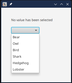
Here, we are just letting the Animal.toString() do the job of populating the pop-up contents. But, what if we want to have the image associated with the Animal appear in the ComboBox? We have to create a custom CellFactory for this:
children += ComboBox<Animal>().apply {
    items += listOf(Animal.BEAR, Animal.OWL, Animal.BIRD, Animal.SHARK, Animal.HEDGEHOG, Animal.LOBSTER)
    comboBoxValue.bind(valueProperty())
    setCellFactory {
        ListCell<Animal>().apply {
            graphicProperty().bind(itemProperty().map { it.imageView })
            textProperty().bind(itemProperty().map { it.animalName })
        }
    }
}
This is an approach you don’t see in most tutorials. There’s no custom class extending ListCell here.
Remember that ListCell is a subclass of Labeled, which means that its presentation can work very much like a standard Label. Specifically, we have both a Graphic and a Text element, and we have a graphicProperty() and a textProperty() method. If we bind those properties to data in item, then they’ll just show up on the screen and it will work.
Since we’re not going to override updateItem(), nor are we going to customize the layout of the ListCells, we don’t have to create a custom ListCell class, not even an anonymous inner class. We can just instantiate a plain vanilla ListCell and configure it from outside, using the methods already available from ListCell.
And it looks like this:
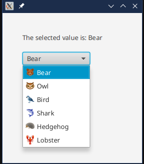
But, you can see that there is a bit of a problem. The main part of the CheckBox doesn’t have the image. This area is called the Button and it has a ListCell in it, just like the pop-up ListView does. We can set it, too, although it doesn’t need a factory but just an instance of the ListCell:
children += ComboBox<Animal>().apply {
  items += listOf(Animal.BEAR, Animal.OWL, Animal.BIRD, Animal.SHARK, Animal.HEDGEHOG, Animal.LOBSTER)
  comboBoxValue.bind(valueProperty())
  setCellFactory { createCell() }
  buttonCell = createCell()
}
     .
     .
     .
private fun createCell() = ListCell<Animal>().apply {
    itemProperty().subscribe(Consumer {
        graphic = it?.imageView
        text = it?.animalName
    })
}
In order to keep with DRY (Don’t Repeat Yourself), we’ve pulled the ListCell instantiation into its own method so that we can call if from the factory, and then directly to set the Button. However, there was a problem when trying to bind the Graphic and Text properties to Item fields. It turns out that the inner workings of the ComboBox skin actually set the values of Graphic and Text in the Button component directly in some circumstances, and the binding causes grief with that. So the bindings have been turned into a Subscription that can co-exist nicely with ComboBox skin code.
Now, it looks like this:
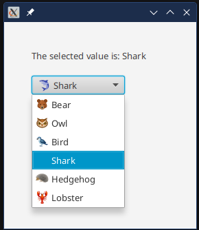
Uh oh! Where did the image go for the shark in the list? Since the Enum contains an actual ImageView which is a Node, and each Node can only appear on the SceneGraph once, it gets removed from the pop-up and put into the Button. To fix that, we’ll need to change the design of Animal (honestly, having ImageView in Animal was probably a bad idea to start with):
class ComboBoxExample1 : Application() {

    private val comboBoxValue: ObjectProperty<Animal> = SimpleObjectProperty()

    override fun start(stage: Stage) {
        val scene = Scene(createContent(), 280.0, 300.0).apply {
            addWidgetStyles()
        }
        stage.scene = scene
        stage.show()
    }

    private fun createContent(): Region = VBox(20.0).apply {
        children += Label().apply {
            textProperty().bind(comboBoxValue.map { "The selected value is: $it" }.orElse("No value has been selected"))
        }
        children += ComboBox<Animal>().apply {
            items += listOf(Animal.BEAR, Animal.OWL, Animal.BIRD, Animal.SHARK, Animal.HEDGEHOG, Animal.LOBSTER)
            comboBoxValue.bind(valueProperty())
            setCellFactory { createCell() }
            buttonCell = createCell()
        }
        padding = Insets(40.0)
    }

    private fun createCell() = ListCell<Animal>().apply {
        val imageView = ImageView()
        itemProperty().subscribe(Consumer {
            imageView.image = it?.image
            graphic = imageView
            text = it?.animalName
        })
    }
}


enum class Animal(val animalName: String, imageName: String) {
    BEAR("Bear", "bear.png"),
    BIRD("Bird", "bird.png"),
    HEDGEHOG("Hedgehog", "hedgehog.png"),
    LOBSTER("Lobster", "lobster.png"),
    OWL("Owl", "owl.png"),
    SHARK("Shark", "shark.png");

    val image: Image = Image(this::class.java.getResource(imageName)?.toExternalForm())

    override fun toString(): String {
        return animalName
    }
}

fun main() = Application.launch(ComboBoxExample1::class.java)
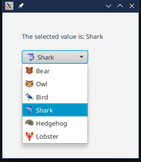
Now we have the Animal holding an Image, which is not a Node, and then loading that Image into an ImageView that is associated with each ListCell.
And it looks like this:
Codes and Descriptions
One situation that pops up all the time is where you have some sort of list of codes, and you want to display some descriptive text about the code instead of the code in your ComboBox. But you still want to return the code from the ComboBox selection. How do you do this?
A lot of programmers try using a Map<Code, Description> to establish the relationship between the code and its description. But then it’s hard to go on from there.
Honestly, using a Map instead of creating a class to hold a value pair is really not a great strategy to begin with. JavaFX has a general purpose class called Pair that you can use for this purpose. It has two fields, key and value and all the methods you might need with it. So you could create a List<Pair<Code, Description>> just as easily as you could a Map.
So let’s use ObservableList<Pair>…
class ComboBoxExample3 : Application() {

    private val comboBoxValue: ObjectProperty<Pair<String, String>> = SimpleObjectProperty()

    override fun start(stage: Stage) {
        val scene = Scene(createContent(), 280.0, 300.0).apply {
            addWidgetStyles()
        }
        stage.scene = scene
        stage.show()
    }

    private fun createContent(): Region = VBox(20.0).apply {
        children += Label().apply {
            textProperty().bind(comboBoxValue.map { "The selected value is: ${it.key}" }
                .orElse("No value has been selected"))
        }
        children += ComboBox<Pair<String, String>>().apply {
            items += listOf(
                Pair("GB", "Great Britain"),
                Pair("FR", "France"),
                Pair("AU", "Australia"),
                Pair("ES", "Spain")
            )
            comboBoxValue.bind(valueProperty())
            setCellFactory {
                ListCell<Pair<String, String>>().apply {
                    textProperty().bind(itemProperty().map { it.value })
                }
            }
            buttonCell = ListCell<Pair<String, String>>().apply {
                itemProperty().subscribe(Consumer {
                    text = it?.value
                })
            }
        }
        padding = Insets(40.0)
    }
}


fun main() = Application.launch(ComboBoxExample3::class.java)
Which looks like this:
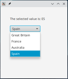
The key point here is that it doesn’t take a mountain of code to populate your ComboBox values with just the description, while still retaining the code in ComboBox.value. All you need is a standard ListCell and binding its textProperty() to a Binding derived from its itemProperty() extracting the Pair.value field does the trick.
This technique will work with much more complex objects, too. Just set up a Binding that composes a String made up from whatever class you are putting into the ComboBox.
At the same time, you can still use Map, in which case you’ll need to put the Map.entrySet() into an ObservableList. Map.Entry has key and value as well.
Linking ComboBoxes
Something that comes up fairly often is the idea of having two ComboBoxes that are somehow connected to each other. Changing the selection in one ComboBox changes the list of items available in the second ComboBox.
We’ll go back to our Animal based ComboBox and then add another that has names of individual animals making the screen a “Pick your favourite animal at the zoo” application. Let’s look at the code first, then see how it works:
class ComboBoxExample2 : Application() {

    private val animalValue: ObjectProperty<Animal> = SimpleObjectProperty()
    private val nameValue: ObjectProperty<String> = SimpleObjectProperty()

    override fun start(stage: Stage) {
        val scene = Scene(createContent(), 400.0, 300.0).apply {
            addWidgetStyles()
        }
        stage.scene = scene
        stage.show()
    }

    private fun createContent(): Region = VBox(20.0).apply {
        children += Label().apply {
            textProperty().bind(FavouriteAnimalBinding(animalValue, nameValue))
        }
        children += HBox(14.0).apply {
            children += ComboBox<Animal>().apply {
                items += listOf(Animal.BEAR, Animal.OWL, Animal.BIRD, Animal.SHARK, Animal.HEDGEHOG, Animal.LOBSTER)
                animalValue.bind(valueProperty())
                setCellFactory { createCell() }
                buttonCell = createCell()
            }
            children += ComboBox<String>().apply {
                val zooAnimals = populateZooAnimals()
                itemsProperty().bind(animalValue.map { zooAnimals[it] })
                nameValue.bind(valueProperty())
                placeholder = Label("  Pick an Animal first  ")
            }
        }
        padding = Insets(40.0)
    }

    private fun populateZooAnimals(): Map<Animal, ObservableList<String>> = mapOf<Animal, ObservableList<String>>(
        Animal.OWL to FXCollections.observableArrayList("Hoodini", "Olive Owl", "Whoolio", "Barney"),
        Animal.SHARK to FXCollections.observableArrayList("Striper", "Steve", "Freddy", "Sushi"),
        Animal.LOBSTER to FXCollections.observableArrayList("Clawdia", "Kevin", "Butter"),
        Animal.BEAR to FXCollections.observableArrayList("Gummi", "Paddington", "Baloo", "Ted"),
        Animal.BIRD to FXCollections.observableArrayList("Tweety", "Comet", "Chickpea", "Cracker"),
        Animal.HEDGEHOG to FXCollections.observableArrayList("Sonic", "Spike", "Whoolio", "Herbert")
    )


    private fun createCell() = ListCell<Animal>().apply {
        val imageView = ImageView()
        itemProperty().subscribe(Consumer {
            imageView.image = it?.image
            graphic = imageView
            text = it?.animalName
        })
    }
}

class FavouriteAnimalBinding(private val animal: ObservableValue<Animal?>, val name: ObservableValue<String?>) :
    StringBinding() {

    init {
        super.bind(animal, name)
    }

    override fun computeValue(): String {
        val favString = "My favourite animal at the zoo is"
        return animal.value?.let { animalType ->
            name.value?.let { animalName -> "$favString $animalName the $animalType" } ?: "$favString a $animalType"
        } ?: "I haven't picked a favourite yet"
    }
}

fun main() = Application.launch(ComboBoxExample2::class.java)
Here’s what it looks like at launch:
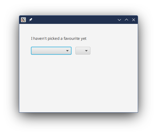
As you pick an Animal:
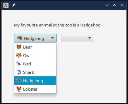
As you select a name:
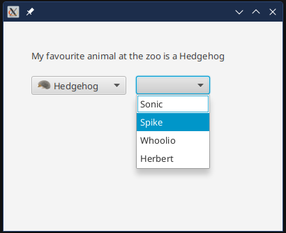
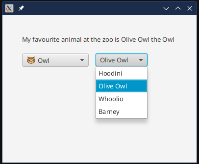
And once a name has been selected:
The trick with this is to treat the ObservableList of the second ComboBox as a Property itself, which ComboBox gives us as itemsProperty(). This is an ObjectProperty<ObservableList<String>>, which means that we can bind it. Do do that, we use ObservableValue.map() to extract an ObservableList from a Map<Animal,ObservableList>.
Each entry in our Map is keyed with an Animal, and the value is an ObservableList<String> of names of particular animals of that type. The ObservableValue.map() function here just pulls the List from the Map using the current Animal value selected in the first ComboBox. An equivalent way to do this in a version of JavaFX earlier than 19 would be Bindings.valueAt().
One last feature you should probably include is a Placeholder on the second ComboBox. This is what will be shown if the ListView in the pop-up is empty - as it will be when an Animal has not yet been selected. In this case, we’re just showing a Label that instructs the user to pick an animal first:
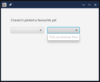
This is done with this line of code:
placeholder = Label(" Pick an Animal first ")
Editable ComboBoxes
Making a ComboBox editable means that the user can type in the Button cell and enter a value that potentially isn’t in the drop-down list. Here’s what happens when we make the ComboBox for name editable:
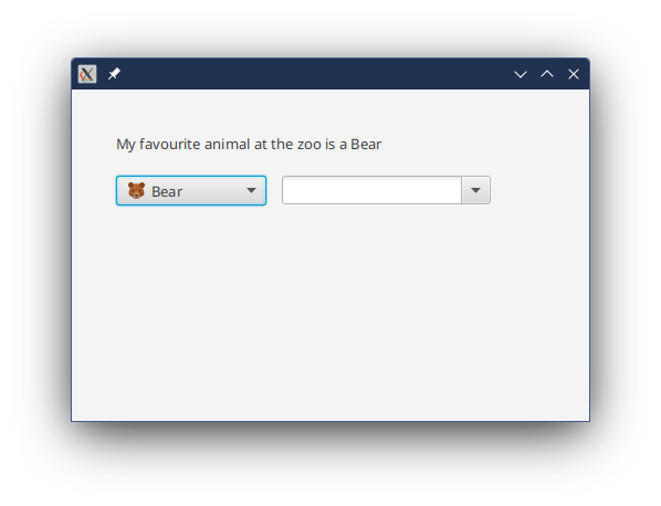
That ComboBox now looks like a TextField with a twisty Button beside it. When we type in something and hit <Enter> this is what happens:
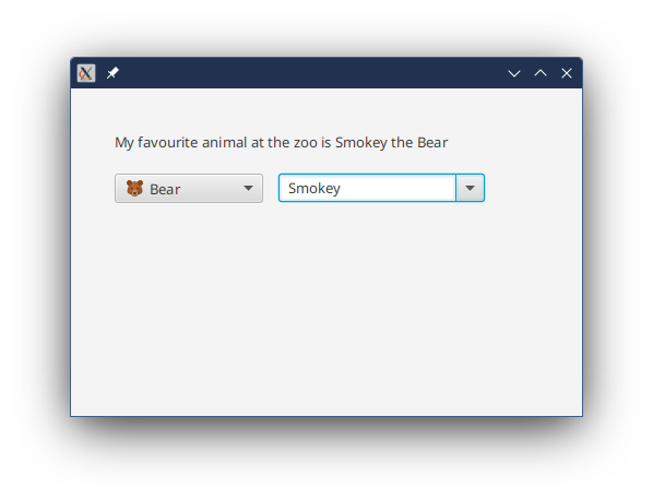
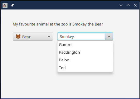
And you can see that none of the items in the drop-down are selected:
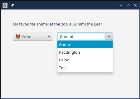
If we change it to one of the items in the drop-down, then the ComboBox makes the connection and highlights it for us:
The connection isn’t made until you commit the change by hitting <Enter> or taking the focus away from the ComboBox. You’re going to have to trust me on this, as I can’t get a screenshot without taking focus away from ComboBox.
Conclusion
And that’s it for our tour of the basics of ComboBoxes. With the information here you can probably handle the vast majority of ComboBox situations that come up when designing a JavaFX application.
The main things to keep in mind:
-
Grab the value from
ComboBox.valueProperty(), don’t go digging into theSelectionModelto get the selected item. This is especially true if yourComboBoxis editable. -
You can use the
Labelednature ofListCellto do a fair bit of manipulation of the presentation of your items without having to extendListCellinto a custom class. -
You can use a generic class like
Pairto display human-friendly names foritemsthat are codes. Also,Enumcan be really useful for this too.