Introduction
This tutorial was inspired by this question (and the answer) on StackOverFlow. There was a lot of back and forth about the OP’s strange ideas about how ListView and TableView work, but the answer posted by Sai Dandem was very good and forms the basis for what we’re going to look at in this article.
The Initial Problem
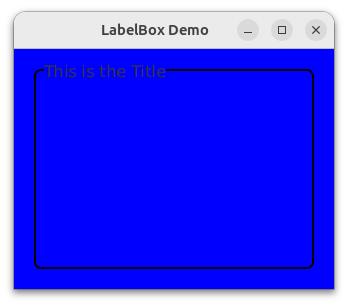
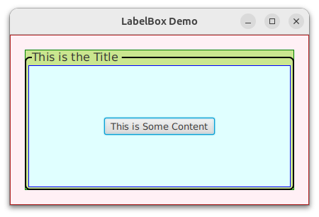
Let’s take a look at a screen shot that shows the issues clearly:
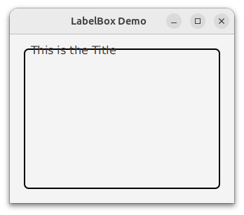
The most obvious problem (there are others) is that the border of the Region runs right through the Label at the top. That was the subject of the StackOverflow question; how to find a way such that the border at least appeared to stop before it went through the Label.
It’s not totally relevant, but here’s the code I used to generate this:
class LabelBoxApplication : Application() {
    override fun start(stage: Stage) {
        val scene = Scene(createContent(), 320.0, 240.0).apply {
            addStyleSheet("/css/LabelBox.css")
            addWidgetStyles()
        }
        stage.title = "LabelBox Demo"
        stage.scene = scene
        stage.show()
    }

    fun createContent() = BorderPane().apply{
        center = VBox(Label("This is the Title").apply{
            styleClass += "box-label"
        }).apply{
            styleClass += "label-box"
            padding = Insets(-10.0, 0.0, 0.0, 8.0)
        }
        padWith(20.0)
    }
}

fun main() {
    Application.launch(LabelBoxApplication::class.java)
}
The main think to note about this approach is that a negative Inset is used to move the Label up and into the area occupied by the border.
A First Solution
This was the stylesheet that was used in this example:
.label-box {
  -fx-border-width: 2px;
  -fx-border-color: black;
  -fx-border-radius: 6px;
}

.box-label {
   -fx-font-size: 16px;
  }
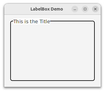
We can make one small change to it, adding a background colour to the Label, which by default has a transparent background.
.label-box {
  -fx-border-width: 2px;
  -fx-border-color: black;
  -fx-border-radius: 6px;
}

.box-label {
   -fx-font-size: 16px;
   -fx-background-color: white;
}
Now we get this:
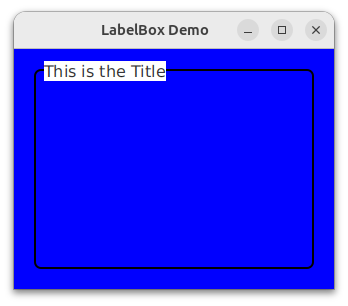
Which is all very good until we change the background color of the BorderPane to some other colour:
There is one last trick we can try, which is to change the -fx-background-color of the Labal to “inherit”, but that yields this:
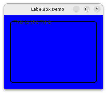
Which doesn’t work because the Label inherits from the VBox which has a transparent background. However, if we set the VBox to something other than transparent, like “inherit”…
.label-box {
  -fx-border-width: 2px;
  -fx-border-color: black;
  -fx-border-radius: 6px;
  -fx-background-color: inherit;
}

.box-label {
   -fx-font-size: 16px;
   -fx-background-color: inherit;
}

.wrapper-region {
   -fx-background-color: blue;
}
Then it will work again:
Complex Backgrounds
If all you’re going to use this LabelBox with is simple backgrounds, then you’re done. This will work fine, and you need not do any more work.
However…
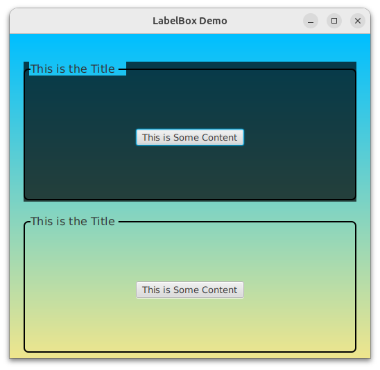
If you are going to use this with any kind of complex background, like a gradient or an image background, then you’ll have problems. Here’s what it looks like with a gradient:
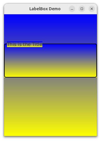
The problem is that “inherit” causes the background to repeat from scratch in each region, which is not what we want.
Making a Section of the Border Transparent
It’s clear that obscuring the border by making the Label region non-transparent is not the answer to the problem. We need to make the border transparent in the same region that we have the Label.
Refining the Layout
Before we get to the transparent border section, let’s take another look at our layout. Initially, it looked like this, restyled to show the regions better:
The green section is entire Pane for our LabelBox and the blue area is the content. Notice how the Label pokes out over the top of the Pane? That’s something we need to think about. We need to decide if we’re OK having some of our Pane's stuff existing outside its boundaries.
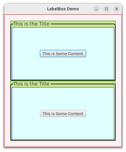
It can be a problem. Take a look at this:
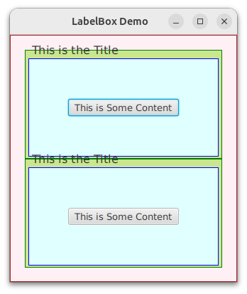
Here we see the LabelBox duplicated in a VBox. You can see how the Label on the lower LabelBox intrudes into the space occupied by the upper one. This is something that you can program around, but it’s probably better not to. It just makes the LabelBox trickier to deal with. So we’ll rearrange the layout to solve this:
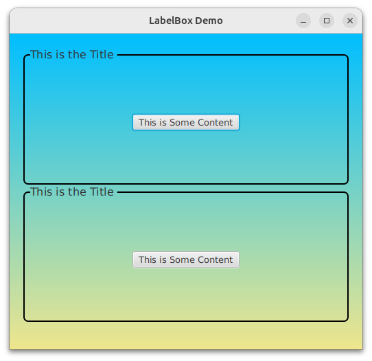
Here, the border has been added back in so that you can see how it now has to come down from the top in order to meet with the middle of the Label text. The Label is now completely contained within the boundaries of the Pane. You can stack them, and it will still look good without requiring any gap:
Using Clipping to Hide Some of the Border
JavaFX supports the idea of a “clipping” region, which defines the visual area in which an element will appear on the screen. In this case, we just want the border to be affected, and we need to define a shape that exclude just the area that the Label will occupy. We want something like this:
The translucent grey box is the area that we want to restrict the border to show. We can create this shape by creating two Rectangles, one that covers then entire area, and the other that is just a little bigger than the Label, and in the same location as the Label. Then we call Shape.subtract() to remove the smaller Rectangle from the larger one.
There’s just one problem with this…
We need to take in consideration that it’s just the border that we want to clip. This means that we cannot just add a border to the Pane and clip the Pane because it will also clip out the background of the Pane if it’s not transparent. So we’ll need to create a separate Pane that has nothing but a border, and then apply the clipping to this new Pane.
Let’s look at the code:
class LabelBox2Application : Application() {
    override fun start(stage: Stage) {
        val scene = Scene(createContent(), 320.0, 240.0).apply {
            addStyleSheet("/css/LabelBox.css")
            addWidgetStyles()
        }
        stage.title = "LabelBox Demo"
        stage.scene = scene
        stage.show()
    }

    fun createContent() = BorderPane().apply {
        padding = Insets(20.0, 20.0, 20.0, 20.0)
        styleClass += "wrapper-region"
        center = VBox(20.0, createPane(), createPane())
    }

    private fun createPane(): Region {
        val label = Label("This is the Title").apply {
            layoutX = 10.0
            styleClass += "box-label"
        }
        val borderPane = Pane().apply {
            styleClass += "border-pane"
            layoutYProperty().bind(label.heightProperty().divide(2.0))
        }
        val content = StackPane().apply {
            layoutX = 5.0
            layoutYProperty().bind(label.heightProperty().add(2.0))
            children += Button("This is Some Content")
        }
        val pane = Pane().apply {
            minHeight = 200.0
            children += listOf(borderPane, label, content)
            needsLayoutProperty().addListener(InvalidationListener {
                Platform.runLater { setClipping(borderPane, label) }
            })
            borderPane.minWidthProperty().bind(widthProperty())
            borderPane.minHeightProperty().bind(heightProperty().subtract(label.heightProperty().divide(2)))
            content.minWidthProperty().bind(widthProperty().subtract(10.0))
            content.minHeightProperty().bind(heightProperty().subtract(label.heightProperty().add(6.0)))
            borderPane.widthProperty().addListener(InvalidationListener { setClipping(borderPane, label) })
            borderPane.heightProperty().addListener(InvalidationListener { setClipping(borderPane, label) })
            label.widthProperty().addListener(InvalidationListener { setClipping(borderPane, label) })
            label.heightProperty().addListener(InvalidationListener { setClipping(borderPane, label) })
        }
        return pane
    }

    private fun setClipping(nodeToClip: Region, areaToHide: Region) {
        val rectangle = Rectangle(nodeToClip.width, nodeToClip.height + nodeToClip.layoutY).apply {
            layoutX = nodeToClip.layoutX
        }
        val clip = Rectangle(areaToHide.width + 5.0, areaToHide.height).apply {
            layoutX = areaToHide.layoutX
            layoutY = areaToHide.layoutY
        }
        nodeToClip.clip = Shape.subtract(rectangle, clip)
    }
}


fun main() {
    Application.launch(LabelBox2Application::class.java)
}
The Layout
All the layout code is in createPane(). You can see that there are four elements: the Label; the Pane with the border; the StackPane with the content; and the Pane to hold it all.
We’ve changed the main Region from the VBox in the first example to a Pane. This is because we’re going to need to monkey with the layout positions of the elements in any event, so we don’t need the automatic layout of VBox here. It will also make it easier to translate to a custom class (you’ll see).
Pane just piles its children on top of each other in the top left corner of the Pane. So we need to position everything manually.
- The
labelstays at the top, but it needs to be tucked over to the right to avoid the corner arc of the border. - The
borderPanestays at the left, but needs to move down 1/2 the height of thelabel. - The
contentPaneneeds to move down the height of thelabelplus a little bit, and also to the right to avoid the border.
This positioning just sets the top left corner of each of the elements. Additionally, the borderPane needs to have its width and height bound to the containing Pane, with the height adjusted to account for how much it dropped down at the top to meet the middle of the label.
The contentPane also needs to be bound to the size of the containing Pane but adjusted to stay within the borderPane without touching the border.
The rest of the code deals with the clipping…
The Clipping
The clipping is done by calling Node.setClip(), and, in and of itself, it’s pretty simple. The biggest issue to deal with is the fact that our clipping Shape is not going to appear on the SceneGraph. This means that it won’t be managed by the Layout Manager when the layout changes.
What this really means is that we cannot us bind() to bind the locations and dimensions of the Shape components to the elements that are on the screen. Bummer.
What we need to do is to use InvalidationListeners to trigger a recalculation of the clipping whenever the dimensions of the label or the borderPane change. This is why we have the four Listeners added at the end of the layout code, each of which just calls the clipping function.
The setClipping function itself is very simple. The two Rectangles are created with correct sizes, they are positioned properly, the smaller rectangle is subtracted from the larger one and the Node.setClip() is called on the borderPane.
There’s one final oddity, and it’s due to the fact that we cannot just bind the clipping shapes to the label and borderPane dimensions. Our Listeners are only triggered when the dimensions change after the elements are on the SceneGraph. The initial values aren’t captured, and any attempt to look at them just gives you zeros. What we need to do is to capture the moment that they are added to the SceneGraph and call the clipping routine after they have their dimensions established. We can catch that by putting a Listener on the needsLayoutProperty of the containing Pane. This flips to true when it’s ready to build the layout. Unfortunately, this happens before the layout is built, so we need to put our call to the clipping routine inside a call to Platform.runLater() which will run the clipping routine as a separate job after the layout is completed.
The Result
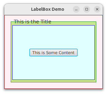
That’s it, this program creates a “builder” function that creates a LabelBox that works with complex backgrounds:
Creating a Custom Class
The only real difference between Pane and Region is that Pane exposes getChildren() as a public method, while it’s protected in Region. This is an important distinction when creating custom classes, but it means that our layout code, which is based on Pane can be moved straight out of the box into a custom class extending Region.
Let’s do that:
class LabelBox : Region() {

    init {
        val label = Label("This is the Title").apply {
            layoutX = 10.0
            styleClass += "box-label"
        }
        val borderPane = Pane().apply {
            styleClass += "border-pane"
            layoutYProperty().bind(label.heightProperty().divide(2.0))
        }
        val content = StackPane().apply {
            layoutX = 5.0
            layoutYProperty().bind(label.heightProperty().add(2.0))
            children += Button("This is Some Content")
        }

        minHeight = 200.0
        children += listOf(borderPane, label, content)
        needsLayoutProperty().addListener(InvalidationListener {
            Platform.runLater { setClipping(borderPane, label) }
        })
        borderPane.minWidthProperty().bind(widthProperty())
        borderPane.minHeightProperty().bind(heightProperty().subtract(label.heightProperty().divide(2)))
        content.minWidthProperty().bind(widthProperty().subtract(10.0))
        content.minHeightProperty().bind(heightProperty().subtract(label.heightProperty().add(6.0)))
        borderPane.widthProperty().addListener(InvalidationListener { setClipping(borderPane, label) })
        borderPane.heightProperty().addListener(InvalidationListener { setClipping(borderPane, label) })
        label.widthProperty().addListener(InvalidationListener { setClipping(borderPane, label) })
        label.heightProperty().addListener(InvalidationListener { setClipping(borderPane, label) })
    }

    private fun setClipping(nodeToClip: Region, areaToHide: Region) {
        val rectangle = Rectangle(nodeToClip.width, nodeToClip.height + nodeToClip.layoutY).apply {
            layoutX = nodeToClip.layoutX
        }
        println(areaToHide.width)
        val clip = Rectangle(areaToHide.width + 5.0, areaToHide.height).apply {
            layoutX = areaToHide.layoutX
            layoutY = areaToHide.layoutY
        }
        nodeToClip.clip = Shape.subtract(rectangle, clip)
    }
}
All we’ve done here is wrap the two methods from our builder code into a class extending Region and rename the createPane() method it init.
And then to run it…
class LabelBox3Application : Application() {
    override fun start(stage: Stage) {
        val scene = Scene(createContent(), 320.0, 240.0).apply {
            addStyleSheet("/css/LabelBox.css")
            addWidgetStyles()
        }
        stage.title = "LabelBox Demo"
        stage.scene = scene
        stage.show()
    }

    fun createContent() = BorderPane().apply {
        padding = Insets(20.0, 20.0, 20.0, 20.0)
        styleClass += "wrapper-region"
        center = VBox(20.0, LabelBox(), LabelBox())
    }
}


fun main() {
    Application.launch(LabelBox3Application::class.java)
}
It just runs and looks exactly the same as the last screen snap.
Refining the Custom Class
There’s a bit of cleanup we can do, now that we have everything encapsulated into a new class…
class LabelledPane : Region() {

    private val rectangle = Rectangle()
    private val clipZone = Rectangle()

    private val label = Label("This is the Title").apply {
        layoutX = 10.0
        styleClass += "pane-label"
        widthProperty().addListener(InvalidationListener { setClipping() })
        heightProperty().addListener(InvalidationListener { setClipping() })
    }
    private val borderPane = Pane().apply {
        styleClass += "pane-border"
        minWidthProperty().bind(this@LabelledPane.widthProperty())
        minHeightProperty().bind(this@LabelledPane.heightProperty().subtract(label.heightProperty().divide(2)))
        layoutYProperty().bind(label.heightProperty().divide(2.0))
        widthProperty().addListener(InvalidationListener { setClipping() })
        heightProperty().addListener(InvalidationListener { setClipping() })
    }
    private val content = StackPane().apply {
        layoutX = 5.0
        layoutYProperty().bind(label.heightProperty().add(2.0))
        minWidthProperty().bind(this@LabelledPane.widthProperty().subtract(10.0))
        minHeightProperty().bind(this@LabelledPane.heightProperty().subtract(label.heightProperty().add(6.0)))
        children += Button("This is Some Content")
    }

    init {
        minHeight = 200.0
        children += listOf(borderPane, label, content)
        styleClass += "labelled-pane"
        needsLayoutProperty().addListener(InvalidationListener {
            Platform.runLater { setClipping() }
        })
    }

    private fun setClipping() {
        with(rectangle) {
            width = borderPane.width
            height = borderPane.height + borderPane.layoutY
            layoutX = borderPane.layoutX
        }
        with(clipZone) {
            width = label.width + 5.0
            height = label.height
            layoutX = label.layoutX
            layoutY = label.layoutY
        }
        borderPane.clip = Shape.subtract(rectangle, clipZone)
    }
}
First off, we’ve renamed the class to LabelledPane, which is more in line with JavaFX’s TitledPane which is somewhat similar.
Next we’ve moved the components out of init{} and established them as fields of the class. This means we don’t need to pass them to setClipping(), and we can bind their dimension properties to the class properties when they are initialized. This allows init{} to be much smaller.
Finally, the StyleClasses have been renamed, and the CSS now has the components in a structure:
.labelled-pane {
}

.labelled-pane > .pane-label {
   -fx-font-size: 16px;
}

.labelled-pane > .pane-border {
    -fx-border-width: 2px;
    -fx-border-color: black;
    -fx-border-radius: 6px;
}
When this is run, it looks just like the other examples, nothing has functionally changed.
Making it Useful
If all you ever wanted to put into your LabelledPanes was a Button that did nothing with the caption “This is Some Content”, then we’d be done. But since probably do want to put our own content into the LabelledPane, we’ll need a way to do it, which means adding a function to the class. I haven’t been able to find a way to override Region's getChildren() method and still use it to add the other components, so I’m calling it getContent(), and it will just delegate to the getChildren() method of the StackPane called content.
Dealing With Sizing
One thing that become very quickly apparent when you try to vary the contents of the LabelledPane is that we need to handle the sizing of both the contents and the LabelledPane itself in relationship to the layout. Region has no inherent behaviour that prevents its children from extending beyond its bounds. So if the children are bigger than the size of the LabelledPane, they’ll just run outside the LabelledPane. So we’ll need to find a way to tame this.
For testing, I used a Label as the content with a large amount of text in it. I turned wrapping on, and Label will use ellipses to indicate if there is more text than can fit into the space provided. This is, therefore, a fairly complicated child from a layout perspective, that will challenge the design of the LabelledPane to contain it and display in an optimal manner.
To get some insight, I peeked into the layout code for VBox and then stole same ideas from it. In practice, this can become problematic because many of the standard JavaFX classes have private methods, and attempting to pull code out of these classes often means that you try to call private and package-protected methods from your own code in your own packages. Copying out those private methods, you find that they, in turn, call other private methods. And so on…
In this case, though, it was possible to prune out some small snippets that do a few important things without going down a rabbit hole leading to huge amounts of code copied from VBox and Region.
Here’s the code for the class:
class LabelledPane(labelText: String) : Region() {

    private val rectangle = Rectangle()
    private val clipZone = Rectangle()
    private val id: Int = counter++

    companion object {
        var counter = 0

    }

    private val label = Label(labelText).apply {
        layoutX = 10.0
        styleClass += "pane-label"
        widthProperty().addListener(InvalidationListener { setClipping() })
        heightProperty().addListener(InvalidationListener {
            setClipping()
        })
        maxWidthProperty().bind(this@LabelledPane.widthProperty().subtract(24.0))
        isWrapText = true
    }
    private val borderPane = Pane().apply {
        styleClass += "pane-border"
        minWidthProperty().bind(this@LabelledPane.widthProperty())
        minHeightProperty().bind(this@LabelledPane.heightProperty().subtract(label.heightProperty().divide(2)))
        layoutYProperty().bind(label.heightProperty().divide(2.0))
        widthProperty().addListener(InvalidationListener { setClipping() })
        heightProperty().addListener(InvalidationListener { setClipping() })
    }

    private val content = VBox().apply {
        layoutX = 5.0
        layoutYProperty().bind(label.heightProperty().add(2.0))
        maxWidthProperty().bind(this@LabelledPane.widthProperty().subtract(10.0))
    }

    init {
        children += listOf(borderPane, label, content)
        styleClass += "labelled-pane"
        minHeightProperty().bind(label.heightProperty().add(content.minHeightProperty()).add(20.0))
        widthProperty().addListener(InvalidationListener { prefHeight = getContentHeight() })
        needsLayoutProperty().addListener(InvalidationListener {
            Platform.runLater {
                setClipping()
                content.maxHeightProperty().unbind()
                prefHeight = getContentHeight()
                content.maxHeightProperty().bind(heightProperty().subtract(label.heightProperty()).subtract(10.0))
            }
        })
    }

    private fun getContentHeight(): Double {
        val value = computeChildPrefAreaHeight(content, width - 6.0)
        return value + label.height + 10.0
    }


    private fun computeChildPrefAreaHeight(child: Node, width: Double): Double {
        var snapWidth = -1.0
        if (child.isResizable && child.contentBias == Orientation.HORIZONTAL) {
            snapWidth = snapSizeX(
                boundedSize(
                    child.minWidth(-1.0),
                    if (width != -1.0) width else child.prefWidth(-1.0),
                    child.maxWidth(-1.0)
                )
            )
        }
        return snapSizeY(
            boundedSize(
                child.minHeight(snapWidth),
                child.prefHeight(snapWidth),
                child.maxHeight(snapWidth)
            )
        )
    }

    private fun boundedSize(min: Double, pref: Double, max: Double): Double {
        return min(max(pref, min), max(min, max))
    }

    private fun setClipping() {
        with(rectangle) {
            width = borderPane.width
            height = borderPane.height + borderPane.layoutY
            layoutX = borderPane.layoutX
        }
        with(clipZone) {
            width = label.width + 5.0
            height = label.height
            layoutX = label.layoutX
            layoutY = label.layoutY
        }
        borderPane.clip = Shape.subtract(rectangle, clipZone)
    }

    fun getContent(): ObservableList<Node> = content.children
    fun labelTextProperty() = label.textProperty()
}
Conclusion
I think this project is neat because it’s a cool problem/idea, and you could ask the question, “Shouldn’t something like this be included in the standard JavaFX layout classes?”. And perhaps it should. But the truth is that JavaFX gives programmers all the tools that they need to create just about anything that you can think of. Yes, there are some quirky bits about this that aren’t obvious if you’re just a beginner, but it can be done.
There’s nothing magical about the Node classes included with JavaFX. If you look at the source code, you’ll see that it’s just standard Java code, using JavaFX tools to exactly the same stuff that’s shown here. For sure, there’s some super complicated stuff in some of the classes that will melt you brain if you try to figure it out, but it can be figured out, and it’s not necessarily any better than anything you could write yourself.
From time to time, I see someone complain that “No new controls have been added to JavaFX for years…”. There’s never any mention of what they think is missing, so I guess they’re just complaining to look smart or something. Part of the reason for the general nature of that statement is that if there was something missing, and they knew enough, or were skilled enough to be affected by it, they should have enough knowledge and skill to build it themselves.
This LabelledBox control isn’t perfect, I noticed some quirky things happening with those Labels when I resized the window causing the wrapping and truncating to change. But it is good enough for a lot of things. I’m sure that when I use it in layouts in the future, I’ll find more problems. And maybe I’ll fix them. Or not.
The other thing that’s cool about this project is that it shows how dead simple it is to go from factory/builder method customizing a layout to creating a full blown custom class. As a builder, we used Pane because we need access to a public getChildren(), but as a custom class, we extend Region and then we have access to its protected getChildren() method. Other than that, though…not too much. A little bit more work was required to make it act more like a standard JavaFX Node, especially with regards to styling was just about all it took.