Introduction
Getting your Nodes on the screen in the places that you want them can be challenging at times. JavaFX has a fairly complete set of layout classes that will organize the contents in some particular fashion. Understanding the options available to you when you are designing a screen can make it much easier to get your screen to behave the way that you want it to.
This article isn’t going to go into deep detail about how to use any of these classes. It’s intended to give you a familiarity with how they work, and to outline some of the key parameters that you can use to change their behaviour.
You’ll find that there are links to the JavaDocs (version 16) of all of these classes. So if you want to know more about them, it’s just a click away.
The Layout Classes
There are a variety of layout classes, and they differ mostly in the way that they arrange the items in them in relationship to each other.
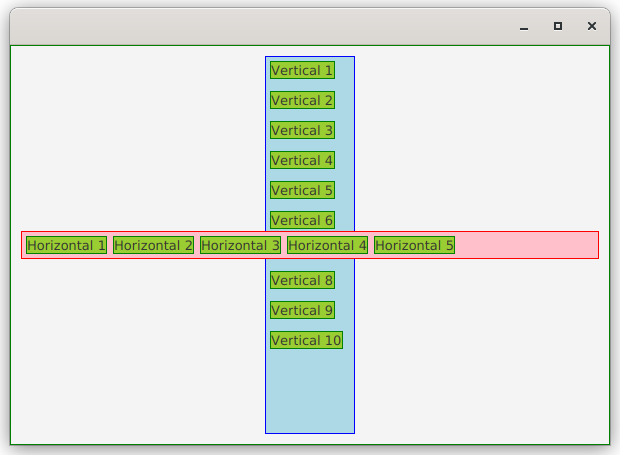
HBox and VBox
These two classes are the basic building blocks of just about any layout. They work very much the same way except for their orientation. HBox places the items in it horizontally, with each new element added to the right of the ones already in the HBox. VBox places the items in it vertically, with each new element added below the ones already in the VBox.
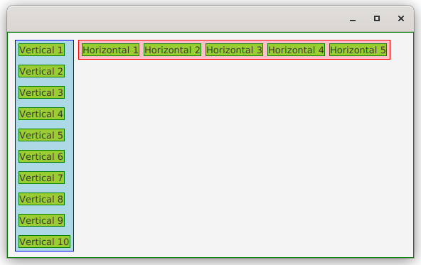
That’s really all there is to it. Both of these classes will respect the boundaries of the elements inside them (meaning that they won’t overlap) unless you force them to do otherwise.
There are a number of parameters that you can alter that will impact the manner in which they work:
- Padding
- Padding is the space inside the container that surrounds the contents. Padding is set using a class called
Insets. - Spacing
- Spacing is the space that occurs between each of the elements in the container.
- Alignment
- Alignment is how the elements will be place with relation to the boundaries of the container. Both HBox and VBox have
TOP_CENTERas the default alignment - Margins
- Margins are spacing around the outside of an element in a container. Margins are imposed by the container on the contained elements. The
setMargin()method is static inHBoxandVBox - FillHeight and FillWidth Properties
- These two properties control how resizable children will grow to fill the height or width of the container. Note that HBox only has
FillHeightand VBox only hasFillWidth.
StackPane
StackPane is the third layout class that orients the contents based on how they are added to the container. In StackPane all of the elements are placed on top of each other (like they are coming out of the screen towards you) as they are added.
StackPane doesn’t support Spacing since the items are intended to overlap. Additionally StackPane tries to resize its children to fill it completely, and the default alignment is CENTER. Otherwise it supports Margins, Alignment and Padding.
StackPane can be particularly useful when you want to have the content of some section of your screen contain different Nodes dependant on the state of something in your application. Just put them all in a StackPane and only have the Visible property of one of them true at a time.
BorderPane
BorderPane is perhaps the most useful of the layouts when designing a complete screen. It’s best understood via the diagram from the official JavaDocs:
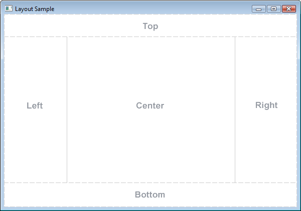
You put things into a BorderPane by calling its methods, setCenter(), setTop() and so on. Note that you can only put one item into each area of a BorderPane, and if you want more than one thing in an area, you’ll have to put them into some other layout class.
BorderPane is especially useful because it follows the same structure that many application screens take. There’s some kind of a header section at the top, then the main form or table in the middle, and then a status, message or button area at the bottom of the screen. These all map nicely to the structure of BorderPane.
Because each area of BorderPane can only hold one item, it doesn’t make any sense to have an overall alignment parameter for the BorderPane. Each of the areas has its own default alignment, and you can change the alignment of any specific contained element using a static method. Margins and Padding are supported by BorderPane.
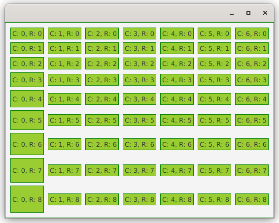
GridPane
GridPane is the most complicated of all of the layout classes in it’s use and structure. It allows you to carve the pane up into rows and columns and to place Nodes it particular columns and rows. There are constructs to allow you to control the nature of each row and each column, and to control the spacing between rows and columns. Additionally, there are ways to make a Node span several rows or columns.
GridPane can become complicated to use because, while it has the concepts of row and columns this is only in regards to layout. There really is no construct to hold a row or column of Nodes. This means that, while you can set some parameters around a row, you cannot write a method to create a row of content Nodes and just append it to your GridPane. Each Node needs to be specifically put into a particular row/column position, and it’s not possible to have a true builder method for a row that doesn’t involve passing a reference to the GridPane as a parameter.
Also, if you find yourself putting a GridPane inside a ScrollPane, you’re likely to be getting into a situation where a TableView or ListView would be a better approach.
On the other hand, any Node that you put into a GridPane can itself be a layout container, which means that you can have fairly complicated constructs inside your GridPane.
GridPane really shines when you do have Nodes that need to be arranged into a row and column arrangement where columns of Nodes need to be aligned with each other horizontally. If this isn’t a requirement, you might be better off by populating a VBox with a series of HBoxes. This can be much less complicated and easier to construct via builder methods.
The other concept you’ll need to understand about GridPane is the concept of RowConstraints and ColumnConstraints. These are classes that can be added to your GridPane to control the width/height, alignment and the grow priority of items in the rows and columns.
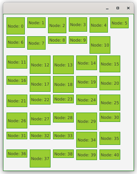
FlowPane
FlowPane is layout container where the children are laid out in column or rows, with the items wrapping either horizontally or vertically. For instance, with a horizontal FlowPane, each child Node is added to the right of the previous one, until the wrapping width of the FlowPane has been reached, at which point it will start a new row, below the previous one.
If the width or the height (for a vertical FlowPane) of the FlowPane is changed, the Nodes move to fill it:
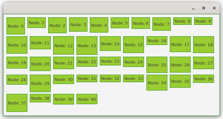
You can see how in this horizontal FlowPane there is clearly a concept of rows with a given height, but there is no concept of columns, as each row will simple have as many Nodes in it as will fit with a standard gap between them.
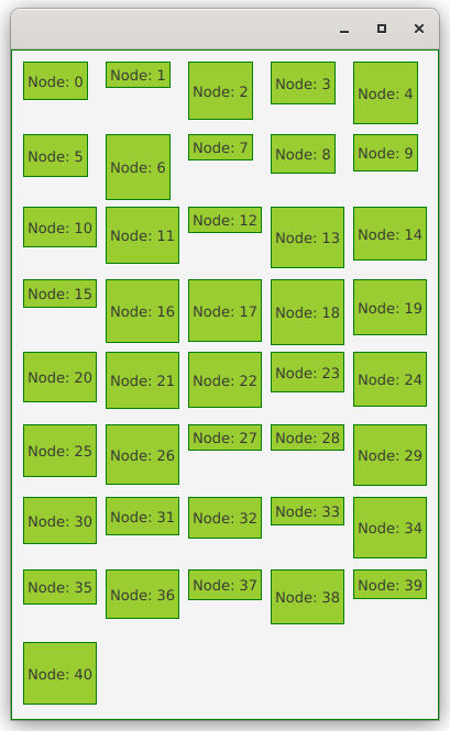
TilePane
TilePane is very similar to FlowPane but it maintains a sense of both rows and columns regardless of its orientation:
and it reorganizes itself as the width changes:
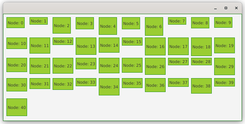
But you can see that it always keeps the Nodes organized in both rows and columns.
AnchorPane
AnchorPane is absolutely the most abused layout container in JavaFX. Probably because it’s the first alphabetically, it becomes the “default” layout container programmers use in SceneBuilder. It’s almost a certainty, if you see code that uses AnchorPane instead of something more appropriate, it’s because someone used SceneBuilder, or they learned layouts by using SceneBuilder.
What AnchorPane is intended to be used for is when you have several contained Nodes that need to be “anchored” to one or more sides of the Pane. This is generally not useful when you only have one item that needs to be anchored, as setting the alignment on something like an HBox will do the same thing with less code.
The Labeled Classes
The classes that inherit Labeled are all technically layout classes also. This includes Cell, Label and Button. These classes have two elements, a graphic and a text value. There are methods to control how these two elements are positioned inside the Node relative to each other, and then other methods that control the presentation of the text value.
If you have some layout that boils down to a Node plus a Label, you might be best off putting all of it together in a single Label node. For instance, a TextField with a prompt Label in front of it could be combined into a single Label instead of using an HBox to contain it all.
The Wrapper Classes
The next three classes aren’t really layout classes, but containers that you can put layout classes into to control their presentation.
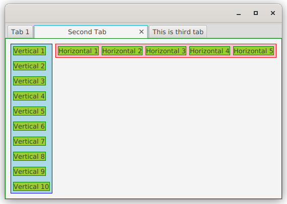
TabPane & Tab
A TabPane is a container that holds Tabs in a presentation that looks like a file cabinet with file folders with tabs that stick up. When you click on a Tab it brings it and its contents to the front of the TabPane, and you can only see the content of one Tab at a time.
Tabs have two regions, the tab itself - which operates a bit like Labeled, and the Content. Like BorderPane you can only put one item into the content of a Tab, which means that you’re probably going to be putting some other kind of layout container in there.
TitledPane
TitledPane works very much the same way that “twisty’s” on web pages work. There is a title section with an arrow, and clicking on this will rotate the arrow and open and close the contents of the panel. Clicking on it again will do the reverse:
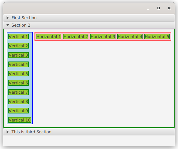
As with Tabs, you can only put one Node into the contents of a TitledPane, so you’ll need to use some other layout class to organize multiple Nodes in a TitledPane.
ScrollPane
ScrollPane is usually used as a wrapper around another layout class to allow it to fit into a area in the screen that would otherwise be too small for it. If the enclosed region is larger than the viewport of the ScrollPane then scroll bars will appear.
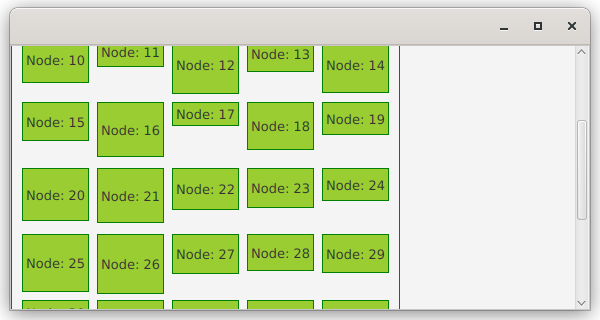
This image shows a TilePane inside a ScrollPane. It also illustrates the very important point that putting a container inside a ScrollPane may often fundamentally change the way that the enclosed container functions. A ScrollPane functionally has an infinite height and width, and won’t cause any resizable elements inside it to automatically expand. In the image above, you can see that the width of the ScrollPane has been increased but the TilePane inside it has not grown wider.
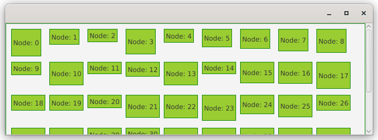
Here’s the same TilePane, but this time the FitToWidth property of the ScrollPane has been set to true. This causes the TilePane to expand to fit the width of the ScrollPane's viewport:
The Non-Layout Containers
This next set of container classes don’t do any layout for you at all and are, therefore, of limited use.
Pane
Pane is the parent class to most of the layout classes. It extends from Region and only adds the public getChildren() method to Region. Anything that you put into a Pane will be stacked in the top left corner of the Pane. Pane won’t auto-resize to accommodate the things you put in it or do anything else particularly useful.
It’s parent, Region, has all of the methods that control the size of the layouts as well as a number of layout control methods. However the getChildren() in Region is inherited from Parent and is Protected, so you cannot directly put anything into either Region or Parent.
To position items in Pane you’re going to have to use setLayoutX/Y() or setTranslateX/Y() unless you’re happy with them all stacked on top of each other in the top left corner. This can be useful, however, if there’s something about the topology of your layout that doesn’t work well with the standard layout classes. For instance, the hexmap layouts that I’ve talked about in other articles are best done with Pane and manual placement of the hexes.
Group
Group is very much like Pane except that it gains its size purely from its contents. So it can’t be resized externally by an enclosing container class.
Group is supposed to be extremely light-weight and doesn’t do CSS styling. So in some extreme cases it might have some value if you were having performance issues. It’s also useful as a holder for Canvas so that you can put nothing more than a Canvas into a Scene. Otherwise, just don’t use Group.
Canvas
Canvas isn’t really a container class, and it doesn’t extend from Parent, but from Node. It’s really a wrapper around a GraphicsContext that you can use to draw on.
Since Canvas doesn’t extend from Parent, you can’t add it directly to a Scene. If all you want in your Scene is a Canvas, then the best approach is to stuff it into a Group that you use as the root of the Scene.
Tips and Techniques
Getting a layout to work the way that you want or expect can, at times, be a bit frustrating. Small changes to a design cause a ripple effect through your layout and stuff moves around in unexpected ways. Here are some tips for creating you layouts with the least amount of frustration…
Understand How Items Grow Inside Containers
Many of the Node classes are resizable, but for many of those there are practical constraints which means that they are essentially fixed sizes. For instance, a CheckBox isn’t going to ever need to be much bigger than the checkbox itself and the label.
Very often, the Nodes that you’ll need to worry about resizing are the container classes. Most of the time, these way that these Nodes resize is going to be dependant on the class of the parent holding them. Sometimes, you can control how these Nodes grow based on their own methods, other times you need to use methods in the containing class.
In order to understand this…
Use Borders to Debug
The absolute best way to understand what’s using up space in your layouts is to use borders on your layout containers. Borders let you understand how things have grown to fill up containers and to understand why a particular Node isn’t appearing where you expect it to. Virtually all of the time, when you cannot understand why your layout is looking goofy, it’s because some container isn’t occupying the space that you think it should.
The easiest way to do this is to just create a few style class selectors in your CSS file, define a border of a particular colour in them, and then add them to the StyleClass list in a container Node. The CSS would look like this:
.test-border1 {
  -fx-border-color: red;
}

.test-border2 {
  -fx-border-color: blue;
}

.test-border3 {
  -fx-border-color: green;
}

.test-border4 {
  -fx-border-color: black;
}
The examples in this article were created using these. I also added background colours to make things a bit clearer.
Don’t Put Stuff Inside of Stuff Unless You Have a Reason
This is something that beginners do all the time. I’ve seen countless layouts where GridPane is inside an AnchorPane which is inside an HBox which is inside another AnchorPane and so on. There’s no point to it, just having the GridPane by itself would do the trick.
Generally speaking, having a layout container with only one child Node in it is probably a JavaFX code smell. This is especially true if that container doesn’t have any configuration done to it at all (like setting Padding or Alignment).
As a rule, putting your layout inside another layout container won’t fix your problem but it will make your layout more complex and harder to debug.
Don’t Worry About “Load” of Layout Types
Unless you’re doing something really graphically complex that might tax your system, just don’t worry about whether one layout class is “heavier” than another. It just won’t matter in real life.
Looking at the source code for JavaFX, you’ll find that many of the more complicated controls, like ComboBox or Slider are actually composed of a number of different Nodes. Generally, if one of those internal Nodes needs to be placed into a layout container (or sometimes just is the layout container), JavaFX uses StackPane. StackPane doesn’t appear to be any lighter than any other container. If this approach is good enough for the inner workings of the JavaFX classes, it’s probably good enough for you.
Build Size Constraints from the Inside Out
It’s usually true that you’ll have better results if you concentrate on limiting the size of your Nodes at the bottom of your hierarchy, not at the top. Leave the layout containers free to resize to the contents as much as possible.
At the bottom is where you’re likeliest to find Nodes that can be absolutely sized. For instance, you might be able to say that a particular TextField should be restricted to only 60px. It would probably look better than having it 5 times as big as the longest String that’s allowed in it.
Don’t Try to Scale to Changing Fonts
One of the most difficult things to do in JavaFX is to try to set limits on a Node based on how much space its text-based contents might take up. Especially when you try to make the calculation independent of the font used for the text.
The best approach is probably to just pick a reasonably font and size that works well in your screen and set your height and width values for your controls based on that font. If you need bigger fonts for special situations, use setScaleX/Y() on the entire Node.
Static Methods
There are a number of static methods in the layout classes that can be used alter the layout of contained Nodes. Methods like setMargins(). These methods should be applied from outside the builders for the contained Nodes.
Let’s say that you have a Label that you intend to put into an HBox and you want to have a little extra space in between this Label and the next thing to its right. Generally speaking, this is a good use for HBox.setMargin(). If you have a builder for this Label don’t include the call to HBox.setMargin() inside of it. This makes your builder assume that the Label is going to be in an HBox, and if you later change that, then you’ll have to change the builder too.
Any code that arranges Nodes in container with regards to each other belongs in the code for the container.
Different Approaches Can Work Fine
There’s often not just one way that you can design a layout. In many cases, there’s no objectively better way to construct a layout, it just boils down to what makes sense to the programmer.
Let’s look at a simple example. We’ll start from the inside, with a Label/TextField combination in a VBox, so the prompt is above the TextField. We’ll create a builder for it, parameterize the prompt text and return the result as a very generic Region. This is Kotlin, but it should be pretty clear what’s going on:
private fun inputThingy(promptText: String): Region = VBox(4.0).apply {
   padding = Insets(4.0)
   isFillWidth = true
   maxWidth = 230.0
   children += Label("$promptText:")
   children += TextField()
}
We’re controlling the width of the TextField by setting setFillWidth(true) and then setting a max width for the VBox. In real life, with a Model, we’d also parameterize the StringProperty from the model that we’d bind to the TextField. But this is just about layouts, so we don’t need to go that far for this example.
Now we’ll look at how you can get a bunch of these inputThingy's onto the screen…
We can lay them out in a set of HBoxes contained in a VBox:
return VBox(2.0).apply {
   children += listOf(HBox(2.0, inputThingy("First Name"), inputThingy("Last Name")),
                      HBox(2.0, inputThingy("Street"), inputThingy("City")),
                      HBox(2.0, inputThingy("Province/State"), inputThingy("Country")),
                      HBox(2.0, inputThingy("Phone Number"), inputThingy("Email Address")))
}
or a GridPane:
return GridPane().apply {
    add(inputThingy("First Name"), 0, 0)
    add(inputThingy("Last Name"), 1, 0)
    add(inputThingy("Street"), 0, 1)
    add(inputThingy("City"), 1, 1)
    add(inputThingy("Province/State"), 0, 2)
    add(inputThingy("Country"), 1, 2)
    add(inputThingy("Phone Number"), 0, 3)
    add(inputThingy("Email Address"), 1, 3)
    vgap = 2.0
    hgap = 2.0
 }
or in a TilePane:
return TilePane().apply {
   children += listOf(inputThingy("First Name"),
                      inputThingy("Last Name"),
                      inputThingy("Street"),
                      inputThingy("City"),
                      inputThingy("Province/State"),
                      inputThingy("Country"),
                      inputThingy("Phone Number"),
                      inputThingy("Email Address"))
   prefColumns = 2
   hgap = 2.0
   vgap = 2.0
}
And they all look the same:
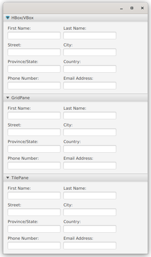
The only real difference is if you stretch out the window, the TilePane adjusts to the new space:
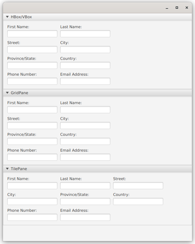
Maybe the TilePane is better because it’s more responsive, but who knows? Maybe there is a constraint to have just two columns of inputs. This example is a little bit contrived, because all of the Nodes in the layout are designed to be the same width, which is a bit simpler. But still, this kind of situation comes up all the time.
Probably more important than the layout class used, is the fact the that Label/TextField pair are set up in their own layout, and then that composite Node is put into the main layout. Many, many programmers would try to put the Labels and the TextFields separately into the main layout, and then it gets overly complicated very quickly.