Introduction
We’re all familiar with Dialog boxes, they pop up with some important information, ask you, “Are you sure?”, let us pick a file, or make some other important decision before processing can continue. In the beginning, JavaFX didn’t have Dialogs and we were left to cook up our own solutions or use third party libraries. But they were added around JavaFX 8, and work quite well.
There are places where a Dialog makes a lot of sense, but a lot of places where they result in a bad user experience. First off, most users hate pop-ups and they’re almost always a surprise when the appear. So if you can design your UX such that whatever information would be in a Dialog is conveyed in your main GUI, your users will be happier. For instance, instead of putting up a dialog that indicates that some TextField contains an invalid value, how about configuring your TextField so that the users cannot enter invalid data?
The sample code in this article are written in Kotlin. If you know Java, you should be able to figure out what the Kotlin code is doing with little trouble. If you need a quick primer in Kotlin, you can check out my article, which should tell you everything you need to know.
The Basics
Dialogs really aren’t that complicated, but this is one of those places where the JavaDocs is not a very good learning tool. This means that beginners get confused about how to go about using them. You’ll need to understand how their layout works, the ButtonType madness, and then about “Result Converters”.
Before we get into more advanced concepts, let’s look at the core concepts about how Dialog works…
Button Types
ButtonTypes is the concept that really gets beginners’ heads spinning. It’s meant to abstract the meaning of the Buttons from the implementation of the Buttons, and make it easier to quickly implement a Dialog. Because you don’t have to worry about how the Buttons actually get on the screen, you can treat them like data through the ButtonTypes. Of course, none of this is explained properly, so it just causes a lot of confusion.
Let’s clear that up…

Dialogs are designed to be user interactions inserted into a procedural flow.
Very often, Dialogs are used to allow the user to make some kind of choice between a small number of options - which can even be something as simple as “proceed” or “stop”. To simplify the programming needed to implement these kinds of Dialogs, the designers of JavaFX have given us ButtonTypes and the Enum class ButtonBar.ButtonData.
ButtonType is a POJO with a set of statically predefined values that correspond to the values in ButtonBar.ButtonData. These are values like APPLY, OK, CANCEL and NEXT. You can make your own ButtonTypes if you want, and this allows you to have a button in your Dialog with a customized label but a standard value.
If you’re using Dialogs this way, then you don’t add the Buttons directly to the Dialog, you just add a list of the ButtonTypes that you want to have, and the Dialog takes care of adding the Buttons in the right place, and then it will tell you the ButtonType of the Button that the user clicked. There isn’t any way to directly add a Button to the standard “Button Bar” in a Dialog.
Handling Return Values
Dialogs are primarily intended to be used modally as part of a procedural flow. “Modal” means that the window holding the Dialog is the only active window in the application, and the user cannot interact with any other part of your GUI until they have dismissed the Dialog. The normal way to put a Dialog on the screen is to use Dialog.showAndWait().
Dialog.showAndWait() is very special case in JavaFX coding. It’s almost like using a blocking operation in your code, which you would ordinarily never do on the FXAT. However, Dialog.showAndWait() does not block the FXAT. Events will continue to be processed on the FXAT, transitions and timers will continue to run, and the screen will continue to respond appropriately to window moves, mouse actions and keystrokes.
What will happen, though, is that the code that contains the Dialog.showAndWait() call will stop. No more code will be executed until the Dialog has been closed. At that point, the execution will continue.
And when the execution continues, the Dialog.showAndWait() call will have returned a value. This value is wrapped in Optional, meaning that you’ll have to check to see if there is an actual value. The JavaDocs for Dialog show three methods to handle the Optional with the notation that, “There is no better or worse option of the three…”. That’s utter rubbish. The first approach uses Optional.get() which is an anti-pattern. The third approach, “The fully lambda approach”, is totally counter-intuitive, and probably inspired by the novelty of lambdas at the time that Dialogs were introduced.
Stick to Optional.ifPresent(), and if you want to have some code executed if there is no value returned you should use Optional.ifPresentOrElse().
But why would Dialog.showAndWait() return an Optional?…
Abnormal Closing of the Dialog
Since windows often have that “X” in the top corner, it’s possible to close them without clicking on one of the Buttons. This means that the Dialog can close without the user giving a response, and the way that is handled is to return the value as an Optional.
The JavaDocs refer to this as “abnormally” closing a Dialog. Not all Dialogs can be closed this way, it depends on the nature of the Buttons in the Dialog.
If a Dialog only has one Button, then it can be closed abnormally. If a Dialog has more than one Button, and one of those Buttons has been defined as a “Cancel” Button, then it can also be closed abnormally.
In the standard implementation of Dialogs, the “Cancel” Button is usually treated the same as an abnormal close, and the Dialog will return an empty Optional.
Dialog Utility Subtypes
There are three subtypes of Dialog, each intended to make it easy to perform specific types of common user interaction…
Alert
Alerts are intended to send a message to the user and require them to acknowledge it before moving on. Control of how the Alert will look is by assigning an AlertType to it. Beyond that, you can change the window title, the text which appears beside the icon, the message and the icon itself. Alert extends Dialog<ButtonType> which means that its showAndWait() method will return Optional<ButtonType>
The AlertTypes and How They Look
The JavaDocs don’t give much help about what the different AlertTypes actually do, just some generic description of their intended uses. The only way to see is to try them, so here’s some Kotlin code that will do the trick:
class AlertTest : Application() {
override fun start(primaryStage: Stage) {
primaryStage.setScene(Scene(createContent()))
primaryStage.show()
}
private fun createContent(): Region = BorderPane().apply {
center = Button("Click Me").apply {
onAction = EventHandler {
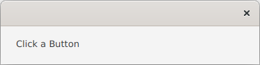
val alert = Alert(AlertType.CONFIRMATION).apply {
contentText = "Click a Button"
}
alert.showAndWait().ifPresentOrElse({ println("This is the result: $it") }, { println("No result") })
}
}
padding = Insets(50.0)
}
}
fun main() {
Application.launch(AlertTest::class.java)
}
From this code I generated the following screen snaps, changing the AlertType each time…
AlertType.Confirmation:
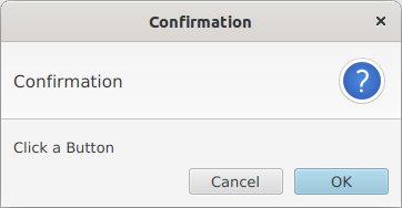
This is the only AlertType that generates more than one button, and abnormally closing it will return a “Cancel” value. The idea behind this Alert is usually to allow the user one last chance to abort an operation before it starts.
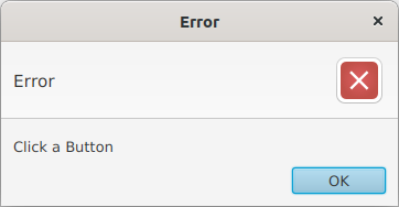
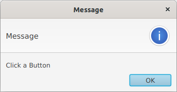
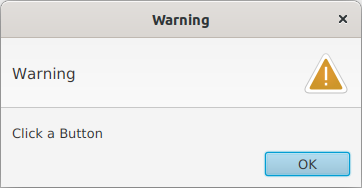
The next three don’t differ in functionality, just the presentation of the message…
AlertType.Error:
AlertType.Information:
AlertType.Warning:
AlertType.None:
This AlertType is useless without some further customization. In fact, it isn’t even possible to close this Dialog at all since there are no Buttons which means it won’t accept an abnormal closing either.
Here’s how you can customize it:
val alert = Alert(AlertType.NONE).apply {
   contentText = "This is contentText"
   headerText = "This is headerText"
   title = "This is the title"
   buttonTypes += listOf(ButtonType.APPLY, ButtonType.FINISH)
   graphic = AlertTest::class.java.getResource("/images/boom.png")?.toExternalForm()?.run { ImageView(this) }?.apply {
      fitWidth = 60.0
      isPreserveRatio = true
   }
}
And that gives you this:
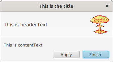
Of course, you can apply all of these customizations to any of the AlertTypes.
TextInputDialog
TextInputDialog looks very much like an Alert set to AlertType.CONFIRMATION, except that it also has a TextField placed into the content. This is intended to be a very quick way to set up a straight-forward input Dialog with a minimun of extraneous code.
Here’s a simple example:
private fun createContent(): Region = BorderPane().apply {
   center = Button("Click Me").apply {
      onAction = EventHandler {
         val dialog = TextInputDialog("This is the default").apply {
            contentText = "This is a message in\n the content text"
            headerText = "Input Required"
         }
         dialog.showAndWait().ifPresentOrElse({ println("This is the result: $it") }, { println("No result") })
      }
   }
   padding = Insets(50.0)
}
Which looks like this:
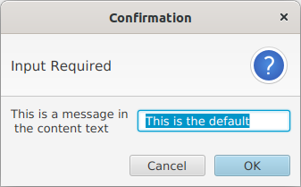
TextInputDialog extends Dialog<String> so it will return an Optional<String>. The result will be empty if the user clicks the “Cancel” Button or abnormally closes the window. Otherwise it will return the value that is in the TextField.
In addition to the customization values available with Alert you can also get access to the TextField contained in the Dialog via TextInputDialog.getEditor(). This means that you can install a TextFormatter on it.
ChoiceDialog
Like TextInputDialog, ChoiceDialog is inteded to be a “no fuss” way to set up an input Dialog, but using a ComboBox instead of a TextField. You’ll need to provide the list of possible choices, as well as the default…
private fun createContent(): Region = BorderPane().apply {
   val button = Button("Click Me").apply {
      onAction = EventHandler {
         val dialog = ChoiceDialog<String>("Wombat", "Bunny", "Wombat", "Kangaroo", "Panda").apply {
            contentText = "This is a message in\n the content text"
            headerText = "Input Required"
         }
         dialog.showAndWait().ifPresentOrElse({ println("This is the result: $it") }, { println("No result") })
      }
   }
   center = button
   padding = Insets(50.0)
}
Which looks like this:
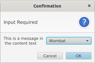
Unlike TextInputDialog, you cannot grab the input control to customize it. You can, however, still customize the other common elements just like the other standard Dialogs.
Creating Your Own Dialog
While Alert, TextInputDialog and ChoiceDialog are likely to satisfy 90%+ of your use cases for Dialogs, there are times when you’ll need to create something a little bit more complicated and customized. So let’s look at how you go about doing that…
DialogPane
The Dialog class is NOT a screen component. It's best thought of as a controller class.
The screen content of a Dialog is a class called DialogPane, which handles the layout. It has four main components, the “Header”, the “Content”, the “Expandable Content” and the “Button Bar”. If you’ve looked at the screen shots of TextInputDialog or ChoiceDialog earlier in this article then you’ve seen how this structure works.
The “Header” Section
The “Header” section contains two elements; some text and a graphic. These are actually two different Nodes, not the text and graphic of a Labeled type of Node. You can change the content of either of these two Nodes directly if you want. Often, the graphic is an ImageView, but you can change it to any kind of Node that you like.
You can directly change the values held in the default Nodes:
- setHeaderText()
- This will update the text content of the “Header” section.
- setGraphic()
- This will update the content of the graphic in the “Header” section. You can put any kind of
Nodein here.
These are also Properties so you can do the usual binding stuff if that makes sense for your application.
But if you want a completely custom “Header” section…
- setHeader()
- This will replace the entire “Header” section with your own
Node. Once you have done this, you will not be able to usesetHeaderText()orsetGraphic().
If you haven’t called setHeader() to implement your own custom header Node, then calling getHeader() will return Null. In other words, you cannot use getHeader() to retrieve and manipulate the default header Node.
The “Content” Section
The “Content” section is occupied by an empty Label by default. You can update its text value directly.
- setContentText()
- This will update the text value in the “Content” section.
This is also a Property so you can do the usual binding stuff if that makes sense for your application.
This looks like this:
If you decide that you do not like the default Label implementation for the “Content” section you may replace it with your own Node…
- setContent()
- This will replace the entire “Content” section with your own
Node. Once you have done this, you will not be able to usesetContentText()any more.
If you haven’t called setContent() to implement your own custom content Node, then calling getContent() will return Null. In other words, you cannot use getContent() to retrieve and manipulate the default content Node.
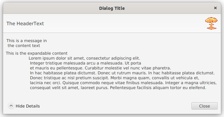
The “Expandable Content” Section
If you have additional details that users may not always need/want to see, you can put it into the “Expandable Content” section. Unlike the “Header” and the “Content” sections, you cannot access a text value for it, you have to supply a Node via the setExpandableContent() method.
If this Node is non-null, then a “twisty” style arrow with the text, “Show Details” will appear in the “Button Bar”. Clicking on it will expand the Dialog size, and display the Node contained in the “Expandable Content” section. The “twisty” changes to say “Hide Details”.
The “Button Bar”
The “Button Bar” really is a ButtonBar and it sits at the bottom of the DialogPane. There’s no way to directly access it, and the only way to add or remove buttons is to add new ButtonTypes to the list from getButtonTypes().
Delegate Methods in Dialog
There are convenience delegate methods in the Dialog class which call the appropriate method in DialogPane to modify all three of the content values. These are the setters and getters for contentText, headerText and graphic. To actually change the Nodes for any of these elements from the defaults (or to access the default Nodes) you’ll have to get the DialogPane from the Dialog first.
For some unfathomable reason, there’s no delegate method in Dialog to retrieve the list of ButtonTypes. So, once again, you’ll have to grab the DialogPane first.
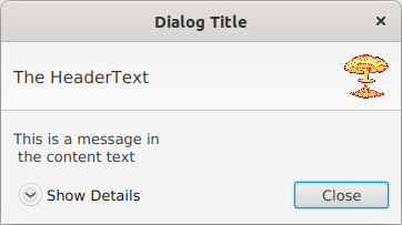
A Sample
Here’s the code for a customized Dialog with the default Nodes for the “Header” and “Content” sections, but with the values populated. There’s a single Button and “Expandable Content”:
private fun createContent(): Region = BorderPane().apply {
      val button = Button("Click Me").apply {
         onAction = EventHandler {
            val dialog = Dialog<ButtonType>().apply {
               contentText = "This is a message in\n the content text"
               headerText = "The HeaderText"
               title = "Dialog Title"
               graphic = this::class.java.getResource("/images/boom.png")?.toExternalForm()?.run { ImageView(this) }?.apply {
                  fitWidth = 40.0
                  isPreserveRatio = true
               }
               dialogPane.buttonTypes += ButtonType.CLOSE
               dialogPane.expandableContent = Label("""This is the expandable content
                  Lorem ipsum dolor sit amet, consectetur adipiscing elit.
                   Integer tristique malesuada arcu a malesuada. Ut porta
                   et mauris eu pellentesque. Curabitur molestie vel nunc vitae pharetra.
                   In hac habitasse platea dictumst. Donec ut rutrum mauris. In hac habitasse platea dictumst.
                   Donec tristique ac nisl pretium suscipit. Morbi magna quam, convallis ut vehicula et,
                   lacinia nec orci. Quisque commodo neque vitae finibus malesuada. Integer a magna ultricies,
                   consequat velit sit amet, laoreet purus. Pellentesque facilisis aliquam tortor eu eleifend.
                  """)
            }
            dialog.showAndWait().ifPresentOrElse({ println("This is the result: $it") }, { println("No result") })
         }
      }
      center = button
      padding = Insets(50.0)
   }
This looks like this:
And expanded it looks like this:
Styling
Here’s the Modena.css entries for Dialog. It will point you to the correct strategy to customize the styling of your Dialog:
/*******************************************************************************
 *                                                                             *
 * Dialog                                                                      *
 *                                                                             *
 ******************************************************************************/

.dialog-pane {
    -fx-background-color: -fx-background;
    -fx-padding: 0;
}

.dialog-pane > .expandable-content {
    -fx-padding: 0.666em; /* 8px */
}

.dialog-pane > .button-bar > .container {
    -fx-padding: 0.833em; /* 10px */
}

.dialog-pane > .content.label {
    -fx-alignment: top-left;
    -fx-padding: 1.333em 0.833em 0 0.833em; /* 16px 10px 0px 10px */
}

.dialog-pane > .content {
    -fx-padding: 0.833em; /* 10 */
}

.dialog-pane:no-header .graphic-container {
    -fx-padding: 0.833em 0 0 0.833em; /* 10px 0px 0px 10px */
}

.dialog-pane:header .header-panel {
    /*-fx-padding: 0.833em 1.166em 0.833em 1.166em; *//* 10px 14px 10px 14px */
    -fx-padding: 0.833em; /* 10px */
    -fx-background-color: -fx-box-border, linear-gradient(-fx-background, derive(-fx-background, 30%));
    -fx-background-insets: 0, 0 0 1 0;
}

.dialog-pane:header .header-panel .label {
    -fx-font-size: 1.167em; /* 14px */
    -fx-wrap-text: true;
}

.dialog-pane:header .header-panel .graphic-container {
    /* This prevents the text in the header running directly into the graphic */
    -fx-padding: 0 0 0 0.833em; /* 0px 0px 0px 10px */
}

.dialog-pane > .button-bar > .container > .details-button {
  -fx-alignment: baseline-left;
  -fx-focus-traversable: false;
  -fx-padding: 0.416em; /* 5px */
}

.dialog-pane > .button-bar > .container > .details-button.more {
    -fx-graphic: url("dialog-more-details.png");
}

.dialog-pane > .button-bar > .container > .details-button.less {
    -fx-graphic: url("dialog-fewer-details.png");
}

.dialog-pane > .button-bar > .container > .details-button:hover {
    -fx-underline: true;
}
You can see that all of the stylings are applied to sub-components of DialogPane, and that you have separate entries for the header, the content, the expandable content and the button bar.
The best strategy for customizing these is to create a separate style class selector for your Dialog and then add it to the DialogPane of your Dialog. You don’t have to customize the base style class you’ve added, but you can add in entries for the sub-components that you want.
This was added to default.css:
.fancy-alert > .content {
   -fx-background-color: lightblue;
}
We’re just adding a light blue background to the “Content” area of the Dialog
private fun createDialog() = Alert(AlertType.CONFIRMATION).apply {
   this::class.java.getResource("/css/default.css")?.toString()?.let { dialogPane.stylesheets += it }
   contentText = "This is a sample message"
   dialogPane.styleClass += "fancy-alert"
}
Dialogs open in their own Scene, so they won't inherit any style sheets that you've added to your main GUI screen.
You’ll have add your stylesheet to the DialogPane which is the root Node of the Scene it opens in.
This results in this:
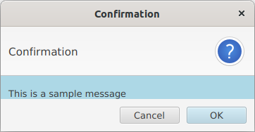
This isn’t pretty, but it does show that the content area has been styled. If you replace the standard Nodes for any of the areas, then you can directly add style classes to your custom Nodes, with the caveat that you’ll still need to add the stylesheet to the DialogPane.
The Result Converter
You may have noticed that the TextInputDialog and ChoiceDialog do not return Optional<ButtonType>. TextInputDialog returns Optional<String> and ChoiceDialog is a generic class, return Optional<T> where T is whatever type you declared your ChoiceDialog to be.
So how does Dialog do this?
It uses something called a “Result Converter”.
Understanding how to implement your own Result Converter is the key to creating custom Dialogs that do more interesting things.
A Result Converter is a Callback. A Callback is a functional interface that’s usually invoked deep within some standard element to allow it to do something customized. It’s essentially a “hook” for you to tie in your own code that will be called at some standard place. That standard element will “call back” to your code to figure out some value for it.
Technically, a Result Converter is of type Callback<ButtonType, R>. This means that it will be passed a ButtonType and it will return a value of type R, and that R is going to be the same R that you declared your Dialog to be. You just have to supply the code that says, “Ok, the user clicked ButtonType.DoIt so I need to return this value…”.
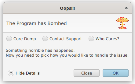
A Simple Custom Dialog Example
Now let’s say we’ve written some process that could possibly terminate badly in some way. We’ve captured the crash, and we need to have the user specify how to proceed from here:
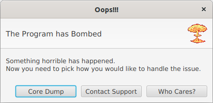
Here we have three custom ButtonTypes, and we need to convert the button that’s clicked into something that’s meaningful to process that’s generated the Dialog. In this case we’re going to us the Enum RecoveryAction that we’ve created. So we’re going to use a Dialog<RecoveryAction>….
class CustomDialogExample : Application() {
   override fun start(primaryStage: Stage) {
      primaryStage.setScene(Scene(createContent()))
      primaryStage.show()
   }

   private fun createContent(): Region = BorderPane().apply {
      val button = Button("Click Me").apply {
         onAction = EventHandler {
            createDialog().showAndWait().ifPresentOrElse({ println("This is the result: $it") }, { println("No result") })
         }
      }
      center = button
      padding = Insets(50.0)
   }

   private fun createDialog() = Dialog<RecoveryAction>().apply {
      val dump = "Core Dump"
      val support = "Contact Support"
      val ignore = "Who Cares?"
      resultConverter = Callback { buttonType ->
         when (buttonType.text) {
            dump -> RecoveryAction.CORE_DUMP
            support -> RecoveryAction.CALL_SUPPORT
            ignore -> RecoveryAction.IGNORE
            else -> null
         }
      }
      headerText = "The Program has Bombed"
      title = "Oops!!!"
      graphic = this::class.java.getResource("/images/boom.png")?.toExternalForm()?.run { ImageView(this) }?.apply {
         fitWidth = 40.0
         isPreserveRatio = true
      }
      dialogPane.buttonTypes += listOf(ButtonType(dump), ButtonType(support), ButtonType(ignore))
      contentText = """Something horrible has happened.
Now you need to pick how you would like to handle the issue.
                     """
   }
}

enum class RecoveryAction { CORE_DUMP, CALL_SUPPORT, IGNORE }

fun main() {
   Application.launch(CustomDialogExample::class.java)
}
This is a very straight-forward use of the ButtonType -> RecoveryAction result converter. We just check the text associated with the ButtonType that the user clicked, and convert that into the Enum. Usually, the idea of using the text on the Button is a pretty horrible idea, but ButtonType doesn’t give a lot of options if you want to use the Buttons to select the action.
A More Integrated Example
As you’ve seen from TextInputDialog and ChoiceDialog, it’s possible to put data collection Nodes into Dialog and then access them from your Result Converter to return something that’s not just dependent on the Button that was clicked. This opens up a whole world of possibilities, as your Dialog can now contain all manner of layouts and can work just like any screen, and then you can gather up results and pass them on to your process.
Let’s move the choice from the Buttons and into the content of the Dialog. In this case, we’ll use RadioButtons:
Unlike the previous version, it’s now possible to have an empty answer, because we have two buttons and one of them is a “Cancel” type. You can see that when that happens, we just return Null from the result converter. In the result converter, we check the ToggleGroup to see which RadioButton was selected. This all works because the Result Converter and the RadioButtons and the ToggleGroup were all defined in the same scope…
class CustomDialogExample : Application() {
   override fun start(primaryStage: Stage) {
      primaryStage.setScene(Scene(createContent()))
      primaryStage.show()
   }

   private fun createContent(): Region = BorderPane().apply {
      val button = Button("Click Me").apply {
         onAction = EventHandler {
            createDialog().showAndWait().ifPresentOrElse({ println("This is the result: $it") }, { println("No result") })
         }
      }
      center = button
      padding = Insets(50.0)
   }

   private fun createDialog() = Dialog<RecoveryAction>().apply {
      val dumpRB = RadioButton("Core Dump")
      val supportRB = RadioButton("Contact Support")
      val ignoreRB = RadioButton("Who Cares?")
      val toggleGroup = ToggleGroup().apply {
         toggles += listOf<Toggle>(dumpRB, supportRB, ignoreRB)
      }
      dialogPane.content = FlowPane(dumpRB, supportRB, ignoreRB).apply {
         hgap = 20.0
      }
      resultConverter = Callback { buttonType ->
         if (buttonType == ButtonType.OK) {
            when (toggleGroup.selectedToggle) {
               dumpRB -> RecoveryAction.CORE_DUMP
               supportRB -> RecoveryAction.CALL_SUPPORT
               ignoreRB -> RecoveryAction.IGNORE
               else -> null
            }
         } else null
      }
      headerText = "The Program has Bombed"
      title = "Oops!!!"
      graphic = this::class.java.getResource("/images/boom.png")?.toExternalForm()?.run { ImageView(this) }?.apply {
         fitWidth = 40.0
         isPreserveRatio = true
      }
      dialogPane.buttonTypes += listOf(ButtonType.CLOSE, ButtonType.OK)
      dialogPane.expandableContent = Label("""Something horrible has happened.
Now you need to pick how you would like to handle the issue.
                     """)
   }
}

enum class RecoveryAction { CORE_DUMP, CALL_SUPPORT, IGNORE }

fun main() {
   Application.launch(CustomDialogExample::class.java)
}
Since we have some actual content in the Dialog, the text description has been moved into the “Expanded Content” area.
This is still a pretty simple example, but you should be able to see that you could use the “Content” section of a Dialog as the View in an MVCI framework. You can have a Model and the Result Converter would be a method call in your Interactor. The Controller would be responsible for instantiating the actual Dialog and pass that back through getView(). If you did something like that, then the sky’s the limit for the kind of things that you could put into a Dialog.
Summary
Dialogs are primarily useful in two ways:
- When you have a process that needs to be interrupted to interact with the user.
- When you some kind of supplementary data entry that you don’t want to clutter your main GUI.
Of the two, the first is probably the most common. When you just need to send a message to the user, then your best route is to use one of the Alert versions of Dialog. When you need more complicated data collection from the user, then you’re probably going to have to design a custom Dialog to do the work.