Introduction
For me, this is the most exciting new feature added to JavaFX in version 23. Putting transitions into the style-sheet means it will be dead simple to have Nodes gently fade in and fade out, resize, or change colours without writing any code at all to control it.
The stated goal of this enhancement was to implement W3.org CSS Transitions in JavaFX. From what I can see, they have come pretty close to the specification listed there.
Why Use This?
From the JDK Issue for this feature:
CSS Transitions is a universally supported web standard that allows developers to specify how a CSS property changes its value smoothly from one value to another.
and a bit later:
CSS Transitions makes it easy to define animated transitions and create rich and fluid user experiences. CSS Transitions also nicely complements control skins: while skins define the structure and semantics of a control, implicit transitions define its dynamic appearance.
First off, since these are “transitions”, this is clearly aimed at elements of styling that change. Secondly, this feature only applies to styling that is defined in the style sheet. This means that styling that is applied programmatically will not transition unless you explicitly program the change inside some kind of Transition class.
To me, this means that this is a feature that works best with PseudoClasses. As a matter of fact, the example from the JDK Issue uses the hover PseudoClass:
.button {
    -fx-opacity: 0.8;
    transition: -fx-opacity 1s;
}

.button:hover {
    -fx-opacity: 1.0;
}
The really, really nice thing about this is that you can define your PseudoClasses in your layout code, define conditions under which they’ll turn off and on, and then you can let the stylesheet take care of the work of making the PseudoClass styling changes transition smoothly from one state to another. That’s a big win because all of that transitioning code just clutters up your layout code - so good riddance to it!
An Example
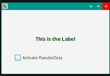
Let’s explore this with a simple example. The base requirement is that we need a screen with an element that is styled with a PseudoClass and some way to turn the PseudoClass on and off:
class CssTransitionExample : Application() {
    private val activatedPC = PseudoClass.getPseudoClass("activated")
    val activated: BooleanProperty = SimpleBooleanProperty(false)
    override fun start(stage: Stage) {
        stage.scene = Scene(createContent(), 340.0, 200.0).apply {
            CssTransitionExample::class.java.getResource("example.css")?.toString()?.let { stylesheets += it }
        }
        stage.show()
    }

    private fun createContent(): Region = BorderPane().apply {
        center = Label("This is the Label").apply {
            styleClass += "transition-label"
            activated.subscribe { newVal -> pseudoClassStateChanged(activatedPC, newVal) }
        }
        bottom = CheckBox("Activate PseudoClass").apply {
            selectedProperty().bindBidirectional(activated)
        }
        padding = Insets(40.0)
    }
}

fun main() = Application.launch(CssTransitionExample::class.java)
(This code is in Kotlin. If you need help understanding it, please refer to this article).)
That’s all we need. We’re using a Label as the styled Node with the PseudoClass, and a CheckBox to turn the PseudoClass on and off. It’s pretty simple.
Here’s the really cool part. For the rest of this article, we aren’t going to touch this code at all…
Which is point of this feature. The code just does the layout and the necessary mechanics of handling the PseudoClass. Once that’s set up, everything else is done via the stylesheet.
Use a transition, don’t use a transition, style it this way or some other way…none of that changes the layout code at all.
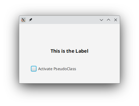
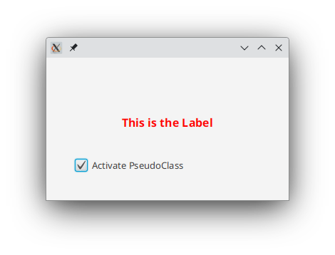
Let’s look at the stylesheet without any transitions:
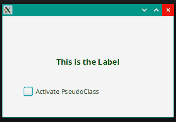
.transition-label {
  -fx-font-size: 18px;
  -fx-font-weight: bold;
  -fx-text-fill: darkgreen;
}

.transition-label: activated {
   -fx-text-fill: red;
}
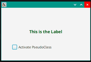
That’s our starting point. Big black letters, which change to red when activated. It looks like this:
and:
Now we want to turn the colour change into a transition. All we have to do, is to change the stylesheet like this:
.transition-label {
  -fx-font-size: 16px;
  -fx-font-weight: bold;
  -fx-text-fill: darkgreen;
  transition: -fx-text-fill 5.0s;
}

.transition-label: activated {
   -fx-text-fill: red;
}
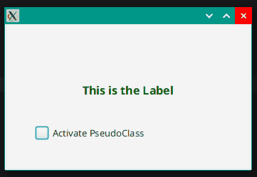
That’s it, we just added the line transition: -fx-text-fill 5.0s; and now the PseudoClass activation will trigger a transition that will take 5 seconds for it to change the text fill from darkgreen to red. Like this:
I’ve changed the initial colour from black to darkgreen because it’s opposite red on the colour wheel, and makes the transition a little bit easier to see when it starts.
Some Thoughs on Transitions
This is a technical arcticle, but…
If you’re building applications to be used in a professional setting, as I did for decades, then there are some things you should keep in mind.
Transitions and animations can make your application look slick and professional, but only if you employ them with restraint. Screen elements that suddenly jump from colour to colour, pop in and, and suddenly change there appearance often look clumsy, and you can improve this by using transitions. But your users should never really be aware that these things are happening.
From my experience, users are consciously aware that they want functionality. More functionality. New functionality, Better functionality. If they think that you’re spending time doing “fancy” stuff, they get annoyed because the perception is that the time that it takes to develop new functionality is becoming longer because of this “fancy” fluff.
On the other hand, user confidence in your application is critical. So it does help if your application looks like it was written by programmers who know what they are doing and can craft a quality product. Transitions can help with that.
This new feature can go a long way towards that. How long does it take to add a single line to a stylesheet?
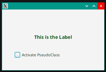
The 5 second transition in this example is ridiculous. It makes the transition starkly obvious and impossible to ignore. However, if we shorten the transition to 0.4 seconds, it changes everything:
Now the transition makes the colour change look more professional. It’s just long enough that it isn’t a sharp jump from one colour to the other.
Details About CSS Transitions
That’s the basics, now let’s look at some of the details:
What Can You Transition?
You can transition anything defined by a primitive type, and anything defined by a type that implements “Interpolatable”. Currently, the latter includes Color, Point2D and Point3D, but only Color is meaningfully used in stylesheets.
I was curious about how Boolean would transition, since it’s a primitive type, but it doesn’t transition. I couldn’t find any meaningful uses of String in the CSS Reference Guide, either.
Unfortunately, anything defined by <size> in the stylesheet isn’t able to transition, since it isn’t a primitive. So you cannot transition -fx-border-width, or -fx-border-insets or -fx-padding, or -fx-font-size, which is a shame. However, the issue notes indicate that at least some of this will be imlemented in a future enhancement.
Essentially, you can transition anything in the stylesheet which is defined by <number> or <paint>.
Notably, things that you can transition are -fx-opacity, -fx-rotate, -fx-scale-x, -fx-scale-y, -fx-translate-x, and -fx-translate-y. You can also transition anything defined by a single <paint>, which includes -fx-fill, -fx-stroke, and -fx-text-fill.
New Transitions in JFX 24
Issue #83332895, included in JFX release 24 has support for the following Node Properties:
- Insets
- Background
- BackgroundFill
- BackgroundImage
- BackgroundPosition
- BackgroundSize
- Border
- BorderImage
- BorderStroke
- BorderWidths
- CornerRadii
- Stop
- Paint and all of its subclasses
- Margins (internal type)
- BorderImageSlices (internal type)
At the time of writing this article, JFX 24 is only available in “early access”.
Transitioning Multiple Attributes
What if you want to transition more than a single property? How do you do that?
You can only have a single transition definition per CSS selector, but you can specify more than one property for that transition.
For example, this won’t work:
.transition-label {
  -fx-font-size: 16px;
  -fx-font-weight: bold;
  -fx-text-fill: darkgreen;
  transition: -fx-text-fill 0.4s;
  transition: -fx-scale-x 2.5s;
  transition: -fx-scale-y 2.5s;
}

.transition-label: activated {
   -fx-text-fill: red;
   -fx-scale-x: 2.0;
   -fx-scale-y: 2.0;
}
But this will:
.transition-label {
  -fx-font-size: 16px;
  -fx-font-weight: bold;
  -fx-text-fill: darkgreen;
  -fx-scale-x: 1.0;
  -fx-scale-y: 1.0;
  transition-property: -fx-text-fill, -fx-scale-x, -fx-scale-y;
  transition-duration: 3.0s;
}

.transition-label: activated {
   -fx-text-fill: red;
   -fx-scale-x: 2.0;
   -fx-scale-y: 2.0;
}
However, if you do want different times, you can do this:
.transition-label {
  -fx-font-size: 16px;
  -fx-font-weight: bold;
  -fx-text-fill: darkgreen;
  -fx-scale-x: 1.0;
  -fx-scale-y: 1.0;
  transition-property: -fx-text-fill, -fx-scale-x, -fx-scale-y;
  transition-duration: 3.0s, 10s, 10s;
}

.transition-label: activated {
   -fx-text-fill: red;
   -fx-scale-x: 2.0;
   -fx-scale-y: 2.0;
}
Which will transition the -fx-text-fill property over 3s and the other two over 10s.
The transition-property attribute is taken as the master, and if you have extra values for the other attributes, it will ignore them. However, if the other lists are too short, it will repeat them. So this:
.transition-label {
  -fx-font-size: 16px;
  -fx-font-weight: bold;
  -fx-text-fill: darkgreen;
  -fx-scale-x: 1.0;
  -fx-scale-y: 1.0;
  transition-property: -fx-text-fill, -fx-scale-x, -fx-scale-y;
  transition-duration: 3.0s, 10s;
}

.transition-label: activated {
   -fx-text-fill: red;
   -fx-scale-x: 2.0;
   -fx-scale-y: 2.0;
}
Will result in the -fx-text-fill property transitioning over 3s, the -fx-scale-x over 10s and then the -fx-scale-y over 3s as the list of durations is repeated to satisfy all of the properties specified.
Also, you cannot do this:
.transition-label {
  -fx-font-size: 16px;
  -fx-font-weight: bold;
  -fx-text-fill: darkgreen;
  -fx-scale-x: 1.0;
  -fx-scale-y: 1.0;
  transition: -fx-text-fill, -fx-scale-x, -fx-scale-y 2.5s;
}

.transition-label: activated {
   -fx-text-fill: red;
   -fx-scale-x: 2.0;
   -fx-scale-y: 2.0;
}
But you can specify
.transition-label {
  -fx-font-size: 16px;
  -fx-font-weight: bold;
  -fx-text-fill: darkgreen;
  -fx-scale-x: 1.0;
  -fx-scale-y: 1.0;
  transition: -fx-text-fill 2.5s,
              -fx-scale-x 2.5s,
              -fx-scale-y 2.5s;
}

.transition-label: activated {
   -fx-text-fill: red;
   -fx-scale-x: 2.0;
   -fx-scale-y: 2.0;
}
But you cannot do this:
.transition-label {
  -fx-font-size: 16px;
  -fx-font-weight: bold;
  -fx-text-fill: darkgreen;
  -fx-scale-x: 1.0;
  -fx-scale-y: 1.0;
  transition: -fx-text-fill 2.5s,
              -fx-scale-x,
              -fx-scale-y;
}

.transition-label: activated {
   -fx-text-fill: red;
   -fx-scale-x: 2.0;
   -fx-scale-y: 2.0;
}
You must specify the duration for each property because the default is 0s.
However, you can do this:
.transition-label {
  -fx-font-size: 16px;
  -fx-font-weight: bold;
  -fx-text-fill: darkgreen;
  -fx-scale-x: 1.0;
  -fx-scale-y: 1.0;
  transition: all 5.0s;
}

.transition-label: activated {
   -fx-text-fill: red;
   -fx-scale-x: 2.0;
   -fx-scale-y: 2.0;
}
Finally, because the default for transition-property is all, you can do this:
.transition-label {
  -fx-font-size: 16px;
  -fx-font-weight: bold;
  -fx-text-fill: darkgreen;
  -fx-scale-x: 1.0;
  -fx-scale-y: 1.0;
  transition: 5.0s;
}

.transition-label: activated {
   -fx-text-fill: red;
   -fx-scale-x: 2.0;
   -fx-scale-y: 2.0;
}
But you cannot do this:
.transition-label {
  -fx-font-size: 16px;
  -fx-font-weight: bold;
  -fx-text-fill: darkgreen;
  -fx-scale-x: 1.0;
  -fx-scale-y: 1.0;
  transition-duration: 5.0s;
}

.transition-label: activated {
   -fx-text-fill: red;
   -fx-scale-x: 2.0;
   -fx-scale-y: 2.0;
}
While you can do this:
.transition-label {
  -fx-font-size: 16px;
  -fx-font-weight: bold;
  -fx-text-fill: darkgreen;
  -fx-scale-x: 1.0;
  -fx-scale-y: 1.0;
  transition-property: all;
  transition-duration: 5.0s;
}

.transition-label: activated {
   -fx-text-fill: red;
   -fx-scale-x: 2.0;
   -fx-scale-y: 2.0;
}
Interpolators
Transitions do not have to move at a steady rate from beginning to end (which would be linear). The following types of interpolation:
- Linear
- Bezier Quadratic Easing
- Step
- SMIL 3.0 Easing
The two “easing” types allow you to have the accelerate at the beggining and decelerate at the end, or both. With the bezier quadratic easing, you can vary the amount of acceleration at each end.
The “Step” function jumps through a number of values interpolated between the two end-point values. You can specify how many jumps you want to have.
All of these are well documented in the CSS Reference Guide. There are diagrams and examples.
To implement one of these, use the transition-timing-function tag in the stylesheet. Like this:
.transition-label {
  -fx-font-size: 16px;
  -fx-font-weight: bold;
  -fx-text-fill: darkgreen;
  -fx-scale-x: 1.0;
  -fx-scale-y: 1.0;
  transition-property: all;
  transition-timing-function: -fx-ease-both;
  transition-duration: 2.0s;
}

.transition-label: activated {
   -fx-text-fill: red;
    -fx-scale-x: 2.0;
    -fx-scale-y: 2.0;
}
It’s extremely easy to change the interpolator, and you really have to try them out to understand how they differ.
You can also have a different interpolator for each property being transitioned:
.transition-label {
  -fx-font-size: 16px;
  -fx-font-weight: bold;
  -fx-text-fill: darkgreen;
  -fx-scale-x: 1.0;
  -fx-scale-y: 1.0;
  transition-property: -fx-text-fill, -fx-scale-x, -fx-scale-y;
  transition-duration: 4s, 10s, 10s;
  transition-timing-function: -fx-ease-both, steps(12, jump-end), steps(12, jump-end);
}

.transition-label: activated {
   -fx-text-fill: red;
   -fx-scale-x: 2.0;
   -fx-scale-y: 2.0;
}
Transition Delay
It is possible to delay the transition for any of the properties listed in transition-property. Like this:
.transition-label {
  -fx-font-size: 16px;
  -fx-font-weight: bold;
  -fx-text-fill: darkgreen;
  -fx-scale-x: 1.0;
  -fx-scale-y: 1.0;
  transition-property: -fx-text-fill, -fx-scale-x, -fx-scale-y;
  transition-duration: 0.4s, 10s, 10s;
  transition-delay: 5s, 0s, 0s;
}

.transition-label: activated {
   -fx-text-fill: red;
   -fx-scale-x: 2.0;
   -fx-scale-y: 2.0;
}
This will cause the -fx-text-fill property to transition in 0.4s after as 5s delay, while the scaling properties transition over a 10s period with no delay.
Some Quirks
If you don’t include the starting values in the base styling, then the transition becomes a bit odd:
.transition-label {
  -fx-font-size: 16px;
  -fx-font-weight: bold;
  -fx-text-fill: darkgreen;
  transition: all 5.0s;
}

.transition-label: activated {
   -fx-text-fill: red;
   -fx-scale-x: 2.0;
   -fx-scale-y: 2.0;
}
This transitions the scaling and the colour when you turn off the PseudoClass, but when turning on the PseudoClass the scaling jumps immediately, and then the colour transitions.
You can fix this by changing the stylesheet to this:
.transition-label {
  -fx-font-size: 16px;
  -fx-font-weight: bold;
  -fx-text-fill: darkgreen;
  -fx-scale-x: 1.0;
  -fx-scale-y: 1.0;
  transition: all 5.0s;
}

.transition-label: activated {
   -fx-text-fill: red;
   -fx-scale-x: 2.0;
   -fx-scale-y: 2.0;
}
I suspect that this might be a bug. But it’s easy enough to work around.
I tried to create multiple transitions for a Node by adding a second selector to the Label called growing-label and then modify the stylesheet to use it:
.growing-label {
  -fx-scale-x: 1.0;
  -fx-scale-y: 1.0;
  transition-property: -fx-scale-x, -fx-scale-y;
  transition-duration: 26.0s;
}

.growing-label: activated {
   -fx-scale-x: 2.0;
   -fx-scale-y: 2.0;
}

.transition-label {
  -fx-font-size: 16px;
  -fx-font-weight: bold;
  -fx-text-fill: darkgreen;
  transition-property: -fx-text-fill;
  transition-duration: 5.0s;
}

.transition-label: activated {
   -fx-text-fill: red;
}
But this didn’t work. In fact, it turned off the transition on the scaling and then did just the transition for the colour.
What if you put the transition properties in the PseudoClass selector section? I tried this:
.transition-label {
  -fx-font-size: 16px;
  -fx-font-weight: bold;
  -fx-text-fill: darkgreen;
  -fx-scale-x: 1.0;
  -fx-scale-y: 1.0;
}

.transition-label: activated {
  -fx-text-fill: red;
  -fx-scale-x: 2.0;
  -fx-scale-y: 2.0;
  transition-property: all;
  transition-duration: 5.0s;
}
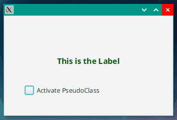
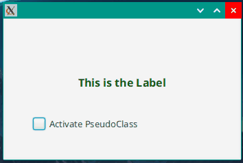
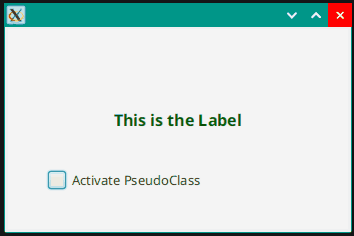
And the results were as I suspected. The Label transitioned to the 2x scaling and red, but snapped back to black and 1x scaling when the PseudoClass was turned off again:
Something That Won’t Transition: Defined Colours
A lot of CSS styling defined in Modena related to the standard PseudoClasses depends on changing the definitions of some pre-defined colours in the stylesheet. Changing the definition of -fx-color in the context of a PseudoClass can change the appearance of that Node without having to recreate a lot of complicated styling.
So it would be nice to able to transition a Node based on a change to a color definition. For instance, I hoped that the following would cause a transition to the background colour of the Label:
.transition-label {
  -fx-font-size: 16px;
  -fx-font-weight: bold;
  -fx-text-fill: darkgreen;
  -fx-scale-x: 1.0;
  -fx-scale-y: 1.0;
  -fx-background-color: -fx-color;
  -fx-color: blue;
  transition-property: all;
  transition-duration: 2.0s;
}

.transition-label: activated {
   -fx-text-fill: red;
   -fx-color: green;
   -fx-scale-x: 2.0;
   -fx-scale-y: 2.0;
}
But it did not work.
Personally, I would really like to see the ability to transition named colours because that would open up a whole world of possibilities for animating standard Nodes with standard PseudoClasses. Take a look at these styles for PseudoClasses from Modena:
.button:hover,
.toggle-button:hover,
.radio-button:hover > .radio,
.check-box:hover > .box,
.menu-button:hover,
.split-menu-button > .label:hover,
.split-menu-button > .arrow-button:hover,
.slider .thumb:hover,
.scroll-bar > .thumb:hover,
.scroll-bar > .increment-button:hover,
.scroll-bar > .decrement-button:hover,
.choice-box:hover,
.color-picker.split-button > .arrow-button:hover,
.color-picker.split-button > .color-picker-label:hover,
.combo-box-base:hover,
.combo-box-base:editable > .arrow-button:hover,
.spinner .increment-arrow-button:hover,
.spinner .decrement-arrow-button:hover,
.tab-pane > .tab-header-area > .control-buttons-tab > .container > .tab-down-button:hover {
    -fx-color: -fx-hover-base;
}
.button:armed,
.toggle-button:armed,
.radio-button:armed > .radio,
.check-box:armed .box,
.menu-button:armed,
.split-menu-button:armed > .label,
.split-menu-button > .arrow-button:pressed,
.split-menu-button:showing > .arrow-button,
.slider .thumb:pressed,
.scroll-bar > .thumb:pressed,
.scroll-bar > .increment-button:pressed,
.scroll-bar > .decrement-button:pressed,
.choice-box:showing,
.combo-box-base:showing,
.combo-box-base:editable:showing > .arrow-button,
.spinner .increment-arrow-button:pressed,
.spinner .decrement-arrow-button:pressed,
.tab-pane > .tab-header-area > .control-buttons-tab > .container > .tab-down-button:pressed {
    -fx-color: -fx-pressed-base;
}
All of these elements that support hover and armed and pressed change their styling for those PseudoClasses by simply redefining -fx-color in those contexts. Imagine that if you wanted Button to transition on hover and armed, you could do this:
.transition-button {
  transition-property -fx-color;
  transition-duration: 0.7s;
}
Then all you would have to do is:
button.styleclass += "transition-button"
And you’re done. But, unfortunately, we cannot do that.
Dealing With CSS Transitions Programmatically
There are circumstances in which you might want to cope with a CSS transition inside your layout code. To enable this, a new Event type has been added, TransitionEvent, which is fired when a CSS transition starts and ends. This means that you can detect a CSS transition and have your layout respond to it.
We’ll modify our layout such that the CheckBox is disabled while the CSS transition is running:
class CssTransitionExample : Application() {
    private val activatedPC = PseudoClass.getPseudoClass("activated")
    private val activated: BooleanProperty = SimpleBooleanProperty(false)
    private val transitionCounter: IntegerProperty = SimpleIntegerProperty(0)
    override fun start(stage: Stage) {
        stage.scene = Scene(createContent(), 340.0, 200.0).apply {
            CssTransitionExample::class.java.getResource("example.css")?.toString()?.let { stylesheets += it }
        }
        stage.show()
    }

    private fun createContent(): Region = BorderPane().apply {
        center = Label("This is the Label").apply {
            styleClass += "transition-label"
            activated.subscribe { newVal -> pseudoClassStateChanged(activatedPC, newVal) }
            this.addEventHandler(TransitionEvent.START) { evt ->
                transitionCounter.value += 1
                println("Started: ${evt.property}")
            }
            this.addEventHandler(TransitionEvent.END) { transitionCounter.value -= 1 }
        }
        bottom = CheckBox("Activate PseudoClass").apply {
            selectedProperty().bindBidirectional(activated)
            disableProperty().bind(transitionCounter.greaterThan(0))
        }
        padding = Insets(40.0)
        val fred = PropertyValueFactory<String, String>("Abc")
    }
}

fun main() = Application.launch(CssTransitionExample::class.java)
I’ve also added some code to print some information about the Event to the console. This is interesting, because it shows 3 transitions running:
Started: ObjectProperty [bean: Label@44abad90[styleClass=label transition-label]'This is the Label', name: textFill, value: 0x000000ff]
Started: DoubleProperty [bean: Label@44abad90[styleClass=label transition-label]'This is the Label', name: scaleX, value: 1.0]
Started: DoubleProperty [bean: Label@44abad90[styleClass=label transition-label]'This is the Label', name: scaleY, value: 1.0]
Started: ObjectProperty [bean: Label@44abad90[styleClass=label transition-label]'This is the Label', name: textFill, value: 0xff0000ff]
Started: DoubleProperty [bean: Label@44abad90[styleClass=label transition-label]'This is the Label', name: scaleX, value: 2.0]
Started: DoubleProperty [bean: Label@44abad90[styleClass=label transition-label]'This is the Label', name: scaleY, value: 2.0]
The first three lines are when the PseudoClass is applied, and the last three are for when it is removed.
This is why you need to use the counter approach, instead of just enabling and disabling the Button directly in the EventHandlers. The Button is disabled the moment that the first transition starts, and sets the counter to “1”, then is enabled when the final transition completes and sets the counter back to “0”.
This kind of monitoring is less useful when your transitions are strictly stylistic and fast, but if you’re doing something that is more functional it could come in handy.
Conclusion
This new feature makes it dead easy to add transitions to a useful set of styling properties that you might want to modify when applying PseudoClasses. And it does it without requiring any changes to your layout code.
All of the examples in this article except for the last one that shows how to integrate CSS Transitions with code differ only in the stylesheets. All of the different techniques were demonstrated without changing anything in the layout code. How cool is that?
The issue notes clearly indicate that this new feature is still in its early stages and that we can expect enhancements in the future. Hopefully, this will include the ability to perform transitions on named colours.