What is a Button?
A Button is the basic control to allow the user trigger an action in a screen. JavaFX has two Button classes; Button and ToggleButton. In this article, we’re going to look at the Button class itself.
How Button Fits in the JavaFX Hierarchy
Button inherits methods and properties from these important classes:
- Node
- Everything in JavaFX inherits from
Node, which gives most of its methods for styling, event handling and responding to mouse actions as well as location and transformation. - Control
- This is the base class for user interaction controls on a screen. This base class adds skinning, tool-tips and context menus to
Node. - Region
- All
Controlclasses areRegions, which means that they can contain otherNodesand have layout properties like padding and borders. - Labeled
- In JavaFX, the
Labelclass contains both a graphical Node and a text property, and the Labeled classes also support this same idea as the contents of theControlas aRegion.
The version 16 JavaDocs for Button can be found here
Layout
You can think of a Button as styled Region with a background and a border containing a Label (which, of course, contains a Graphic and/or some text). All of the button-like feel of a Button is just the styling responding to different states of the properties in the class.
These states change when:
- The
Buttonis disabled. - Gains or loses focus.
- Becomes or stops being default.
- When the cursor enters or leaves the Region.
- When a mouse button is clicked and released when the cursor is in the region.
Of course, you can change the way that the Button responds to all of these changes.
CSS Elements
Modena
To understand how the styling works with the properties on Buttons, we’ll look at the Modena stylesheet, which is the standard stylesheet that ships with the latest versions of JavaFX.
The basic colours in Modena are as follows:
The rest of the colours you see referenced are more complicated gradients and ladders based on these fundamental colours, but this should give you the idea.
It’s important to note that -fx-color is initially set be -fx-base. Most of the transitions are accomplished by changing -fx-color to another value for the Button.
Here’s what the various stylings look like:
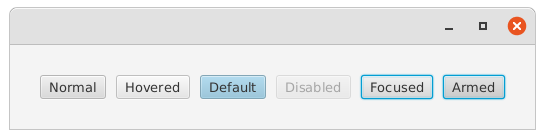
The following selectors control Buttons in the CSS, these are the definitions from “Modena”:
Base layout for Button
.button {
  -fx-background-insets: 0 0 -1 0, 0, 1, 2;
  -fx-background-radius: 3px, 3px, 2px, 1px;
  -fx-padding: 0.333333em 0.666667em 0.333333em 0.666667em; /` 4 8 4 8 `/
  -fx-text-fill: -fx-text-base-color;
  -fx-alignment: CENTER;
  -fx-content-display: LEFT;
}
The first three lines here create the border and shadow effects by layering 4 background colours on top of each other with differing insets and corner radii. There’s no actual “border” defined. The colours are standard colours for the Modena theme.
The text colour is set to be the standard theme text colour.
Mouse Hover
This is the styling added when the cursor hovers over the Button. It simply lightens it up a little.
.button:hover {
  -fx-color: -fx-hover-base;
}
-fx-hover-base is supposed to be just a little bit lighter than -fx-base.
Armed
When the mouse button is pressed when the cursor is over the Button it appears to push down a little bit. This is accomplished by darkening it a by 6%. JavaFX refers to this as “armed”.
It’s virtually impossible to have an armed Button that doesn’t also have focus. So the example in the image above shows both states.
.button:armed {
  -fx-color: -fx-pressed-base;
}
Focused
When the Button has focus, the border colour scheme changes to a “glowing” blue ring:
.button:focused {
  -fx-background-color: -fx-focus-color, -fx-inner-border, -fx-body-color, -fx-faint-focus-color, -fx-body-color;
  -fx-background-insets: -0.2, 1, 2, -1.4, 2.6;
  -fx-background-radius: 3, 2, 1, 4, 1;
}
Disabled
Disabled Buttons are a quite a bit translucent. Personally, I find this amount to be extreme and it makes the buttons almost difficult to see.
.button:disabled {
  -fx-opacity: 0.4;
}
Mnemonic Underline
This is specifically the colour of the underline which is shown under key letters when the mnemonics are activated (usually by pressing the <Alt> key). Ordinarily the colour of the underline is “transparent”.
.button:show-mnemonics > .mnemonic-underline {
  -fx-stroke: -fx-text-base-color;
}
Default
When a Button has been set as the “default”, the base colour changes to a light blue.
.button:default {
  -fx-base: -fx-default-button;
}
Properties
Button has all of the standard properties of Node and Region, which define things like MaxHeight, MaxWidth, Visible, Managed and so on. In addition, it has a few other properties which are interesting:
Let’s take a look at what some of those properties actually do:
Graphic
Since Button extends Labeled, it has two properties holding the contents. The Graphic is simply any kind of Node that you want to put on the Button. It can be an ImageView, an icon, or something bigger and complex, like a TableView, BorderPane, or Chart. That would probably end up with a really big Button, but it would still work.
Here’s a sample showing how the Graphic property can be manipulated:
public class ButtonsGraphicExample extends Application {
public static void main(String[] args) {
launch(args);
}
@Override
public void start(Stage primaryStage) {
primaryStage.setScene(new Scene(createView()));
primaryStage.show();
}
private Region createView() {
HBox results = new HBox(10);
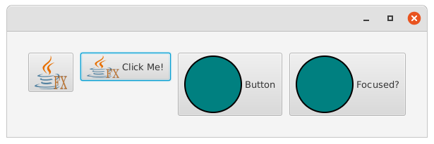
Button button1 = new Button("", new ImageView(new Image("/images/JavaFXLogo.png")));
ImageView logo = new ImageView(new Image("/images/JavaFXLogo.png"));
logo.setFitHeight(32);
Button button2 = new Button("Click Me!", logo);
Shape circle1 = createCircle(Color.TEAL);
Shape circle2 = createCircle(Color.TEAL);
Shape circle3 = createCircle(Color.RED);
Button button3 = new Button("Button", circle1);
Button button4 = new Button("Focused?");
button4.graphicProperty().bind(Bindings.createObjectBinding(() -> button4.isFocused() ? circle3 : circle2, button4.focusedProperty()));
results.getChildren().addAll(button1, button2, button3, button4);
results.setPadding(new Insets(30));
return results;
}
private Shape createCircle(Paint colour) {
Circle results = new Circle(40);
results.setFill(colour);
results.setStroke(Color.BLACK);
results.setStrokeWidth(2.0);
return results;
}
}
The first two Buttons show an ImageView loaded in as the graphic, with and without a Text value. The last two Buttons have a Shape loaded into the Graphic.
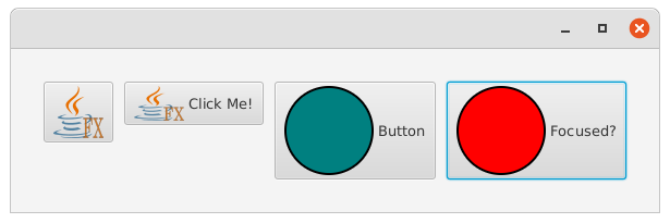
The last Button, “button4” has its Graphic property bound to its Focused property, swapping out a red circle when the Button has focus.
This is what it looks like with the focus somewhere other than the last Button:
And when the last Button has focus:
Text
The other part of Labeled is a StringProperty called Text, and is simply any text you want to show on the Button and is what people generally think of as the Button “label”. Since it’s a property, it can be bound to other properties in your screen and Model and change dynamically.
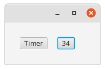
Here’s an example where the Text is bound to the results of an animation loop, so that the Button displays the number of seconds (almost) since the Button was clicked:
public class ButtonBoundText extends Application {

    public static void main(String[] args) {
        launch(args);
    }

    @Override
    public void start(Stage primaryStage) {
        HBox pane = new HBox(20, createTimerButton(), createTimerButton());
        pane.setPadding(new Insets(30));
        primaryStage.setScene(new Scene(pane));
        primaryStage.show();
    }

    @NotNull
    private Button createTimerButton() {
        Button timerButton = new Button("Timer");
        timerButton.setOnAction(evt -> createTimer(timerButton.textProperty()));
        return timerButton;
    }

    private void createTimer(StringProperty boundProperty) {
        IntegerProperty counter = new SimpleIntegerProperty(0);
        Timeline timeline = new Timeline(new KeyFrame(Duration.seconds(10000), new KeyValue(counter, 10000)));
        boundProperty.bind(Bindings.createStringBinding(() -> Integer.toString(counter.get()), counter));
        timeline.play();
    }
}
This is what it looks like with the timer on the second Button running:
DefaultButton
Straight from the JavaDocs for Button, as it says it all:
A default button is the button that receives a keyboard VK_ENTER press, if no other node in the scene consumes it.
This can be super useful if you have a screen with multiple Buttons but you want your UI to respond to “Enter” key in an appropriate manner. Or if you have several data entry controls that need to be completed in order to activate a Button to respond to “Enter”.
For instance, you can bind the DefaultButton property of a Button to the Focused property of a TextField. So whenever a user hits “Enter” from that TextField, it activates the Button, but not if they are not in that TextField.
Events
The OnAction Event
OnAction is really the only event you’re likely to use with a Button. It’s the one that’s fired when you click and release the Button.
For practical purposes, there’s no useful information in event itself, and just the fact that it’s been fired is the main piece of information you’ll need in order to do anything that’s triggered by the event. My recommendation is to keep the Event Handler itself as short as possible, and create a method to handle the actual work that the Button is going to do, possibly passing the Button itself as a parameter so that you can access its properties to temporarily disable it.
A Simple example
In this example, we’re just going to update a Label on the screen with contents from a TextField. The entire action of the Button is set with just this one line:
button.setOnAction(evt -> target.setText(textField.getText()));
That’s pretty simple, but you can see that there’s no need to reference any data from the Event itself, it’s just a trigger for the action to happen.
public class ButtonActionExample extends Application {
public static void main(String[] args) {
launch(args);
}
@Override
public void start(Stage primaryStage) {
primaryStage.setScene(new Scene(createView()));
primaryStage.show();
}
private Region createView() {
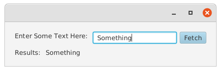
Label actionTarget = new Label("Button Has Not Yet Been Clicked");
VBox results = new VBox(10, inputLine(actionTarget), new HBox(6, new Label("Results: "), actionTarget));
results.setPadding(new Insets(20));
return results;
}
private Node inputLine(Label target) {
TextField textField = new TextField();
Button button = new Button("Fetch");
button.defaultButtonProperty().bind(textField.focusedProperty());
button.setOnAction(evt -> target.setText(textField.getText()));
return new HBox(6, new Label("Enter Some Text Here: "), textField, button);
}
}
Before you click on the Button, the screen looks like this:
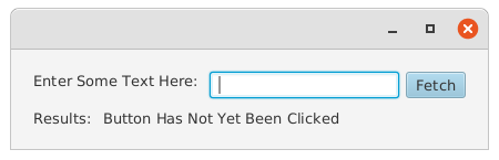
And then it looks like this:
Tips
Disable vs Disabled Properties
This confuses everyone. Disable is the read/write property that you can change to control whether or not the Button is to be disabled. Disabled is a read-only property that will tell you if the Button is currently disabled. Disabled should always be used for querying, as it will change if a containing Node of the Button has been disabled, while querying Disable will only tell you if the Button has been specifically disabled.
Avoid Double-Clicks
If a Button's action takes more than a couple of milliseconds to complete it’s a good idea to immediately set Disable to true in the OnAction event so that the user can’t trigger it a second or third time while it’s running.
This can get a little tricky if Disable has been bound to other elements of the GUI. In that case you should create a boolean property called “xyzRunning” (or something similiar) and add it to your binding. Then toggle that property instead of directly messing with the Disable property.
Binding the Default Property
Being able to just hit <Enter> can be a huge convenience for users, and is often the most intuitive behaviour. But there might be multiple Buttons that could be candidates for the “default”, and the correct one might change depending on what’s happening in the GUI. Here’s an example where there are two lookup buttons, and the one that is default is determined by which TextField has the focus at any given time:
public class DefaultButtonExample extends Application {

    public static void main(String[] args) {
        launch(args);
    }

    @Override
    public void start(Stage primaryStage) {
        primaryStage.setScene(new Scene(createView()));
        primaryStage.show();
    }

    private Region createView() {
        VBox results = new VBox(10, inputLine("Customer Name:"), inputLine("Account Number:"));
        results.setPadding(new Insets(20));
        return results;
    }

    private Node inputLine(String label) {
        TextField textField = new TextField();
        Button button = new Button("Fetch");
        button.defaultButtonProperty().bind(textField.focusedProperty());
        return new HBox(6, new Label(label), textField, button);
    }
}
This looks like this:
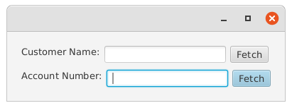
It’s also easier than trying to capture <Enter> in the keystrokes in the TextField!
Use Multiple Buttons - Don’t Reconfigure a Single Button
Sometimes you’ll have multiple contexts in which a Button could operate, and it might need to have different labels and actions depending on the context. For instance, in a CRUD screen the Button could read “Create” for a new record, or “Update” to save an existing record. Unless the differences are entirely cosmetic, it’s usually cleaner to have two or more Buttons and simply hide any Buttons that don’t apply, rather that keeping track of the context and having the OnAction Event Handler figure which action code it should be running.
Here’s an example where the Button that’s shown depends on whether or not a TextField has anything entered into it or not. There are four versions of it on the same screen, to show both states and confirm which action was run when clicked:
public class ButtonHideExample extends Application {

    public static void main(String[] args) {
        launch(args);
    }

    @Override
    public void start(Stage primaryStage) {
        HBox row1 = new HBox(20, createExample(), createExample());
        HBox row2 = new HBox(20, createExample(), createExample());
        primaryStage.setScene(new Scene(new VBox(20, row1, row2)));
        primaryStage.show();
    }

    private Region createExample() {
        TextField textField = new TextField();
        Label targetLabel = new Label("Nothing has been clicked");
        HBox inputRow = new HBox(6, new Label("Number: "), textField);
        HBox outputRow = new HBox(6, new Label("Results:"), targetLabel);
        VBox results = new VBox(10, inputRow, outputRow, createButtons(textField.textProperty(), targetLabel.textProperty()));
        results.setPadding(new Insets(20));
        return results;
    }

    private Node createButtons(StringProperty triggerProperty, StringProperty targetProperty) {
        Button saveButton = new Button("Save");
        saveButton.visibleProperty().bind(triggerProperty.isEmpty().not());
        saveButton.managedProperty().bind(saveButton.visibleProperty());
        saveButton.setOnAction(evt -> targetProperty.set("Save was clicked"));
        Button generateButton = new Button("Generate");
        generateButton.visibleProperty().bind(triggerProperty.isEmpty());
        generateButton.managedProperty().bind(generateButton.visibleProperty());
        generateButton.setOnAction(evt -> targetProperty.set("Generate was clicked"));
        return new StackPane(saveButton, generateButton);
    }
}
Which looks like this:
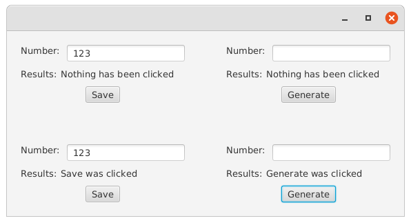
Things to note about this:
- You need to set both the
VisibleandManagedproperties.
If you don’t do this then the invisibleButtonswill still take up space on the screen. - There’s no connection between the two
Buttons - Each
Buttonis fully configured in 4 lines of code. - The
Buttoncreation method is essentially stand-alone.
It’s given a pair of properties to work with, but there’s no global variables or any other connection to the rest of the screen. In fact, the same method is called 4 times, and the results of each are completely independent.
Content Drives Minimum Size
If you have large content in your Button, the Button will grow to accommodate it. Setting MaxHeight or MaxWidth won’t cause the button to shrink if it’s smaller than the size of the contents. You’ll need to apply some sort of scaling transformation on your content to make the Button smaller.
However, setting MinHeight and MinWidth can make a Button larger.