What You’ll Learn
- Layout classes like
HBoxandVBox - Some basic concepts about configuring layouts. We’ll cover spacing, alignment and padding in this part.
- The
PosandInsetsclasses. - A little about
TextField
Adding Some Simple User Input
The screen from Part 1 is really simple, and doesn’t do much except display “Hello World” in a tiny little window. Let’s add some elements that will actually do something.
The Code So Far
Our code at the end of Part 1 looked like this:
public class Main extends Application {

    public static void main(String[] args) {
        launch(args);
    }

    @Override
    public void start(Stage primaryStage) {
        Scene scene = new Scene(createContents());
        primaryStage.setScene(scene);
        primaryStage.show();
    }

    private Region createContents() {
        return new Label("Hello World");
    }
}
With this output:

The Screen is Too Cramped
You can barely read the, “Hello World” since the screen is so tiny. We can fix that by setting the initial size of the Scene in it’s constructor. We’ll change the line to:
Scene scene = new Scene(createContents());
to:
Scene scene = new Scene(createContents(),400, 200);
This sets the initial window size to 400 pixels wide, and 200 pixels tall. When you run this it looks like this:
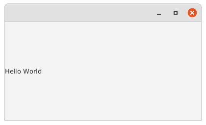
That’s somewhat of an improvement, even though the “Hello World” is still tucked over way to the left. We’ll look at that kind of thing in a little bit.
That’s about all “Hello World” is good for. Let’s move on to something more interesting…
Adding User Input
Over the next few parts of this guide we’ll change this screen to let the user enter their name and click on a Button. When the Button is clicked, we’ll update the contents of the Label to be “Hello {name}”. The first step is to provide a way for the user to enter their name.
Adding a Prompt and an Input Field
The prompt is just going to be another Label that says “Name:”, and the input field is a control called a “TextField”. TextField is the basic control for simple text input in a screen. We want the prompt and the input to be in a single row, so we are going to put them in an HBox. For now, we’ll scrap the output label:
public class Main extends Application {

    public static void main(String[] args) {
        launch(args);
    }

    @Override
    public void start(Stage primaryStage) {
        Scene scene = new Scene(createContents(), 400, 200);
        primaryStage.setScene(scene);
        primaryStage.show();
    }

    private Region createContents() {
        return new HBox(new Label("Name:"), new TextField(""));
    }
}
What’s an HBox?
HBox is an example of a “layout” class. It’s a Region subtype Node that holds other Nodes inside it. There are a number of different layout classes, like BorderPane, ScrollPane, GridPane, VBox and HBox. Each one has different characteristics and is designed for different methods of organizing their contents.
HBox presents its contents in a horizontal row, with the first item at the far left and each new item added to the right. VBox is similar except that it shows it’s contents arranged vertically, from the top down. In this case, I’ve chosen to populate the contents of the HBox in its constructor.
HBox and VBox are probably the most common, versatile and easy to use layout classes in JavaFX. Get used to seeing them because they are used a lot.
Making it Look Nicer
If you run this code, you’ll see it looks like this:
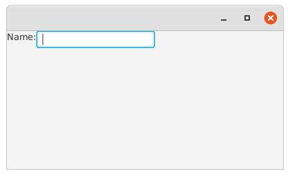
Well, it’s all squished up in the top left corner, and the “Name:” prompt seems to be a little higher than the TextField. So let’s fix that.
This is done by configuring the layout of the containing HBox. The code ends up looking like this:
public class Main extends Application {

    public static void main(String[] args) {
        launch(args);
    }

    @Override
    public void start(Stage primaryStage) {
        Scene scene = new Scene(createContents(), 400, 200);
        primaryStage.setScene(scene);
        primaryStage.show();
    }

    private Region createContents() {
        HBox results = new HBox(new Label("Name:"), new TextField(""));
        results.setSpacing(6);
        results.setPadding(new Insets(0,0,0,50));
        results.setAlignment(Pos.CENTER_LEFT);
        return results;
    }
}
The first thing that you’ll notice is that we’re now instantiating the HBox as a variable so that we can configure it through some of its configuration methods. Let’s look at what we’ve done:
setSpacing()- This defines the space between the
Nodescontained inside theHBox setPadding()- This defines the space between the edges of the
HBoxand its contents. Insets- This class is used to define space around or inside a Node.
Insetshas two constructors. One takes a single number which is applied to all sides of theNode. In this case, we’ve used the second constructor, which takes a separate number for each side in the order: Top, Right, Bottom and Left. setAlignment()andPos- This defines how the
Nodescontained in theHBoxwill be oriented in relation to theHBox. In this case, they are going to be left aligned and vertically centred. The default isPos.TOP_LEFT, which explains why theLabellooked higher than theTextField.TextFieldis slightly taller thanLabelin its default styling.
When you run this, you’ll see it looks almost like this:
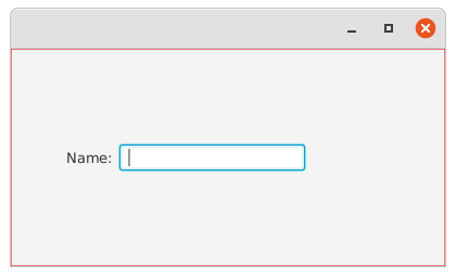
I’ve added an extra line to put a red border around the HBox. It’s not included in the code above because it uses concepts we haven’t looked at yet. But since HBox is usually invisible, it helps to have a border to understand how it works. We’ll get to the border later on.
When you see the red border it becomes clear that the HBox is occupying all of the space available to it, not just the amount of space required to hold its contents. This explains why everything was originally up in the top left corner with the default Pos.TOP_LEFT alignment, and why it’s now moved to the middle of the window. It’s not all the way over at the left because we set a 50 pixel padding on the left side of the HBox.