Introduction
One of the advantages of coding layouts by hand and following both DRY (Don’t Repeat Yourself) and the “Single Responsibility Principle” is that your code ends up composed of lots of small methods that do very specific things. Over time, it becomes very easy to start viewing the results of these methods as “custom layouts”, “custom controls” or “custom widgets”. This is especially true if you’ve built up a library of these methods that you call from different layouts.
This can be as simple as a method that instantiates a Label and then adds a StyleClass to it. If you call your method headingLabel(), then you’d start to think of the results not just as a Label, but a HeadingLabel, or maybe just a Heading.
There’s a great deal of power in this way of thinking about your layouts, because now the layout code isn’t calling a bunch of methods, it’s integrating a collection of custom widgets. That’s not just semantics, it is a different viewpoint.
If you keep applying DRY across your projects, or even layouts in the same project, you’ll eventually move some of those small methods, the ones that aren’t one-offs, into separate library so that you can share them across screens and projects. Once you’ve done that, you get the added bonus that you never have to think about how those custom widgets work, because you know that they work - and you can concentrate on your layout instead.
In this tutorial we’re going to look at how to start from a simple small method in a layout and then how you’d implement it as part of a shared library.
Our Example
For this tutorial we’re going to work with a control that looks like this:
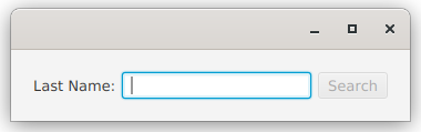
It’s an HBox with a Label, a TextField and a Button in it. When the TextField has focus, then the Button becomes the default button, so you can just type in the TextField and hit
It has some specific functionality, so it’s not totally trivial, and yet the implementation of the layout is pretty straight-forward and easy to understand. So let’s get to it…
First Version - Local Factory Method
The first way to build this, we’re going just create it as a local factory method. It’s going to be a “one-off”, so we don’t need to be particularly careful about it, and we can make all kinds of assumptions about how it’s being used - because we know how it’s being used:
class FactoryMethodStyle : Application() {
   override fun start(stage: Stage) {
      stage.scene = Scene(createContent())
      stage.show()
   }

   private val name: StringProperty = SimpleStringProperty("")
   private val results: StringProperty = SimpleStringProperty("No search done")

   private fun createContent(): Region = BorderPane().apply {
      center = createCustomBox("Last Name:", "Search", name, EventHandler<ActionEvent> { doSearch() });
      bottom = Label().apply { textProperty().bind(results) }
      padding = Insets(20.0)
   }

   private fun createCustomBox(labelText: String,
                               buttonText: String,
                               boundProperty: StringProperty,
                               handler: EventHandler<ActionEvent>): Region = HBox().apply {
      val textField = TextField().apply { textProperty().bindBidirectional(boundProperty) }
      children += Label(labelText)
      children += textField
      children += Button(buttonText).apply {
         onAction = handler
         defaultButtonProperty().bind(textField.focusedProperty().and(name.isNotEmpty))
         disableProperty().bind(name.isEmpty)
      }
      alignment = Pos.CENTER_LEFT
      spacing = 6.0
   }

   private fun doSearch() {
      results.value = "Nothing found for: ${name.value}"
   }
}

fun main() = Application.launch(FactoryMethodStyle::class.java)
This is Kotlin, but there’s nothing scary in here. If you’re really stuck, you can read my Kotlin for Java Programmers article, which should clear everything up.
We have a BorderPane, and in the centre we’re putting our widget, which we’ll call “CustomBox” throughout this article. The factory method needs the text for the Label and the Button, the StringProperty to bind to the TextField and the EventHandler for the Button.
Then we construct the HBox and we create the contents, do all the bindings and put the parts into the HBox.
The method returns Region which isn’t going to expose any of the contents since there’s no public Region.getChildren() method - this is going to be important later on. Once you’ve got the CustomBox there’s really nothing you can do with it except put it in the layout. Region allows you to mess with the min and max width and height, but that’s about all, and there are the methods from Node, too.
Second Version - Builder Class
Now, we’re going to look at how you might start to move this out of your layout code altogether, and the ways that you might implement it as part of a library of sub-layouts and widgets that you use frequently.
JavaFX has this handy Interface called Builder. It’s generic so you declare you class as implementing Builder<SomeClass>, with SomeClass being the class of the object that is going to be built.
The standard method with builders is to configure them, and then call Builder.build() to get the output. Let’s take a look at a builder for CustomBox:
class CustomBoxBuilder(private val labelText: String,
                       private val buttonText: String,
                       private val boundProperty: StringProperty,
                       private val handler: EventHandler<ActionEvent>) : Builder<Region> {

   override fun build(): Region = HBox().apply {
      val textField = TextField().apply { textProperty().bindBidirectional(boundProperty) }
      children += Label(labelText)
      children += textField
      children += Button(buttonText).apply {
         onAction = handler
         defaultButtonProperty().bind(textField.focusedProperty().and(textField.textProperty().isNotEmpty))
         disableProperty().bind(textField.textProperty().isEmpty)
      }
      alignment = Pos.CENTER_LEFT
      spacing = 6.0
   }
}
And here’s how we’d use it:
class BuilderStyle : Application() {
   override fun start(stage: Stage) {
      stage.scene = Scene(createContent())
      stage.show()
   }

   private val name: StringProperty = SimpleStringProperty("")
   private val results: StringProperty = SimpleStringProperty("No search done")

   private fun createContent(): Region = BorderPane().apply {
      center = CustomBoxBuilder("Last Name:", "Search", name, { doSearch() }).build()
      bottom = Label().apply { textProperty().bind(results) }
      padding = Insets(20.0)
   }

   private fun doSearch() {
      results.value = "Nothing found for: ${name.value}"
   }
}

fun main() = Application.launch(BuilderStyle::class.java)
To be honest, the CustomBoxBuilder.build() method is almost exactly the same as createCustomBox() from the first version. We don’t have access to name in CustomBoxBuilder so some small changes were made to the bindings to reference textField.textProperty() instead. Otherwise, they are identical.
But since CustomBoxBuilder is a generic tool, we can’t make assumptions about how it’s going to be used, and we can’t assume that all of the design decisions that we made initially are going to work for any new situations. So we’ll need to add some more capabilities to CustomBoxBuilder by adding decorators. Using decorators will allow us to use a “fluent API” style to configure our builder…
typealias ButtonRunner = (Runnable) -> Unit

class CustomBoxBuilder(private val labelText: String,
                       private val buttonText: String,
                       private val boundProperty: StringProperty) : Builder<Region> {
   private var spacing: Double = 4.0
   private var buttonAction: ButtonRunner = {}

   private val actionRunning: BooleanProperty = SimpleBooleanProperty(false)

   override fun build(): Region = HBox().apply {
      val textField = TextField().apply { textProperty().bindBidirectional(boundProperty) }
      children += Label(labelText)
      children += textField
      children += Button(buttonText).apply {
         onAction = EventHandler<ActionEvent> {
            actionRunning.value = true
            buttonAction { actionRunning.value = false }
         }
         defaultButtonProperty().bind(textField.focusedProperty().and(textField.textProperty().isNotEmpty))
         disableProperty().bind((textField.textProperty().isEmpty).or(actionRunning))
      }
      alignment = Pos.CENTER_LEFT
      spacing = this@CustomBoxBuilder.spacing
   }

   fun setSpacing(newValue: Double) = this.apply {
      spacing = newValue
   }
   fun setButtonAction(newAction: ButtonRunner) = this.apply {
      buttonAction = newAction
   }
}
First of all, Kotlin makes declaring decorators ridiculously easy. The structure:
fun something() = this.apply{}
will return the object itself, and run whatever is in the {} against the object. For spacing, we just added a private field to the builder, and then wrote a decorator setSpacing() method that updates the field. It’s almost exactly a traditional setter except that it returns the object.
When we start thinking about how a Button might be used in a more general sense, it’s obvious that it could invoke a background Task that might take some time. We want to prevent clicking the Button again and launching a new background Task while the first one is running. This means we’ll need to disable it, and then create a Runnable that the Task can run when it’s completed.
That’s what we have here. First of all, we created a Kotlin thing called a typealias. It’s just a way to have a meaningful name on a more complicated type definition. In this case, it’s the object that we need to have passed in to run the Button action, hence ButtonRunner. In Java terms, Kotlin’s, (Runnable) -> Unit is the same thing as Consumer<Runnable>, which means that ButtonRunner == Consumer<Runnable>.
Finally, the disabling logic for Button gets a little more complicated. We already have the DisableProperty bound to whether or not the TextField is empty, so we can’t just call Button.setDisable(true) because we’ll get an Exception about trying to set a bound Property. So we’ve introduced the actionRunning Property and added it into the disable binding. Then we just toggle actionRunning to control the disabling of the Button.
Third Version - Extend a Layout Class (Not Recommended)
The builder method is great, but once you’ve run Builder.build() and have your Region there’s nothing that you can do to it other than put it in a layout. Let’s say that you wanted to change the spacing in response to something that happens in your GUI, you can’t do it.
So the answer is to have something that behaves more like a Node from the ground up. You can instantiate it, put it into a layout and continue to call methods in it to interact with it.
That approach is to create a custom class by extending HBox. This is somewhat equivalent to what most beginners do anyways, when they return HBox from their factory method instead of Region. Our example would look like this:
typealias ButtonRunner = (Runnable) -> Unit

class CustomHBox(private val labelText: String,
                 private val buttonText: String,
                 private val boundProperty: StringProperty) : HBox() {

   private var buttonAction: ButtonRunner = {}
   private val actionRunning: BooleanProperty = SimpleBooleanProperty(false)

   init {
      createLayout()
   }

   private fun createLayout() {
      val textField = TextField().apply { textProperty().bindBidirectional(boundProperty) }
      children += Label(labelText)
      children += textField
      children += Button(buttonText).apply {
         onAction = EventHandler<ActionEvent> {
            actionRunning.value = true
            buttonAction { actionRunning.value = false }
         }
         defaultButtonProperty().bind(textField.focusedProperty().and(textField.textProperty().isNotEmpty))
         disableProperty().bind((textField.textProperty().isEmpty).or(actionRunning))
      }
      alignment = Pos.CENTER_LEFT
   }

   fun setButtonAction(newAction: ButtonRunner) = this.apply {
      buttonAction = newAction
   }

   fun withSpacing(newSpacing: Double) = this.apply { spacing = newSpacing }
}
And you’d use it this way…
class HBoxStyle : Application() {

   private val name: StringProperty = SimpleStringProperty("")
   private val results: StringProperty = SimpleStringProperty("No search done")

   override fun start(stage: Stage) {
      stage.scene = Scene(createContent())
      stage.show()
   }

   private fun createContent(): Region = BorderPane().apply {
      center = CustomHBox("Last Name:", "Search", name).setButtonAction { postRunAction ->
         doSearch()
         PauseTransition(Duration(3000.0)).apply {
            onFinished = EventHandler { postRunAction.run() }
            play()
         }
      }.withSpacing(50.0)
      bottom = Label().apply { textProperty().bind(results) }
      padding = Insets(20.0)
   }

   private fun doSearch() {
      results.value = "Nothing found for: ${name.value}"
   }
}

fun main() = Application.launch(HBoxStyle::class.java)
You can see that this implementation is only slightly different from the Builder structure. The build() method has been renamed to createLayout() and we now call it from init{} (which is almost like a constructor in Java). The method withSpacing() needed to be changed a little so that it delegates to HBox.setSpacing(), while still acting as a decorator.
But, why is this not recommended?
Fourth Version - Extend Region
The problem with creating a custom class by extending HBox is that you expose all of the methods of HBox to the client code. This includes, for instance, HBox.getChildren(). And that means that someone can add to and remove stuff from your layout. Or they could decide to modify the TextField somehow; just call HBox.getChildren() stream or loop through the List until you find the TextField and then start messing with it.
Is this a big deal???
That depends. If you’re just working by yourself and you know you aren’t going to do those things (until you do), or if you know you can deal with the consequences, then it’s probably not a big deal.
However, if you’re working in a bigger or more formal environment with other programmers, it can be huge. Part of the beauty of having a library of custom components is that - especially over time - you know that they work, and have been tested and proven. So you don’t even have to think about them much. You use them and you rely on them.
But if you have a situation where someone has found it expedient to monkey with the inner workings of one of those components from your library in the client code, then the bets are off. And if you don’t catch that they’ve done it, then it could cause confusion.
Even worse, in that situation you now have coupling between the client code and the implementation of your custom class. Let’s imagine that they’ve done something to the Button by grabbing the children of the HBox and then taking the 3rd element from the List. But then you decide to add graphic to the HBox as the first element. Now the Button is the 4th element and this change will break their client code.
So the best thing is to create a custom class that extends from something that doesn’t expose it’s inner workings to the client code. The easiest answer to that is to use Region as your base class. The reason for this is that getChildren() is protected in Region, and isn’t public until Pane and its subclasses. So you can create a class that extends from Region, and your client code can’t mess with its implementation:
class CustomRegion(private val labelText: String,
                   private val buttonText: String,
                   private val boundProperty: StringProperty) : Region() {

   private var buttonAction: ButtonRunner = {}
   private val actionRunning: BooleanProperty = SimpleBooleanProperty(false)
   private val hBox: HBox

   init {
      hBox = createLayout()
      children.add(hBox)
   }

   private fun createLayout() = HBox().apply {
      val textField = TextField().apply { textProperty().bindBidirectional(boundProperty) }
      children += Label(labelText)
      children += textField
      children += Button(buttonText).apply {
         onAction = EventHandler<ActionEvent> {
            actionRunning.value = true
            buttonAction { actionRunning.value = false }
         }
         defaultButtonProperty().bind(textField.focusedProperty().and(textField.textProperty().isNotEmpty))
         disableProperty().bind((textField.textProperty().isEmpty).or(actionRunning))
      }
      alignment = Pos.CENTER_LEFT
   }

   fun setButtonAction(newAction: ButtonRunner) = this.apply {
      buttonAction = newAction
   }

   fun withSpacing(newSpacing: Double) = this.apply { hBox.spacing = newSpacing }
}

class RegionStyle : Application() {

   private val name: StringProperty = SimpleStringProperty("")
   private val results: StringProperty = SimpleStringProperty("No search done")

   override fun start(stage: Stage) {
      stage.scene = Scene(createContent())
      stage.show()
   }

   private fun createContent(): Region = BorderPane().apply {
      center = CustomRegion("Last Name:", "Search", name).setButtonAction { postRunAction ->
         doSearch()
         PauseTransition(Duration(3000.0)).apply {
            onFinished = EventHandler { postRunAction.run() }
            play()
         }
      }.withSpacing(50.0)
      bottom = Label().apply { textProperty().bind(results) }
      padding = Insets(20.0)
   }

   private fun doSearch() {
      results.value = "Nothing found for: ${name.value}"
   }
}

fun main() = Application.launch(RegionStyle::class.java)
This is very similar to the HBox version except that the HBox is now added in as the sole element in Region.getChildren(). So we have our same HBox wrapped in a Region.
Just doing that hides away the HBox. None of the client code can call Region.getChildren() because it’s protected.
It does mean that we have to deal with the Spacing issue. Since our client code can’t just call HBox.setSpacing(), we’ll have to provide a method in our custom class to provide this functionality. Here we have withSpacing() implemented as a decorator.
Fifth Version - Custom, Skinnable Control
We aren’t going to go into the details of this here, as it’s tutorial or two all in itself, but we’ll talk about it so tha you can know when it would be appropriate to use.
Our CustomRegion is designed such that the GUI implementation is muddled up with the control code. It’s not a big deal here, because it’s still pretty simple, but it could be an issue if you wanted to change the implementation of the GUI.
The JavaFX class, Control extends Region and implements an interface called Skinnable. The design essentially allows an MVC-type structure to be used. Since there’s never any business/application logic to implement (it’s a GUI widget, after all), and the Model won’t have domain objects, the Model is essentially just the Presentation Model. The View implementation is done in a class that implements an interface called, Skin. The Control class becomes the Controller contains the Properties that comprise the Presentation Model, and the View is implemented in the Skin.
In practice, unless you want a client project to be able to rework the Skin, there’s very little reason to go through the trouble of creating a Skinnable Control. You can do virtually everything you need by extending Region. So we aren’t going to look at how to do this in this article as your not likely to need it building real applications.
Conclusion
I think the key idea is that every programmer, or every programming shop, is going to evolve their own conventions about how different layout components are going to be used and put together. There’s often lots of different ways to get to very similar outcomes in JavaFX, and best way is usually the one that makes the most sense to the programmers doing the coding.
That means that you’re going to find yourself using the same patterns over and over again, and you don’t want to be reinventing the wheel every time. And you certainly don’t want those details clogging up your layout code.
Move the code that implements those patterns out into factory methods in your layout code, then if you use the same patterns in another layout, move them out into a library of factory methods that you can use anywhere. Most of your “custom widgets” are going to be implemented this way.
When things get a little more complicated, or you need to tune the implementation to handle a variety of situations, then it might be time to implement a Builder class for your custom widget. If the implementation needs to be dynamic and respond to changes in the state of your GUI, then you might need to create a custom class that extends Region.